I know some of you have noticed but I've been making some minor upgrades to the visual aspect of the blog. Figured I could address them here and get any feedback.
Most notably, I'm redoing all the logo graphics. You'll notice in the Third Jerseys section of the sidebar — where the majority of the logos are — they now have dark grey backgrounds instead of colors. No real reason behind the change. I just get bored looking at the same thing every day.
Thing is, I can't decide whether I like the darker background or the lighter one so I figured I'd do a quick reader poll. It's on the right. Which do you prefer? Darker or lighter backgrounds? The poll closes tonight.
For an example of a lighter background, check out the logos that have been added to the Rebranding the NHL section. I think it's a better representation for Matt's work than plain text links. Clicking on a logo will take you to the post where that rebrand was featured here or at NHLToL. I'll also be adding links to the jerseys available for NHL 08 made by DRutka. I've been meaning to do that for a while but I've had other things on my plate.
Also made some small improvements to the championship banners. Should make them look nicer.
As you know I'm always looking for ways to make things better. If you have any ideas or suggestions, don't hesitate to let me know. And don't forget about tomorrow's Live Chat at 11:30 AM EDT for the first third jersey unveiling.
 2 Comments
  Saturday · Oct 11 · 2008 | 12:04 PM PDT


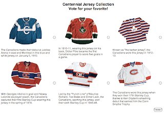
 They beat me to the punch. On their official web site, the Montreal Canadiens are holding a poll, asking you to vote for your favorite of the six newly unveiled Centennial Jerseys.
