Previewing The New Thirds
 46 Comments
  Thursday · Jul 31 · 2008 | 8:46 AM PDT
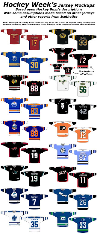
 All right, so much to discuss. This is the post I promised days ago but I kept putting it off every time new information leaked. So far I haven't heard anything new today so here are some of the concepts folks have put together based off of the latest design rumors. We're starting with Hockey Week, who put together a graphic that includes all 18 possible thirds!
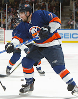
That's a lot of work he put into that. But there's still more. The Islanders wore special vintage jerseys briefly two seasons ago that will probably serve as a basis for this year's alternates.
Very sharp. Those are the only photographs I have. Everything else is fan made art.
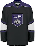
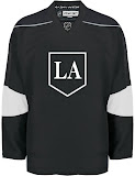
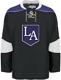
Next up are the Kings in a variety of different looks based off of Howard Berger's description.
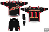
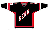
I'm pulling for the one on the left, personally. Here are a couple of concepts for the Senators — or should I say, Sens?
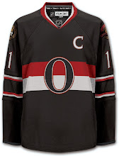
While I'm on the subject, a group of fans in Ottawa are pushing a "heritage jersey" as they call it. This is what it looks like.
You can sign their peititon if you're so inclined. Honestly, they could do a lot worse. That's a very nice sweater.
You want to see what's not a nice sweater?
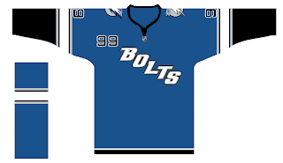
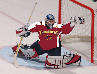
With the text on the jersey, I don't imagine the Lightning will use the numbers on the front. I do like the arm stripes here, though. Staying in the south, we've got Kari Lehtonen with a possible third jersey design painted on.
I'm not a huge fan but I think I need to see the actual sweater.
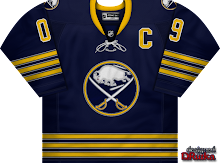
And finally, our friend Dave (aka DRutka) has come up with a little something for the Sabres. Charlie posted this at Sabres Not Slugs.
By the way, as you guys know, Dave's been adapted Matt's rebrands for use in EA's NHL video games. I'll have links to those coming shortly. You'll find them in the Rebranding The NHL section of the sidebar.
If you guys have anymore third jersey mock-ups, feel free to send them along for posting here.
By the way, almost forgot to mention it. All 18 teams getting third jerseys are now featuring in the sidebar.




Reader Comments (46)
Oh please don't let Hockeybuzz be right about the Hurricanes jersey. That would be just awful.
That heritage jersey is leaps and bounds better than a ridiculous rumored wordmark.
The heritage would sell tons more than a stupid wordmarked jersey too.
I can't stand the basketball style jersey that Dallas has brought into the league, and that Atlanta has picked up on.
As for the others:
-The Sens and Bolts using their nicknames? Lame. I like the fan retro one for Ottawa
-The retro jerseys are all, although I don't like the Penguins' one
-Hockeybuzz's Carolina mock up is bad
-St. Louis should stay in their colour scheme
as said by paul, please let hockeybuzz be wrong, why are there stars on the bottom of the sweater?
That idea for an Ottawa heritage jersey is really nice.
Great stuff! The Oilers' and Hawks' concepts are awesome.
That Ottawa heritage jersey is fricken awesome. I am by no means an Ottawa fan, but I would wear that. And I would consider it one of if not the best in the league if they played in it.
Another thing. That Ottawa heritage jersey almost looks like a dark brown. And I am not complaining. I actually thing that would be cool and in fact is kind of what makes me like it so much. Something completely different than what we have seen.
as most are saying, that Ottawa heritage jersey is great! too bad they're taking the route they're going instead of something like that... but i'm pretty much a fan of most vintage designs for the sweaters
I like the introduction of the Black to the Blues jerseys replacing the yellow. The navy looks great too!
Maybe it's been asked, and I've been just oblivious to the answer, but what happened to wallpaper Wednesday? Has it been relegated to a bi-weekly feature now?
Ricahrd
Ottawa heritage jersey looks great! The 2 best third jerseys that look the best are San Jose Sharks and Phoenix Coyotes. Also, Carolina would look wayyyyyyyyyyyyy better if they use the hurricane flag!
Maybe it's been asked, and I've been just oblivious to the answer, but what happened to wallpaper Wednesday? Has it been relegated to a bi-weekly feature now?
Ricahrd
I took this week off, what with the news coming about the third jersey logos. Felt like that kind of trumped everything. Assuming the artwork keeps coming in, Wallpaper Wednesday will be back next week and remain a weekly feature. Sorry for skipping one.
am i the only one that thinks vancouver's is lame since it's basically the exact same home jersey just different logo?
all in all there are more letdowns than i was hoping. while the 'sens' and 'bolts' is lame in itslef, the lightning jersey is nice. and why are the blues using black? makes no sense. atlanta's is ugly, LA's remains to be seen, but use purple! i'm even a little upset with boston, although i like the jersey, they should have changed it up and gone gold
For a team that has given us some crazy sweaters in the past, the Canucks are sure keeping it conservative on this one. Why the heck even release a third jersey that does nothing but change the logo, which itself is simply a retread of another logo? This is even more frustrating since the Canucks have the new Johnny Canuck logo to play with. I can only assume that management is so afraid to create another marketing disaster that they are instead making something safe and boring to placate fans that hate the wordmark/Orca combo. Thanks for nothing. I already bought that jersey three years ago when they brought back the vintage look.
I always likes the Orca logo, no other animal can pull that wordmark off. Too bad whales have nothing to do with Canucks.
Ken, would you rather see a Green->Blue gradient jersey? xD
Hey! I always liked that gradient jersey, it was creative and original. They should try it with their new Johnny Canuck logo lol.
The Vintage Flyers,Pens and Oilers are the best in my opinion.Good to see the Oil returning to their "dynasty" jersey.The black San Jose Sharks jersey is also pretty cool looking.
Sens,Thrashers,Kings and Hurricanes are worst.
not too sure about those "Sens" & "Bolts" nickname crests...I guess the designers thought they would be "cool" and "hip"....more like lame and unimaginative.
the Blues look suprisingly similar to the old Jets road jerseys,dont they?
I agree with what Ken said about the new Canucks jersey.
all they did was remove the "VANCOUVER" wordmark and swap the skate in rink logo for the Orca C...the jersey remains the same,no different striping or colors.
Vancouver fans must feel let down.
the Canucks really messed up with last years jersey...they should have all along went with the 70-71 style for the home and away,then re-introduced either the 80's skate style black road jersey or an all new version with the Johnny Canuck logo this year as their alternate.
the current jerseys with that hideous "VANCOUVER" text across the front are the worst in the league.
well, right behind Atlanta and Dallas.
I could make better jerseys with color crayons and lined paper, come on Chicago come up with some new designs, and Ottawas is disgraceful! SENS? come on now...and Dallas' 3rd is the exact same as their Away? What is that? Mix it up a little go with a green j or something. And lastly Tampa's and the Bolts? Who comes up with this stuff let me make the 3rd jerseys for the whole NHL and they will be 10 times better then all of this rubbish and junk posted above.
The Ottawa Heritage jersey is awesome! I would love to see that happen. Its both classic yet updated for today's NHL.
http://sports.yahoo.com/nhl/blog/puck_daddy/post/Third-jersey-images-leak-and-Phoenix-never-look?urn=nhl,97127
Hey Chris, Puck Daddy cited you again.
"Who comes up with this stuff let me make the 3rd jerseys for the whole NHL and they will be 10 times better then all of this rubbish and junk posted above" -LightTheLamp017
you DO realize that this website was made to showcase custom jersey concepts as made by people like us, right? even if you use MSpaint (which is standard on EVERY microsoft computer), send Chris some artwork, and back up those claims. I agree that a lot of those are pretty bad, but at least i'm trying to show new stuff.
so c'mon, draw some jerseys and send them in, back up what you say
Yes i understand and I already have sent Chris some artwork but he has yet to post some of it, maybe if you want to see some you can talk to me or have him post it. Im not getting down on people who created them im getting down on the people who designed the jerseys in general.
Most of those are correct, except the Blues one I have is a bit different. I'll email Chris after the weekend with all of the jersey pics I was sent, assuming everything hasn't been leaked by then.
Also, the 3 Kings jerseys posted in a row, the middle one is the most like the picture I have. From the shitty quality it is (my pic) it looks like crossed sticks, or a crown in an inverted triangle, under the LA.
The pic I have of the Blues is a bit different than the concept posted. It's my favorite of the third jerseys.
And I'm not bullshitting considering my descriptions from a week ago seem to be almost spot on to what Howard Berger had posted...
I am a Canucks fan who actually loves the "VANCOUVER" wordmark logo design. I'm kind of disappointed in this supposed third jersey design, but I'm glad they're keeping that colour scheme.
flyersk27, killer whales are very relevant to the geography of Vancouver and its region, which is why they've been frequently represented in native art from the area. That would also be why the design of the orca is so influenced by first nations art. I think it's an awesome logo as far as regional relevance goes.
I really like the retro feel of the Flyers, Islanders, Pens, Sabres, and especially the Oilers. All those 60's/70's teams are definitely going for the same feel. The Senators heritage sweater is a great idea, too, much better than writing 'SENS' on a jersey.
I'm not thrilled about the wordmark jerseys. It just screams "we need to appeal to the American market."
As for my Canucks, I'm convinced the ONLY reason they went with a wordmark jersey in the first place was to cash in on the 2010 Olympics. By the time 2010 rolls around, you'll be able to buy friggin' toilet paper that says 'Vancouver' on it. Gotta get those tourist dollars, you know.
That said, I don't hate the new sweaters. But I definitely get the feeling that these new 3rd's are so similar to the current jerseys for one reason: because after 2010, that WILL be the Canucks sweater. Goodbye Orca/wordmark. A lot of teams have used this strategy over the years. They do a 'soft' changeover of a team's look by bringing in a third that eventually becomes the new look (Calgary, Ottawa, L.A., Isles, Pittsburgh, etc.)
Pittsburgh is the ONLY city in which all professional sports teams wear the same colors(black and gold) and I highly doubt(and will frown apon if they do) they would change the uniforms to powder blue and white. Personally I can't wait til the RBK EDGE contract runs out so the jersey can go back to what they're supposed to look like. PRE EDGE style(CCM box cut jerseys)
Arwyaien, obviously i'm Very interested in these jerseys. could you describe the blues jersey? that's the one i'm most interested in. i'll take as detailed a description as you feel safe offering me.
for the sens, how close am i? i used one of the team's old wordmarks from sportslogos.net.
does the sharks jersey have front numbers?
what colors are the numbers on the thrashers jersey?
is it possible that there could be gray stripes next to the white sleeve stripes on the kings?
seriously, ANY other innacuracies, please post them, i'd love to update my mockups and have as correct drawings as possible before the jerseys are unveiled
thanks!
one thing i think is funny about the thrasher's jersey is that it's actually maroon. they did all they could to almost eliminate that color from their jerseys and then they come out with an entire jersey that's that color? guess that whole blue nation thing or whatever that was ran dry
Those "SENS" jerseys make me really cringe. But that heritage jersey... oh baby, I would buy that thing up in a second. Why, oh, why, doesn't management listen to us?! We have two great secondary marks and they want to use "SENS"... makes no SENSe.
Why does everybody assume that the Hockeybuzz report meant it would be our primary logo? the Secondary already has a triangle, and it is predominantly red, while red is one of three element sin the primary. the Hockeybuzz report said the Canes red logo, not primary. It could mean either.
Also, two years ago I was talking with a lady at a boot and she said that the next year they would be getting a jersey with the secondary logo on it. She seemed to know. As we know, there were no thirds that year, it will be introduced this year.
My bet is on the secondary flag logo on the front with the normal black triangle in that logo made white, and the stars on the bottom, one for each season played. And I wouldn't be surprised if the 8th was a different color...
sorry to double post, but Arrow dat, the pens jerseys are throwbacks to the second year of the team. They didn't always wear black and gold. And they are so far the only team that we have actual confirmation on- they stated they would use the winter classic jersey as the third the year after about a week after that game.
I wasn't sold on the new Phoenix logo when it first was shown yesterday, but after seeing it on those jerseys I have to say it looks very sharp. Overall I think almost all of these jerseys are great, excluding the "Sens" and "Bolts" debacles, and I think the Kings could have done more with their rich heritage of color cominations and logos.
I really like that Canucks jersey and logo. I hate the Johnny Canuck logo. But I also hate the Canucks.
cptjeff,
I really like your idea for the 10 stars for 10 years with the different 8th star (it'd be too easy to make that one silver), but now that this is the 11th season, do you really think they'd do that? would they keep adding a star each year?
isn't there a clause that a team can't change jerseys until so much time elapses like in the NFL?
i think i'm going to draw up a jersey using that idea and see if it gets posted here. i have my doubts though, something like that would've been spectacular for the anniv. patch last year, not so much now.
someone else said that the stars were just mistaken for the normal flag pattern, either one of you could be right.
as for the logo, it's very possible. that's why i included two drawings for the Canes
The Sabres jersey is colored wrong. It's gonna have the new Sabres colors, the ones in DRutka's jersey.
And shouldn't the Bruins jersey have a yellow stripe at the bottom? And the Penguins jersey's colors are bit wrong.
The only ones I like are the Penguins and Maple Leafs vintage jerseys. And the Blues jersey would be awesome without that logo. It's too plain.
Damme, Not sure as to why you are saying the Pens colors are wrong.I own a Penguins Winter Classic Jersey....and the colors in the mockup are exactly the same.
im not sure why so many of you like the Ottawa "heritage" jersey.
looks like a rip off of the classic Habs design with the band across the chest underneath a central logo.
and the giant "O" is horrible.
who wants a big O on their jersey?
I can just hear the jokes about the jersey now.
h
UGH the Kings jersey in the Hockey Week group is exactly what I was afraid of. no no no no no no!
the white piping along the side is horrible - it makes it look exactly like a practice jersey. especially with those single-color numbers on the back which otherwise seem fine (though I think they will be silver with white outline, or the reverse which is easier to see on TV as we saw in the early 90's)
the Kings far left one of the other three submissions is exactly what I hoped for in my head and honestly the best I think we can hope for by the Berger description. the shoulder yoke definitely needs to be purple as does the neck to really complete the look. the white looks completely wrong and black is too flat, if that makes sense.
also the Ottawa (petition) is great. that's what their 3rd should be. simple, classy, represents the city well unlike some of the other goofy jersey variations they've had
@ Arwyaien
If you and Hockey Week are right about the Kings alternate, then I'm gonna burn it when I receive mine. And this is gonna sound down-right terrible, but I actually prefer the "Bolts'" third.
Now the Blues' was one I've been anxious to see for a long time. Seeing this concept, I can't say I'm disappointed. I can't quite clearly see the Gateway Arch, but I am really glad they didn't mess up that beautiful logo.
Boston, Phoenix, and San Jose's jerseys look pretty nice, while the Blackhawks, Oilers, Islanders and Leafs all get high marks by me for returning to vintage jerseys.
If the Hurricanes use the alternate logo on the alternate jersey, then that'll be a nice jersey. I think the Thrashers could do a bit more, and I don't know why Dallas didn't use this as their road last season when they introduced the "DALLAS" home jersey. It didn't make any sense, and the logo was barely visible from the nosebleed sections (where I was sitting for the Kings' incredible 6-5 comeback win on November 10, 2007!!). Only reason I knew it was the Stars playing was because of the giant octagon hanging from the rafters.. the one that says "Dallas"?
But seriously, if your jerseys are just plainly going to have the city name on it, why do the Stars and Canucks even have nicknames? We just know them as "Dallas" and "Vancouver" because that's all that's on their jerseys.. I view them the same way I view EPL (English Premiership League) teams: I only know them by the city they play in, not because of their nickname. At least the Canucks dropped the "VANCOUVER" from their alternate.. at least according to what we've seen. But they could always screw us up and throw it on.
As for the Thrashers, I don't understand why they took the "DALLAS"/"VANCOUVER" route on their alternate. I personally believe they have one of the nicest logos. But they're an Eastern Conference team, so I at least don't ever have to see them.
Now.. have I ever mentioned how much I despise these Kings' alternate jersey rumors? Well, I can't shut my computer down without mentioning it once more. EVERYBODY KNOWS WHO YOU ARE!! You don't need to throw "Los Angeles" on the jersey to identify yourselves; you've been around since 1967. Anybody who knows hockey knows you're Los Angeles. But now you've gotta just put "LA" on it? You're not from Louisiana, which is what I think of when I see "LA", despite the fact that I live in Los Angeles County.
But seriously, and Stars, Leafs, Senators and Lightning fans are gonna appreciate this: is there anything that looks more plain than two letters in Times New Roman font inside a pentagon? In black and white, no less. Not a spot of purple, according to the design Arwyaien says looks most like his picture. They have worn purple every single day of their franchise until about the time Gretzky came and every single day of their franchise after they left the Forum. I can't imagine that they would choose to go this direction, but this just saddens me.
rhinos7 said...
"UGH the Kings jersey in the Hockey Week group is exactly what I was afraid of. no no no no no no! the white piping along the side is horrible"
I'm not sure why the artist put the piping down the sides. The original description from HuckeyBuzz said "A thin white stripe will run horizontally on each side of the jersey, just beneath the shoulder."
Plus, there's a Kings third jersey "mystery" photo on the kings website that shows enough to see the horizontal stripes...check it out here:
http://kings.nhl.com/team/app/?service=page&page=NHLPage&id=3053
That is basically the same 3rd the Sharks for a few seasons before the RBK take over. The only difference in the logo (I'm sure the cut and material will be different, but yet the look is the same)
cptjeff:
Thanks but I was born in Pittsburgh PA 1973. Have been a Pens fan since 1981. I am well aware that the Pens weren't always Blk/Gold. I think all the teams(Pens,Pirates,Stillers) realize how unique it is that they all share the same colors. However, to get technical the Pittsburgh Pirates Hockey Club(1925 - 1930) was the first professional spots team to wear the colors black and gold. The Pirates were the first team in Pittsburgh to use the black & gold color scheme, basing their colors around the Flag of Pittsburgh's colors. Decades after the team folded, the colors have become the team colors of all three of Pittsburgh's major sports teams. However, during the team's existence, they would be the only team in the city with the colors, as the baseball team of the same name, like all other baseball teams at the time, had a more patriotic red, white, and blue color scheme and wouldn't adopt black & gold until 1948. The NFL's Pittsburgh Steelers were not in existence until 1933, three years after the team left town and two years after the franchise folded altogether.
The Pirates would later have a connection with Pittsburgh's next NHL franchise; the Pittsburgh Penguins used the Pirates as an example of a team other than the Boston Bruins using the black & gold color scheme when the Bruins protested to the NHL over the Penguins change in team colors in January 1980. The NHL allowed the Penguins to change their colors as a result of the Pirates using these colors.