Inspiring Concepts
 43 Comments
  Sunday · Aug 3 · 2008 | 11:46 AM PDT
 It's been a while since I've done a concept post. But as you know I've been busy redesigning the blog this weekend (again). Before I get into today's artwork — and there's a lot of it — I wanted to share my inspiration for this latest round of design upgrades.
A reader and graphic artist named Guillaume Bellemare emailed me a couple of weeks ago about the design of Icethetics. He said he had some ideas for improving it and I asked him to send me whatever he came up with. I just wanted to show you guys what he sent.
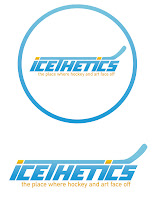
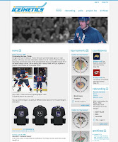
First of all, Guillaume obviously does really great work. You can check out his web site for more like it. You can click on the images above to enlarge them. On the left is the logo he created. I don't plan on using it (not a big fan of the font) but I do like the concept a lot. And on the right you can see the site design he came up with. So I have to credit Guillaume with putting the idea of a pollbar in my head. It wasn't until I saw his design that it really clicked with me.
One of the main focuses of this site is the polls. Why am I letting them get buried in pages of posts? It didn't make any sense. Now you have a quick at-a-glance way of seeing what you can vote on — and how long you have left to do so. That was the main element I took away from his demo here.
As for the rest of it, like I told him, the majority of the people who visit Icethetics are designers or otherwise artsy people who tend to use higher resolution monitors. Tiny text is difficult to read so I prefer large text and lots of spacing. I also widened the page for the same reason. Anyway, there's no need to beat this to death, so I'm not going to go into anymore details unless specifically asked.
If you have any questions, email me or comment. Now for today's concept art...
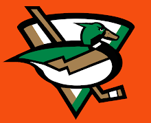
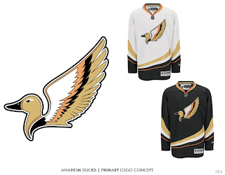
We're beginning with the Ducks because I have two great logo designs for them.
This one I like a lot but it's funny to me that, like the Canucks, the uniform would feature a prominent color not in the actual logo itself. The designer created orange uniforms for this concept. Still a great logo. The next one, I don't know.
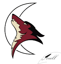
It is quite duck-like, but I'm not sure that's winning it points. A little detailed perhaps, it makes great use of Anaheim's new colors. Moving on now to the Coyotes.
I think this logo would be improved by filling in the moon with a color. And while I like Phoenix's actual logo better, in this one, the coyote actually appears to be howling.
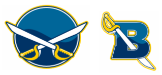
Another interesting Sabres design to add to the pile.
Simple, straightforward, traditional. Nothing wrong with that.
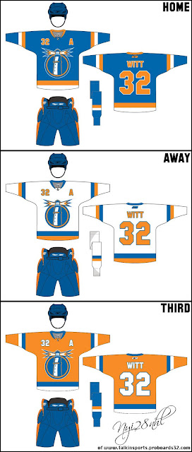
The next piece is based off an Islanders concept logo I posted here about a month ago.
Those are some nice jerseys and I can't see how the club from Long Island could go wrong with a logo like that.
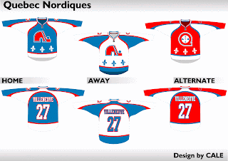
We'll finish things off with a little something for the Quebecois population out there still missing the Nordiques. Here's what the old club might've looked like in today's Rbk EDGE sweaters.
Not bad at all.



Reader Comments (43)
Great concept site design. Having some buttons at the top like that sure would help clean things up a bit.
Wow Chris I'm really blown away that you aren't going to be using that font Guy sent you for the title of the blog. Your current one is 100% cheese. Guy's is pro. Ignoring it will be a huge mistake unless you have something up your sleeve.
That first ducks logo is nut-awful. Looks a constipated mallard. The second isn't bad, but the wings are too much of a ripoff of Detroit's logo... The Sabres design is too plain, needs some more work.
fun post to read!
I think the Sabres logo is fantastic in its simplicity...
Nice work, Guillaume! I actually really like the logo as it's more clear what the site is about.
Wow Chris I'm really blown away that you aren't going to be using that font Guy sent you for the title of the blog. Your current one is 100% cheese. Guy's is pro. Ignoring it will be a huge mistake unless you have something up your sleeve.
Seriously? First of all, I love cheese! That's all this blog is! (We talk about logos and uniforms all day like it's important or something. Really?!) There's nothing professional about it — though some of the concept art is top of the line — so to use a logo that makes us appear professional I feel would be tantamount to false advertising.
Like I said, his work is excellent but it's not quite right for Icethetics — even the name, Icethetics, makes me laugh. That's why I love doing this.
Anyway, I hope you guys understand why I'm not using it. But like I said, it's very a good design and I at least wanted to showcase his work a little.
I still see one mistake in the site. After you vote it's hard to see what the results are. The two bars representing the votes are like right on top of one other and I can't see which bar is which.
I still see one mistake in the site. After you vote it's hard to see what the results are. The two bars representing the votes are like right on top of one other and I can't see which bar is which.
What browser/system are you using? I haven't noticed a problem on Firefox/IE 7 (Windows) or Safari 3/Firefox 2 (Mac).
I love the Islanders jerseys...
Ducks aren't bad either ;)
Yeah, I use Internet Explorer. I opened the site on Firefox and it looked fine. I don't use Firefox cause i can't be bothered to download the plug in for YouTube. It's nothing tragic it justs takes a few seconds to pick both of them out.
Here's what it looks like.
http://i111.photobucket.com/albums/n152/JetFlyinKyle/Untitled.jpg
Yeah, I use Internet Explorer. I opened the site on Firefox and it looked fine. I don't use Firefox cause i can't be bothered to download the plug in for YouTube. It's nothing tragic it justs takes a few seconds to pick both of them out.
I think I know what happened there. Try it now, refresh the page and let me know if it's fixed. Thanks!
Yeah it looks fine now. Thanks.
i really like that stuff that guy sent, the logo looks sick abd the whole concept is cool, the only thing is is that i like the tournaments on the left side like it is now i think it would be a good idea to take use his ideas
the logo is pretty sweet. the set-up i'm not a huge fan of, that whole right-side crowding thing. i think you have a pretty darn good look right now, the colors have grown on me, the sides are balanced, and the date-bar doesn't take away from the posts. i think you'd be alright for some status quo for a while.
but Icethetics concepts are something we really haven't seen here, it's a unique idea, do you have others? they'd be cool to see
That Islanders logo is solid but from a distance it kind of looks like Dr. Robotnik...just sayin
Wow, I really really think u should use that Icethetics logo. I don't like the layout of the concept site but I love the logo. MAybe make the new logo a darker blue but other than that its perfect. Maybe you should have a poll to see which logo people like more. This IS a site where the readers usually are the people sending in the art so why not let a user come up with a new logo?
I know this is off-topic but what happened to Wallpaper Wednesdays?
The wallpapers will be back this week. Took a week off with all the third jersey news coming in.
I'm don't plan to change the banner. If someone would like to create a non-text-based logo for Icethetics, I'm up for it.
The Nordiques jersey's are killers.
Long live the Nordiques.
I really like the Icethetics concept logo. My suggestions are get rid of the one in the circle, the circle adds nothing - the wordmark alone looks great. And drop "the place" from the slogan so it just says "where hockey and art face off". That's my $.02.
Oh and for that concept ducks logo on the orange background - flip the triangle behind the duck upside down so it looks like an A for Anaheim.
The logo for the site looks good, but the background for the site shouldn't be white, it's too plain
Not sure if it is my PC or the site, but loading is really slow for Icethetics.
I Really dig the second ducks concept logo. I'm not sure how you could possibly like the first one, Chris. To each his own though.
What I think you should take from Guillaume's design is his rewording of your subtitle, 'Where hockey and art face off." This, in my opinion, sounds far better than, 'The face-off between art and hockey." I mean any time one refers to two teams playing one another they would say, "Said teams are facing off" as opposed to, "This is the face-off between said teams."
Think about it ;)
What I think you should take from Guillaume's design is his rewording of your subtitle, 'Where hockey and art face off." This, in my opinion, sounds far better than, 'The face-off between art and hockey."
That's funny. The irony in that is what he used was my original tag. But I wasn't sure how much I liked it because I wanted to use the word faceoff instead of the verb. Weird.
I don't know, I could change it back. What does everybody else think? Let's get a consensus.
What I think is strong about Guillaume's design is that it's clean. I like the current look and feel of Icethetics, but I think getting that cleaner look could be something to look into. Maybe lightening the values and simplifying the headers might work. I like the current setup though with the polls on the left side rather than cluttering up the right side. I can see why you want to use the noun "faceoff" but I think wording it the old way works better. It rolls off the tongue better. Keep up the good work!
The Sabres are already known as the Butterknives in certain circles. That concept design would not help to erase that moniker. Nice attempt, but no thank you.
As far as the site goes, I think it's fine as is.
Chris,
I agree with your using of the noun instead of the verb, but it does sound a little better.
But all in all, I think the new design looks good. If nothing else, the logo creates some permanence for the site. You'd have a marketable identity.
Also, the polls on the side is a great idea. I personally like reading the posts and seeing the concept art, but it's nice to have it all divided more clearly.
Keep up the good work.
Guy's website branding work that he gave you, if it was contracted by a professional web designer, would probably run you somewhere close to $400 dollars, and I think that's being pretty conservative about it.
Personally, as with a lot of casual, mainstream viewers to this site, I think it's a fantastic way to identify yourself. Right now this blog looks like a Blogger account (which it is) with a bit of HTML pizzaz.
Look, I'm no pro at design, and I don't aim to be... but you're really doing a disservice to Guy's work and your own website by not getting that stuff out there.
As much as you say as this is for fun, which it most definitely is, what's the hurt in trying to make this place look a little more professional? With a visual identity such as the one Guilliame has made, the site instantly gains more credibility.
I also apologize for butchering the spelling of GUILLAUME's name.
yeah, that icethetics concept is miles above the current design.
you know...i like chris' idea about someone designing a logo for icethetics.
it gave me an idea that i wanted to throw out there. i'm not talented enough to actually create it, but if someone else wants to take a crack at it...go for it.
how about a skull and crossbones take off with a goalie mask - a hockey stick and an paintbrush?
i think it would tie in the tagline beautifully.
also...imo...i like the font that Guy created. i do agree that some dark color values are needed, though.
great work, guys. keep it up!
almost forgot...i also like the old tagline...Where hockey and art face off.".
just my 2 cents.
I find it amusingly ironic that you're able to take stabs at de-valuing the Blackhawks logo while you're blog looks like a 14-year-old's myspace page. You have an option now that will gain much more credibility to your blog and you're just going to discard it. First impression is extrememely important on the Internet; peoples' attention span is very short when sufing the web, so in my mind it would make sense to care about the titleblock and banner, but if you would rather it be cheesy that's up to you.
You guys were right, the old tag line was better. The banner has been updated to reflect that.
Look, I'm no pro at design, and I don't aim to be... but you're really doing a disservice to Guy's work and your own website by not getting that stuff out there.
That's exactly why I posted it here — to get it out there. He's talented but it's not the direction I'm looking to go.
I'm really happy with the design I have now since I think it better expresses what this site is about. As I've said, his work is great, but it's way too slick for Icethetics.
But I'm sure he'll be glad to hear how much you guys love his work.
I like both Ducks logo concepts, especially the first one. As a Pens fan, I was kind of annoyed that the Ducks decided to change their colors to "classic black and metallic gold", but whatever. Even awesome colors can't save their logo. Either one of these concepts would be a great change for them!
The thing that jumps out about that second Ducks concept is that the logo compliments the upward sweeping stripe across the bottom of the sweater. I'm not sure if the logo itself is NHL-quality, but I really like that one aspect of it.
these look sick.
Hi guys!
As you can see, my nickname is Billy but my real name is Guillaume.
So it's me who've sent the Icethetics logo and web redesign.
I'm glad that all you guys find it interesting!
I respect Chris's opinions tough. It's is site so he decide!
But I like to read all your comment folks!
Especially those of Dan, xcnuck and Andrew Harkins!
Thank you all guys!
The other slogan was better and simple, and this logo is definitely perfect. Sorry Guy, I prefer the current one.
Chris, I am not trying to slam you in any way by saying this, but that site concepts is waaaaaaaay better than the actual site. In every way except the location of the poll bar where I think you made a good choice (although, I am not really a fan of the pollbar anyway). And good move on switching the tagline back. It sounds a lot better.
Regardless, I think it is the content that matters and whether the site is butt ugly or beautiful makes no difference to whether I will come back or not and the content on this site is amazing.
And before I forget, I agree with somebody else who mentioned it earlier that you are backwards on your assessment of those duck logos. The second one is much better than the first.
Nathan, I appreciate that and I in no way disagree with the assessment that Guy's design is better than mine. I think it's a better design but I think the one I currently have is more suited to the blog — if that makes any sense. After a year in dark gray and and light yellow, I want some bright colors to spruce things up.
Just out of curiosity, what elements of Guy's design do you guys like more than mine? Spacing, text size, colors, fonts, layout, etc... I think this calls for a poll! (No but seriously, I think I'm going to do a poll on this.)
And on the Ducks logos... guys, I know I can be dry, but seriously. I understand it's more difficult to express laughter while typing versus laughter while speaking. Credit to the artists one their hard work but should an NHL team be wearing those logos? Seriously?
OMG, NO MORE POLLS. HOLY CRAP, the logo being used right now is WAY better than Guy's. It seems less amateur too. It gives off way more of a clean look than a hockey stick being run through a word. I'm sick of the logos with sticks and pucks and stuff, and in case anyone hasn't noticed, all of the best logos don't involve sticks or pucks! Chris shouldn't be tortured intp doing a poll just for you whiners who need it the way you want. If you designed the current banner Chris, then you created a way stronger logo that represents this blog well. I sometimes forget that this is even independently run. The blog is fine the way it is as of now. Let's stop begging for our way and suck it up if we don't like something.
It's weird how many nordiques concepts we get with that logo, when the team was planning to use a new wolf's head logo for the 95/96 season if it hadn't moved. Technically one of these would probably be the nordiques retri 3rd jersey coming out this year, and the home and away jerseys would look more like this: http://www.sportslogos.net/logo.php?id=c72hgmvtcvxu8bmqvogo