Jerseys For Your Tuesday
 14 Comments
  Tuesday · Aug 5 · 2008 | 11:29 AM PDT
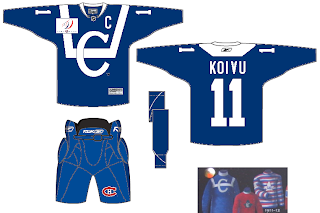
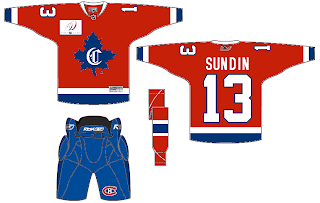
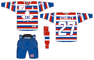
 I've had a few jersey concepts sitting around that I thought I'd share this afternoon. I wanted to start with the Montreal Canadiens — who, according to a few sources will have a number of vintage sweaters throughout the season to celebrate their centennial. Using some past looks, one designer came up with this three.
Solid if not a bit boring.
Notice the name on the back of that one.
And those stripes are making me hallucinate.
Moving to the west now, we've got a cool concept for the Stars.
Seems that Bruins jersey would work for just about any team with a little recoloring. And while we're on new colors, when Matt did his Dallas rebrand, a couple of people brought up the idea of using Cowboys colors. Here's how that might manifest itself.
It's not bad but a little to close to my Lightning, you know?
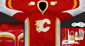
And speaking of the Lightning, they're currently facing the Flames in the Center Ice Tournament — last day to vote on that poll, by the way! Here's a Flames concept jersey with their original colors and an interesting new alternate logo on the shoulders.
It's not the outline of Alberta I'm impressed by, but the small flame within it. Anyway, keep the concept art coming. We've also got a Wallpaper Wednesday tomorrow. Get excited!


.png)


Reader Comments (14)
I really like that Dallas Stars jersey. Somebody should put the Bolts logo on it, I think it would look real good.
The Stars not having the green & yellow/gold on it seems rather understated, but it's sure a clean design. Definitely the best one of the bunch.
those socks on the Calgary jersey bug me...i've noticed that style on other teams and they look terrible when looking at them at the back...
Any who..I like the Boston inspired Dallas jersey, its nice to see the green back in the uniforms.
The Habs' jerseys look too Maple Leafish.
I was skeptical about the Cowboys idea for the Stars at first, but now I'm sold. Those uniforms look sharp, and establish the desired continuity between the Dallas teams without being cheesy.
Also loving the classic Habs uniforms, and that Flames alternate logo on the jersey. Nice post.
I like the Flames concept, but as an alternate jersey only.
If I didn't hate the Cowboys and like the Stars, I'd like that concept. But tying those teams together in any way, other than a common city, turns me off big time. Blech.
Best Stars Jersey ever on this site. The 2nd best is the Blue Stars jersey. You'd have to do something because it's hard to see the silver on the white. I'd like to see this concept on a blue jersey. The number font is wrong. Squirrelly font never work on any jersey. Only manly block numbers are acceptable.
The Calgary jersey is totally effing awesome. Nice touch dropping black, since it isnt one of Calgary's colors.I love state .....uh...I mean provincial outlines. Those always work. ( Unless drawn by 2nd graders ).
The second Canadiens jersey should've been on Freakout Friday. Sundin and Canadiens... well you can always dream, but Sundin is too loyal to Maple Leafs.
Anyway, the Canadiens jerseys look cool. And in my opinion the Stars logo should have some green and yellow, cause the jersey looks too "LA Kingish".
The Flames concept is alright but I disagree with motleybrent the jersey needs the black. It also needs the new red and yellow colors. The original colors were fine in the 80's and 90's but those colors were also the same colors as the Atlanta Flames. Don't get me wrong there is nothing wrong with using the same colors but when your a new team or franchise you want to distant yourselves. The Avalanche, Coyotes, Hurricanes didn't. Granted they changed their names though.
I like the way the flames are going. Even though I don't like their new arrangement as much as their last but it's growing on me. As long as they get ride of those flags, strips on the pants and those horrible socks. Then they'll look a lot better. The use of the province instead of the flags was a good touch I do like that.
But that's just my two cents, if you agree great and if you don't that's fine too.
That Flames jersey is better than the one they have right now. The shoulder patch owns using the Canadian Flag and the Alberta flag.
I'm in love with that Flames jersey! Motleybrent is right. Black should never have been intoduced to Calgary's uniforms. Those original colours look better here than on their original style jerseys. The Alberta shoulder patches are much more fitting and don't clash like the Canada flag patches do. Overall it is a clean looking design, not like the mess they are currently sporting.
Hey, almost 10 years ago, My friends and I had a site where we rated football uniforms and helmets. We had a term that would count against you severly. Perhaps we could use it here? It was called U.U.B. Care to guess? Unecessary Use of Black. When the 49ers put black stripes on their helmet....UUB. Louisville....that's UUB. That crap TCU is wearing now? You better believe that's UUB.
Now what Atlanta did in 1991, when they went from red and black to black and red. That was acceptable. Anyway Just putting it out there. But Calgarys current....UUB baby!
It was pretty much our consensus though that a fantastic uniform was able to utilize 2 colors.No more. Not counting white as all teams have whites.Even better if a team can get dibs on one color. Those are almost always classic. The Yankees, Jets,Colts, Red Wings, Maple Leafs, Celtics....all great.
Sorry to football whip you.
The second Canadiens jersey should've been on Freakout Friday. Sundin and Canadiens... well you can always dream, but Sundin is too loyal to Maple Leafs.
I'll agree, but not for the reason you state (because I don't buy that loyalty malarkey for a second). The logo on that middle Habs sweater makes me want to scream, because all the dude who submitted that to SportsLogos.net did was take the "CAC" maple leaf from #3, fill it in, add a "C". Problem is, it's http://wwwrealitycheckeyesontheprize.blogspot.com/2008/08/1910-11.html" REL="nofollow">wrong. Wrong shape, wrong colour. I'm also not sure about the bottom striping on #2 (I think there was red at the very bottom, after the blue and white, looking at the photos in that post), but I still like the renders otherwise.
That being said, I think all three of those sweaters (with the fourth being the traditional bleu, blanc, et rouge with the "CA" logo) would be fun to see in a modern setting.