Fans Get Creative
 13 Comments
  Friday · Sep 26 · 2008 | 3:37 PM PDT
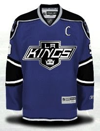
 I've been trying to get some concept art posted a little more frequently. So since we're lacking any real news today, I can offer you these concept designs created by some of your fellow readers.
We'll start with the Kings and some ideas for their new third jersey.
And here's a series of various Kings logos from history in black and silver on a black sweater.
They don't all work, obviously. So let's get some color back in here.
I could really get behind a jersey like that.
Got a couple of concept logos to share as well. We'll start with the Blackhawks.
You already know I'm not a fan of their Indian head logo, but you can also be assured that I don't think this is the right direction. Very clean design though.
This would only work for the Islanders if the Rangers didn't exist. But this Big Apple imagery won't fly for the team on Long Island. Still, it's another excellent logo.
And we'll finish where we started — colorless.
These are some all-star game jersey ideas. Not bad, but very plain.


Reader Comments (13)
Love that purple kings jersey.
Waaa ... Carp sad.
------------------
Definitely like that purple Kings jersey.
For the Blackhawks, the actual bird head is good, but I'm sure about the rest.
Strangely enough, whenever I see the Statue of Liberty jersey, I always think of the Islanders. I know it doesn't make sense, but it just triggers that thought for some reason.
Toucan Sam!
that purple kings jersey is amazing. would be really sharp on the ice.
"not sure", I am "not sure about the rest."
Oops.
If the ASG was in LA those AllStar Jerseys would look really good
How can you not be a fan of the Blackhawks Indian head logo? It's a classic and to not use it should be a crime!
I'd like to make a reference to it being the wrong time of the month for Lady Liberty in that Islanders logo, but that would be in poor taste.
Those All Star jerseys beat the hell out of anything that's been used lately. Speaking of that, are there any clear pictures of the ones that will be used this season? What is visible in the picture that was posted here a few days ago is pretty freaky.
Unfortunately, since the Kings hosted the All-Star game recently in 2002, they likely won't have it again until the mid-20s. And by then, who knows what colors the team will be wearing.
The old Kings crown pwns the new crown. By a lot.
blesskylesfall said:
How can you not be a fan of the Blackhawks Indian head logo? It's a classic and to not use it should be a crime! AMEN, I agree 100%. I would like to see the NHL make the All Star uni's resemble the host team uni's/colors. It's in Montreal this year, so East wears Red and West wears white(same design as Montreals uni's), If it were here in Pittsburgh, then East wears Black and West Wears white(same design as the Pens uni's). NHL could make a killing in $$ because the uni's would be unique to that city and that city only!!! I'd also really like to see the NHL go back to home team wears white. Tired of Pens(blk) vs. Ranger(wht). Pens(blk) vs. Devils(wht). Pens(blk) vs. Flyers(wht). Howabout Pens(wht) vs. Ranger(BLUE). Pens(wht) vs. Devils(RED). Pens(wht) vs. Flyers(ORANGE, yes I said orange, I wish the Flyers would go back to the Orange away uni's).
I'm glad you like my purple jersey! It was fun to create. :)
Looking at the lineup of black jerseys, the Gretzky era still stands out as the strongest to me. This is why I chose to update that look using the purple jersey since I've heard so many fans love their purple.
Arrowcat: Vancouver sometimes switches their home/away jerseys for games. I liked it when the league switched half-way through the year to lets fans appreciate all team jerseys.