Icethetics

via Blogger

Entries in news (170)

Wednesday
Sep242008

Sabres Repaint Center Ice

According to our friends over at Sabres Not Slugs, the Buffalo Sabres are going retro with the paint job on center ice at HSBC Arena.

Charlie has pictures posted of the rink.


credit: Charlie @ Sabres Not Slugs

This news isn't too surprising. A lot of you noticed that the center ice circle was empty at Puck Drop 2008. Obviously, having this logo painted there at that point would've given away the secret that the team was going with the vintage look this year with their third jersey.

Wednesday
Sep242008

NHL.com Gets A Makeover

I'm sure the second site you visit every day is NHL.com — first being Icethetics, of course. Well if you haven't already heard, the NHL's official web site is getting a facelift and the beta version of it is now online.

It features a beautiful new sleek look and feel. I'm going to be spending a lot of time on it looking around today.

They've even introduced new logo graphics which even have me a little impressed.

You can get a complete look at them on the Standings page.

I wonder if this look will be made available to the individual teams for web site revamps. Certainly would help. The template handed down by the league last year was— is pitiful.

I want to know what you guys think, but first, call me crazy or a little full of myself, but don't some of the design elements of the new site remind you a little of Icethetics? The glassy look to the logo graphics — a staple of the old NHLToL... even the small area behind the NHL logo with the diagonal lines.

I'm probably just seeing what I want to see, but it's kind of interesting to me because the look of it is right up my alley. Comment away!

Monday
Sep222008

Monday Afternoon Notes

I've got a few things to talk about this morning. I'll start with the IceHL. I had to disqualify a bunch of team names that were up for rating in the Central Division. It was pointed out that several of them have already been used by obscure or defunct pro teams.

I asked that you guys not submit ineligible names since I don't have the time to search everything submitted. Anyway, some of you may want to go back and adjust your ratings based on the names that were disqualified. There are links to those pages in the pollbar.

In other Icethetics related news, we surpassed the million-hit mark. Did it in under three months too. Thanks for continuing to check in, everyone. According to my stats, we've had over 400,000 unique visitors following Icethetics in the last three months. You guys are the reason I do this every day. Thanks again!

...

SANFORD'S MASK GETS PAINTED
Vancouver Canucks goalie Curtis Sanford decided to wear a fan-designed goalie mask this season. And after choosing his favorite last week, it's now been painted. The team's official web site had photos of the new mask.

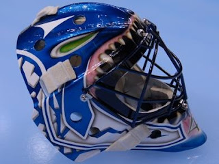
It doesn't quite look how I thought it would, but I think it's still a great looking mask. I like the green eyes at the top.

...

REBRANDING THE NHL & PROJECT: IHA
Been getting a lot of questions about both of these. First, I can tell you I've talked with Matt and since school and work — designing logos — have him very busy and without much free time, it may be about six weeks before we see his Blues rebrand. Hope you don't mind waiting a little longer. If you do, too bad.

Nicolas, creator of the IHA, will have a statement for everyone later in the week regarding the future of the league we designed logos for here at Icethetics. At that point we'll also begin accepting logo submissions for the league itself. The IHA will need its own logo as well.

...

NO THIRD JERSEY NEWS
Over the weekend, the Sabres and Blues unveiled their new third jerseys but I was keeping an eye on the rest of the league to see if anyone else would have theirs on display at various fan events. The Senators, Coyotes, Blackhawks and Lightning all held festivities over the weekend but none showed a third jersey. We'll probably have to wait until November for most of them.

...

FAKE THIRD JERSEY NEWS
I've been getting a lot of emails from people saying they've found pictures of all the new third jerseys on various message boards. Well, what they're seeing are the concepts created by JerseyDatabase.com based off Howard Berger's descriptions. I'm writing this hoping to get those emails to stop.

Let's take a look at the concepts JB.com did versus the actual jersey — all of which they have on their site. We'll start with the Hurricanes.

Berger wrote about stars across the bottom but we know the images he had were really bad quality so it was probably difficult to make out. Though I think seeing dots around the sweater, it would've been a better guess to stick with the storm flag design. Next, the Bruins.

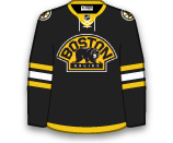
It seems this concept wasn't based entirely off Berger but maybe a little wishful thinking. The main differences are the drawstring collar, the gold stripe at the bottom and the word BRUINS in the logo. Berger never said it would be the BOSTON logo and the earlier images we saw kind of confirmed that. Now the Sabres.

Berger did say it would be a throwback but the low quality images probably precluded him from noticing the slight modifications. And finally, the Blues.

For this, I'm betting Berger was looking at something similar to the image I posted on Saturday. Because of the terrible quality of the image, the jersey appears to have black stripes on it and the gold's been washed out entirely. It's also hard to tell that the ends of the sleeves are white.

So there it is. JerseyDatabase.com appears to be basing their concepts off of good descriptions but these are by no means the actual jersey designs. For that, we'll have to keep an eye out the next few months. I'll be here keeping track of all of it.

Sunday
Sep212008

Blues Unveil Third Jersey!

Today, the St. Louis Blues became the fourth team to unveil their third jersey for the 2008-09 season.

The team posted a photo gallery on their official web site shortly after the unveiling ceremony at FANfest. It features Brad Boyes wearing his brand new sweater.

Below you can see shot of the complete uniform and a close-up of the crest — a new logo featuring the iconic Gateway Arch.

From what I can tell, they kept the same pants but got new socks to match these sweaters. They've also dropped the lighter blue from their color scheme for this jersey. They have a very classic yet not retro feel to them.

The third jersey features the same numbering and lettering style as the regular home and road jerseys.

For what it's worth, it looks like the sneak peek I posted yesterday was dead on — just really terrible quality.

To the right you can check out the full photo gallery which now includes several pictures sent to me by folks who attended today's FANfest in St. Louis where the jersey was unveiled and on display.

As with all of the photo galleries, I'll add game action photos when the jerseys finally hit the ice.

Saturday
Sep202008

Sneak Peek At Blues Alternate

I got an email from a reader earlier claiming to have scans of all of the new third jerseys. He's sent along what he says is the St. Louis Blues' new sweater. I can't say one way or another whether it's legitimate, but what could it hurt to share it?

We'll see the real thing tomorrow straight from the source anyway. So here's what was sent to me.

It's terrible quality. Nothing I can do about that, I guess. But if you squint and sort of tilt your head you can kind of make out the logo on the front. It's a white circle with the Blue Note and the Gateway Arch over it. It could also be the Virgin Mary.

Anyway, just a little something for you while we wait for the Blues to show us the actual jersey.

Saturday
Sep202008

Sabres Unveil Third Jersey!

After weeks of speculation, the Buffalo Sabres have officially unveiled their new third jersey. The team broadcast the unveiling ceremony live on their web site.

They also made the official announcement of the new sweaters with this graphic.

The ceremony, which began after a team scrimmage, featured each member of the team stepping out onto the ice in the new sweater. Ryan Miller got things started, giving fans their very first look at the new duds.

It's a great redesign of their classic look — with an update of the logo and blue uniform.

We got a decent look at the full uniform when Maxim Afinogenov and Drew Stafford stepped out. You can see the Sabres will keep the sweater number on the front shoulder and add new socks to match the jersey.

You'll also notice a silver area under the arms in this picture of Teppo Numminen. They're very sharp jerseys.

Once everyone was out there, the players skated a few laps around the ice and waved goodbye to fans.

The Sabres had the following statement regarding the new sweaters on their web site.

Utilizing the original crest from the 1970s, the logo has undergone minor modifications for an overall vintage appearance.

“The first thing we wanted to do is go to our new color scheme, which is the deeper blue and gold,” said Director of Creative Services, Frank Cravotta. “After that we added the striping pattern, introduced some silver accents in it and put some silver vertical piping along the front… It makes for a new and unique look.”

The jersey also encompasses a tie at the collar to “reinforce the retro style,” according to Cravotta.


I couldn't agree more with Cravotta's statement. And to every person saying the vertical piping is "unnecessary"... can you please define what is necessary outside of a uniform that identifies a group of players as teammates? Stuff like that has me in stitches.

I've set up a photo gallery for the Sabres' third jersey. Right now, it's made up primarily of screenshots from the live broadcast of the event on Sabres TV. I'll add more images when they're available.

If I hear anything else or see any better photos of these sweaters, I'll be sure to keep you updated.

Saturday
Sep202008

Sabres To Stream Unveiling

Just like the Hurricanes did, the Buffalo Sabres will be streaming live video of their third jersey unveiling today at 10:30 from their official web site.

That means we'll all get to watch the unveiling ceremony as it happens this morning. So just like last time, I recommend having two browser windows open — one with the live video and the other with today's Icethetics Live Chat which starts at 10.

Friday
Sep192008

Official: Blues Tease New Third

The St. Louis Blues news keeps coming. According to the team's official web site, it's official. The Blues will unveil their new third jersey on Sunday at FANfest.

They even teased us with a new photo of the jersey itself.

Ok, so it is just the shoulder of the sweater, but it's still something. St. Louis Post-Dispatch writer Jeremy Rutherford did say they original Blue Note will appear on the shoulders. He got a chance to see it privately yesterday and wrote about it in his blog Morning Skate.

Naturally, the Blues have even more information for us. The jersey will go on sale November 19, two days before it is first scheduled to hit the ice. But at FANfest, there will be merchandise for sale with the new Gateway Arch logo that will don the front of the new sweaters.

Here's the team describes the new jersey.

In contrast to previous Blues uniforms which were (and are) primarily accented in royal blue and gold, the new third jersey and matching socks lean toward navy blue and white. Features of the third jersey include:
• A powerful base color of navy blue trimmed in white gold.
• A new logo on the crest of the jersey featuring the time-honored Blue Note against the Gateway Arch, the iconic symbol for the City of St. Louis, captured within a gold circle highlighted by the words St. Louis Blues.
• The Blue Note, in navy, trimmed in gold and white on each of the shoulders.
• Uniform numbers on the back and sleeves in white — a first for the Blues — trimmed in gold and navy.
• A classic, old-school draw string — another first for the team — at the base of the white-trimmed collar.
• Navy socks trimmed in white and gold will complement the on-ice look, resulting in a navy blue combination from head to toe – helmets, jersey, gloves, pants and socks.


They're certainly going to be blue. Can't wait to see it!

Friday
Sep192008

Habs Jerseys Bear New Patches

Training camp is underway for the Montreal Canadiens and the Montreal Gazette has photos. They're on the Habs Inside/Out blog. Why is that interesting?

They have this shot of Robert Lang, Georges Laraque and Alex Tanguay wearing their new red sweaters — with some new shoulder patches.

Obviously the right shoulder bears the new 100th anniversary logo — which can now be seen at center ice in the Bell Centre. Habs Inside/Out has a better picture.

What's not obvious is the patch on the left shoulder. You can make out something on Tanguay's sweater but it's out of focus in this picture yet clearly not the same as what's on the right. None of the other pictures I saw in the gallery show that shoulder. However, if I were to guess, I'd say it's the 2009 All-Star Game logo.

Most teams seem to wear the logo on the front of the jersey when they're hosting, but there's no reason it couldn't be up on the shoulder. So there you have it. If any new pictures turn up, I'll have them.

Thursday
Sep182008

Blues To Unveil Third On Sunday

The St. Louis Blues will unveil their new third jersey this Sunday at FANfest, according to the St. Louis Post-Dispatch. Jeremy Rutherford wrote in his blog Morning Skate tonight that the new jersey was actually shown to him and he described it in detail.

The jersey is Navy blue with a circular logo on front. In the logo is a silver-stitched Arch with the Blue Note positioned inside the legs of the famous St. Louis monument. Above the circle, it reads “ST. LOUIS” and below it “BLUES.”

Upon further exploration, I noticed that the Blues’ new jersey (which will be worn at least 15 times this season) has the old-school draw-strings near the neck with white numbers, trimmed in Navy blue and gold. There is also a Bluenote crest on the shoulder of the jersey.

It’s hard to please everyone, but the team’s hard work appears to have paid off.


I won't post the entire write-up here but I highly recommend giving it a read. As for the vitals, the most important thing...

Fans will be introduced to the jersey this Sunday at FANfest, where five of the Blues players (Brad Boyes, Lee Stempniak, David Backes, Eric Brewer and Paul Kariya) will be showing them off on the ice. They will be available to order on Sunday but won’t be delivered until mid-November.


They will first hit the ice on November 21 when the Blues face the Anaheim Ducks. (Which team is going to look better? It's a landslide.) The Blues will wear the new sweaters for 10 home games and 5 road games — for an interesting change of pace. I'm assuming a schedule will be released at some point.

Another interesting note.

The Blues toyed with the idea of powder blue (which the team wore earlier in the franchise’s history), but the ‘Powers that be’ decided they want to move forward. Davidson reportedly was in favor of the Navy blue.


And also the Thrashers wear powder blue jerseys at home and the Penguins will supposedly wear powder blue thirds this year.

Finally, my thanks to everybody who got on top of this almost immediately. Drew, Leanna, Cody, Stephen and Adam... you guys should know you all sent me emails within 12 minutes of each other. Well done.

I'm excited and I'm not even a Blues fan. Can't wait to see what these jerseys look like. Don't forget that the Buffalo Sabres also have plans to unveil their third jersey on Saturday. Less suspense for that one though because of all the leaks. We're still having a Live Chat though and now I'm thinking we may do another on Sunday. Standby for that.

Page 1 ... 6 7 8 9 10 ... 17 Next 10 Entries »