Icethetics

via Blogger

Entries in news (170)

Thursday
Sep182008

NHL 09 Had Chops Jerseys Right

Time for me to eat my words. Looks like NHL 09 did have the Iowa Chops' jerseys right after all.

For some reason, I completely missed the press conference where the Chops announced their logos and jerseys. Apparently their web site has a whole gallery — which features the following picture.

The jersey mockups on those boards look an awful lot like what the Ducks wear. Thanks to everybody who pointed out my failure on this. I really should pay more attention to the minor leagues, you know.

In fact, I should mention that this jersey looks an awful lot like the Augusta Lynx — with one color swapped. Right down to the numbers on the sleeves.

Yeah, now I'm starting to question everything.

Thursday
Sep182008

THN Down To 8 Logos

I was all set to write an "Around The ECHL" post today to round out the week. But I honestly couldn't find anything. Either I'm really out of touch with the ECHL or there just isn't anything relevant out there to report on. Except for one thing.

Remember when The Hockey News kicked off their knockoff of NHLToL? Apparently they're down to their final 8 logos this week — the Elite 8, if you must.

Yeah, they even have a clever little graphic to go with it. We can let this serve as our ECHL news for the day. The Florida Everblades (my local team) and the Ontario Reign — ironically, they're from California — are in this special group. The Everblades beat out the Pittsburgh Penguins and the Reign topped the Minnesota Wild, shockingly. It's worth checking out the rest of the bracket.

It sort of makes me want to do something similar to see if we'd end up with the same results here. Based on past experience, I highly doubt it. That means it's time for a poll. Off to the right there you cast your vote. Should we try a multi-league logo tournament similar to but not exactly like what THN did or would that just be a waste of time?

Poll's open until Saturday at noon. I'm curious to see what everyone says.

UPDATE (2:17 PM): NHL Jeff brought up a good point with his comments. A few ECHL teams have unveiled new logos, albeit not recently, but still worth mentioning.

The South Carolina Stingrays have a new logo incredibly better than its predecessor. Easily one of my favorite new logos. It was unveiled by the team back in June.

It also has a couple of nice secondary logos to go with it, plus a new 15th anniversary logo. I'll go into all of these in more depth in the Season Preview in a couple weeks.

The Charlotte Checkers introduced a new primary logo — again, a huge improvement over what came before it. This logo is an anomaly because from what I've been reading it was introduced midway through last season — meaning the Checkers actually changed horses midstream.

They, like the Stingrays, also had a 15th anniversary logo. And again, I'll talk more about all of this in the Season Preview.

And then of course there's the Ontario Reign — the reincarnation of the Texas Wildcatters who were unable to stay in Beaumont. This logo is one of the final 8 in the THN tournament discussed above. It's a good logo, but better than the Wild? Really?

And while I'm on the ECHL, I might as well mention a couple of things I found interesting. The Columbia Inferno have suspended operations this year because of arena issues but will supposedly return next year. And the Toledo Walleye will also begin play then — they're the former Toledo Storm which ceased operations when the city decided to build a new arena.

It's all very confusing and strange. Stop playing for a year, then come back. Constant relocating. I think this is why I've never been able to get into minor league hockey.

Wednesday
Sep172008

Kings Modify Jersey Numbers

Photos from a recent rookies game between the Phoenix Coyotes and Los Angeles Kings seem to indicate the Kings are making a slight modification to their home uniforms this season.

A picture I found at LetsGoKings.com shows an outline has been added to the numbers stitched onto the back and sleeves of the black sweaters.


credit: Wile E. @ LetsGoKings.com

It's small but I guess it adds a little something to the jerseys. And it's different so I suppose that makes it news.

By the way, it's worth noting that teams tend to do all sorts of weird stuff for those rookie jerseys this time of year so it's hard to say for sure if this is a permanent change or just something that made it easier to throw together a bunch of sweaters for guys who won't see real NHL ice for a few more years.

That being said, this particular change seems like it'll stick. We'll know for sure soon. The season's right around the corner.

Thanks to Steven for the tip on this change.

Wednesday
Sep172008

Around The AHL

I don't plan to make a habit out of it, but I was just catching up on some news around the AHL. I'm more of an NHL guy but I figured there might be some stuff out there of general interest. Came across a couple of things.

A reader recently pointed out an unusual logo currently appearing on the Binghamton Senators' official web site. He noticed it in NHL 09 and wondered if it was a new logo the team plans to use.

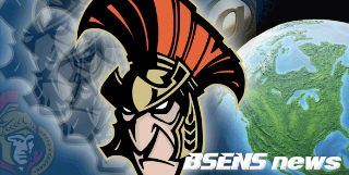
Did some quick research and found that this is a specialty logo designed by a local artist for the B-Sens for an Ottawa-themed jersey almost two years ago. The jerseys were worn on February 23 and 24, 2007. It looked like this.

As far as I know, there are no plans to recycle the logo this season, but then I don't really have my finger on the pulse of the AHL. If any Binghamton fans have heard anything, let us know.

...

The Norfolk Admirals — affiliate of my Tampa Bay Lightning — unveiled a 20th anniversary logo a few weeks ago. It incorporates blue into the logo which the primary lacks despite being on a blue jersey. The blue was added to the team's color scheme when they hooked up with the Bolts.

I don't know how or if the Admirals plan to make the logo part of their uniforms this season. I would assume there will be a shoulder patch. But for sure, folks in Norfolk (ha) will see it on a lot of promotional materials.

...

The Bridgeport Sound Tigers are going green! No, they aren't changing their colors despite what the image below might suggest. That's just a Bridgeport PR guy having some fun. Everybody wishes they had Photoshop skills.

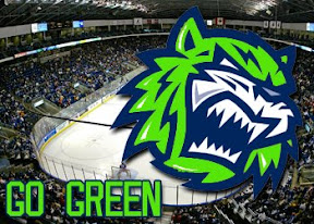
No, they mean "going green" in the sense that they're saving the environment. Anyone who works in media or has been in the media box of any hockey arena knows about the stacks of stats sheets you get handed when you walk in. You've easily wasted an entire ream of paper after a few days worth of games.

To help curb the tree-killing, the Sound Tigers will begin offering all of that information on reusable USB drives.

Sounds cool to me. Makes you wonder whether the NHL will join up.

...

I know the season hasn't begun yet and these may just be preseason jerseys, but it seems NHL 09 had the jersey designs wrong for the AHL's newest team — the Iowa Chops. The image below, a still from the game, shows sweaters based off the design of the Anaheim Ducks, with some colors changed.

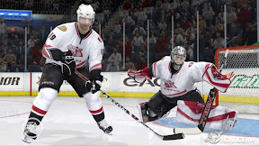
On the Chops' official web site is the following image which shows a jersey that looks nothing like Anaheim's. It also lacks the obnoxious CHOPS text beneath the logo.

Now this may or may not be the actual jersey. The story it's attached to is talking about a rookie tournament. But this is why I don't inherently trust video games for accurate jersey depictions.

Anyway, that's all for this afternoon. If there's anything I missed, feel free to email me.

Tuesday
Sep162008

Blues "Close" To Unveiling

Coming on the heels of this morning's post is some interesting news regarding the St. Louis Blues' new third jerseys.

St. Louis Post-Dispatch writer Jeremy Rutherford mentioned in his blog, Morning Skate, today that the team is close to unveiling them.

I’m told the Blues are “really close” to unveiling their third jersey, which they will wear several times in 2008-09. Owner Dave Checketts hasn’t allowed the details of the jersey to leak out, but he tells me he’s very excited and thinks the fans will be proud of the new look. (Nothing could be as bad as the last time the Blues ventured into the third-jersey business ... remember the trumpets?)


I hate to correct him, but the last time the Blues ventured into the third jersey business, they kept it! The uniforms they wore prior to last year were third jerseys back when red was in their color scheme. They adopted those jerseys when they phased out the red.

So "really close," you say? As I mentioned this morning, FANfest is this weekend. That's pretty close. I'm not completely convinced but if for no other reason than I feel like there's a strong possibility of an unveiling, I'm adding the date to the countdowns. Don't hold it against me if I end up being wrong. Wouldn't be the first time.

Cross your fingers, Blues fans.

Tuesday
Sep162008

Around The League

Time to get caught up on a bunch of news items from around the NHL. Get comfortable. This is a long one.

Vancouver Canucks goalie Curtis Sanford has decided on the fan-designed mask he'll be wearing this season. Hundreds of designs were submitted and the winner was announced yesterday on the team's web site.

I'll follow up when pictures of the final mask start popping up.

...

The Chicago Blackhawks recently attended a White Sox baseball game — I'm guessing to show the other hometown ball club that they don't love them any less than the Cubs even though they'll be playing in the Winter Classic at Wrigley Field. But they were wearing some unusual jerseys for the occasion.

See what I mean? Let's just hope they never make it on the ice.

...

The Los Angeles Kings continue to pimp their season tickets by offering a free third jersey no one's ever seen. Guess that's one way to avoid complaints. You can't whine about something that's free (...oh, wait a minute). There's an ad on their web site showing that ol' question mark jersey.

...

I got an email from an Atlanta Thrashers season ticket holder who asked his account rep about when the team would be unveiling their third jersey so he could get tickets for that game. He was told Friday, November 14 when they play the Hurricanes. That date coincides with what I've had in the sidebar.

...

Recently, a handful of new Phoenix Coyotes logos leaked and now it seems the team's own web site has some confirmation of at least one of them. A version of the new script logo in that post can be seen in the CoyotesFest logo.

The event is this Saturday at 11 AM. The team hasn't indicated any plans to unveil their third jersey... but neither did the Bruins.

...

Speaking of third jerseys, aside from the Sabres and Coyotes, a handful of other teams are holding fan events this weekend. Only the Sabres have mentioned anything about unveiling their third jersey, but it'll be worth keeping an eye on these other guys.

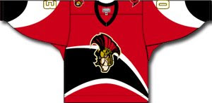
The Ottawa Senators will have their Fanfest on Saturday from 8 AM to 1:30 PM. They really want you waking up early for a Saturday morning. Anyway, on the agenda for the day is the grand opening of The Sens Store. Might they have certain new merchandise for sale? (Wink, wink.)

The Chicago Blackhawks have Training Camp Festival 2008 on the books for Saturday from 8 AM to 4 PM. The Bruins unveiled their new third jersey to very little fanfare. I'd expect the same from the Blackhawks who are likely to go with their standard black alternate that's been in service for over a decade now. Will they have it on display at this event?

The St. Louis Blues will hold FANfest on Sunday from 11 AM to 4 PM. There's a Q&A scheduled with head coach Andy Murray and president of hockey operations John Davidson with season ticket holders at 1:45 PM. I can almost guarantee someone will ask about third jerseys. What will the guys say?

That wraps things up for today. I wanted to get as much new information as I could in this post since it might be the only one I write today.

Monday
Sep152008

Oil Shows 30th Year Patch

The Edmonton Oilers are showing off their new 30th anniversary shoulder patches at the Oil Country Rookie Tournament going on now.

A photo gallery on their official web site showed a picture of a bunch of white jerseys with a new patch.

If you're looking for it, the gallery is titled Rookie Camp: Day 3 and there's a direct link from the home page. I mentioned on Saturday that the Oilers put a simplified version of this logo at center ice for the coming season.

The reader who sent in this picture also mentioned that it was only on the right shoulder of the jerseys being used in the tournament.

I can't say for sure whether this logo will be on the home, road or third jerseys for the regular season. I also don't know whether this patch would be worn on both shoulders or just one. We won't have to wait long to find out though. Season starts in three weeks.

Sunday
Sep142008

Admirals AHL Logo Game

I was surfing around tonight when I stumbled across something kind of funny. I happened to click on the Milwaukee Admirals' web site. (Can't remember what for. Usually I have no interest in the AHL.) In the Fans section of their site is this funny little Flash game based around AHL team logos.

It's called Logo Face-off and you can find it here.

Basically, you control the goalie with the arrow keys on your keyboard, moving him left and right. Various team logos are falling down at various speeds and your goal is to catch all the Admirals logos. Weird because as a goalie you shouldn't be stopping your own team, you should be stopping everybody else.

I don't know how long this game's been there or how long it will stay, but if you're bored, it's a decent way to kill a few minutes.

For the record, I got 74 points.

Saturday
Sep132008

Another Sabres Third Jersey Leak

Yeah, if the Buffalo Sabres are trying at all to keep their new third jersey under wraps prior to its official unveiling — they're bad at it. Really bad.

The first leaked picture cropped up last week and was followed up on by The Buffalo News a few days later. Now another picture has surfaced.

The image on the left is the original leak. The new one on the right shows the detail of the sweater a bit better. I'm sure this picture was taken with a camera phone and the bad color can be attributed to that. Otherwise, it looks good and I have no reason to question its legitimacy.

Again, the Sabres are set to officially unveil their new third jersey on Saturday, September 20. Yeah, we've seen it now, but I'm sure we'll get a better look when comes out for real.

Saturday
Sep132008

Sun's Silly Sens Sweater Surmising

All right, rarely will you catch me taking a newspaper to task but a recent story appearing on the Ottawa Sun's web site is laughable! I think it's fair to say that I've probably been paying almost as much attention to the new third jersey releases as the NHL marketing gurus actually doing the job. So try to understand my position as I write this.

The following make up the first four paragraphs of the article in question, written by Chris Stevenson.

The Senators will have another new look on the ice this season.

After a year's absence, most of the teams in the NHL, including the Senators, are expected to unveil another third jersey to complement their home and away duds this season (never mind that for many of the clubs these new jerseys will actually be their seventh or eighth versions over the last few years).

According to an image obtained by Sun Media and believed to be approved by the NHL, the Senators' third jersey could look something like this: Black with red and white trim and the word "Sens" climbing up from the right to left on the chest.

"I've seen a sheet that had the third jerseys on it and it was stamped 'NHL Approved,' " said a source. "That's the Senators jersey I saw."


The "image obtained by Sun Media" is this.

It was created by JerseyDatabase.com as part of a series of concepts based off of a report by Howard Berger back in July. I wrote about the concepts last month. See the next image, a screen grab from the original JerseyDatabase.com blog post.

Then a "source," which is a roundabout way of saying "anonymous poster on a message board," is quoted as saying he's/she's seen it on a sheet stamped "NHL Approved." Ok, my sides are sore from all this laughing.

Since when do legitimate news-gathering organizations quote blind sources on something this ineffectual? That's usually left to the likes of blogs — like Icethetics. I quote blind sources like it's my job, here.

By the way, I'd love to see this "approval" stamp and witness this 1950s bureaucratic process in action.

Anyway, sorry if my reaction came off as a little over-the-top, but I got a few emails linking to this story and I just wanted to offer my take on it. I'm all for "leaks" and such but let's call a spade a spade. This is just funny.

While the image above may be a close representation of what actually is the Ottawa Senators' new third jersey, this article doesn't have me convinced. What do you guys think? (Keep it clean, please.)

Page 1 ... 7 8 9 10 11 ... 17 Next 10 Entries »