


Let's Catch Up
 52 Comments
I made some free time tonight to get some new items here on the blog. I've got a bunch of items so settle in.
 First on the list are the Pittsburgh Penguins. Tribune-Review beat writer Rob Rossi says the Pens are ditching the baby blues next season. That's his story and he's sticking to it.
Initially published just before Thanksgiving, this rumor is gaining new details — still from Rossi. During an ESPN.com live chat last Thursday, he added that a blue alternate jersey is still in the cards for the Penguins.
Rob Rossi: By the way, Pens donning the baby blues tonight. Best uniforms in team history, IMO; they will scrap them for next season, but I'm told the new alternates will have some blue coming back.
Joy_Russo: That's a travesty. Those power blues are great.
I don't know who this Joy is but she's right. If you'd like to read that chat in its original form, I'm told you have until Thursday before it turns into a giant pumpkin. My thanks to Ryan for the link.
And I'm done. Except to say this: Why shed the best jerseys currently in use in the NHL? Is a simple reason too much to ask for if you really have to do it? Regardless, we'll add the Pens to JerseyWatch 2010.
Anyway, the Kings are next on the list. Well, not exactly. Actually, Los Angeles is next on the list — having recently been announced as the host city for the 2010 NHL Entry Draft. The new palm tree-infused logo is making the rounds.
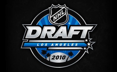 2010 NHL Entry Draft event logo
They could do worse. They have done worse. But it's just so not what you'd expect to see on NHL Draft Day. Palm trees and the like. It's what I see on my drive to work every day.
All right, knocked another one out.
That brings us to Atlanta. Somehow the Thrashers' 10th anniversary logo managed to slip under my radar a few months ago when I posted the Icethetics Season Preview. Embarrassing. Anyway, a lot of you have been noticing it on the players' helmets.
;) Atlanta Thrashers' 10th anniversary logo on a player's helmet
Atlanta Thrashers' 10th anniversary logo on a player's helmet
It's wretched, is what it is. This is how you celebrate and symbolize ten NHL seasons? You know me. I rarely have a harsh word to say about a new logo or jersey. But this? Let's break it down.
What should we be seeing there? An "ATL" next to a stylized thrasher head? An "AT" (Atlanta Thrashers) next to a 10? A mish-mash of all of that? Whatever it is, it's bad. Go back. Try again.
Maybe the reason I overlooked it for the Season Preview was that my brain was unwilling to actually admit to seeing it. Let's move along now.
 The Ottawa Senators are worth a mention here. Remember that whole ordeal back in August where The 6th Sens blog picked up on the "O" jersey making an appearance on the team's official web site?
 via Sens ChirpWell another Sens blog has joined the third jersey fray. Icethetics reader Julian writes in to point out that Sens Chirp is adding to new unsubstantiated rumors. See the tiny, unenlargeable image to the right.
Why their version of the vintage alternate is red, I don't know. The Senators already wear red at home. However the red helmet is an interesting touch. But let's stick to the black "O" jersey as that is actually aesthetically pleasing.
Beyond this image, I have no new information regarding a change to the Senators' third jersey — except to say that they've only had it for two seasons. I think it's a little soon to be dumping it already.
Don't make me add the Senators to JerseyWatch 2010.
Fine. They're added.
Speaking of ridiculous/wishful thinking, the New York Rangers popped up on the old Icethetics radar this week. A reader sent in this picture claiming it was a leaked third jersey prototype.
;) This is not a Reebok Edge third jersey for the Rangers.
This is not a Reebok Edge third jersey for the Rangers.
It doesn't take an expert to figure out it isn't. Sewing an NHL logo into the collar does not a legitimate Reebok Edge jersey make. And while I'm sure we'd all like to see the Lady Liberty sweater make a comeback, getting my hopes up for no reason is just... mean.
Anyway, thought you might like to know.
That brings us to the final item of the night. The 2010 Olympic Games are just weeks away and so the IIHF has taken it upon themselves to give us a look at all the new hockey jerseys for the participating nations — all in one place.
There's Belarus, China, the Czech Republic, Finland, Germany, Latvia, Norway, Russia, Slovakia, Sweden, Switzerland, and the U.S.A. Wait, I feel like I'm forgetting one. Is Canada fielding a team this year? Someone double check for me.
You'll notice that the U.S. is the only country taking advantage of the third jersey cash grab. Because this is America, dammit, and if we're not selling something then the terrorists win.
Hey, incidentally, does anyone know how I can go about getting Canadian citizenship? That only sounded like I was kidding.

Reader Comments (52)
Penguins - I'm hoping that maybe there is a misunderstanding here and what will really happen is for the blues to become regulars.
Draft - Yeah, I'd say that logo is good enough.
Trashers - Agree, the only good thing that can be said is that those logos aren't on the jerseys.
Senators - Should be black to be sure, but they look OK. In my opinion they could add another horisontal line or two without going completely barberpole. And why not lose the black on the shoulders?
Rangers - The team has by far the worst regular jersey of the orginal six so I would welcome the introduction of a third, any third. It doesn't have to be lady liberty though.
http://www.cic.gc.ca/EnGLish/citizenship/index.asp - Here is all the know how!
Germany's dark jersey looks like the Canucks' old skate-and-puck. Maybe Christian Erhoff had a say?
And Switzerland's jerseys are quite interesting, taking a minimalistic design. However, the crest on the upper-left and the collar makes it seem more like a football kit than a hockey sweater. I like the minimalism idea, but I think they could have done a lot better.
Did Lady Liberty ever really die? The Rangers wear the logo on their pratice jerseys now. At least they were Saturday morning in the morning skate in Buffalo.
Good grief, we just had to go with the 3rd jersey for TeamUSA didn't we? Seriously, why have a third jersey for such a short tournament. It's not like they're playing 82 games.
I'm trying to figure out how Chins qualified for Olympic hockey? Something is a farce in that. Kazakhstan has a better national team then them. Do you think there in there because they paid there way or the world is worried China is going to exports so they let them in? lol
Joy Russo hosts the Melrose Line (ESPN podcast). So that's who she is. I think she is also an editor on espn.com.
Also, why shouldn't the Sens have a red third? There are already many teams w/ two jerseys of the same color. I think it is stupid, and redundant, and stupid, but it would look much better than say the Stars lame third by a mile. It at least has quite a bit of black on it and it's better than the SENS crap they have now.
The Sens jersey is awesome! why it's red? because that's the original jersey's colour! The barberpole is a classic part of Ottawa hockey! It is so much nicer than that shitty black modern excuse for a hockey jersey! "SENS" looks more like a poor attempt at a football shoulder patch than a hockey logo! With this jersey it seems that there is a very love hate relationship. I love it!!!!!!!! Get that black garbage out of my town and give me the classic look!
Wow, Team U.S.A. really ripped off the Rangers for that third jersey.
Canada is there you just missed it. Speaking of Canada has anyone else noticed that when Canada changes their international jerseys all the other countries seem to have new one that have the same elements added to them (excluding this years USA jerseys of course), or is this just me?
Big fan of the "watermakrs" on the sleeves of the Russian and German jerseys. Not sure I like the USA one though, almost looks too busy ... on the fence about it on first sight.
Just to add a little info on the Atlanta 10th Logo. The logo first appeared shortly after the end of last season in season ticket renewal packages. And from there the fan base has dumped all over it. Suspected to be a patch on the jersey and probably in all Ads for this season. Read interview with their General Manager stating due to negative feedback of the logo they decided to limit the use to just a sticker on their helmets. Thanks God! This was definitely a fail moment for them, with their new third jersey coming in a close second.
Hmmm...maybe Pittsburgh will switch up the powder blues to a dark navy base sweater with powder blue shoulders. Oh wait...the Panthers already stole that design! (sarcasm intended!). I'm with Chris...why would they mess with such a great design?
As for the Sens going to their own version of a barber pole with an "O" third jersey - the sooner the better they get rid of that silly "Sens" wordmark on a sweater that has piping and color accents going all over the place.
Atlanta's anniversary logo? Does anyone really care? Their jerseys and logos have been just like their market for hockey - hideous!
This post was certainly a different style for you. Very enjoyable.
Wow, that Chinese jersey looks disgusting.
Great post to get back into it
Yea no more panzy powder blue. If the Pens have a new 3rd uniform for the new barn, I hope it's the '91/'92 Cup uniforms(Yellow gold and all)
My eyes still haven't recovered from that Thrasher's logo.
Draft Logo: Where's the purple?
the chinese are only in the women's
The Pens powder blues are tops. They would be better off ditching the ugly black and tan and ending the "all Pittsburgh's teams have the same color scheme" nonsense once and for all. Black and yellow belongs to Boston, anyway.
And if Ottawa ran with something like what is shown here, or a black version thereof, they would become iconic, just like the "C" in Montreal. The standard cartoonish unis and the current third look like they are marketing to children.
Penguins-
Being from Pittsburgh and being a die heart Pens fan, I have no idea why the Penguins would change their thirds next year. We love them here, but we only love them as thirds. I can't speak for everyone, but about 90%-95% of us Pens fans in Pittsburgh would probably riot if they switched the third jerseys to the primary jerseys. Our city is black and gold and having blue thirds is a nice change but they should never switch back to blue full-time. We changed to black in gold the year after the Pirates and Steelers won their Championships in the same year, we won 3 stanley cups with black and gold, (and with our current logo). No need to go back to the blue.
* Dont get me wrong, i like the blue thirds, i own a current third jersey and winter classic jersey. I just hate the idea that people think Pittsburgh should use blue for their home and away.*
Im somewhat dissapointed that we will have third jerseys with blue in it next year. I was hoping that we would have a third that had the original black and gold colors from the 80's and 90's.
I didn't even see the post from 91PENS92 until after i posted my first comment, but I definitely agree with him. I would love to see the pens use the old school black and gold on their third jerseys. Those are the colors we won the first 2 cups in and they have a lot more history then the powder blue colors. Why not use those colors?
honestly i prefer the red 'O' jersey to the black , the striping looks better and the red helmet is a nice touch
Good post, but you really let me down with the Rangers. Bring back Lady Liberty!
Mike Ivall Design: Kazakstan is better than China in mens hockey sure, but maybe not in womens hockey which is where team china qualified.
You and your yellow & gold!
Travesty that the Pens would ditch, as Chris says, the finest jersey in the league today!
Pens already have black and ugly pale gold, why make it worse?
Bad move for Pittsburgh, just when we thought they got it right.
What the heck is up with Switzerland's jerseys? One tiny little logo from their flag in the corner, maybe they were trying for a simple look but it's just not working for me. China's uniforms are awful; with all the money they have you think they could at least get a better design than that. Belarus has a neat looking wavy stripe across the arms as well.
Stripes look stupid on the 2010 jerseys. Definitely don't look good that high up on the arm.
Did someone ACTUALLY just say the Rangers have the worst jersey of the original six?! Glad to see blind people are learning to use the internet.
The Rangers jerseys are fantastic the way they are, though I certainly wouldn't complain about a Lady Liberty alternate.
Let's see the gold sleeves make a comeback for the Pens!
Those Nike Olympic jerseys... ugh. At least Sweden's not letting them screw with their uniform style. As far as the USA third, I believe the design comes from the 1960 Gold-winning team. (And, yes, I'm sure it was influenced by the Rangers then.)
Pittsburgh: I Love the blue alternate and it's ashamed that they are trashing it but i wouldn't mind a new jersey to help ring in the new arena, a new beginning of sorts in the "House that Cros Built".
New York: with the Lady liberty jerseys I wouldn't mind seeing them updated and returned to service, besides, I would bet that if the rangers were not original 6 then the diagonal script would be relegated to a 3rd jersey at least
Ottawa: I am a leafs fan so i am not a fan, but, I would love for them to have a 3rd with a logo not a script and bring back the cool trim on the old black 3rd (http://www.icehockeyjersey.com/assets/images/nhl/Senators-3rd-Alternate-Jerseys.jpg) and use the unused 3rd logo (http://sportslogos.net/images/logos/1/21/full/x8dxgo0eh0zensmq7icp.gif)
No team in the NHL should ever have a word mark logo except the Rangers. None. Any other team that uses a word mark for a logo I feel is a cop out, lazy move. I'm also getting a little sick of the new circle logos with the team names on them that are popping up....Is it that these places forget what their team is called? Then these places shouldn't have teams. Plain and simple. These guys are paid big bucks to design something original and create a unique identity for their team! This includes colors and logos. Who's paying these guys anyways?
what I don't understand is why the US and Canada were forced to change their jersey but no other country was. I'm not a fan of the US jersey, looks too much like a basketball jersey, I think the lettering is too high.
Thank God their ditching those awful powder blue jerseys. It's probably because their sick of their crowds having massive amounts of baby blue in it when they shouldn't, stick to one color scheme. By far the worst 3rd jersey out there.
China is listed in the hockey jerseys because they compete in the Woman's portion tournament. The ladies world ranking is different than the men's.
The Penguins powder blues the best in the league? Please. Powder Blue is to this decade what teal was to the 90's. Gaudy and played out, and while the jerseys looked great at the Winter Classic, I wish they had stayed there. The Penguins third should be an updated throwback to early 90's cup winning jerseys.
As for Atlanta's 10th anniversary logo, are you really surprised? The Thrashers have consistantly been one of the worst dressed teams in the league. Home and Away jerseys that dont match, the stupid "atlanta" script running down one arm am alternate that may top the "Wild Wing" cartoon jersey for the worst of all time. Thrashers need to rebrand from scratch, nothing is working.
One a positive note, those "Lady Liberty" thirds the Rangers used to wear have to be one of the best alternate designs of all time and would be really easy to adapt to the edge template (since they didnt have hem stripes to begin with). Hopefully it will make a return.
Chris-- you love hockey-- you are already an honorary Canadian.
I would love to see the Rangers bring back the white Lady Liberty jerseys.
Dave, that is the nicest thing any Icethetics reader has ever said to me.
G-Man, go to www.nhluniforms.com and check out the Pittsburgh Pirates Hockey club(circa 1924-1929). They were the FIRST Pittsburgh sports team to wear Balck and Yellow gold. The Pirates Baseball team wore red/wht/blue back then and them Stillers weren't born until 1933. Futhermore in that time period 1924-1929 the boston Bruins wore Brown and Yellow. True the Pens did switch to Black and Yellow gold in Jan. of '80(because of the Stillers an Pirates) and True Boston did fight the color change BUT it was because of the Pittsburgh Pirates Hockey Club that the Pens were allowed to change.
Whats up with the big opinion change with the Pens third jerseys? I remember when they first made the switch to them being full-time thirds, everyone was going crazy saying that they were horrible and that no team should wear light blue as a jersey. Now were the minority saying that the pens should switch from using blue! The jerseys were def nice while we had them, but if we are going to change them, use the old black and gold, NO BLUE!
PITTSBURGH FANS WANT BLACK AND GOLD!
I think Pittsburgh has the best Alternate Jersey around ditching the powder blue would be crazy. Great draft logo from LA the palm trees look perfect. Atlanta? What a poor 10th Anniversary logo(its awful) How come USA only has a 3rd Canada should have a 3rd with the olden 72 series logos on the front like the juniors whore last year that would be perfect.
I hope the Rangers do something; the Ottawa thing might work. As for the Pens, the powder blue jersey doesn't work because the Pens are black and gold. Pittsburgh is black and gold.
Could the Pens be going back to navy for their thirds? Everyone else seems to be doing it.
Pens would be stupid to lose their powder blue thirds. They are the best selling third jersey by a wide margin. Plus it's very unique to the league. Nashville stole their look obviously but prior to that it was a very unique look and wasn't an asinine colour change as it harkened back to the franchise's past.
Ottawa needs to hunt down every one of those 'Sens' jersey and burn them. They then need to produce a variation of their 'O' jersey as soon as possible. I'm torn on what colour scheme would look best for the proposed thirds. The red is just too red and they already have a red jersey. The black is far too oppressive for such a beautiful design. Add in pants and socks and you've got another Sanjose atrocity. Personally I think just using the original barber pole ;O' design would work best. It's a fantastic look and the thick stripes help keep the look appealing. Plus that design was worn by kings of hockey for a brief period. It would be a nice gesture to bring some class back to our Capital because I agree that the present Ottawa logos belong in the minor leagues.
I don't know how anyone can dislike those Switzerland jerseys. They are by far the best looking set to be worn in the upcoming Olympics. Nike design horrible jerseys plain and simple. The lines are all out of wack with what traditional hockey teams wear. I realize that they are probably trying to create their own identity but they pump out forgettable jersey after forgettable jersey to the point where I sort of hate watching international hockey because it is just so visually unappealing. The Swiss jersey is almost an exact copy of a jersey they wore early last century. Simplicity was key to jerseys back then and it worked. Fans aretypically watching you from afar so the busier a design the worse it looks. I cannot wait to see these Swiss jerseys in action. I wonder if they'll be selling any woolen versions because that would be a treat to own.
"Best uniforms in team history, IMO"
BAHAHAHAHAHAHA. 'Best' and 'baby blue' should never, ever, ever, EVER be put together in the same thought.
@ Blake....You mean that Florida stole their look, right? (http://www.icethetics.info/blog/2009/11/24/panthers-unveil-3rd-jersey.html) The Preds have no light blue at all in the jersey (http://www.icethetics.info/blog/2009/9/17/new-sweaters-abound.html) except for an outline on the main crest, and that color has always been a part of the main logo anyway.
The penguins organization has always been greedy when it comes to jersey sales. just look at the 1992-93 season when we changed uniforms and logos AFTER WINNING BACK TO BACK STANLEY CUPS! I still blame the jersey switch for that loss to the Islanders.
Does this switch surprise me? not at all. those jerseys had a good run, now the scarcity of them will drive stores to sell what they have left in stock, and allow for new sales of what is hopefully a conservative jersey. I was hoping they'd change the uber-rbk home and away first, but whatever, maybe this third will be the test base for a new home (hey, it's happened twice before).
I look for something completely new that will eventually replace the black (assuming that this jersey still has black and gold), or i'm hoping it'll be the 1976-79 jerseys that were so damn classy
As a long-time Pens fan, the powder-blues should really stay in my opinion. They mark a return to a second 'golden-age' in Penguins hockey and also pay homage to the first Penguins teams (of which I have had the good fortune of meeting a member because he recognized my powder-blues and approached me here in Nebraska).
They sell well and the only 'Pens fans' who really hate them are Steelers fans who think rooting for anything not Black and Gold-esque is sacrilege.
^ That's how we get stuck with the dumbed-down "black is tough" mentality. Nothing wrong with baby blue. It's bright, colorful, and distinctive. Every team should be recognizable based on their color scheme alone.