Claims of a Predators Preview
 Friday · Jul 3 · 2009 | 9:18 PM PDT
  20 Comments
 I'm normally opposed to posts based entirely upon rumor, but I can make an exception in the name of a slow news day. Yesterday, a commenter called LF3240 left us a couple of links to interesting message board threads that explore potential third jersey options for the Nashville Predators.
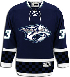
 I'll start with the realistic and slowly move into the silly. To start, a user at HFBoards (echlfreak) claimed to have had an "inside look" at the new alternate sweater. Whether this is true or wishful thinking remains to be seen, but I'll take a page out of CNN's book and report on the reports of others for a moment.
The following is that user's description of the jersey, verbatim.
There is no yellow or gold at all. They have brought in a steel grey, same blue color and some other shades of grey to the logo. Same Pred logo...just different color scheme.
The arms and bottom have two white stripes separating a thick middle stripe. The middle stripe is black and blue checkers. Tie on the front.
Thats it. Looks cool from far. But, the checkers is kind of dumb up close. From far away the checkers are not noticeable.
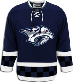
That spurred another user to create the following concept design.
I'm not a fan, but then it's not geared toward me. It's more for the Nashville/NASCAR fan, I think. (The checkered pattern?) What I do like is the simplified color scheme. However, echlfreak replied, "The checkers are only two rows and the Pred's eye is red." Mulligan.
Not much different, but also not any better. Typically a lot is lost in translation when people get a quick glance at a new sweater. So we'll just have to see when in comes time for the Preds to release the real thing.
The aforementioned message board threads also featured a handful of other concepts based on what fans are hoping for. Two stuck out for me — both featuring the relatively new saber-toothed skull logo. The first is based on a more traditional striped look.
The other looks like something you might seen on someone working in a construction zone.
Philadelphia can get away with orange. Maybe even the Ducks one day. This concept convinces me the Predators should never attempt it.
I wish I had more to offer tonight. But unfortunately, rumors reign when facts are few and far between. Take all of this with a grain of salt and believe none of it until you read the word "official" in the Icethetics post headline.
And Happy 4th of July!


Reader Comments (20)
LF3240 here, also the same guy that made that atrocious orange Preds jersey, was more of a joke than anything serious at all. Rumors of an orange Preds jersey have been around since the mustard was retired, but I agree, orange just doesnt work.
no, No, NO!
I stuck through with the Mustard jersey, I will not sit through this!
The checkered pattern is disgusting, and is only made worse when there are only two rows. And the predator looks better without the red eye.
Overall a huge improvement of anything i've seen from them. The checkered pattern is the only bad thing about it. it would be nice to see nashville have a hockey sweater that looks like a hockey sweater.
The Preds board universally agreed that the checkerboard design was lousy. I can't see any connection with NASCAR though. The core fan support doesn't come from folks who are huge NASCAR fanatics, and I doubt a jersey is going to sway their minds. Someone suggested that it might be a tie in with the UTK Volunteers. That is a possibility, but still odd since the organizations sit in different cities.
I like a dark blue/silver color scheme, but it's not too much different than their current (except for a significant change in the amount of silver). Not a big fan of the checkered pattern on the bottom, but without it it's way too plain. I don't know, it just doesn't look normal. Looks more like something you'd see on an IHL uniform. Maybe if you get rid of the checkers and just use a solid black stripe or something. But even then, I'd rather it be the regular home uniform. I don't understand the point of having an alternate jersey the same color as the primary.
Here in TN, we have UT (orange), that might be why the creator made that color. It's still hideous though.
GO WINGS
The first two, while somehow being both a touch plain and a bit too much (why bother with checkers that are hardly visible?), would be a million times better than anything that team has ever worn.
Okay, seriously. The red-eyed two-row checkerboard jersey is pretty cool, if not great. But I absolutely LOVE the idea of an orange Preds jersey.
I'm suprised no team's done a checkerboard design before. I like the idea of it, it's certainly better than some of the ridiculous design stripes some teams have tried (Ottawa, Carolina).
Not great, but the idea of Nashville's complete lack of skill in jersey design is getting old. I like their RBK ones, don't ruin them with another bad jersey!
I actually really like the 3rd jersey down. Though I'd put a less "modern" crest on it.
Hey, i know its not really on the right post but you forgot D Steve Montador(played for Boston and anaheim last year) he was picked up by Buffalo. I know its a 2 year contract but thats about it.
Is it wrong that i like the blue third.... I think its less sophisticated then most jerseys. But it just looks so organized and perfect... I LOVE THE COLOR SCHEME!
I REALLY like the yellow and blue - but get rid of the skeleton logo.
The red eye logo on the blue sweater is OK - put that on the yellow / blue traditional.
I like this design its a new take on a great team .
That concept isnt bad but its to dark for a team with promise.
I like this design I found on google
I know from a former pred staffer that the original "mustard" jersey from a few years ago was to have the skull on the front, and even did some NHL tests with the skull front. The NHL eventually turned it down because it was "too scary."
My hope is that the final version will be navy and gray (in place of more modern silver) mix. They said they were going "retro" and "traditional." Horozontal striping through the body (like Montreal) would be cool.
What program do you use to make the concepts?
The top one is the best by far. When the owner said that this would be Original 6 like, this jersey matches the description and the colors are great. Should be their primaries.