


Baby Pens Unveil 3rd Jersey!
 19 Comments
 The AHL's Wilkes-Barre/Scranton Penguins have unveiled their third jersey for the 2009-10 season.
A picture of the new sweater was posted on the team's official web site recently. It's primarily black with heavy red and white horizontal stripes passing through the midsection.
In other words, it's the Chicago Blackhawks' Winter Classic/third jersey template sans the collar laces. Only the Pens managed to ruin it! (Didn't think that was possible.)
 WBS Penguins third jerseyRegular readers know about my disdain for the baseless love the hockey world seems to possess for the Hawks' primary logo and jerseys. Why is it considered by so many to be the best? (None of your reasons will satisfy me so don't bother.)
Still, I was floored by last season's Winter Classic offering. That was a Blackhawks jersey I could get behind. I was even more impressed the decision to promote it to alternate for 2009-10. The more it's used, the better.
But nothing should be on the front of that jersey except for that classic Chicago mark — least of all this ridiculous penguin. Oh well. What can we do?
The team says the new threads will be worn for at least 10 home games this season. Interesting because the AHL usually wears darks on the road, right?
Thanks to Alex for sending in the link on this one.

Reader Comments (19)
Awesome!
Unless there's been a rule change, they better get on the phone with the visitors fast. In the AHL you gotta work it out with the road team anytime you want to wear a dark jersey at home; for this reason it saves a lot of headaches to just have a white/light color third jersey, which about half of the teams do.
btw, looks like there's 2 Alex's working the AHL, because it wasn't me who tipped off this one like the last two.
I clearly see black collar laces
That is the worst jersey ever. Why steal a Black Hawks jersey, and then destroy it? The Hawks jersey is awesome. It would be like the Flames using the kings third, as an example. Weirdest thing I ever saw...
I second that on the laces
I think they'll probably wear it against teams that make a day trip (Hershey, Adirondack, Albany, etc) not teams who are on long road trips. I'm a Hershey fan and they play I think 5 or 6 games in WB/S this year.
totally new here (started following ice hockey not long ago, i live in australia). My friend, follows the playerss religiously, where i instead have become obsessed by the jersey's and logos. logo design is a passion of mine and i will contribute some work soon. SO GLAD I FOUND THIS PLACE!
but to my main point....
chris i totally agree. the hawks logo is one of the worst i have ever seen. that goes for the jersey as well, yet my friend loves it? why is this?. everything about it is just distasteful. I really like alot of these third jerseys, but it makes me wonder who in the hell is hiring these people?
@ JIM
The whole thing about it being distasteful is a load of PC nonsense. There is nothing distasteful about an image of native american power and pride.
Native american people were proud to wear feathers and war paint. So let's just leave it at, "some people like it, some don't" and not try and drag anything else into it.
Jim - "chris i totally agree. the hawks logo is one of the worst i have ever seen. that goes for the jersey as well, yet my friend loves it?"
I hope you mean penguins when you say hawks because the hawks have the best uniforms in hockey to date.
i mean both, the hawks logo is awful. its not the native american i dont like. its the whole thing. the entire logo is an assult to aesthetics. its a badly designed logo, and a badly designed uniform
Yet it is one of the most celebrated and cherished logos/uniforms in the sports world. So maybe there's a level of design elitism going on in your viewpoint. I happen to be a graphic/web designer who likes the logo/jersey not because I think it's great form a pure design standpoint but because it does everything a SPORTS logo should.
I actually think the Thrashers have one of the best [i]designed[/i] logos in the league, but it's not nearly my favorite (even though they're my favorite team, lol) because it doesn't make a great sports logo.
There's a simplicity the Blackhawks logo has that you don't get in modern design. It's not the simplicity of the design itself but the idea of it.
Look at some old-school NFL logos. The Buffalo Bills played in their throwbacks on Monday Night Football the other night. That buffalo on their helmet isn't great from a design perspective. But from a fan's perspective it's great. it's what you want to cheer for, not some swanky Adobe Illustrator design.
Anyway, I don't think it's a matter of taste that y'all don't like the Blackhawks logo -- it's just a different perspective. Maybe it's nostalgia somehow, but I just don't think you get it.
Nobody who supports a team that actually thought slapping a nickname onto a 3rd was a good idea has any right to critique jerseys, I'm sorry :X
Agreed Chris
Fine he supports the team...he didnt choose what the thrashers used, did he? Would you still support your team if they came out with a terrible jersey, or are you one of those fans with like 3 favourite teams? At least he has loyalty and sticks with his team, just like Sabres fans are still sabres fans with that abomination of a moustache logo, and just like Senators fans are still senators fans despite that terrible "SENS" jersey. He gave good input and insight, unlike your wonderful(sarcasm for those of you who it would fly over your head) post.
My team is Detroit, they've barely changed their jersey since the 30s.
Sorry, try again.
i honestly believe that colorado has one of the greatest logo's in sporting history.
i wonder what caused the baby pens to change from their white and blue jersey from last year. in my opinion last years 3rd is easily better than this years.
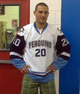
-heres a pic of last years
The man is from Australia, obviously doesn't know much about the history of the game. As a Hawks fan I'm offended by his comments. The red jersey is one of the best.
PRIDE, HONOR, DIGNITY, COURAGE, POWER.....
that's what comes to my mind when I see a Blackhawks uniform. ESPECIALLY the logo.
Jim, watch this and maybe you will get the picture.
http://www.youtube.com/watch?v=mIrK8VgaLus
That looks like a photoshop job and a bad one at that