


New Sweaters Abound!
Big night for classic hockey jersey enthusiasts! The Nashville Predators unveiled their new third jersey as the Boston Bruins gave fans a first look at what they'll wear on New Year's for the Winter Classic — both with tradition in mind.
 Let's start with my favorite of the two — the Bs' 60-year-old throwback.
A photo leaked last week but didn't really do this jersey justice. For one thing, I don't think it was clear enough that it's brown and gold. That's awesome! Nobody else wears brown. And it's used rather nicely here.
Check out David Krejci sporting the new threads.
;) David Krejci models the Bruins' 2010 Winter Classic sweater
David Krejci models the Bruins' 2010 Winter Classic sweater
I don't know. It may well be the best of the six Winter Classic jerseys — and that's some stiff competition. It barely beats out that Blackhawks jersey if you ask me. Just barely.
What we really need is a side-by-side comparison of the sweater it was based on, which was worn for a single season (1948-49) — to celebrate a quarter century of existence.
;)
The Bruins are now just 15 years shy of their 100th anniversary. That's quite a bit of history. And there's no doubt in my mind they picked the best looking uniform for this event. By the way, I haven't seen any head-to-toe pictures yet. Anyone know if they're going with those classic socks too?
 Leaked pictures take the wind out of jersey unveilings a little bit. I disappoint myself being part of that machine. Still, the Nashville Predators officially debuted their new alternate sweater for 2009-10 before their preseason tilt against Atlanta.
David Legwand, Martin Erat and Joel Ward gave fans their second look at the sweater — Taylor Swift having given the first one at a recent concert.
;) Legwand, Erat and Ward model their new threads (John Russell/Getty Images)
Legwand, Erat and Ward model their new threads (John Russell/Getty Images)
The big question you're surely asking: What of these wretched checkerboard patterns we heard about? Were they mere rumors? Sadly, I'm afraid not. Check out the close-up.
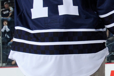 The checkerboard stripes
I mean it may not ruin the jersey, but it sure doesn't help things. Why are they there? They don't seem to serve any visual purpose as they're only visible up close when well-lit. But I've learned not to question what goes on in the Age of Reebok.
The jersey sticks with a classic numbering and lettering style in plain white and the primary logo on the front has undergone a bit of desaturation — now featuring only shades of blue. The shoulder patch features the now standard skull logo on top of its very own checkerboard pattern.
;)
Icethetics reader Matt has provided these close-ups for us.
I think that covers it. The Icethetics Season Preview kicks off in just three days!
 Chris
Chris
Almost forgot about these. Both teams have short videos worth taking a look at.
Cam Neely talks about the elements that went into the design of the Bruins' Winter Classic sweater...
...and the Predators unveil their alternate with a unique video.
Best part of that was Diller trying to defend the mustard.
Chris
...and this is how the Bruins Winter Classic sweater was leaked.
Thanks Colin!

Reader Comments (60)
Both of Those jerseys look great bruins needed that
The Bruins are classic. The brown is homage to their older jersey's where black was not there at all. So it honours the distant past and the Bobby Orr era yellow jersey. Awesome.
Nashville is, well, weird. I hope the fans like them!
I really like the Bruins jersey... it's an instant classic.
I like the color scheme on the Predators jersey and think if they went to a more refined blue and silver look, it could really work for them. Not a big fan of the checkerboard pattern... dunno why it's necessary.
Love both jerseys. The Bruins one will likely be a regular alternate for next season, like the Pens and Blackhawks WC jerseys before it.
The Checkers? I don't mind them. They are at least hidden, and not nearly as distracting as the Cane's lego block stripes...or the old garish Coyotes jerseys.
If it's yellow, let it mellow. If it's brown, flush it down! Lol!!
Okay, bad joke, but I couldn't resist! All kidding aside, I actually really like the Bruins new sweater. The shade of brown used is like chocolate. I actually would like to see a team wear an all-brown uniform. The Bruins get a big thumbs up.
As for the Predators, VERY NICE. Not to crazy about the checkered design, but a nice classic look. Now, if they only played in a good hockey market.
Wow @ the Bruins. Just wow. Those are spectacular, IMO easily the best WC jersey. And one of the best jerseys I've ever seen.
I still think last year's WC produced the best jerseys. This Bruins one is good but there's a reason noone in the NHL touches brown nowadays.
The Bruins finally give us a nice gold jersey, and they go and slap that disgusting 'B' on it. That is a dealbreaker. I don't care if its the 25th anniversary 'B' or not, it is garbage. Otherwise, the jersey is beautiful.
Congratulations to the Predators for having a decent looking jersey for the first time. Hope that eventually ends up being their regular home and a white version is made for on the road.
Seeing the Pred jersey in person I have to say that the checkers are very difficult to see. I was standing in from the damn thing, inches away and I had to duck around and get the light to hit it just perfectly. Would have I have preferred the dark blue between the stripes, yes. But I do think that the checkers make the jersey more interesting.
Glad to know that the checkers are barely visible. Not what I had in mind by "Original 6" (See Boston Bruins Winter Classic), but an OK jersey nonetheless.
Both jerseys look great. i am so happy the Bruins went old school with the brown. It is a risky yet bold move. This is the first Bruins jersey I actually want to own.
The Preds jersey is clean and classy overall. It is a major improvement over the 90s infused monstrosity they have rocked since the getgo. My only guess with the checkerboard is some sort of nod to the Volunteers.
love the bruins jersey... probably gonna get one... and the Sabres winter classic jerseys were the best... to bad they never sold replica's to the public though... i really wanted a sabres rbk edge throwback.
Hey DasMuse; http://www.rivercitysports.com/US/details-06.cfm?sku=126040
Not Reebok, but still.
Cannot wait to get my Preds jersey, and will enjoy sitting down on New Years to watch the Classic.
OH!!! And whom ever has seen Mystery Alaska knows why a brown jersey would totally work!!! If done in a classic feel.
The sad thing is, that really is the best Preds jersey ever. The checkerboard pattern doesn't bother me, especially since it is so sublime.
The Bruins' WC jersey is pretty nice.
Those are both awesome jerseys... the Preds should have had that to begin with. They would have been less of a joke in their early years.
Great looking jerseys both! Too bad the Predators won't be around in a few years to get good use out of them.
I saw Krejci in full gear at the State of the Bruins event last night. The lighting was bad, so I couldn't get a good picture. The socks are similar, but the striping on them is more traditional than on those old jerseys.
I actually wish the checkerboard pattern on Nashville's jersey was more visible, but apparentley I'm the only one.
That Bruins is not only the best Winter Classic jersey, but one of the NHL's best jerseys of all time. I wish teams still used brown. The Blackhawks would look good replacing the black in their colour scheme with brown.
OMG -- a bright, non-traditional color? Blasphemy !!!! I think the best way to fix crappy jerseys is have teams play in the Winter Classic.
Put the Stars and Kings in...maybe we'll get Green and Purple back or something intriguing !
It will be a great day for hockey and the league when those B's sweaters (which are gorgeous) become the third jersey.
Philadelphia going to orange full time, Minnesota going back to green...maybe the B's use yellow and brown by next year (pretty please), Devils going back to their old ways for a game, the Flames going retro...Isles/ Edmonton...
in 3-4 years, we could have a nice looking league again !
PS
http://predators.nhl.tv/team/console.jsp?id=46642
check that out. gives you a nice close-up. The red eye is sweet. The checkerboard is a nice allusion to the Vols. They did a heckuva job. Soon, that'll be their primary !
Bruins socks are shown 20 seconds into the Neely video.
The Tennessee college football team has the checkered pattern in their end zone:
http://sec12.com/neylandstadium.jpg
Is there some sort of connection there?
Bruins jersey is amazing! Glad to see brown! Anyone know the Pantone used? 412 or 476 maybe?
MAPLE LEAF FANS! Behold your new Home Jersey! Oh wait that's Nashville!
Glad to see some color begin to creep back into the NHL. Maybe soon traditional looks will re-establish themselves and the dark 90's look of the league with it's 3 color choices: (red, black, so-dark-blue-it's-almost-black) will be over. All these Winter Classic looks have been winners, to the point it makes you wonder how we were stuck with vertical piping and bland colors for so long. Who thought that junk looked good?
I love the Bruins jersey (yellow!) (and brown!!), but am slightly put off by that particular "B". That said, they could go to this jersey full-time and I would love it.
The Predators...not spectacular, but when you factor in everything else this Bettman Franchise ™ has worn has been crap, well it's great. Maybe in a few years they'll be rocking the Nordiques logo.
That giant B is a joke, it looks horrendous. Almost like the designed was laughing at the Bruins while they made it.
Other than the B, the jersey looks great. But get rid of that joke of a B!
Regardless of what you think of the Preds new 3rd it's honestly the best they've ever had and finally the first step in the right direction. Their regular jerseys look like practice jerseys.
A full-body view of the uniform (including the socks) is, now, up on the Bruin's official website.
the bruins b logo on that jersey was the first spoked b that appeared on a bruins jersey, im sure that had a big impact on the decision to use that b instead of something else
I always figured the checkerboard pattern was an attempt to appeal to NASCAR fans. No, I'm not kidding.
Boston's jersey is just beautiful. So are Philly's.
I wouldn't hesitate to say this should be what Boston wears full time. Create a road jersey for this design and go for it.
The Preds jersey is nice, but it really isn't that unique. For me, what would make it unique is if the jersey was the mustard color they had as a 3rd jersey a few years back. I'm aware a lot of fans are not fans of that, but I just find that it was a unique color and it was something the Preds could have used as an identity.
I'm not a fan of many teams having black and dark blue as their home jerseys. Many times, you don't know who it is unless you read the scoreboard on the top of the screen.
The Winter Classic jerseys are great, but I'm unhappy with Nashville's.
Does anyone else think that the striping is a rip off of Chicago's home?
Is that really Brown in the B's jersey? Nobody has refuted it but me, but I think y'all are crazy to see Brown there somewhere. Of course, I am slightly color-blind, but still. Looks Black to me. Both teams look really nice in these. I like how from afar you can tell that the coloring is different in between the Pred's White stripes, but can't quite tell whats going on. It gives it a little mystery.
I agree MP!
Bruins jersey very nice. Preds jersey the best they've done.... and that ain't sayin much.
I still think that logo belongs with Jurassic Park or the Flintstones, instead of a hockey jersey.
I think that the Pred's jersey would be AMAZING if it a) had the logo from the front of the mustard jerseys, and b) if they got rid of the checkers.
I really like the checkers. You know before the Thrashers switched to their light blue sweaters, the fans really had no theme to show their appreciation. Then BLUELAND came, and everybody just goes all out on light blue. I can assume that was the same with the Predators... Big checkerboard flags in the stands? It gives the team an identity, and hey, you can hardly even see it. It's cool.
I was actually really impressed with the Preds new thirds, at first when the mockup concept of the design was leaked along with the description of the design (i.e checkerboard pattern), I was expecting the worst, but it actually turned out quite nice. As for the Briuns, they did an awsome job with their WC design.
Great job on both.
Okay I tried posting this yesterday but had no luck so here's a condensed version.
I love them both...
Bruins:
Pros:
-Great use of yellow
-Lots of history on this one uniform
-Nice touch using some brown
Cons:
-Didn't use enough brown
-Would have preferred something like this...
http://www.nhluniforms.com/Bruins/Bruins03.html
Verdict: Great look! They're gonna make the Flyers look out of place in these unis. Oh, and can I get a "Goodbye Black Third Jersey!" If this isn't their third within two years (a la Penguins and Blackhawks), I'm disappointed.
Overall: 5 Out of 5
Predators:
Pros:
-No mustard yellow or orange, just blue, white, silver, and...charcoal? oh, and the red in the eye.
-Shoulder patch (would love to see that on a third someday if this third became their primary)
-Checkers on the stripes aren't visible from afar.
Cons:
-Looks too much like a Leafs Jersey
-Checkers on the Jersey makes the striping look a bit too busy
Verdict: Another team has found out simplicity is key!
Overall 4.5 out of 5
The B's socks are like the old ones, lots of stripes. Looks cool though. Love the Preds jersey also, the checkers don't bother me.
The "B" looks like it had a few too many brews (I guess it kind of works for the "Hub")
@ Curtis: Watch the Preds unveiling video that Chris has posted above. The guy says that the NHL will not alow the Preds to use the skull logo as the main logo on a jersey. (Sadly) I'm still pushing for the front-looking Cat.
On the Bruins jersey:
First, where on earth do you see brown? It's yellow, Black and White. No brown. At all. None, Nada.
Second, I hate the fact that it's made up. The jersey they used the comic B on was White, and had dates on the wheel. The Yellow jersey template they use never existed. It's close, but the cuffs are taken from a different yellow jersey.
They had straight up throwbacks that would have looked great. Instead, they make shit up. I'm not happy with that. It's not as bad as the flyers taking something that never existed in their history and just throwing it on there, but It's annoying.
Last year was much better uniform wise. At least the jerseys were mostly accurate, even thought the socks and pants weren't.
Jeff the "black" you are seeing on the bruins jersey is actually a dark Brown, think dark Chocolate or Georges Laraque
@Jeff P - My thoughts exactly. Give me authentic, or give me nothing.
Getting too off track after only 2 Winter Classics!
Love both jerseys so much, really really well done on both
Broadway Blueshirt : yes !!
!!
just a new jersey from the AHL. the rochester americans apparantley have unveiled this new third jersey
