New look designed by a fan of the St. John's club in 2011
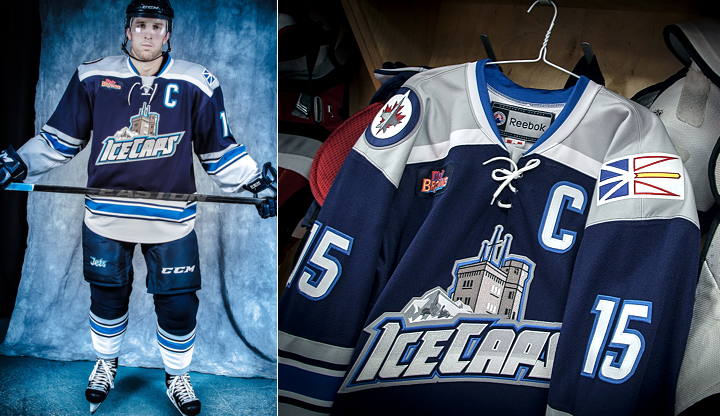
As promised, the AHL's St. John's IceCaps unveiled their first ever third jersey on Friday night — complete with the brand new crest seen above. The team had been previewing the new look with daily teaser photos on Instagram since Oct. 28.
The coolest part of this new jersey is how it came about. That story follows these photos.
 Photos from St. John's IceCaps
Check out this excerpt from the team's press release:
The jersey was designed by Troy Birmingham, a graphic artist from St. John’s, who approached the team with his concept when the club was formed in 2011. It was the first time Birmingham had designed a logo for a sports team.
To all you concept artists, I guess sometimes it does pay off to approach a team with your design. Great to see the IceCaps taking advice from their fan base on this jersey design.
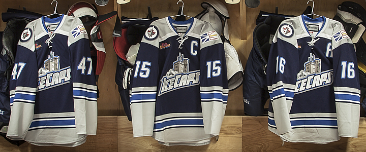 Photo from St. John's IceCaps
For specifics on how Birmingham's design came about, here's another chunk of the release:
He explains his inspiration: “The primary logo was meant to represent the province as a whole, so for the third jersey I wanted a logo that was a bit more specific to the city, that’s why I used Cabot Tower,” said Mr. Birmingham.
“The font was meant to represent ice-grey gradient, power and motion and I included a stylized iceberg. I included the small outline of Newfoundland and Labrador to tie the alternate logo to the primary logo and have a connection with the original logo.
“For the jersey itself, I wanted to keep a similar colour scheme to the primary jersey but I wanted a traditional look and feel. It kind of reminds me of an old jersey from the 1970′s with the square shoulders.”
The IceCaps debuted the new look for their game against the Manchester Monarchs on Friday where they won 5-2. They'll face the Monarchs again tonight where the same sweaters.
 Photos from St. John's IceCaps (via Facebook)
The new looks is fantastic — just what the IceCaps needed to infuse a bit of their own identity. For the last two years they've simply been wearing the jerseys of their NHL affiliate, the Jets. So it's nice to see them go their own way a bit here.
That's the positive. I also have a couple of negatives. The provincial flag on the shoulder is a bad trend. It started with the Calgary Flames in 2007 and the launch of their Reebok Edge jerseys. We then saw Abbotsford of the AHL follow suit.
I can only speak for myself, but I really don't want to see this become a regular thing. The way I see it, throwing a flag on your jersey is a lazy way of connecting to the locals. If your own trademarked logos can't do that job, come up with new logos that do.
 Photo from St. John's IceCaps
I'm also not crazy about the crest. I like the tie-in to the city of St. John's certainly, but I'm just not sure it's a well-executed design. The text is the focal point and it has my least favorite feature in the world — a gradient.
But those are just minor issues in the overall picture. The jersey's colors and striping are cool and unique and I really like the square shoulder yokes here. In action, they look great!

St. John's to host 2014 AHL All-Star Classic
While we're on the subject of St. John's, N.L., I should point out that they're hosting the 2014 AHL All-Star Classic. The logo for the event was released back in September along with the announcement of a brand new format.
Instead of pitting two teams of AHL stars against one another, a single team of AHLers will face off against Färjestad BK from the Swedish Hockey League — known as the Swedish Elite League (or Elitserien) until this year. According to the AHL, it's the first time a Swedish club will compete in North America.
That game will take place on Wed., Feb. 12 and Canadians will be able to watch live on Sportsnet.

I'll leave you now with a look at Färjestad's logo. Pretty standard stuff for a European hockey team.


 29 Comments
 All photos by Micheline Veluvolu