


Tuesday
Oct262010
Avs Set 3rd Jersey Schedule
 8 Comments
 The Colorado Avalanche have posted their third jersey schedule online for the 2010-11 season.
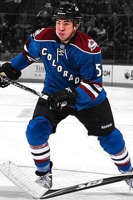
Our buddy Glen C. has been hard at work digging up these schedules and sent in the link from the Avs' website. The blue alternate sweater was launched last fall. It features a burgundy shoulder yoke and COLORADO written diagonally down the front.
 The jersey will be worn for 12 home games this season on the following dates:
- Sat., Oct. 30 - vs Columbus
- Mon., Nov. 15 - vs St. Louis
- Fri., Nov. 19 - vs NY Rangers
- Tue., Nov. 30 - vs Atlanta
- Tue., Dec. 21 - vs Los Angeles
- Sun., Jan. 2 - vs Vancouver
- Sat., Jan. 8 - vs NY Islanders
- Thu., Jan. 20 - vs Nashville
- Thu., Feb. 3 - vs Minnesota
- Wed., Feb. 16 - vs Pittsburgh
- Fri., Mar. 11 - vs Anaheim
- Sun., Apr. 3 - vs Calgary
The dates have been added to the Icethetics sidebar calendar. Looks like we may have the Los Angeles Kings schedule shortly, including the three additional dates when they'll sport the purple retro sweaters this year.

Reader Comments (8)
I still love that jersey!!!
These would be 100 times better with blue helmets/gloves/pants and burgundy trim around the letters/numbers instead of black
I still hate that jersey!!!
I liked it better with the colors flip-flopped; a burgundy jersey with blue trim. Still ok, though,
I think twelve is too many games. I'd like to see the NHL scale back the amount of times thirds are used, like in the neighborhood of eight; it'd make them more special that way (or, in the case of Edmonton, it'd help bury their ugly dark blue jersey). About the only exception I'd personally make is for the Flames, but like Edmonton, I prefer their classic look over their 2007 design - especially without the black in the logo.
I do agree that blue helmets and red trim on the numbers/wordmark would improve the look a little bit.
... yikes. Brandon Yip looks like he's storing walnuts in his cheeks. Personally, I think I'd have picked the Milan Hejduk or Adam Foote images from the gallery. But that's just me.
That's going to be extremely confusing when they play the rangers
Ugh, they still wear this thing?
It looks too much like the New York Rangers 3rd jersey. Let's be original people!!!!!