


Rock Your Green!
 Splash graphic on Devils website featuring red-green jersey

 Devils break in the greenIt's St. Patrick's Day and that means wear green or get pinched.
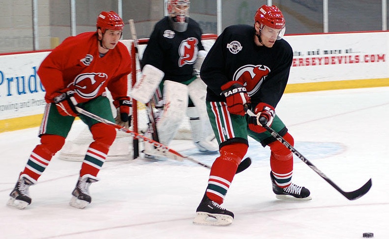
The New Jersey Devils will certainly not get pinched tonight, as they'll be wearing replicas of the red and green uniforms not seen in NHL action since 1992.
And they've been teasing us with photos in the weeks leading up to tonight. Just yesterday, the players broke in some of their their throwback gear during practice, including red helmets, special socks and green pant shells. The Devils posted photos on their website.
The Devs have also revamped their website with a bunch of green — I'm guessing for today only. But it features a picture of Martin Brodeur as a rookie in 1991! Here's a look at the background image, in case it disappears before you get a chance to see it.
 Devils limited time green-infused website
By the way, he'll be wearing a helmet with that same design tonight. Definitely a game you won't want to miss. Makes me glad to have a subscription to NHL GameCenter.
Preds, Thrash Warm Up to Green

 Preds don the greenThe Nashville Predators took the ice for warm-ups prior to last night's game against the Flyers in their green threads.
Couple of things to note about these jerseys. First, it's not a typical shade of green — which is cool. It's almost a really dark teal, a little bluer than the Sharks' teal.
But more importantly, check out the crest. It's the logo from the third jersey. Does this signal a shift in the Predators' primary logo?
You'll remember back in December that Howard Berger said the Preds would be making a "significant alteration" to their uniforms next season. Will the thirds get the full-time treatment so soon? Will the gold and orange disappear for good? Am I reading too much into a warm-up jersey?

 Green for Atlanta too!The Atlanta Thrashers also wore green during their pre-game skate last night. Here (right) you see Maxim Afinogenov in the special jersey.
The sweaters were subsequently autographed and auctioned off during the game, resulting in $16,000 for the Thrashers Foundation.
Naturally, the jerseys worn by Chris Chelios and Evander Kane nabbed the highest dollar figures at $1,200 a piece.
Perhaps taking advantage of the Irish's luck, both the Predators and Thrashers walked away with wins last night after donning the green.
 Chris
Chris
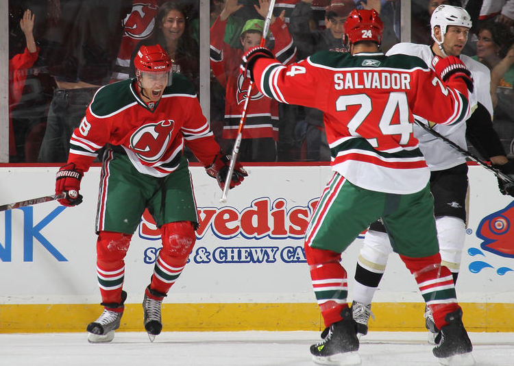 Devils throwback jersey in actionThe Devils' green-infused throwback jerseys were a big hit the other night. It's always cool to seeing the past come back to life on the hockey rink.
Devils specialty jersey gallery
In fact, the Devils weren't the only team rocking the vintage threads this season. The Calgary Flames also wore their '80s sweaters five times against Canadian rivals.
And the team just announced that these jerseys are coming back another dozen or so times in 2010-11 as a third jersey. The Devils are probably happy to keep this a one-time deal, but imagine if they went a little further. That got me thinking...
 Devils vs Flames, 1984This photo was taken in 1984 and the 1991-92 season was the last time we would see those jerseys on the ice together. Now, 20 years later, I don't think it's out of the realm of possibility that we could actually see it again.
Maybe at some point teams like this will see that the 1980s was the pinnacle decade for the hockey sweater. They were bright, colorful and easily identifiable.
Today almost every team wears some shade of blue, red or black. How original and diverse. I know it's all about the money grab with these jerseys, but I'm all for it if it means the NHL looks like it should again.
It's great to see hockey jersey designs trending back toward the classics these days. Anyone else agree?

Reader Comments (30)
The Preds jerseys had special patches on them as well as sublimated shamrocks on the bottom part of the numbers of the back. All in all, a pretty interesting look.
As a Devils fan who never got to see these sweaters in action, I am unbelievably excited. LET'S GO DEVILS!!
Does anyone know, Are the Devils going to don special green and red gloves too? Because from the practice pictures, they were still wearing Red and Black. And it just didn't look right. I think it you're going to go retro, go all out.
I can't believe the Predators didn't use a true shade of green... if you're not gonna go St. Patrick's Day fully, don't go halfway.
That being said, while the Predators' shade looks like a very "minor league" color, nice to see green back on the ice. Don't see nearly enough of it.
Chris Chelios is back in the NHL?
Anyone know if Brodeur is wearing his old 29 tonight? It's on the back plate of his mask. Can you imagine how much that jersey would be worth?
Ryan, the Devils aren't donning red and green gloves, because the players wouldn't want to. It takes time to break it gloves, and they really haven't had the time to, so they'll be wearing red and black gloves.
As a true fan of jersey design (and collecting) like all of us here, I'm wondering if anyone has come to the same thought as me -- we just love seeing new jerseys for the sake of new jerseys...even if the new jerseys are old jerseys like New Jersey's tonight! I remember seeing those green and reds come into Winnipeg as a kid and thinking how great they'd look if the green was black. So, now that we've seen the black all these years we are excited to see the green return. I guess that's we have the "hobby" we do -- it's always fun to see different colors and designs on the ice.
dont know if any one noticed the devs were wearing old jofa practice jerseys not the new rbk ones
There's already a player on the Devils' roster with the number 29, Anssi Salmela, and all indications are Brodeur's sticking with his regular number.
I did notice the old practice jerseys, down to the Center Ice logo with the pre-lockout NHL shield. Nice touch.
What a great game. I was at the game and the Devils looked great in the classic jerseys. Glad I was there. We needed the win.
Wow, just watched the Devils-Pens highlights. The jerseys looked great! I would definitely make this a third with two changes:
1) Hem the bottom so that its straight or make it green so it blends into the pants.
2) Go to red helmets full time so that they don't have to have three sets.
I agree with Dave. I will always prefer the dark green over the black, but I also feel that the Devils can still use black and go with the original look. Use the red helmets full-time, as Dave had mentioned, but also have red yokes with black and white trimming on the whites and white trimming around the black yokes on the reds. Also, put the piping back on the pants. A true Devils look.
I thought the Devils' retros were truly awful. Any positives were totally negated by the Edge design. For one game (one game!!), could they not have simply worn a jersey that was a true re-creation of the original jerseys? My god that Edge cut is atrocious!
I did rock my green Blackhawks jersey yesterday! Sad that it's not part of their uniform set, but that's life!
Still, it was really fun to have everyone stare at my jersey wondering in which parallel universe it's from :P
LINK
Seeing the old Green on the Devs was awesome! But WHY WHY WHY the WHITE tail? That white just really distracted me, why couldn't they just make it red?
I was at the Preds-Flyers game. I also noticed that these jerseys had some kind of watermark/gradient type of deal within the numbers on the back. It was pretty colorful, almost rainbow like, if I recall correctly. I've yet to find any pictures of this yet, though.
anyone know why the Flyers played in Nash. and Dallas, and used their black alternates both times? What a letdown. Nashville and Dallas do the right thing by allowing their fans to see something different in the white homes and colorful aways...and the Flyers end up packing their black crappy jerseys. To me, it's obvious that when a home team is doing that, they would like to see a certain jersey. The Blue Jackets used white against the Penguins in hopes of them wearing the powder blues (God forbid you have color versus color....how renegade!). They were rewarded. It's obvious that the Preds and Dallas want to accomodate the Flyers (and do something different), but they are hoping the orange beauts show up. Just thought I'd inform folks.
I don't see the retro unis as a money grab, I see them as the team looking the way they're supposed to look (like a hockey team). You're certainly right about there being too much red/black/blue I want some bright interesting colors back in the league, some unique colors on the pants and helmets!
Call me crazy, but I've never liked green for the Devils. I love the retros and new jerseys, but green just isn't a color I'd associate with a team called the "Devils". It'd be like having the St. Louis Blues wearing a jersey that wasn't predominately blue (speaking of throwbacks, I'd love to see St. Louis' old blue with the red and yellow make a return...) or a Caps jersey that didn't involve just red, white, and blue (I'm looking at you, black and gold). The jerseys looked nice (as did the Caps black and golds back in the day), but it just doesn't fit the team. I like the throwback St. Patty's Day tribute, but keep it as that. NO GREEN FOR THE DEVILS (sorry, Devils fans).
Devils never switched to the RBK practice jerseys after the lockout. They still use the old style to this day.
Here are some pics from a practice in 2008, still wearing the old style Center Ice practice jerseys. I saw pics from this year too where they still wear them, it wasn't just a throwback deal because the green jerseys were coming.
I say go back to home team wear white. Would be nice to go to a Pens game and see the Pens(home white) play Florida(away BLUE), Pens(home white) vs. Sharks(road TEAL), Pens(home white) vs Minnesota(road GREEN), Pens(home white) vs. Detroit(road RED), Pens(home white) vs. Philadelphia(road ORANGE). Bring back some color to the games. Getting tired of the black vs. white games...might as well go watch an adult pick up game(they're usually blk/wht). Plus if road team wears the dark color that means people in LA/Cal/Det/NJ/NY/Bos/ETC/ETC can see the Pens pansy powder blue live and in person as opposed to just on the TV.
Vancouver should bring back the Flying V's for Halloween every year. That would turn some heads!
I totally agree, Chris. Brighter colors and a greater variety of them. Teams should be able to be identified by their color scheme alone.
The whole reason for the switch to dark jerseys at home was because teams tend to wear their thirds at home, rather than on the road, and since most thirds are dark, it would mean that if the road team was on a multi-game trip, they'd have to either bring two sets of jerseys, or arrange with the other teams to switch too (usually only if it was a two-gamer on consecutive nights). Personally, though, many of the thirds are overrated; either throwbacks or, in Minnesota's case with their green, a throwback-inspired style seem to work the best.
Personally, I prefer home whites partially because, as a native Detroiter and Wings fan, I love the uniqueness of the red-sleeved white jerseys. But I also like seeing the different colorful dark jerseys coming through.
My sister and I were having a discussion about uniform styles at the Whalers game tonight. Plymouth's use of the Edmonton/Florida template for their home blues is just disappointing at best, especially considering the Seattle Thunderbirds successfully adapted the 90s Hartford stripes to the EDGE design, and we both agreed that the Whalers' shirts have way too much piping. (The Whalers' road whites are based on the Blackhawks stripe pattern, so thankfully they lack any piping.) The thing we agreed upon is that we prefer the traditional straight tails over the EDGE shirt tails. As they really don't appear to serve any practical purpose, considering the bottom of the tail is lower than the classic cut, I'd love the NHL to bring back the classic straight tail. I mean, it's not a critical part of the EDGE system, is it?
The Oilers, Islanders, and Flyers have also been rocking the vintage thirds: it's been nice to see a little more orange in the League again, spice it up some.
I love the red and green look the Devils had.... it doesn't necessarily say "devil" to me, though. I think of hell, red and black, dark colors and darkness when I think of Devils. This makes me think "Italy" (which isn't truly a bad thing. My mom lived in Italy for a while growing up).
It's amazing how the lightning made the green shoulder trim look completely black. It worked so perfectly, except for the white tail. Can't they just make it red or green as well?
Only other thing that kinda weirded me out was on the arm and sock stripes. You have the green sandwiched between the two thin white stripes, but why is there another thin white stripe out there floating around in the middle of nowhere? That just looked kinda strange to me.
I agree 100% Chris, the 80's had the greatest sweaters ever. There was great ones (Oilers, Islanders, Flames, and the Devils), there were also some really bad ones (CANUCKS!, Leafs, Rockies). But the bad ones were so bad that they were awsome, if you know what I mean.
The NHL should do what the Western Hockey League does. Wear darks at home until Christmas and then, wear the whites at home for the balance of the regular season and playoffs. Pardon my Canuck bias, but I disagree with Pete, lol. Had the Canucks not had the Flying V design, their look would have been much better. The league does need a couple of home yellow teams as well, like the Kings(purple and gold). I also disagree on the Rockies. They had GREAT uniforms. Colourful, but simple. The problem was that they were a brutal team and a brutal organization.