


Checking In With the AHL
 The Charlotte Checkers are making preparations to check into a new league next fall as they jump from ECHL to AHL. That means the unveiling of a new logo — in a way.
Here's the scoop in a nutshell. The Carolina Hurricanes want their top farm club, the AHL's Albany River Rats, to be geographically closer. So decisions were made to get the team relocated from upstate New York to Charlotte, North Carolina — a quick, 45-minute flight from Raleigh (or about three hours if you're driving).
 Basically, the owner of the ECHL's Charlotte Checkers bought the Albany club and will move it to North Carolina, transferring the name of his ECHL franchise. So the Albany River Rats become the Charlotte Checkers this fall and will keep the Checkers' current logo, with some color alterations. It will now match the Hurricanes in black and red, as seen in this banner from the Checkers' AHL website.

Not a big surprise. Is the color change an improvement? More of a lateral move, in my opinion. An article on the Checkers' website discussing the move to the AHL had this to say:
The Checkers have also announced that they will change their logo and uniform colors to match those of the Hurricanes. The team went through an entire rebranding before the 2007-08 season and will simply change colors and incorporate the Hurricanes trademark. The details of these changes will be revealed at a later date.
When they say they will "incorporate the Hurricanes trademark," I assume that just means Carolina's logo will be used on the shoulder — a common affiliate practice. The logo in the banner above is likely the final artwork for the Checkers' updated logo. If anything changes, I'll let you know.
I'm keeping an eye on some other AHL jersey news.

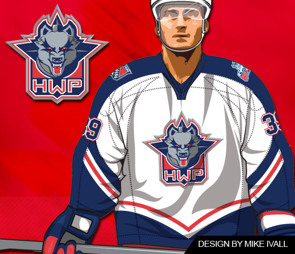 Wolf Pack jersey design by Mike IvallThe Hartford Wolf Pack seem to have skipped a scheduled specialty jersey event last weekend.
I only bring it up because the jersey was the result of a fan contest won by a frequent Icethetics concept art contributor named Mike Ivall.
According to the Pack's website, the March of Dimes promotion and jersey auction was scheduled for (and took place) Feb. 26 and 27. Only the jerseys auctioned were not the one's Mike designed.
Photo albums posted on the team's Facebook page from the games on Feb. 26 and Feb. 27 clearly show the players wearing their standard white sweaters. I'm assuming it's those that were auctioned off following the weekend's games.
I have emails in both to Mike and the Wolf Pack about the situation. If I get any answers, I'll be sure to share them. In the meantime, if anyone else knows what's up, we'd love to hear about it.
Last bit of AHL news for the night. John writes in to let us know that during the Olympic break, a couple of American clubs wore specially-designed jerseys modeled after those worn by the United States in 1980 as a tribute to the "Miracle on Ice" team.

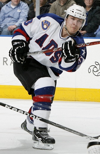 Admirals "miracle" jerseyInstead of USA, the Milwaukee Admirals' red, white and blue tribute duds read ADS.
But to everyone in the stands, it must've felt like they were at the Olympics too. (Right?)
The Admirals wore these special sweaters on Feb. 19 and 21 and then auctioned them off afterward to benefit the Power Play Foundation.
In case you were wondering, they were good luck as the Ads won both games, beating the Houston Aeros 2-0 on Friday and the Rockford IceHogs 4-1 on Sunday.
It's a neat tribute and it makes me wonder if it's been done before — or if they were just waiting for a nice, round-number anniversary. But then I feel like all these one-off specialty jerseys are just now becoming more commonplace in the minors. Am I mistaken about that?

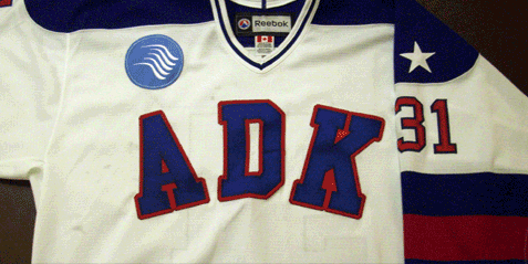 Phantoms "miracle" jerseyThe Adirondack Phantoms, who recently relocated from Philadelphia, also wore similar jerseys. Theirs read ADK in lieu of USA.
Unlike the Ads, for which I was able to find loads of information thanks to their incredible and easy to use website, I can't seem to track down any details on when (if) these were worn.
I'm assuming it would've been between Feb. 16 and 28 but then again this is not a game action photo so I can't be sure. Any Phantoms fans out there that care to fill us in?
Anyway, that wraps things up for tonight. Get excited for the new logo tournaments! Voting kicks off on Monday!
 Chris
Chris
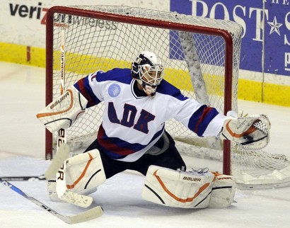 Phantoms goalie in 1980 USA replicaDoes Icethetics have the best readers or what?
A commenter called chaosof99 added a link with details and even a photo showing the Adirondack Phantoms in action wearing their 1980 Olympic throwback jersey.
The Phantoms wore that jersey in a 3-2 win over the Norfolk Admirals on the 26th of February. Broad Street Hockey got an action shot too.
Good to know.
Another Icethetics reader told me he thought the Lake Erie Monsters either did something similar or plan to, with regard to this 1980 USA throwbacks.
I can't find any details to support that, but I can tell you the Monsters' Pink in the Rink night is March 19.
Chris
A representative from the Hartford Wolf Pack tells me that Mike Ivall's contest-winning specialty jersey will now be worn on April 10 for the last home game of the season.

Reader Comments (8)
The Phantoms wore that jersey in a 3-2 win over the Norfolk Admirals on the 26th of February.
Broad Street Hockey got an action shot too
The Wolf pack Jerseys i designed where moved to the Fan appreciation night on April 10. Guess no one liked my design? Oh well. boo to them. ill have to conform to the masses and try to stay classic to teams logos when doing a entry. LOL
They also were worn by the Phantoms the following night, February 27th in a shootout win over the Lowell Devils
The Lake Erie Monsters also wore a 1980 USA style jersey a few weeks ago. It read LEM in lieu of USA.
What's with the Brewers logo in the corner? I know they're in Milwaukee... but why is it there?
In the AHL they have corporate sponsors. And that's where you will see there logo. The Brewers are just there Sponsor.
I would love to see Ivall's design become the Pack's primary.
Here is a picture of those jerseys.