Entries in milwaukee admirals (3)

Monday
Nov012010

Around the AHL, Again

Last week I said the Wilkes-Barre/Scranton Penguins would have their own post later in the week. Well that didn't happen.

The team unveiled three new specialty jerseys over a week ago, each of which pays tribute to a group of public servants who put their lives on the line every day. Photos were posted on Penguins' Twitter account.

I've also collected them here for your convenience.

Wilkes-Barre/Scranton Penguins unveil firefighter, police and military jerseys

The firefighter-themed sweater (left) will be worn on Fri., Dec. 3 when the Pens host the Binghamton Senators, who will be wearing their police-themed uniforms that night.

The Penguins also have a police jersey (center) which will be worn once in Binghamton, presumably when the B-Sens will wear a firefighter sweater of their own. There will be one other home date for the Pens' police jersey, but no details have been announced yet.

Finally, the military jersey (right) will be worn on Sat., Feb. 26 when the Baby Pens host the Norfolk Admirals. I'll try to keep an eye on these dates so as to share game action photos at some point.

Thanks to Shawn S. for the tip on these.


Sharks debut third jerseyThe Worcester Sharks have debuted their new 5th anniversary alternate jersey.

The new teal sweater is based on their NHL affiliate, the San Jose Sharks, with the anniversary logo on the chest. The uniform hit the ice for the first time on Oct. 23 when the Sharks hosted the Providence Bruins.

Something interesting I've noticed about Worcester's uniforms: While many AHL teams use their NHL affiliate's primary mark as a shoulder patch, the Sharks use shield version which isn't featured on any of San Jose sweaters — only the pants.

Not sure if these jerseys will be used beyond this season. Though if they are, the crest will need replacing. Maybe they can use that shield logo?


Texas Stars' pink jerseyThe Texas Stars held their Pink in the Rink Night on Saturday.

They sported a special sweater to mark the event and unfortunately, this particular pink jersey has to be among the worst we've ever seen.

Maybe it's the shade of pink. Or the ribbon standing in for an A. Hard to be sure. And for the record, the Stars (6-3-0) lost 3-1 to the Houston Aeros (3-5-1) while wearing it. Coincidence?

If you're still interested in looking at this jersey, the Stars promoted the event with this rendering on their website for a time. My thanks to Brian G. for the tip.


Milwaukee Admirals' pink jerseyIn stark contrast, the Milwaukee Admirals have put forth one of the best pink jerseys in recent memory.

Their Pink in the Rink Night was held Oct. 23 and they were actually successful, playing to a 3-1 win over the Abbotsford Heat. As is typical, the team is auctioning off the pink sweaters with proceeds benefiting a breast cancer research/awareness organization.

What's weird is that they have one autographed by Felicity Huffman that you can bid on. How random. (Ok, not really if you can read, but whatever.)

But back to what I was saying before. Brilliant job with this design. Sure it's pink, but it doesn't make a spectacle of itself or go out of its way to look feminine. It's still an ice hockey sweater, it just happens to be two-tone pink. Get over it.

Although maybe it's the pirate skull coloring my judgment. Also, it uses the same numbering style as the Tampa Bay Lightning did in the early days. Hm.

Thank you Kent S. for the tip.

That's really all I can muster for now. There should be another post coming soon dealing with more CHL third jerseys. Keep an eye out.

Saturday
Aug072010

Falcons Saga Isn't Over Yet

Many were outraged by the blatant logo theft by a certain NAHL team last month. Now, the story gets even more pathetic as they throw everything at the wall to see what sticks.

NAHL's Port Huron Fighting Falcons 2010-11 identity package

On Friday, the NAHL's Port Huron Fighting Falcons officially unveiled not one, not two... but three new logos. And the worst part, is that the primary mark is the same one — with more minor alterations — that got them in trouble in the first place.

Nothing has ever really made sense about this team's branding decisions.Times Herald beat writer Paul Costanzo has been covering the team throughout Falconsgate. He says the logo above labeled "road crest" has been designated by the club as the official primary logo. The secondary logo, which presently appears on the team's website, will be worn on the home jersey.

The logo posted on Icethetics last week will more fittingly be a shoulder patch on both sweaters. By the way, not to add to the confusion, but the NAHL's website has it flipped, saying the home crest is the primary mark. And it would be odd if the home sweater gets the secondary logo. But nothing has ever really made sense about this team's branding decisions.

Which brings me to my next point: Who thought these three logos made for a single cohesive identity? Holy mismatch, Batman! They all use the same colors, mercifully, but not in the same manner. Only the home crest and shoulder patch appear to be in the same neighborhood, and you'll find out why in the next paragraph.

Having said my peace, I do like the new home crest. It is very much a solid minor league logo. In fact, I learned tonight that it was created by an Icethetics concept artist. Chad Stilson, who is also active in Icethetics contests, was hired by the Falcons to create the home crest and shoulder patch. You can see his full identity package here. (For the record, he says the team hired someone else to rework Mike Ivall's logo again.)

My thanks to Mike B. for keeping on top of this epic saga and introducing the term Falconsgate into the Icethetics lexicon.

By the way, this week's minor league wrap-up continues below, so keep reading.

Admirals go black on the road

Milwaukee Admirals unveil road jerseyThe AHL's Milwaukee Admirals unveiled a brand new road sweater on Thursday.

The Ads will wear the black jersey to the right for away games starting in the fall as they retire the grey one which has been in use for the past four seasons. Here's an excerpt from the release posted on the team's website:

The new jersey features the traditional Admirals colors (white, black, and ice blue) with black being the most prominent. Just like the home white jerseys, an Admiral skull adorns the chest, while blue accents run down the sides and also on the sleeves. The name and numbers on the backs of the jersey are white with a blue outline.

“We are excited to unveil this new look for Admirals hockey for the 2010-11 season,” said Greenberg. “The new black jerseys represent the toughness and ‘Never Say Die’ attitude by which our team plays and we look forward to playing in them for our 10th season in the American Hockey League.”

In case you don't have instant recall of the old gray sweater, all they did was fill in the gray parts with black and add a blue outline to the crest. The striping remains the same.

Kudos to C.J. for the heads-up on this one!

Chilliwack finally adds third jersey

Chilliwack unveils third jerseyThe WHL's Chilliwack Bruins unveiled their first-ever third jersey on Tuesday.

The maroon sweater will make its debut in October, according to the team. It will mark the club's 5th anniversary in the WHL. Additional details in this block quote:

For the first time in franchise history, the Bruins will wear a third jersey. The jerseys will debut on October 2nd versus the Kamloops Blazers as part of the Bruins First Nations Night. The jerseys worn that night will be auctioned off during the game and winning bidders will receive their jersey immediately following the game.

In other words, the Bruins like their new alternate jersey so much, they're giving them away as soon as the game is over. No, but seriously, if you're a Chilliwack fan, get one!

The Canadian junior clubs tend to be pretty good about designing awesome uniforms. It's those shady Americans you have to watch out for.

Thanks to Matt M. for the tip!

When Third Jerseys Attack!

Lastly, the OHL's Owen Sound Attack will also debut their first-ever third jersey this fall. The announcement, made on July 22, says the jerseys will be unveiled in "mid August."

Owen Sound Mercurys, 1951The alternate sweater will pay tribute to area's original hockey team, the Owen Sound Mercurys, which played from 1947 to 1957. They wore blue and orange, in contrast to the Attack's red and gold.

This team photo of the 1951 Allan Cup champion Mercurys (right) was the best image I could find on short notice depicting the historic uniforms the Attack will replicate this season.

The PR director had this to say on the team's website:

“Reebok has done an exceptional job in making this come to life”, says Brent Fisher, Director of Marketing and Public Relations.

“The jersey is an exact replica right down to the heavy stitching and felt crest and they have matched the pants and gloves perfectly. I wasn’t around during that time, but hopefully those who were or had relatives play on the team will be proud to see the uniform again. I hope it means something to them.”

“This is the first time the Attack have worn a third jersey and I know many of the fans and also the players are very excited about it. We can’t wait for the guys to hit the ice on September 25th,” said Fisher.

The jerseys will be worn for every Wednesday night home game throughout the season, plus the home opener on Saturday, Sept. 25. Replicas will be sold in the team store and game-worn sweaters will be auctioned off throughout the season.

Thanks to C. McPhee for the link!

Saturday
Mar062010

Checking In With the AHL

The Charlotte Checkers are making preparations to check into a new league next fall as they jump from ECHL to AHL. That means the unveiling of a new logo — in a way.

Here's the scoop in a nutshell. The Carolina Hurricanes want their top farm club, the AHL's Albany River Rats, to be geographically closer. So decisions were made to get the team relocated from upstate New York to Charlotte, North Carolina — a quick, 45-minute flight from Raleigh (or about three hours if you're driving).

Basically, the owner of the ECHL's Charlotte Checkers bought the Albany club and will move it to North Carolina, transferring the name of his ECHL franchise. So the Albany River Rats become the Charlotte Checkers this fall and will keep the Checkers' current logo, with some color alterations. It will now match the Hurricanes in black and red, as seen in this banner from the Checkers' AHL website.

Not a big surprise. Is the color change an improvement? More of a lateral move, in my opinion. An article on the Checkers' website discussing the move to the AHL had this to say:

The Checkers have also announced that they will change their logo and uniform colors to match those of the Hurricanes. The team went through an entire rebranding before the 2007-08 season and will simply change colors and incorporate the Hurricanes trademark. The details of these changes will be revealed at a later date.

When they say they will "incorporate the Hurricanes trademark," I assume that just means Carolina's logo will be used on the shoulder — a common affiliate practice. The logo in the banner above is likely the final artwork for the Checkers' updated logo. If anything changes, I'll let you know.


I'm keeping an eye on some other AHL jersey news.

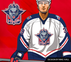
Wolf Pack jersey design by Mike IvallThe Hartford Wolf Pack seem to have skipped a scheduled specialty jersey event last weekend.

I only bring it up because the jersey was the result of a fan contest won by a frequent Icethetics concept art contributor named Mike Ivall.

According to the Pack's website, the March of Dimes promotion and jersey auction was scheduled for (and took place) Feb. 26 and 27. Only the jerseys auctioned were not the one's Mike designed.

Photo albums posted on the team's Facebook page from the games on Feb. 26 and Feb. 27 clearly show the players wearing their standard white sweaters. I'm assuming it's those that were auctioned off following the weekend's games.

I have emails in both to Mike and the Wolf Pack about the situation. If I get any answers, I'll be sure to share them. In the meantime, if anyone else knows what's up, we'd love to hear about it.


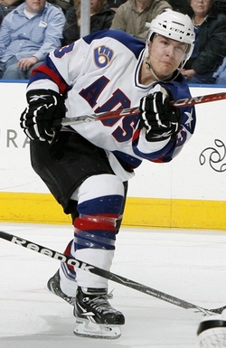
Last bit of AHL news for the night. John writes in to let us know that during the Olympic break, a couple of American clubs wore specially-designed jerseys modeled after those worn by the United States in 1980 as a tribute to the "Miracle on Ice" team.

Admirals "miracle" jerseyInstead of USA, the Milwaukee Admirals' red, white and blue tribute duds read ADS.

But to everyone in the stands, it must've felt like they were at the Olympics too. (Right?)

The Admirals wore these special sweaters on Feb. 19 and 21 and then auctioned them off afterward to benefit the Power Play Foundation.

In case you were wondering, they were good luck as the Ads won both games, beating the Houston Aeros 2-0 on Friday and the Rockford IceHogs 4-1 on Sunday.

It's a neat tribute and it makes me wonder if it's been done before — or if they were just waiting for a nice, round-number anniversary. But then I feel like all these one-off specialty jerseys are just now becoming more commonplace in the minors. Am I mistaken about that?

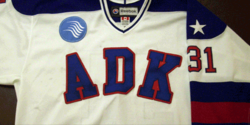
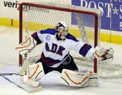
Phantoms "miracle" jerseyThe Adirondack Phantoms, who recently relocated from Philadelphia, also wore similar jerseys. Theirs read ADK in lieu of USA.

Unlike the Ads, for which I was able to find loads of information thanks to their incredible and easy to use website, I can't seem to track down any details on when (if) these were worn.

I'm assuming it would've been between Feb. 16 and 28 but then again this is not a game action photo so I can't be sure. Any Phantoms fans out there that care to fill us in?

Anyway, that wraps things up for tonight. Get excited for the new logo tournaments! Voting kicks off on Monday!