


Kings Going Retro in 2010-11?
 33 Comments
 The Los Angeles Kings will sport a special throwback jersey for a handful of games in the 2010-11 season, according to LA Kings Insider blogger Rich Hammond.
Hammond wrote on his blog earlier today, answering fan questions, that the Kings would wear the purple-and-gold uniforms for as many as four games against the Vancouver Canucks, who will be celebrating their 40th anniversary season.
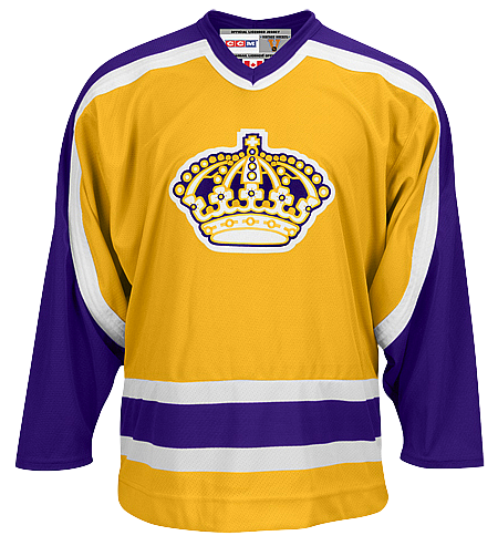 Kings may wear this again soonHere's the direct quote from LA Kings Insider:
mrbob25 asked: 1) Who makes the decision to wear alternate jerseys for home games? 2) Will the Kings continue with their black-purple-silver uniforms with the crown or must we witness another uniform modification/change of using the alternate "LA" unis as primary? Good to know for the fans considering an authentic jersey purchase.
Answers: 1) I'm not actually sure how they set the regular-season schedule. It is pre-determined though, because I saw the schedule, early in the season, of which games the players would wear the black uniforms in. For the playoffs, the players decided to wear the black jerseys.
2) I don’t know of any significant changes on the horizon. I think they’re staying with the black alternates, and I know that, for at least one game next season (and perhaps three more), the Kings are going to wear an old-school purple-and-goal uniform against the Vancouver Canucks, because it will be the Canucks’ 40th anniversary.
Not only is this information of prime interest to Kings fans, but Canucks fans as well. Presumably, if another team in the league (not even in their own division) is wearing a classic sweater to celebrate the anniversary, the Canucks are likely to as well. And perhaps other teams will join the fray. But all that is just speculation.
The photo above comes from Shop.NHL.com and is only meant as a reference. This is brand new information and Hammond doesn't go into specifics about the jersey itself. But since it is available in the NHL Vintage collection, it wouldn't surprise me to see it be used in this case.
If this is true and the Kings are going retro against the Canucks next season, I cannot imagine the Canucks would wear the whale. Time itself would likely implode. Think the classic stick-in-the-rink that Icethetics readers seem to have a love-hate relationship with.
 Before I go, I thought I should address a Kings-related question I've been getting a lot lately. Many have asked, are the Kings giving their current thirds full-time home jersey status next season?
As Hammond says, there is no evidence for any changes to the home, road or alternate sweaters for 2010-11. The team opted to wear the black-and-silver sweaters at home throughout this postseason, but things should go back to normal next fall.

Reader Comments (33)
I think the choice to go black in the post season was due at least in part to the convenient (and awesome in my opinion) "Blackout" gig LA did during home games against the Canucks.
I'd imagine the Canucks wouldn't go with the stick-in-the-rink logo on their jersey simply because it's what they have as their alternate. Nothing special about seeing it again.
But I don't know what else they would wear. These are the two teams in NHL history (post-'67 expansion) to have worn a gold (or any colored) "light" jersey, which made their meetings very..... colorful. Although the Kings could wear their purple jersey, with the Canucks wearing gold?
Should be interesting...
From what I have heard, the Canucks will wear a special 40th anniversary jersey for 5 or 6 games. It will be the very original white Stick 'n Rink jersey, worn from 1970-72. This jersey has two thick horizontal stripes and a white V inside the stripes on each arm.
As for the Kings, I also heard that they will wear the original away purple and gold uniforms in the Canucks' home opener next season. I have always loved LA's purple and gold. I see the Kings one day making their current thirds their full-time uniforms with the purple and gold retro as an alternate.
The Penguins wore gold uniforms too.
This jersey is in my top two!
I hope the Oilers have a white jersey. Then they could help celebrate with the Canucks as well!
I love it! The NHL has become unbelievably boring and conservative with its uniform design and colors since the mid 1990's and a return to flashy and bright colors is long overdue. There are four teams whom I would love to see wear gold/yellow based color and that would be the Bruins, Kings, Canucks and Penguins. The NHL needs to bring back the bright blues, oranges, reds, greens and yellows especially in this age of high definition tv. Can you imagine how great it would look on HD TV to see the Kings in purple/gold against the Canucks in black/yellow/red or the Oilers in orange/blue or the Flames in red/gold. It would be amazing.
comon bring back the flying V.
So will the Kings be wearing the yellow pants?
@Craig
Ah yes, I forgot about them. I thought their gold jersey was only as an alternate, but according to nhluniforms.com they wore gold primarily in 1983-84.
Andre is spot on. The Canucks will wear a white version of their original NHL uniforms from 1970. The Kings will wear purple. The significance with the Kings is that the Canucks played their NHL franchise first game against them.
Personally If I see them wear anything with a skate on it I will puke. It's an ugly, dated design,and the colours say Calgary Flames. It just needs to go. Genxers need to stop living in the past.
Excellent news! Especially since LA was the Canucks' first opponent. Do I see LA's purple and gold against the Canucks' blue and green on October 9th, 2010?
Also makes me wonder if the Canucks do have plans to unveil a vintage sweater. If it's true, I smell a possible Winter Classic opportunity...Canucks and Flames at McMahon in Calgary anyone? Or maybe the Nucks can host it at home in the Temporary Empire Stadium since BC Place is being renovated this year. Just a thought.
i hate the bright coloured jerseys, way tooooo much of an eye sore.. darker jerseys simply look more sharp and sleek, bright crap like the oilers wear for throwbacks look more at home at a circus. Retro is okay for a couple games, but please dont bring them back permanently, there's a reason why teams have moved on from those colours and its because they just look grotesque.
I'm all for the Kings' throwback as much as anybody but... why put so much effort into coordinating with Vancouver?
This is great news. Those purple & gold unis are awesome; I wish they would go to them full-time. Hopefully when the fans are exposed to them next season, they will see how sharp they are. Love to see the bright colors slowly making a comeback in the NHL. What was with the "drab fad", anyway? Did some mid-90s focus group determine colors are something to be shunned? Idiotic.
I was delighted to see the Kings lose in the first round while wearing the black unis.
Bright colored jerseys are far from eye sores. The dull, boring and drab uniforms of today that are heavy on midnight blues, black, etc are a joke and they make the games very uninteresting.
@ Malardious
You couldn't be farther from the truth. As Dave points out, drab is not interesting, and having every team being blue , black or red (and having those shades be dark in general) makes teams look too similar and doesn't create brand recognition.
Funny -- did you read this article?
Wow. a bright purple and gold jersey is the league's top seller? Who knew ? Doesn't hurt that Kobe is an NBA god, but still...when will the NHL learn? Non-traditional colors can complement the ones we are used to and help create an identity.
It's such a slam dunk to have the B's in gold...it makes too much sense almost...Have the Kings in purple and gold...make the Canucks a permanent fixture in blue and green (in fact...get them a nice clean skate set -- blue / white / green alts). Get Dallas back in green...I'm all for barber poles in Ottawa and Montl...when did it become a bad thing that you can ID the teams playing (on first glance...from far away) without having to look at the scoreboard?
MP
I hate the black unis--anywhere. So boring.
I'ts embarassing we get new color schemes every ten years.
Who says we have to wear white on the road, black and white are the
most boring colors you could possibly wear. This makes sense too, and
Jack Kent Cook knew it. Gold screams royalty, and purple (Forum Blue) dye was so rare
in history that only kings could afford it. Its ashame we abandoned this while the
Lakers are known for wearing our LA KINGS colors.
Dave, MP, and Michael have been saying EXACTLY the same thing that I have been saying for quite some time. I remember back in the good old 1980s of the 21-team NHL. Up until 1988, there were two home yellow-gold teams(Canucks & Kings), one away purple(Kings), two away greens(North Stars & Whalers), and just three away blacks(Canucks, Bruins, & Penguins). There was variety and simplicity in crests and uniform colours. There was none of this generic copycat nonsense.
It's very bothersome when I hear people in the hockey media knock the Canucks' and Kings' old home yellow-gold uniforms. Yes, the Canucks' Double Vs and the Kings yellow pants were gaudy, but not the colour schemes themselves. When there are two, even three yellows, it makes the rest of the whites look more unique.
Michael is 1000% correct. The Lakers' original colours were white and double blue. If I stand correct, they took on the purple and gold the same year the Kings joined the NHL. What if Wayne Gretzky had worn the purple and gold unis? Nobody would have criticized them.
I would also like to point out that if critics can call the NJ Devils old red and dark green uniforms as Christmas outfits, then why not call the Red Wing uniforms Santa Claus outfits, right? Sounds pretty double standard.
I can't stand that home teams wear dark in the NHL these days. I really wish that would change. And that gold Kings jersey is far superior to anything else they are wearing these days.
The new Reebok jersey material is crap. If the jersey's are made from the "older" style cloth, bring it on. Every team should have a 2 week run where they wear retro, throwback jerseys.
I don't really understand the reason for this. The Kings are not celebrating an anniversary, so why wear a throwback for a few games? What do the Kings have to do with the Vancouver Canucks history in that they will celebrate it with them in terms of throwbacks? Why not do this with the Buffalo Sabres (who are celebrating their 40th anniversary too) or this past season with Calgary (who celebrated their 30th anniversary)? I just don't get LA wearing throwbacks because Vancouver is celebrating an anniversary.
@The Giant Octopus
The Canucks first ever game in franchise history was a 3-1 home loss against the Los Angeles Kings.
It's basically so that they both wear the jerseys they wore in that game as a part of 40 years.
I was hoping the Kings would go with the black thirds as their home, they looked awesome! However, the gold and "forum blue" are quite the staples of the, um, Staples Center. I do agree with most of the posters that the color palette needs to expand. Anybody care to remember the original Sharks teal and Anaheim's purple jerseys? It's not like everybody had the bland uni's in the 90's.
Hey Giant Octopus:
Vancouver played it's very first NHL against the LA KIngs. That's why LA is going to wear throwbacks against the Canucks.
If people would just read the comments in here they wouldn't have to ask the same questions over and over.
love that all-star game logo. fierce but not so fierce that it looks silly
great news! LA looks brilliant in purple, yet i think that my 'nucks needs to expand from blue and green. every chance for a new jersey it's "lets go back to the blue and green or the stick and the rink". the blue and green is great, but what about the lumberjack logo? and for a vintage (i know many hate the yellow for vancouver) but the V on the neck was a great logo. if u look to late 70's and early 80's you will se a nice yellow jersey that has a V on the neck. a very clean design. as for the LA-Vancouver games, not only did they play each other in the first game in 1970, but also after the first round, they have started a hard felt rivalry that well really make those games exciting. and i remember on January 1, 2010, there was a lot of talk about a Calgary-Vancouver winter classic, which makes a lot of sense due to the fact that it is the 40th anniversary in Vancouver, and also that after my 'nucks pounding of Chicago last night in game 1, it looks like they will go far in this years playoffs. Go Canucks Go!
The thing that ties Vancouver and LA together is years ago each teams sweaters were designed by the same person for both teams. When LA changed the uniforms so did Vancouver.
love the purple/gold 80's era jerseys.
they were quite easily the best looking uniforms in Los Angeles Kings history.
the Kings should get rid of that ridiculous ugly black and silver 3rd jersey and go with these from now on.
I loved the monochromic gold at home and purple on the raod for the Kings.
The Kings should go back to the classic silver and black logo and unis they wore during the Gretzky era. The current unis are a mess.
where can i buy this??????