Draft Day Checklist
 Friday · Jun 25 · 2010 | 9:34 AM PDT
  17 Comments
 It's NHL draft day and a handful of teams around the Hockeyverse have jerseys and logos to unveil at some point tonight. So what good would Icethetics be if it didn't offer you a checklist of what's coming?
So here's how the schedule shakes out:
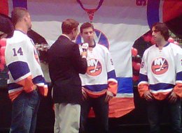
- 5:30 PM - Doors open at the New York Islanders Draft Party, where John Tavares, Matt Moulson and Trevor Gillies will be on hand to officially unveil and model the team's new white road sweater. A raffle will give fans the chance to go home with these jerseys right off the guys' backs, complete with a fresh autograph. [details]
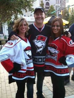
- 6:00 PM - The AHL's Charlotte Checkers are unveiling their new uniforms at a draft day party at Buffalo Wild Wings in Charlotte. It's widely expected they will adopt a uniform design similar to that of their new NHL affiliate, the Carolina Hurricanes. [details]
- 7:00 PM - Hockey Greenville will unveil the name of its new ECHL franchise, formerly known as the Johnstown Chiefs. An email sent to fans today doesn't specifically say whether colors or a logo will also be revealed, but it is expected. The event takes place at the Hyatt Regency Plaza in downtown Greenville. [details]
Did I miss anything? Drop me a line if so. Otherwise, these are the new logo and sweaters we're keeping an eye out for tonight.
 Chris
Chris
It's just after 7 PM and we can check everything off of our Draft Day Checklist above.
Islanders unveil new road sweater

 Islanders unveil new road sweaterThe New York Islanders unveiled their new road jersey at their Draft Party tonight.
As promised, last year's No. 1 overall pick John Tavares was on hand to model it alongside Matt Moulson and Trevor Gillies. A couple of photos were posted to the Islanders' Facebook page.
As expected, the new sweater is a white version of the blue jersey introduced two years ago as an alternate uniform. Both are throwbacks to sweaters worn by the Isles during the first 20 years of their existence — colors and all.
Charlotte Checkers unveil 3 jerseys

 Checkers unveil new uniformsThe AHL's Charlotte Checkers have unveiled their new home, road and third uniforms along with a special alternate logo.
They did so at their NHL draft party tonight in Charlotte. And as predicted, the home and road jerseys are carbon copies of what their NHL affiliate Carolina Hurricanes wear.
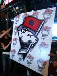
There was a surprise, though, that came by way of the third jersey. The black sweater features a brand new logo, which combines elements of Checkers and Hurricanes identities — incorporating the Canes' red storm flag.
 Checkers' new alternate logoThe jerseys and logo were revealed by way of the Checkers' Twitter account tonight. The team has planned an overhaul of its website in July. While it currently features relevant news, the design is a carryover from their recent years in the ECHL when their colors were blue and red.
And on a personal note, I have to say I'm impressed with the new logo. Yes, it may seem weird that a polar bear is carrying a tropical storm flag on a hockey stick, but I just think the mark itself looks great!
The integration is nice so long as the Checkers and Hurricanes remain affiliated. When/if that ends, the logo becomes obsolete since, again, it's a polar bear with a tropical storm flag.
Greenville welcomes Road Warriors
 The Greenville Road Warriors was revealed as the long-awaited name of the newest member of the ECHL tonight.
The team's name colors and logo were unveiled in an announcement by owner Neil Smith to fans in Greenville at the big event and on the club's new website, greenvilleroadwarriors.com.
A press release on that new site explained the symbolism of the team's name and colors, as chosen by the fans among the more than 5,000 name-the-team entries:
The name pays tribute to Greenville-Spartanburg’s current day business and cultural presence, while the logo features an intimidating warrior ready for battle. With the highway behind him, the fearless fighter appears on the road to victory.
The area hosts an integral piece of the South’s growing automotive industry — BMW manufacturing, tire manufacturer Michelin and Clemson University’s International Center for Automotive Research all make enormous contributions to the local economy — as well as a large and supportive communities geared towards cycling and race car enthusiasts.
Additionally, the team’s blue, white and copper colors mirror items unique to South Carolina. The blue and white represent the colors in the South Carolina state flag, while the copper highlights are similar to the sunset found on the state’s license plate — and typically on the horizon.
It wouldn't have been my first choice, but I don't live in Greenville. And you know what? It's better than Grrrowl. Isn't it?


Reader Comments (17)
I am very Positive that i seen a Photo of Yuri Tlusty with a checkers Jersey that was the Hurricanes Jersey and the Checkers logo. Ill track it down.
Any chance we can get some concepts soon ?
I sure hope so, Matthew. I don't have the time to dedicate to Icethetics every day. And lately on the days I do have time, there's jersey and logo news to cover. And the blog is my priority. Then tournaments. Then concept art.
Alright, thank you very much, i appreciate the effort and time you give to this website
way to be creative charlotte. ugh. why do some ahl teams go with their parent clubs jerseys. is it THAT hard to come up with an original jersey design?
As a Canes Fan, Absolutely love the Checkers set. Will have to pick them up.
As a bonus cody, they're probably cheaper then the Canes ones too. Hay have to get a jersey t shirt for one of our future stars or something. But yeah, they did a good job with those. And I agree Chris, the third jersey logo does look good, even with the non sequitur of the polar bear and the storm flag.
As for Connor, it's common because teams like to build their brand in other parts of the country with similar branding. At least they don't do what some baseball teams do (like the braves) and make their minor league teams share the same name and logo as the big club. And in hockey as with baseball, that practice started due to the big league team passing down old jerseys to the minor league clubs when they got a new set.
Interesting how a team from GREENville doesn't have any green in their color scheme. Aside from that, good look.
- The LA Kings had Derek Forbort first put on the throwback purple and gold jersey before he switched to the current black home sweater. I assume the first jersey he put on will be what they wear vs Vancouver next season.
- No sign of the slug. The logo at the Sabres table was the old school Buffalo. The draft jersey was their thirds.
- The Islanders had their "new" away jersey on display. The bigger attraction for them was E from Entourage.
-The Sharks and Wild draft picks put on the third jerseys.
Very disappointed with the Checkers uniform. I've no issue with them matching the Canes' color scheme, but I would have liked them to have their own design. Granted, I also would have liked them to reuse that old logo with the polar bear with the stick over its shoulder, but I'm sure that's mostly the nostalgia in me remembering those good ol days when I was ten.
just wait for the ROADwarriors to lose their first home game.
poor name choice.
that "warrior" is hardly intimidating, and the word mark/banner above the logo i hope is not an actually part of the logo, bc on a jersey, that'll look really bad.
they couldn't leave it as being just the warriors, they had to be cute and tie it in to the regions automobile industry, the same way their baseball team did when they switched from being the "capital city bombers" to being the "greenville drive." pathetic and cheesy. road warriors? what about when they play at home? will they be the home warriors? they should have just gone with road kill. sure, it's better than the GRRRRRRRRRRRRRRRRRRRROWL, but that's like saying its better to be paralyzed from the waist down than from the neck down.
I agree with everyone here about Greenville's team name. I live just an hour north of Greenville and look forward to checking out some games, but good god what a terrible nick name. I submitted 2 names when they held the contest.
Greenveille Palmetto Leafs
Carolina Secessionists (the rules were that the team name should represent Greenville or South Carolina as a whole, why not have a civil war reference? they could have confederate flag shoulder patches or something)
The Hurricanes aren't trying to build their brand in other parts of the country, they're strengthening locally. Charlotte is only 2.5 hrs from Raleigh. Not to mention Charlotte's a larger more diverse city. I'm a long time season ticket holder for the Checkers. Not a huge fan of the new logo, but I'm glad they came up with something new....it was not a surprise the home/road looks like Carolina's. The Canes have pretty much dictated that at the AHL level for several years now.
Also, Greenville's name sucks and so does the logo. I was looking forward to going down there again. I didn't think they could do as bad as Grrrowl, but they sure did.
It's disappointing that Charlotte didn't come up with something more original. I didn't know that moving from ECHL to AHL meant they had to lose their creativity. For that matter, they can still have a red/black/white/carolina blue scheme. It means nothing for the equipment. Of course, some one in branding probably told them that it would be better to use the same boring crap.
Ugh...Greenville's logo is just a cleaner and more professional version of the old Lexington Men O' War
As a resident of the Palmetto State, I'm pretty bummed by Greenville's name choice. Name the team contests are great until you realize that letting a plurality choose a brand just lets mediocrity rise to the top. If they wanted to pay homage to the automotive industry, why not something simple like the Greenville Motors? Or Drivers? Or Racers? Or Wheelers (sort of like Steelers but for auto ;) ).
BTW, I like the Palmetto reference above, but Palmetto trees don't have leaves -- they have fronds. How about just the Palmettos? Just steal the logo from the state flag, and you have a top-selling jersey statewide.
Anyway, it's great to get the community involved in suggesting names, but hire a freaking professional to help you polish your brand. They have a nice little arena in downtown Greenville. Shame it's been vacant for so long.