


A Trio of CHL 3rd Jerseys
 28 Comments
A large chunk of Canadian Hockey League teams are adding alternate sweaters this season. It would be impossible for me to keep up with all of them on my own. So I thank all my awesome Canadian readers for their emails. Today, a trio of new third jerseys for your enjoyment.
WHL: Rebels go for retro feel

 Rebels unveil third jerseyThe Red Deer Rebels unveiled their new third jersey on Wednesday morning.
I'm starting with this one because I'm a huge fan. It is by far one of my favorite junior league sweaters, with a great vintage look. And that's what they were going for.
Here's an excerpt from their news release:
The most noticeable change from the previous "R" uniform is the base color. The predominant burgundy has been replaced by a beige color that adds both a retro tone, along with a western feel.
The standalone "cow skull" shoulder patch, taken from the teams primary logo, reinfoces this western concept. The striping has been moved to the middle of the jersey, and a burgundy shoulder "yolk" [sic, I hate it when I get egg on my jersey] added to the top of the sweater.
The most predominant feature of the jersey, the popular "R" logo which the team has worn since 2001, has been made over. The black fill adds strength to the logo, and compliments the neck collar.
The team will wear black pants and black helmets to complete the look. Player socks will be beige with two burgundy stripes through the middle.
The jersey will make its debut on Oct. 2 when the Rebels face the Medicine Hat Tigers.
OHL: Frontenacs add impressive third

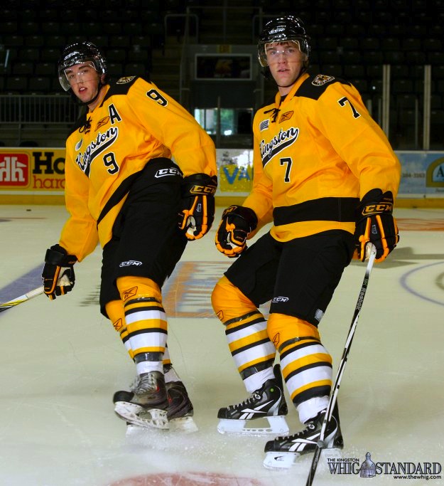 Frontenacs unveil third jerseyThe Kingston Frontenacs also unveiled an impressive new third jersey on Wednesday.
I'm really blown away by the uniform designs that come out of the CHL. Their designers really need to take a stab at the NHL because rarely do we find a bad one in the bunch. In fact, a Frontenacs official may have put it best:
“We went for a retro look and they turned out better than what we ever imagined,” said Jeff Stilwell, Director of Marketing and Communications.
Indeed, Jeff. You really don't need to say any more than that. Well done, Kingston!
And here's another picture, because it's just that good.

OHL: Rangers rely on fan favorite

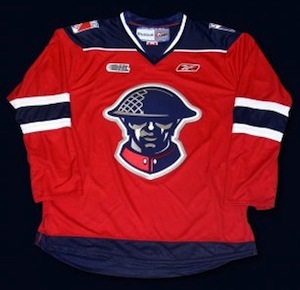 Kitchener unveils third jerseyLastly, the Kitchener Rangers unveiled their 2010-11 third jersey about three weeks ago.
I may be a little late to the party picking this one up but it's still very much worth a mention. This is a sharp sweater that is a big fan favorite. The team's press release has details:
This exciting new jersey was influenced by the Rangers 2008 Commemorative MasterCard Memorial Cup Jersey, and will feature the same highly popular soldier crest.
The crest on the front of the jersey was designed by the Kitchener Rangers Hockey Club in honour of the Canadian Forces. The design was derived from a recruiting poster that was used in England during WWI. This popular recruiting poster was inspired by "Lord Kitchener", the same individual that the City of Kitchener was subsequently named after.
The poster's popularity led the United States to use it as the basis for the creation of their "I Want You - US Army" poster in their recruiting efforts on this side of the Atlantic.
As I said, if only NHL teams were this thoughtful and inspired when it came to uniform designs. Time to stop marketing your slick, flashy jerseys to A.D.D.-addled children and think about what real hockey sweaters are meant to look like. Call the CHL. They can help.
Thanks to Andy for the email on this jersey and to everyone who wrote in about the Rebels' top-notch sweater. Remember, if you see something that hasn't been on the blog, drop me a line and I'll share it with everyone.

Reader Comments (28)
That Red Deer jersey is sweeeeeet! I'd even go so far as to call that a sweater. There are no photos of the hem, so I can only hope that the throwback look of it left off the stupid RBK rounded hem.
Actually, if you click the link to the Rebels website, you can see a full length photo of the jersey. It is a Reebok Edge jersey.
Love the color and idea behind the Red Deer jersey, but I am not a fan of having a red shoulder yoke with the horizontal striping on the bottom. This makes the jersey look too top heavy to me, sort of like the Phoenix Coyotes white jersey. I absolutely love the Kingston Frontenacs jersey! As you know, I am all about bright colors in hockey and this jersey is killer. Ditto for the Kitchener Rangers, great logo, great colors and design. CHL jerseys are by far and wide the best in hockey!
The PEI Rocket has a new third too
Apparently, all teams of the QJMHL will wear at least once a pink jersey during a home game in october.
I love that Rebels jersey!
The Kitchener logo is pretty nice, and I like the off-white colour on Red Deer's unis. Kingston's leave something to be desired, but they're not terrible.
Red Deer and Kitchener have some great jerseys!!
However, I have to say this about Kitchener and the latest trend in hockey jerseys in general .... STOP IT WITH THE SCRIPT INSTEAD OF A LOGO!!!!!!!!!!!!!
Thanks Chris - I did go there and see it. Looks like a black stripe around it to lessen the effect of the curved hem. The huge RBK logo on the left chest is a bit much...their logo has migrated from the rear hem, to the back of the collar and now to the left chest. What's next? The team logo is a tiny shoulder patch and all jereys have a huge RBK logo smack dab in the middle?
Still send kudos to the designer of the sweater - that is a fantastic look.
Can't endorse the Rebels' jersey because there are no stripes on the bottom and that is my major pet peeve right now with hockey sweaters. They just look so... incomplete without them.
Kingston's sweaters remind me of the Halifax Mooseheads black thirds, with the city name in that style on the front and a number on the bottom right.
And speaking of the Mooseheads, they will be relaunching their black third jerseys on October 1. They're calling it Back in Black night. I have my fingers crossed that stripes will be added the to the bottom.
Oops, I have to correct myself on the Red Deer jersey: I don't like the shoulder yoke without the horizontal striping on the bottom because it makes the jersey look too top heavy, my bad.
The Frontenacs' jersey is, like the rest of their look, Bruins based. This on on the 1940-44 look
Meh, the Rebels' is okay, the other two are fugly.
Must needs buy Rangers jersey. This is up there with Lady Liberty in my books.
When the minors are doing better than the NHL in the uni department, you know something is wrong.
Every one of those is great, and better than a lot of NHL teams.
I love the Rebels third looks real nice. The Kingston third could have used a white stripe in few places, the way it is just looks too bland for me, I'm not really liking it.
I just dont understand all the hate for Reebok Edge. All these people that complain about it really need to just suck it up.
I'm sorry but that Frontenacs jersey is terrible. Wordmarks as a jersey crest belong in college, not in junior and up. The Rebels and Rangers, however, are awesome.
All of those look absolutely fantastic.
Those Kingston jerseys remind me of the defunct North Bay Centennials jerseys far too much just missing the little train wheels, I like the idea behind the Kitchener logo of good ole Canadian military pride but shouldn't that be more suited on a Brampton jersey lol, Red Deer jerseys are cool nice colouring that really works well and design I'm no Red Deer fan but might add one to my jersey collection.
I don’t understand all the hate for Reebok Edge also. Reebok may design or help some teams design their jerseys but a lot of teams have a person or persons in place to design the jersey's look and they send off the artwork to have it created. Reebok logos are just added on to the final artwork designs to complete the whole package deal. Pretty much in the same way a sponsor patch is stitched onto a jersey.
Kingston's third yellow uniforms are absolutely beautiful. Now, that is how a yellow uniform with black should be designed. However, yellow is also a home colour and yellow helmets should be used. If and when the Hamilton Tigers ever make their return to the NHL, USE that look! Awesome. TOTALLY AWESOME!!
The Kingston jersey is nothing new. It's a remake of a Boston Bruins alternate jersey that was worn in the early 40's. The only difference is the team name on the front of the jersey.
Those yellow jerseys are terribly ugly.
3 stellar 3rds
It looks like a cross between the Columbus Blue Jackets (the head) and the Montreal Canadiens (the jersey coloring/striping), and yet...it looks completely original, and REALLY classy.
The Rebels jersey is already on sale here in Alberta. Saw it at Pro Hockey Life when I bought my Blues third last week.
LOVE THE RD JERSEY!!! Even better in person, bought one at the RD Rebels store on the debut night!