


Lightning Unveil New Logo, Uniforms!
 226 Comments
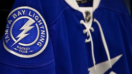
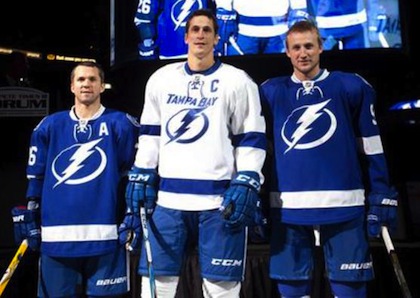 St. Louis, Lecavalier and Stamkos model the jerseys / TBL.comThe Tampa Bay Lightning officially unveiled their new logo and uniforms at a press conference today.
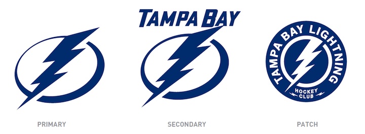
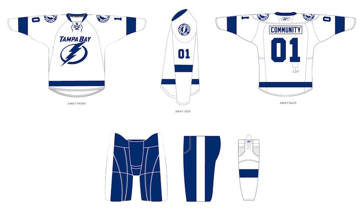
The new logo is one color... white on the blue home jerseys and blue on the white road jerseys, which includes the TAMPA BAY wordmark.
While it's a not a huge departure from the basic idea — a lightning bolt in a circle — it has been stripped down to its simplest elements.
We have a clean, iconic symbol here which is exactly what the new management was going for.
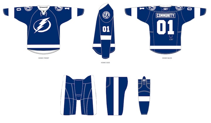
The uniforms are blue and white, and I hate to say it, but the striping is awfully derivative of the Detroit Red Wings'. It's understandable as it's a classic look but it's the one spot where the new brand fails to meet its goal of individuality and being unique. Outside of that, it's a traditional look that stands apart.
And it looks nothing like the Toronto Maple Leafs, as some worried. Unless, of course, you don't have your glasses on and every shade of blue looks the same to you.
At the press conference, we heard from owner Jeff Vinik and CEO Tod Leiweke. Even core players Vinny Lecavalier, Marty St. Louis and Steven Stamkos were on hand to discuss it. And they loved the new look, which will take over starting in 2011-12 season.
Here are the renderings of the new logos and uniforms as displayed on the Lightning's website:
As a Lightning fan, my first impression is very good. I love the simplicity of the logo. We always talk about how a good logo is one you'd find a kid doodling on his notebook. This one's easy to draw. I've thought for a long time the Lightning should have a blue home sweater — and just more blue in their uniforms in general. They certainly have that now.
But there are some things I don't like. The lightning bolts on the pants were always a unique element that's now disappeared. The "championship stripes" underneath the arms were used by no other teams and don't appear on these jerseys. Neither of these elements would've taken away from the simplicity of the design. Instead, the character they added is gone.
 New logos, uniforms unveiled / Tampa Bay LightningThat said, I already know what the reaction is going to be from most readers: You don't like it. It's change and many of you are averse to that as a rule, no matter what the end result. You'll come around. And unlike the last few uniform designs, I can see this one being around for decades to come. Vinik, Leiweke and Yzerman have done a tremendous job rebranding this franchise.
The team said the jerseys will not go on sale "for a while" but that they wanted to be the ones to reveal them, rather than seeing it leaked before the summer. And I think that is awesome. Also noteworthy, only the home and road jerseys will change. The alternate BOLTS jersey will be retained next season, according to CEO Tod Leiweke — presumably with the black and gray elements.

Reader Comments (226)
Switch the secondary logo for the primary, and I think these jerseys are solid. The new primary looks like a superhero logo.
wow. it's good, but pretty LEAFY.
love the simplicity.
might have been okay to add a little more color, but all in all, it's great.
should have kept the bolts on the pants, but that might change before the fall...
It's okay looking. I think it''s a step up from what they currently have, but I wouldn't rank it as one of the elite great sweaters in the NHL.
..... solid B, imho.
I really like the third logo, which would have been awesome on the shoulders. But the simplified logo is just too "meh." (Three people asked me if it was a Gatorade logo... Ugh.)
Things I miss: The silver, the lightning bolts on the pants, and the underarm "championship" marks.
It just needs some silver. A little to monochromatic.
I'm a big fan, but I will miss the lightning on the pants. I think it would look even sharper at this point, a solid color white bolt on blue pants (rather than the silver bolt in the blue stripe on the black pants they have now).
The blue feels, well, electric! And having its only compliment color be white just adds to the brightness and energy. Not sure why, but that logo brings to mind the aesthetic feel of the "Incredibles" and I mean that in a good way. Clean, crisp, energetic, harkens to a simpler time.
I would have liked the striping to be a little more complex, but other then that I give it the thumbs up.
I am sorry but there is so much in common with the sweater of Toronto that it is not even funny. The blue, the shoulder patch, the laces, the font and numbers are very similar, the collar, the alternating logo colours on home and away (White and Blue respectively). Sorry, TB, not a fan.
I am definitely glad to see the black go, but the striping and bolt on the pants will be missed. I can see the idea for a timeless look here but it is really just a hodgepodge of elements from other teams. We will see how long this one lasts.
nice......ish. like the logos, but the jerseys are crying out for some silver & maybe dark blue adding to them!!!!
shame, bit of a missed opportunity there toronto, err, sorry tampa......
Most liked jersey in nhl chicago, how many colors do they use. Black Silver and Blue is a great color scheme always has been always will be. They said they had fan input, i find that hard to believe. I will say this thank god for Vanik!
I love the simplicity, and I love the color blue, but I agree they are more Tampa Bay Blue Wings than Maple Leafs. I also agree though they are almost too generic, like something you'd see in a movie or commercial that has hockey in it but they don't have a license to use NHL logos so they make something up. I think they look nice, but too plain. Interesting about the microchip embedded for STH.
Sorry...not a fan. It looks like a logo for a superhero, not an NHL team. I beleive they blew it again. I was never a fan of their originals and this is worse.
I personally think the patch looks pretty good, except that it's not the primary. As for the logo i think it feels more proper to be on tights with a cape, at least from my first impression.
There are definitely some things I like about the new stuff and things I do not like. I do like the simplicity and the removal of the wordmark on the home jersey (I also like that they kept the wordmark on the away jersey). I like the removal of the lightning bolt on the pants and the removal of the championship stripes. I do not like the complete removal of black in the colour scheme, but I'm alright with the removal of silver. I like the lightning bolt on the shoulder patch better than the lightning bolt on the main crest and think they should be swapped, but not the words around the shoulder patch, just the bolt and circle. Overall, I think it's an improvement, but I really miss the black, it could have been a great trim for these jerseys and added a punch to them without sacrificing the "classic" look they were going for. Oh well, nothing is ever perfect. And besides, if there is an uproar in the fanbase (I'm thinking there won't be) then there is still time to change things. Overall, I'd rate them at above-average, but not great.
You must have enjoyed the Guardian Project if you think this is good design. Love your site but this is so bad...
Chris, The NEW Lightning crest when I first saw it remind me of The Incredibles logo. If they when with the patch logo as the crest it would be an awesome jersey but this is a forgettable jersey sorry for you to hear it but it's true.
I like them more than I expected to. They're what I expected from the descriptions, which surprises me a little because it seemed too obvious. It's a definite "Blue WIngs" design, which isn't so different from Gretzky's concept with the Coyotes (which are pretty much the "centennial Leafs" design in brick red).
I'm still not 100% sure I like the wordless, monochromatic logo. And, although it's a "classic" style, the classic look has itself become trendy. As others have pointed out, I think a lot of these retro styles will be replaced in a few years. Sports teams have figured out that you sell more merchandise when you change unis and logos more often. How else to explain the Reebokization of the NHL, waist stripes frequently MIA, and the very existence of the Buffaslug? They know people will buy them and then they'll "fix" them in a few years and people will buy the "fixed" one. Planned obsolescence (a term I learned from MAD magazine when I was a kid).
I think I prefer the logo with the wording more than the wordless logo because, with the text, it looks more like a logo. Without the text it looks more like just a "symbol." But I kind of like the "italicization" of the logo, makes it a little more dynamic.
I'm not a Lightning fan...I'm a Red Wings fan, actually. Overall, I like them. It'll be interesting to seem them in action next year, to get a better idea how the look works.
The Tampa Bay Maple Wings. No idea how you think it looks nothing like the Leafs Chris, all they did was change the logos and merge the two stripes on each sleeve and waist into one. Same collar and same shade of blue. And the logo is definitely way to cartoony, the way the ring is shaped looks like it should be in the corner of the cartoon network.
I would like it better if they used the Patch as there primary, it has more to is. Then use the Secondary for a Patch. Then have no Secondary. Home and Road should have the same logo in my opinion. As it is now, I prefer the old logo over the "primary" they have choosen. If they would have used the secondary, it would be scary good, one of my favorites in the league. Too bad, they were that close.
1) They've overdone it with the simplicity of the chest logo. Give it some personality somehow. 2) The laces and the 2 color branding works for teams that are instilled in our hockey memories: original 6 teams or even first expansion teams. Not for teams that have been around for 20 years.
3) It does look EXACTLY like the Toronto uniforms with a few details off. This just in: Blue and White branding in the NHL is taken, has been forever. 4) The shoulder patch does not complement the chest logo in any way. It lacks cohesion. 5) Sorry TB fans. Better luck next time.
Ewwwww, how terribly disappointing! Their old logos were far from great. They were boring but but they didn't look so instantly trendy/dated. Simple classic designs are preferred but this one is the bad kind of simple and not at all classic. It's a poorly conceived and executed logo for a 20 year old team, it's more appropriate for a team from the 1920s — except that the team name and style of the new logo is thoroughly modern.
Also, the lopsided alignment of this anachronistic logo on the terribly bland uniforms will drive me crazy.
The Tampa Bay Lightning were never the best looking team but they had their own history. I was in favour of a redesign because of the generic template of their old unis, but they absolutely should have retained their unique and attractive colour scheme as well as the notable parts of their identity, like the bolt on the pants and the underarm stripes.
Unless the Lightning suddenly turn into a dynasty and these subpar uniforms become associated with legendary times I don't think this classicly-inspired design will last long enough to become a classic. Classic Tampa Bay hockey is black, blue, and silver. It's a modern team in a newer market. They should embrace who they are and throw this new look in the trash with the Panthers' third jerseys (and the Tampa Bay Rays whole look).
introdeucing the Tampa Bay Blue Wings
They also had unique colored gloves that are now gone...
I am all about simple logos. I love the Flyers and Wings logos. I think the best logo of all time is the Whalers logo. My current fav jersey is the leafs white 3rds.
But the Bolt logo w/o the wordmark just doesn't do it for me. I don't know what they could do differently. Maybe use the shoulder patch as the primary? Although that would look like they ripped off the Wild (as everyone else does).
Zelepukin made a point that occurred to me after my previous post. The Lightning DO have their own history.
Overall, I like the design. The plain blue-and-white logo is more lightning-y than I pictured it in my head, so that's good. I generally prefer classic-styled uniforms to some of the crazy 90s/00s stuff. And as a non-Lightning fan I can live without the bolts on the pants.
But I think the restoration of "championship stripes" would be an appropriate tie to the existing Lightning tradition. I think they could even do them in black and silver without disrupting the ovarall look.
Basically, they won a Stanley Cup. In MY mind, that gives a franchise a history. I DO like the new look but I think it would be even better if it reflected the franchise's history a LITTLE more.
Its so simple! i like it!
These are boring, they do not give much personality to the team
I LOVE the shoulder patch. Like really. The first picture at the top of the article and the artwork of the patch. It's incredible.
EPIC FAIL! The black and silver should have stayed.
I really like them, but I am disappointed that the really cool stripes from the underarms are gone. That seemed like something that would make it through.
On second thought, I think the patch would look nicer on the front of the white jersey than the logo w/ "Tampa Bay" seemingly snuck in just enough to fit.
See, I, personally, would have been fine with the Blue Jersey if it had the Tampa Bay wordmark on the logo. The home crest is too simplistic.
I really think these are embarrassing....
we had one of the best color schemes in all of sports, had.
And I thought the Sens had some of the worst jerseys in the league. These are awful! Simply awful! I like the current jerseys and logo. The silver always looked good. Yikes, poor Bolts fans.
Everything I feared in my original comment on the prospective changes has now been confirmed. Far too cartoony, far too DC Flash, or Shazam!, in blue and is that yet another lazy circular wordmark logo on the shoulder? Add in a tie up neck for a team that isn't a vintage franchise and you have a bit of disaster. There is nothing unique about this redesign and I quite frankly think the NHL is now aesthetically a poorer place without the silver and black.
I like Tampa Bay as a team that have done well in the recent past in what isn't a huge hockey market so this is a bit disappointing.
These jerseys are very simple but so are some other classics in this league. In your mind change the blue to red and what do you see?......Classic Red Wings.......perfect.
Tampa Bay Maple Wings? but I do love the shoulder patch
Boring, bland, blah. Someone before me said they'll dump these within five years. I say it'll probably be closer to two years...
They look like a pee-wee team. Sort of generic style striping and that logo looks like it could be silk screened on. I can understand a classic and simple look, but using black and/or grey would have made them look so much better.
It's... okay. Not spectacular. Not horrible. Just okay.
But most of all, it's anticlimactic. Completely and utterly anticlimactic. I mean, there's NOTHING going on with these uniforms. There's simplicity, and then there's... Well, OVER-simplicity. This may be it.
At least it's not Rainstorm Sweaters all over again. Blech.
Am I mistaking or is the new logo sublimated on to the jersey? Looks like everything but the shoulder patch is. Dunno if you can confirm it without seeing an actual sweater, but it sure looks that way.
I like the logo. Everything else I hate. Seriously, flat out wrong shade of blue. The one they use for their third would have made this much better. Clone of the most boring template ever created in hockey. At least the Red wings switched it up on the white uni to make it less boring and generic. Perhaps throw a white yoke on it. Perhaps (gasp) use a second color. Yeah, some teams only use one. The vast majority don't, and there's a reason for that. And not just because of modern trends. which do you prefer? The red and black of the classic blackhawks sweater, the pop of the yellow against the black of the bruins, the red, white, and blue stripes of the rangers, the blue and white separating the field of red of the habs, or the "yup, we wear red/blue" of the leafs and Red Wings?
Pretty easy question for me to answer. Tampa could have had that. Instead, they get a uni that looks like it was thrown together in ten minutes for a beer league team. Clipartish logos, generic template, and 'just use your cheapest single color screenprint' block lettering.
Clarification on the above: The logo itself is nice. I like it. It's simple and classic. But being put on a bland jersey drags the logo down from classic to clipart. The simplicity of those simple logos can make that a very fine line, especially when it's a one color line drawing. Surround the logo with a classy package and it's a masterpiece. Surround it with, "well, these are the full team sets we keep in stock", and it starts to look like it belongs on a beer league jersey set provided by the rink.
They went from trendy bad design to anti-trendy underdesign. I guess if anything, they're only capable of extremes.
One thing I haven't noticed being commented on - the lack of numbers on the front! That is one thing I can definitely celebrate!
Congrats to the Lightning, you went from having some of the more original uniforms in the league to one of the least
I don't hate it and I think they're on the right path, but it's incomplete. Going to blue and white is bold when that's Toronto's thing. Making them essentially a blue and white version of the Red Wings seems bizarre too, stealing two Original Six teams thunder (no pun intended). Very disappointed in the lack of lighting bolts on the pants. Would personally like to see a third color as an accent, silver, black or something entirely different. I like the Tampa Bay on the white one, would like to see it on the blue one as well. Overall, not disappointed but I feel they stopped short of greatness. It's good but could be great. Perhaps they revealed it now to get fan feedback for possible adjustments? Probably not, but that'd be kind of cool if they considered the fans' opinions.
LOVE em.
They look so sharp, mostly because of the simplicity. The secondary logo is rad, and I would suggest it being the primary, were it not for the glut of 'logos in circles' in the NHL. If i had one complaint, it'd be the Tampa Bay wordmark on the road jerseys. It looks tacked on. Good job lightning!
Chris, glad you added the survey at the top of the post. I am surprised so many like these new jerseys.
I think the issue is the following: the NHL let those two slip by and there is no way the jerseys will be altered now that they were made public. So how can they be fixed ?
A few options: use black laces, black gloves, (maybe black helmets), and blue pants with a black bolts. That should help a lot to bring life to this simplistic design.
I do really like the shoulder patch and I really like it AS a shoulder patch (it would also be great at center ice...).
I like the idea of the blue and white unis, though I do wish there were some black and silver trim. The logo is not bad, I do see it looking a little clip-art-ish since the bolt is now by itself in an incomplete circle/oval, but I actually do really like it without the TBL words in it. I keep going back-and-forth as far as my overall take on it, though. I can't decide if I love the simplicity, or if I can't stand losing a modern-styled team that had done a decent job on designs in the past. Would it be so bad to have some black and silver in the mix, or maybe make a black-blue-silver alternate to go with this set. Then I'd be completely fine with it. Heck, simply making the pants black with a silver bolt on the side would make me really happy with them; it would keep the "simplicity" of the jersey while keeping the black and silver in the uniform.
LOVE the logo - simplistic and iconic. I just think those sweet blue jerseys would look better with some black and grey trim...it will enhance those great jerseys.
I agree with some others. Change the patch to the jersey front. Be careful with silver as the Leafs have thrown it in as well with there TML shoulder patch a few years ago. But again i agree, some siver and black should have been maintained. Love Stevie but how much influence could he have?