


Lightning Unveil New Logo, Uniforms!
 226 Comments
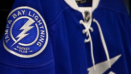
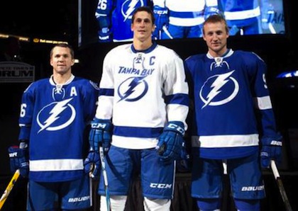 St. Louis, Lecavalier and Stamkos model the jerseys / TBL.comThe Tampa Bay Lightning officially unveiled their new logo and uniforms at a press conference today.
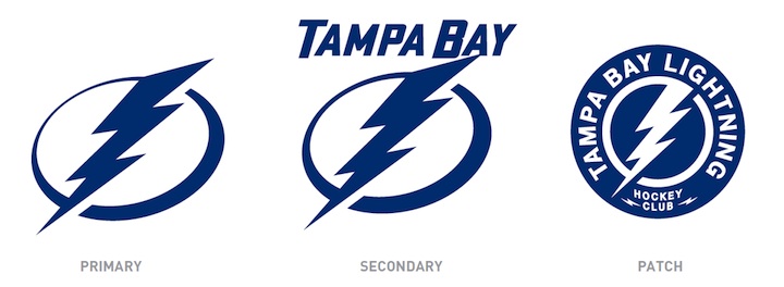
The new logo is one color... white on the blue home jerseys and blue on the white road jerseys, which includes the TAMPA BAY wordmark.
While it's a not a huge departure from the basic idea — a lightning bolt in a circle — it has been stripped down to its simplest elements.
We have a clean, iconic symbol here which is exactly what the new management was going for.
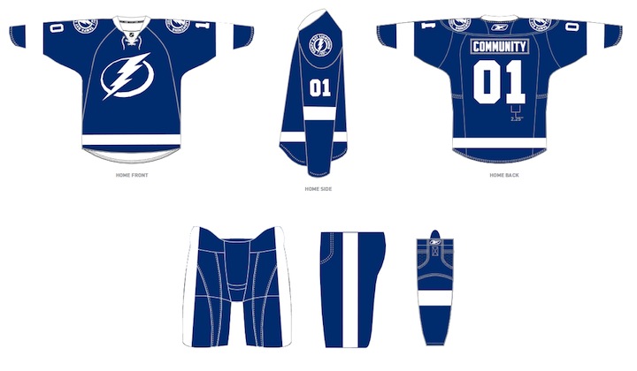
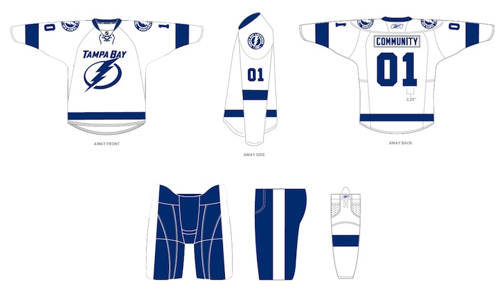
The uniforms are blue and white, and I hate to say it, but the striping is awfully derivative of the Detroit Red Wings'. It's understandable as it's a classic look but it's the one spot where the new brand fails to meet its goal of individuality and being unique. Outside of that, it's a traditional look that stands apart.
And it looks nothing like the Toronto Maple Leafs, as some worried. Unless, of course, you don't have your glasses on and every shade of blue looks the same to you.
At the press conference, we heard from owner Jeff Vinik and CEO Tod Leiweke. Even core players Vinny Lecavalier, Marty St. Louis and Steven Stamkos were on hand to discuss it. And they loved the new look, which will take over starting in 2011-12 season.
Here are the renderings of the new logos and uniforms as displayed on the Lightning's website:
As a Lightning fan, my first impression is very good. I love the simplicity of the logo. We always talk about how a good logo is one you'd find a kid doodling on his notebook. This one's easy to draw. I've thought for a long time the Lightning should have a blue home sweater — and just more blue in their uniforms in general. They certainly have that now.
But there are some things I don't like. The lightning bolts on the pants were always a unique element that's now disappeared. The "championship stripes" underneath the arms were used by no other teams and don't appear on these jerseys. Neither of these elements would've taken away from the simplicity of the design. Instead, the character they added is gone.
 New logos, uniforms unveiled / Tampa Bay LightningThat said, I already know what the reaction is going to be from most readers: You don't like it. It's change and many of you are averse to that as a rule, no matter what the end result. You'll come around. And unlike the last few uniform designs, I can see this one being around for decades to come. Vinik, Leiweke and Yzerman have done a tremendous job rebranding this franchise.
The team said the jerseys will not go on sale "for a while" but that they wanted to be the ones to reveal them, rather than seeing it leaked before the summer. And I think that is awesome. Also noteworthy, only the home and road jerseys will change. The alternate BOLTS jersey will be retained next season, according to CEO Tod Leiweke — presumably with the black and gray elements.

Reader Comments (226)
@Chris: I think because it's such a simple, stylized logo, it evokes other simple, stylized lightning logos. I immediately thought "The Flash" (there may be a comic-book character with an even more similar logo, but that's not my forte), but Gatorade and Power Rangers would also fly.
I think the design could've used some silver trim to spice it up, but I think once everyone gets used to it, it'll be fine. It's a clean, simple, traditional look, and that's something that I generally tend to give teams the benefit of the doubt over (a lot of people hated Columbus's thirds, but I liked them just fine.) Ryan Lambert of Yahoo! said on Twitter that had this come out 30 years ago, it would've been seen as classic by now, and indeed, if anything, it looks a little like a 50s/60s WHL team jersey with the simple design and cartoony logo. It doesn't scream "instant classic," but it's something that can be adapted to in time, and the next generation will probably wonder what the big deal is, because that's what the Lightning have always looked like, and it looks fine to them. Assuming, of course, they don't change jerseys 16 times between now and then.
All of which is a long-winded way of saying "pass." Doesn't light my shorts on fire, but it's not the design disaster that it could've been.
I'm about 80% in approval. If that is the same rich blue they have on their current alternate jerseys, then I'm 100% on board.
Looks very Superhero-ish.
I think the easiest (and best IMHO) way to go would have been make this year's "third/alternate" jerseys and change the "BOLTS" logo for this simpler one. Then, to make things even better, drop the black and change it to blue. So blue/white/silver with the new logo would have been the wayh to go.
A) They would have been more distinctive than these (which are too close to a Maple Leaf rip-off)
B) They keep the "distinctive elements" that Chris refers to in the write-up (the champion stipes and the bolt on the pants).
Let's all just be happy they didn't use their shoulder logo as their primary and we'd have another Blue-CircleLogo-WithLaces sweater on our hands...
I love the color, the simplicity, but I would have gone a little bit more like the new Blue Jacket's third, with a darker blue and some white on the soulder. Some silver might have been good to pop out a bit the logo from the jersey, giving it some more strength.
What I definitely like, though, is that with this simple shirt, they will be able to do so many alternate versions like the Maple Leafs do, especially with the striping, without removing the core look of the branding.
The circle on the logo on the front of the jersey resembles the circle in the Avalanche logo. I much prefer the shoulder patch but unfortunately it would be the 200th blue circle logo in the NHL. I applaud the effort though. They came close but too many borrowed concepts from other teams ruin it. Yeah, the blue is a different shade but it's still blue and white. Now when people say the blue and white, they'll have to be more specific.
Will we ever see a new NHL jersey that's NOT blue ever again? Seriously, what's the deal with the blue lately?
i'd rather see TBL's current logo on a blue jersey
Looks better then what their wearing now, but they should have a touch of silver. Loosing the black is always a GREAT idea.
Chris,
Some jerseys get ridiculed for being to much I think this one is being ridiculed for being too simple. You said it yourself Chris, a grade schooler could of came up with this. Stevie Y is definitely implementing his original 6 background with the fuse of the Maple Leafs and Red Wings. I don't like the logo and the word mark looks out of place on the away jerseys, sort of like the Canucks except it's not curved. I do like the jerseys because I like both the Maple Leafs and the Wings jerseys I just think they should of kept black in the jersey at least in some extent. I like teams going classic but modernizing as well. Like the Sabres and to some extent the Predators. I also dislike that their keeping the Bolts wordmark jersey as the third. Way too much of the same blue. I also think you're overlooking the Leafs comparison it is a different blue, correct, but it is getting compared because the Leafs strictly stick to white and blue jerseys & logos. I think a little use of black and/or silver would of went a long way in improving these jerseys.
Yawwwwwwwwwwwn.
I can't see how you can say "And it looks nothing like the Toronto Maple Leafs, as some worried."
The colours look almost exactly like the Leafs. Tampa Bay used to have it's own identity because of it's unique colour scheme now they look like one of the pack now.
Logo is not bad but overall, they failed in the rebrand.
I dont mind them,but for a team known as the Lightning I honestly have to say: needs more bolt!
It's key design elements are unique, definitely granted, but the colour scheme is too similar to the Leafs for my liking. Keeping the black and silver would've kept the Bolts' jersey truly distinct. Even if they were just used as trims, stripes, or other minor elements. That's just my two cents. Cheers.
First, this logo reminds me of the one on the superhero suits in the movie "The Incredibles". That said i loved the movie "The Incredbles", so i like the new logo, but the logo without the "Tampa Bay" word-mark looks too plain.
Second, the jerseys are way too boring and plain in my opinion. Like many have said, they look like the Redwings, but blue instead of red. The striping just doesn't go well with the logo at all. I think they should go with something new and more modern to match the logo (personally i think the logo on the recent NHL all star jerseys would look nice)... either way, just change the striping at least!.
Finally why change the colors to blue and white!? First, it takes more color out of NHL jerseys. Second seeing those colors alone on a NHL jersey makes any hockey fan immediately think of the Toronto Maple Leafs. If you want to re-brand the hockey team, taking the colors of one of the earliest and most popular teams is a mistake. At the very least they should have kept the gray in the logo. When you see lighting; the sky is gray. So it makes perfect sense to have gray in the logo.
I want to see more color and unique jerseys (good unique) in the NHL, not less. ... I already miss the old Anaheim Might Ducks jerseys
Looks like Stevie Y had a bit too much input with the jersey redesign.
a simple lightning bolt on the pants would've been great, no outlining, just a white bolt. a really great jersey when you see it in the pictures, it looked very boring in the graphic artists rendering
I don't think people are averse to change, I think they are just adverse to poor designs, and this certainly looks like one. To me, there is nothing worse than a relatively new franchise with anything but a storied history trying to pass itself off as some vintage, old school team with a rich heritage.
Right now I'm not a fan, but I have a feeling it'll grow on me so I gave it a thumbs up.
it is a combination of the leafs and wings they got to get some silver shading in there and it will make all the difference. the shoulder patch is cool and classy which is rare. as it is the lightning continue their trend of house league uniforms. i didn't mind the lightening on the pants either, should consider bringing it back.
I am curious to see what they look like matched up against some other teams' uniforms on the ice. At first glance, the logo looks a bit "cartoonish" but the overall look is classic. I think the overall look is great and they could be around for quite a while.
I think they are awful. They had the signature Blue, Black and Silver look. Also The lighting were always one of those cutting edge teams that always sported a modern style. Now they have no personality and look like the Leafs deformed cousin. How do you just dump the signature lighting bolt pants?!?
HORRIBLE!!!! keep the jerseys and logos the way they are. these make the "bolts" jersey like nice, so crappy. it does look like the love child of Toronto and Detroit, and not in a good way
The logo is solid, but the jerseys are plain. Additional striping would have done wonders for this design, like an additional thinner blue above and below the wider blue on the away jersey (and a white one on the home jersey). The could also have kept a third(?) colour, and made that the thin stripe. I'm wondering if they are possible releasing them early to perhaps get a feel from the fans, see what they like. If there is enough backlash, perhaps they go back to the drawing board, or just stick with what they have for now, but update the logo.
This is brutal. I hate the trend of making every hockey team "traditional". You are not an original 6 team, your one of the newest teams in the league- EMBRACE THAT! Do something new and interesting. This the Red Wings jersey with a boring logo - is it clean, yes. but it in no way says sports team.
And yes I would know - I am a professional designer who had branded and rebranded sports teams (mostly hockey) - this trend has got to go. I think the lightning had a great identity before this, now its boring. If I were a lightning fan I would be pissed - not only because my team now looks boring, but they rebranded themselves only 4 years ago... that shirt, jersey, hat, sticker I bought now is old. it is too quick of a rebrand and has been changed to something that doesn't represent the team's identity..... the first benchmark of a logo.
This is a logo for an energy drink, not a sports team.... SME has done other sports identities, but the lead designer or art director on this obviously does not know, or cares to know, hockey......... tampa bay just spent a lot of money on something that hurts their product.
Anybody getting an Avalanche vibe from the logo?
Ok, can't argue with any traditional look. I really like the white stripes on the pants, which the Leafs need desperately. Also like that they didn't get caught up in the vintage white fad. But how about matching logos? ("Tampa Bay" wordmark on both or neither).. I think it should be a rule that NHL teams must have matching logos (and color patterns/ someone please let Thrashers, Wild know) on their primary jerseys. And this is off topic, but how about red helmets for the Caps with their red jerseys?
These are the LA Kings throwbacks but blue and white.
Am i the only one that notices this?
My original thought was "cheap". Hours later, still looks cheap. I have been a loyal Lightning fan going on 19 years. Just about 2/3 of my life. I can safely say I am insulted. Insulted that this is for the community of Tampa Bay, yet no one in the community had a chance to tell Vinik how cheap and bland this logo is. Or how much most of the Lightning community was going to hate it.
And even the fact that the players strongly approve drives me nuts. We are the ones paying. We are the community. Not a single say so in any of this. Thank goodness the color scheme works. It looks nice only because an NHL team has had the same colors for the majority of the last decade. My Dad said it best. "...Get your money back and really do a survey. Ask the people who pay the salaries, not the ones who collect the checks. I refuse to spend my money on this crap".
In the end, we spent good money that could have gone somewhere within the organization to a company that royally boned us with a logo that looks like it was ironed on.
I'm a huge fan of the patch. The new logo does have that sense of staying power, but I preferred Ivall's take on it better where the current logo just had the black elements/text removed.
Pretty decent design but I always thought the Lighting bolt on the pants was one of the coolest elements of the Bolts' uniform. If they had retained those and a little black highlighting the new design would have been perfect.
First of all I really do have to say I like Tampas new digs. I like the simplified image, and i think removing the black and silver really made the uni's look more vintage and i think it will be a more memorable look for future generations. The bolts on the pants would've been a nice element to keep, but I still think they took a step up with these new uniforms.
Overall, I like the new logos and jerseys. The lightning bolt looks an awful lot like a tshirt I used to have except it was silver, probably looks similar because of the simplified design. I like the blue but am disappointed in the lack of the victory stripes. I think that's an essential part of the design of the Lightning because it was unique and had meaning. To a lesser extent, I am disappointed in the lack of black, I always thought of black and blue as the Lightning's colors. I hope they would have at least kept it in for striping. Overall though I do like the design and think it's very solid.
I think they are lacking a focal point on the uniform. At least the Toronto maple leaf stands out from the rest of the uniform but the lightning bolt here looks boring and very ordinary. Yeah it looks like something from the 50's (remember the old Toledo Storm logo?) that is what it reminds me of. It's one of those logos that will have a love/hate relationship.
I for one would have made the bolt silver, then it would be the focal point of the whole uniform, it would have given it a WOW factor. Add in some thin black trim around the white stripes and I think it would have been the best looking uniform in the league. Oh yeah and the championship striping under the armpits...yeah those were Tampa Bay's calling card, sad to see them go.
I agree with most here that these uniforms are very (to put in laymen's terms) BORING!
Sometimes simplicity works and sometimes it doesn't. In this case it doesn't.
The uniforms just look too generic. A simple dull lightning bolt as a logo? Come on. Is this the best they can do?
Logos on the home and away jersey that don't match? This doesn't give the team a coherent identity. Is the main primary logo the simple lightning bolt or the word mark version of said lightning bolt?
Generic deep blue colors? Why not go with an nice electric blue shade?
Generic pants? The best part of the Lightning uniforms in the past was the lightning bolt pants.
Generic secondary logo? Putting the bolt in a ring with "Tamps Bay Lightning Hockey Club" around it is so generic. The old "lightning bolt going through the state of Florida" logo was much nicer.
And keeping those lame "Bolts" uniforms as a third. Those should have been ditched BEFORE they were worn.
Overall I'm disappointed.
As much as I realise that this would devastate Chris, I'm reminded of something when I look at these.
1991-3, Minnesota North Stars. Major changes to their jerseys, including changing the logo and primary colour in the colour scheme.
Light blue, eh? Maybe it's just wishful thinking, or maybe the conspiracy theorist in me is itching to get out, but those look like Nordiques jerseys to me...
Hate to say it, Chris, but your team dropped the ball (or puck, in this case) with this one. Design seems amateur-ish to me. Blue canvas works for the Lightning but not with this logo. At least they didn't use the shoulder patch or it would have been chaos.
They're a bit plain but I like the logos and the colors.
Another long-time Lightning fan here. Unlike many other teams in the NHL, black has been one of our colors since the very beginning, unlike most other clubs. I think it's a mistake to completely get rid of both that and silver.
Overall, it's simplistic to a fault (especially the logo) and doesn't have enough going on color wise to distinguish it from other uniforms around the league. It's not a matter of not liking change; it's a matter of recognizing a missed opportunity. Not a fan.
P.S. The Flash Gordon comments are hilarious. Who else here has a strange desire to crank up Queen right now?
I can't say I hate them. I definitely don't mind them, and that says a lot from a guy who puts Tampa in the top 5 least favorite teams. >>>sorry Chris<<<< but I think the Lightning have broken some kind of unwritten protocol here. The Leafs and Wings are the only teams to ever have only 2 colors. Every other team that has ever existed in the NHL since the Original 6 has had at least 3. Now we add the Lightning to the same category as the some of the most storied franchises in the history of hockey (I will never cheer for Toronto or Detroit, let's get that straight). I just don't think the Tampa Bay Lightning, a barely 20 year old franchise, deserves to be placed on that kind of pedestal.
So strictly on that basis, I will say no.
The logo is simple...too simple. I like the change towards blue, but does anyone else think that the secondary shoulder logo would have looked better as the primary logo? The Bolt all by itself really looks awkward, like one of those generic EA sports logos you can choose when you create your own franchise.
I think this misses the mark. This faux vintage trend in the NHL is completely played out and needs to end soon. TB's tradition is victory stripes, lightning bolts and black and silver - there's a way to incorporate all of that and still re-brand successfully. Bring back the victory stripes, replace the pants with solid black, give everyone black gloves, sprinkle in some silver trim, and you might have something. This just feels too forced.
I think lt look like a one of the comic book logos. The other one is better. it's unique.
I love simplicity but, seriously, this effort is trying too hard to blend a modern logo and modern colors with a classic look - it just doesn't do it for me. I have to wonder if this somehow evolved from the Guardian Project? The basic logo and color scheme have me thinking all that's missing is a cape -- "Look out world..I am Stammer....the most electrifying hockey player in the universe"
Can anyone remind me what's wrong with their current home and roads (let's forget the "Bolts" alt tho.)
I don't see why they had to loose the black and silver. Love the new logo though.
I think the Lightning completely failed with this look. I think they look like a cross between the Maple Leafs and the Red Wings. I also think its kind of a slap in the face of the history of the teams uniform. I loved the bolt on the side of the pants and the color scheme. I thought they needed to tweak their uniforms, but I think this is a step in the wrong direction. I credit Steve Yzerman for going for a classic look, but like I said, I think this is a big miss.
i like the simplicity of the jersey, but its too Red Wings...nearly a carbon copy sans logo and colors. not really a big bolts fan, but i'm sad to see that the stripes under the arms are no more, that some something that was truly unique to the hockey club. color is slowly disappearing from the NHL...blue, blue, blue and white is the unfortunate standard now. hopefully these sweaters look better on the ice than in the photos!
Blah. The more I look at them the more they missed the mark. And what's up with the logos themselves? The relationship between the wordmark and the bolt is atrocious. Are the primary and secondary accurate? Why does the secondary logo, the one with more elements, feature a bolder circle? It should be the other way around. (Technically they should be the same.)
I reall like them. Simple, which is what a logo needs to be. Definite improvement over their old, cluttered one.
Honestly, the jerseys are okay. The problem is, they're too plain, especially compared to what they wear right now. Look at the first RBK jerseys from the Oilers. Many thought that they sucked, all because there was nothing going on with the jersey. Basically, it contained their logo, half-stripes on the elbows, and that was it. Same can be said about these jerseys. Some stripes, the patch and the simple logo with only two colors on the entire jerseys. It doesn't work for them. Truly, it only works for the Original 6 in that regard, nobody else in the league.
However, the one thing I love is the patch. It looks really nice, I must say. It does have that classic look going for it.
Forget Toronto, forget Detroit. The tam that most influenced these jerseys are: the Vancouver Canucks. Which is good, because the Canucks currently have the most gorgeous uniforms in hockey.
it feels like they're trying to be an original 6 team, but since they aren't, it looks bad on them.