


Lightning Unveil New Logo, Uniforms!
 226 Comments
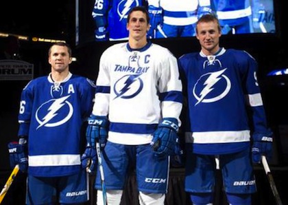 St. Louis, Lecavalier and Stamkos model the jerseys / TBL.comThe Tampa Bay Lightning officially unveiled their new logo and uniforms at a press conference today.
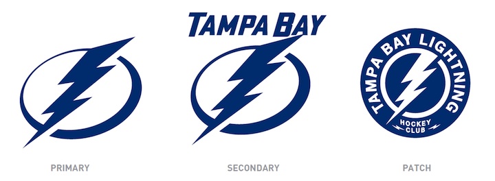
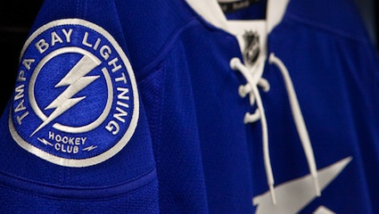
The new logo is one color... white on the blue home jerseys and blue on the white road jerseys, which includes the TAMPA BAY wordmark.
While it's a not a huge departure from the basic idea — a lightning bolt in a circle — it has been stripped down to its simplest elements.
We have a clean, iconic symbol here which is exactly what the new management was going for.
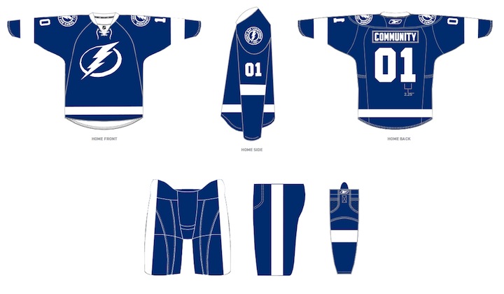
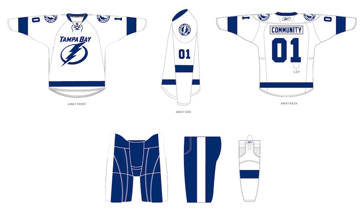
The uniforms are blue and white, and I hate to say it, but the striping is awfully derivative of the Detroit Red Wings'. It's understandable as it's a classic look but it's the one spot where the new brand fails to meet its goal of individuality and being unique. Outside of that, it's a traditional look that stands apart.
And it looks nothing like the Toronto Maple Leafs, as some worried. Unless, of course, you don't have your glasses on and every shade of blue looks the same to you.
At the press conference, we heard from owner Jeff Vinik and CEO Tod Leiweke. Even core players Vinny Lecavalier, Marty St. Louis and Steven Stamkos were on hand to discuss it. And they loved the new look, which will take over starting in 2011-12 season.
Here are the renderings of the new logos and uniforms as displayed on the Lightning's website:
As a Lightning fan, my first impression is very good. I love the simplicity of the logo. We always talk about how a good logo is one you'd find a kid doodling on his notebook. This one's easy to draw. I've thought for a long time the Lightning should have a blue home sweater — and just more blue in their uniforms in general. They certainly have that now.
But there are some things I don't like. The lightning bolts on the pants were always a unique element that's now disappeared. The "championship stripes" underneath the arms were used by no other teams and don't appear on these jerseys. Neither of these elements would've taken away from the simplicity of the design. Instead, the character they added is gone.
 New logos, uniforms unveiled / Tampa Bay LightningThat said, I already know what the reaction is going to be from most readers: You don't like it. It's change and many of you are averse to that as a rule, no matter what the end result. You'll come around. And unlike the last few uniform designs, I can see this one being around for decades to come. Vinik, Leiweke and Yzerman have done a tremendous job rebranding this franchise.
The team said the jerseys will not go on sale "for a while" but that they wanted to be the ones to reveal them, rather than seeing it leaked before the summer. And I think that is awesome. Also noteworthy, only the home and road jerseys will change. The alternate BOLTS jersey will be retained next season, according to CEO Tod Leiweke — presumably with the black and gray elements.

Reader Comments (226)
This look is okay for the TBL, but i can't shake of the feeling of dissapointment when looking at these. I was really hoping for something new and eccentric-ish, but i guess this was a safe bet. A well balanced jersey kit with classic features. The logo on the other hand is almost spot on perfect.
As a Carolina Hurricanes fan, I offer my unbiased opinion.
While I like the idea of having a primarily blue jersey, I feel that too many NHL teams are going for a "classic" look. Teams need to learn that modern looks aren't so bad! As an example, I think that the Nashville Predators' old color scheme is so much better than their new one, but that is irrelevant.
The new sweaters are far too simplistic, and they look strikingly similar to the Toronto Maple Leafs' uniforms. If the Lightning kept their old (current) logos, and employed them onto a blue jersey (the current third jersey template, but replacing BOLTS with the current crest), they would look AMAZING. I myself am a huge fan of the Lightning's third jersey, not so much the crest, but the jersey itself is a work of hockey art.
Either way, simple blue and white jerseys just don't fit this team well in my opinion. Black and silver just seem to complete the look in my opinion. Perhaps in time, the black and silver will find their way back to Tampa Bay.
I really love these new jerseys and logos. I like them over what Tampa Bay has now. Yeah I admit the jerseys look like a mix between the Wings and the Leafs, but give it a few years and maybe they'll change that up. As for the logo, I love it. It's so simple. Why do people have the idea that logos need to be so complex and detailed. I dont see how a logo for "Lightning" would have to be so detailed. It's lightning. It's white... and its not like there's any sort of detail in it. But oh well. Haters gonna hate.
I guess I am going to be buying a lot of the current Tampa Bay merchandise because I am not buying this, black and/or grey(silver) should still be in this uniform, the Lightning Bolts should still be on the pants, this uniform is going to have a short life. They should have when with the current logo put it on the alt blue jersey, had a white one off the same template, and then for the new alt use the old logo and old black jersey since they are celebrating their 20th anniversary.
I am flattered that Tampa wanted to copy my Leafs but at the same time, get your own team colours!
I'm certainly not always adverse to change! I think you're just a little biased as they are your team. I agree that they look classic, but they are a little boring. However, I'm not commenting to disagree with you, I just wanted to say how much I like the shoulder patch! It's quite classy looking and at the same time, they had the discipline NOT to make such a nice looking logo be the primary. You think the striping looking like Detroit's would have taken away individuality? Thank goodness it's not yet another blue jersey with a circular logo!
They're not great by any stretch, but they'd look better if they incorporated some silver. I think a silver outline to the primary logo, and pants with a white bolt with a silver outline (instead of the plain white stripe that's so very Detroit) would help give the design a little more of its own identity, as opposed to looking completely derivative of Original Six unis.
The Leafs and Wings have great, classic uniforms, but simply combining elements from two classics doesn't make a great uniform, it makes for a conservative, forgettable uniform.
It is a cross between Detroit's uniform with that single bold stripe at the bottom and Toronto's with the nearly identical blue. Unique indeed. Not sure it will grow on me. A classic, simple look, yes it is. A bit cartoonish as mentioned by some, yes also
I've looked and looked and looked some more, these jerseys still need an additional color. No doubt about it.
That's an awesome logo to have on a potential Stanley Cup championship ring... super power!
The secondary logo should be the primary. And they should have just kept the template of the third jersey. That would have looked sick imho
The management had the right idea: more blue, less black, simpler jerseys and crest. If they're going for simple, then why the Tampa Bay above the crest on the road jersey? The logo by itself is classic, not when there is a name over it.
Honestly, I'm not really thrilled with this revision Yzerman and SME came up with. While I do support the uniform going more vintage and blue becoming the primary color, I really think that black and silver need to be on the jersey. Those colors have been a part of the Lightning as long as blue and white have and to get rid of them after 18 years: bad move. Whether its through adding highlighting lines to the horizontal stripe or even adding a shoulder yoke, black and silver really should be in the jersey.
Also, although I am okay with the new primary logo, I think that some 3-demensionality (kind of like what they have now) needs to be added. I saw a concept on here that included that and I thought it worked well.
Last, and probably the things that irritated me the most, I am really ticked that the victory stripes and the bolt on the pants were removed. I know that Yzerman wanted to go old fashioned, but those two things are Tampa Bay hockey traditions. They have always been there, through Stanley Cup years and losing seasons. If anything needs to change about these new sweaters, its bringing those two things back.
These look like standard house league hockey jerseys. Why make the colour scheme almost exactly that of the Leafs? Is it so hard to be original? Even change the shade of blue, perhaps?
This might be the worst logo in pro sports, period. To me, this is right on par with the old Islanders logo and King's.
WTF? Yzerman approved this? Really?
disgusting... in a good way
Blue and white? Toronto wears blue and white. For the love of all that's good, don't curse yourselves with those loser colors! LOL
I like the uniforms you have now. :)
These are sick!
I think they are horrible. Too simple and the fun has been taken out of the uniform. It looks like the flash logo. Are the Lightning going for a comic book character look? It appears so. Thumbs down. I will not purchase a jersey that ugly.
Newsflash: you're not the Maple Leafs, you're not the Wings, you're not an Original Six team...so why dress like one? Embrace modernity. The retro trend is already fading and 5 years from now everyone will want a new, more up to date logo and jersey. And then TB will probably switch back to their current logo which is far better and more energetic (they are the Lightning after all). The primary just looks dull and uninspired, like someone tried to forcibly come up with a classic. Well, you don't come up with one by trying too hard. A "classic" look has to earn it.
They are nice jerseys and very simple just what stevey Y wanted cuz he played for the city with simple jerseys as well(red wings) but what i hate is that they took black out of there jersey. Now ur a one color team in the same conference as another one color team who is the exact same color as you. tampa and toronto look the exact same now, blue uniforms with white stripes on the sides with a maple leaf/lightning bolt in the middle, there the exact same so im not gonna knock the jersey its nice if i were a TBay fan id buy one but im not so i look at this as dissapointing.
Hey! It's the "TAMPA BAY BLUE WINGS!" Thanks but I MUCH preferred the previous jerseys. It used to be one of my favorite jerseys in the league... NOW, not so much. I can't stand the 2 color jobs in Detroit and Toronto... Wait, add Tampa to the mix now. Disappointing.
Looks like a house league jersey
Two words BO RING
I really don't HATE the new Tampa Bay logos, but I can't say that I like them. They are a little too plain for me. Even if they could just add a little bit more color, or a little dimension to the logo, then it could look alot better. All it is, is a plain blue/white lightning bolt. Where's the fun in that!? I thought hockey logos were supposed to be bold! Powerful! Intimidating! This is just lame! A lightning bolt is just not going to cut it for me. But, at least they put it in a circle. To give it SOMETHING else!
1. No, it's the exact same shade of blue.
2. Being simple doesn't make a logo "iconic". Having history and tradition does.
I know what Stevie Y was trying to do, but it doesn't work here. The classic looks of Toronto and Detroit are unique to Toronto and Detroit. It's their identity. They use only 2 colours but their design and stripes are completely different. Stevie Y and his design team borrowed key elements from those two teams that hinges on being a direct copy. Where's the uniqueness? Where's your team's identity? Is it the Detroit Maple Lightning? Or the Tampa Bay Maple Wings? Either way, Toronto and Detroit are teams that were conceived nearly 100 years ago whereas Tampa Bay is younger, modern and their uniforms should reflect that rather than what they are not. Be creative!