


Lightning Unveil New Logo, Uniforms!
 226 Comments
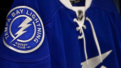
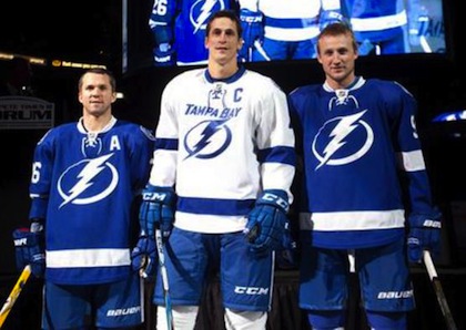 St. Louis, Lecavalier and Stamkos model the jerseys / TBL.comThe Tampa Bay Lightning officially unveiled their new logo and uniforms at a press conference today.
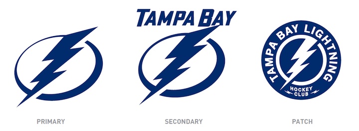
The new logo is one color... white on the blue home jerseys and blue on the white road jerseys, which includes the TAMPA BAY wordmark.
While it's a not a huge departure from the basic idea — a lightning bolt in a circle — it has been stripped down to its simplest elements.
We have a clean, iconic symbol here which is exactly what the new management was going for.
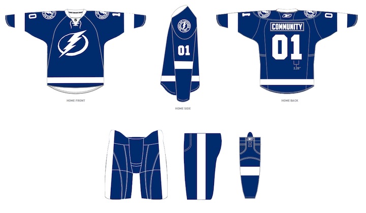
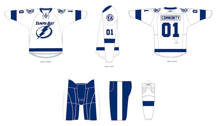
The uniforms are blue and white, and I hate to say it, but the striping is awfully derivative of the Detroit Red Wings'. It's understandable as it's a classic look but it's the one spot where the new brand fails to meet its goal of individuality and being unique. Outside of that, it's a traditional look that stands apart.
And it looks nothing like the Toronto Maple Leafs, as some worried. Unless, of course, you don't have your glasses on and every shade of blue looks the same to you.
At the press conference, we heard from owner Jeff Vinik and CEO Tod Leiweke. Even core players Vinny Lecavalier, Marty St. Louis and Steven Stamkos were on hand to discuss it. And they loved the new look, which will take over starting in 2011-12 season.
Here are the renderings of the new logos and uniforms as displayed on the Lightning's website:
As a Lightning fan, my first impression is very good. I love the simplicity of the logo. We always talk about how a good logo is one you'd find a kid doodling on his notebook. This one's easy to draw. I've thought for a long time the Lightning should have a blue home sweater — and just more blue in their uniforms in general. They certainly have that now.
But there are some things I don't like. The lightning bolts on the pants were always a unique element that's now disappeared. The "championship stripes" underneath the arms were used by no other teams and don't appear on these jerseys. Neither of these elements would've taken away from the simplicity of the design. Instead, the character they added is gone.
 New logos, uniforms unveiled / Tampa Bay LightningThat said, I already know what the reaction is going to be from most readers: You don't like it. It's change and many of you are averse to that as a rule, no matter what the end result. You'll come around. And unlike the last few uniform designs, I can see this one being around for decades to come. Vinik, Leiweke and Yzerman have done a tremendous job rebranding this franchise.
The team said the jerseys will not go on sale "for a while" but that they wanted to be the ones to reveal them, rather than seeing it leaked before the summer. And I think that is awesome. Also noteworthy, only the home and road jerseys will change. The alternate BOLTS jersey will be retained next season, according to CEO Tod Leiweke — presumably with the black and gray elements.

Reader Comments (226)
It's... ok. I think the two colour thing, although simple, doesn't quite hold the same classic feel of the Wings. I think it feels a little flat. I actually don't mind the logo although I still don't like how they incorporate the "Tampa Bay" in the secondary logo. I actually sometime think it would be great if they had a big lightning bolt like Captain Marvel (SHAZAM!) lol but I know a lot of people would ralf thinking about that. I do wish they would have kept the bolts on the pants but I'm happy about losing the pit stripes. I think overall this is an improvement for the bolts but I still feel this could be a little punchier. Just sayin...
the jersey actually looks great in the designs, probably because of the additional detail of the jersey cut... the real thing looks too simple, not good...
personally, the logo isn't bad as much as I'm concerned that yzerman is installing red
wings tradition with the lightning when there is going to be question whether he's going to stay there for the long haul, either as being successful or taking Ken Holland's place once he goes. I'm terribly
disappointed that they took the black and silver out of there, cause I thought they benefited from the EDGE design. being a caps fan, I thought the lightning had the second "sickest" jerseys I've ever seen. I love the home and away, not too fond of the 3rd, but it's not atrocious by any means.
Very disappointing to be honest, I look at them and I'm thinking a bizarre mix of the Leafs/Wings designs thrown into one and putting the new logos of the Lightning on it.
Usually I'm really critical of third jersies, but in this case I'm making an exception and in my opinion, Stevie Y should have seriously kept the colour scheme as it was and not dare mess with it, otherwise one of the more unique franchises in the NHL has just become something from a minor league team as a few pointed out.
It looks too generic, hate to say it to you being a Lightning fan, Chris. But the logo and jersies have lost their edge that I really liked and that's what made them unique before this.
Adding a stripe of black instead of silver would pop the contrast a bit more. That and the little details like the championship stripes, and the lightning bolt on the pants would make for a good clean but still simple look. I think just adding black would differentiate this jersey from anyone else.
Personally "Just add black" should be the slogan for those new, simpler, somewhat unfinished jerseys. I think that addition would complete them, and keep the 'Bolts unique color scheme.
They are indeed a classic look-- Yzerman's Detroit influence is very obvious. I like 'em. But one thing I noticed, being an Islander fan, is that the arm stripes and socks are perfectly matched and proportioned (despite Edge template)... WHY CAN'T THE ISLANDERS DO THAT?!?
Impressions:
-Like the move from black to blue as the primary, but dropping black altogether - which people associate with an electrical storm - may be a mistake.
-The current uniforms are simple, did they really need to be more so? Swapping the black and blue on the current home uniform would've been a solid, understated improvement.
-Lighning Bolt on the pants will be missed, very unique and identifiable to the team.
-Given that the classic-type circle logos are overdone these days, this one works quite well.
Preference:
-Add a small splash of black back in
-Make the road crest the circle logo, and the home crest the reverse of the above away.
-Give us the bolt back on the pants!
I would have to place these in the unoriginal column. The logos look like something a middle school kid could have come up with, the color scheme and stiping pattern completely make them look like Toronto now. Not good Tampa.
They should've atleast used an all white bolt on the side of the pants instead of completely thowing it away and having BORING white line...
Good simple Logo. Jerseys....Red Wings and Maple Leafs? Miss the pant lightning bolts as you pointed out as well. It's not horrible, and I know with time I'll like it more. I do like how it's bright blue and not black. The NHL needs more color in the jerseys and this is one step forward.
The Incredi-Bolts!
My 9 year old son is devastated. He became a Lightning fan based mainly on the uniform colors. Stupid Stevie Y.
Now those are ugly. Tampa Bay had fine jerseys, there was no need to mess with them.
My gosh Marty St-Louis is short... awesome player though. The jerseys are growing on me, and I'm glad they got rid of the player number on the left side shoulder
Not too bad at all, very simple... makes me think of the Red Wings being just two colours.... Although the Tampa Bay word mark needs to be dropped from the Away jerseys. I really hate when lettering is unnecessarily added to these jerseys, seems so out of place. Just like the Canucks.
Too simple. Could have added a little black or grey to break it up. Looks like they just made the Detroit jerseys blue and white instead of red and white. Steve Yzerman seems to have a lot of imagination.
Too simple. Could have added a little black or grey to break it up and keep the original colour scheme. Even if they kept the lightning bolt on the shells would have been nice. Having the solid blue shells, like they are now, but with a 1 colour white bolt going down the side would have still looked good but staying with their classic look. It looks like they just made the Detroit jerseys blue and white instead of red and white. Steve Yzerman seems to have a lot of imagination.
It's simply the wrong color of blue. Had it been darker I would be fine with it, but it is eerily similar to the Toronto Maple Leafs jerseys. Though I must say, Stamkos looks wonderful in that shade of blue.
In my opinion, it is one of the finest jerseys in the league. I am not a fan of their current jerseys. They aren't bad, just not good either. But these new ones are fantastic.
i hate it should have promoted the third to the home jersey and made a white jersey out of it.... these ARE TOO SIMPLE!!!!!!! and they got rid of the best part the lightning bolts on the pants!!!!!! hey also got rid of the grey which i liked because it was a nice accent color and i think symbolized they grey during the lightning storm
A step back IMO
I would almost rather have the patch be the secondary logo. That "Tampa Bay" word mark is a bit too much like Vancouver's--which isn't a good thing. Overall, I like them a lot better now since I first saw them a couple days ago, but like what they have now more than what they're going for next year.
To be honest I the the "Tampa Bay" word mark on the away jerseys is unnecessary and slightly 'Vancouver Canuckish'. The jerseys are a cross between Maple Leaf colors and Red Wing templates but very sharp in a retro kind of way. The logo and shoulder patch are nice, simple and to the point. Over all they are excellent. And for the record I am 16.
I'm shocked at the amount of thumbs-downs for these new uniforms. I think they are fantastic!
No black!! Yes!!!!
Though maybe a bit of silver (let's call it was it is... gray) wouldn't have been bad, but all in all, pretty decent.
All I can say is ... "owch".
These are just awful. I'd have thought MAYBE they'd be a litte like their original sweaters pre RBK EDGE look. You'd figure w/the history of their Stanley Cup win they'd go back to that at least!
too simple. i too liked the lightning stripes on the pants and the armpit patch. the logo looks like clipart
Why oh why did they not make that patch the main logo??? it is FAR AND AWAY the best thing they came up with. I do love the simple striping (I'm a retro enthusiast), but it would have been nice to see the history of the jersey like Chris alluded to. The victory stripes and lightning pants were as important to the lightning brand as bleu, blanc, et rouge is to the Canadiens. So disappointed...and I definitely am not adverse to change, there are so many teams in the NHL that need updating, but thats for another post....
The Good
-Simple striping (truly is Yzerman's vision on that one a la Red Wings)
-Blue home jerseys,
-Solid Block numbers
-and most of all that patch!! I'll say it again: Make that the primary logo!
The Bad:
-Exclusively Blue and White IS the maple leafs. Its just like you cant have a baseball team get away with navy blue pinstripes, you cant have a hockey team in just blue and white!!......This just in! The Clippers unveil Gold and Purple uniforms!
-why did they have to eliminate black all together?? at least outline the numbers and logos in black or something and leave the possibility for a black alternate...also, its been the main colour of the jersey since its inception...you dont see the senators dropping the red
-Clip art logo. Come on Steve, even the red wing has more detail in it than this...
-Where are the victory stripes and lightning bolt pants?? Just killed the team identity. I can barely remember andreychuk lifting the cup as it is!
Anyway, thats my first post on icethetics after being an avid reader for years. Great job on the blog btw Chris, this is my favourite site to go to when I get home from class....after facebook....and maybe ill start posting on here more often!
I don't get the bitchin about how Tampa Bays old uni's were unique and how everyone is complaining about how these look like the Leafs and the Wings. The old Tampa uni's were basically the same templates as the Sen's and Pen's. These look about as much like Leaf uni's as the Oilers look like the Islanders or how Carolina looks like Ottawa or Chicago or New Jersey. I'm not sure how I like them yet but we'll see about it after I see them on the ice with a better picture.
Terrible jerseys, like someone said, they look like they were thrown together in the jersey generator in NHL11
Too simple, undefined, and boring boring boring.
I can't see these lasting more than 5 years, hopefully they get cut sooner.
I'm not one to hate on change, in fact, I loved the 3rds when they were revealted (despite the 'bolts' name) but these are just bad all around.
A huge improvement over the crap they wear now.
Hey bolts fans, I didn't really like them at first either. But they still have a very unique look and they are clean. I think they will grow on you my fellow members of the bolt brigade. Think about the logo on a hat. I think that'll be awesome.
Great look. I like what the lightning have done with their new look. I personally prefer the new white jersey over the blue, I think the blue
jersey needs a little bit more as compared to the white jersey which includes the word mark. Overall I think people will come to see that the new
design isn't the most unique , yet its one that looks crisp and will be easily identified to the team.
Only thing I would change is the shade of blue, it looks bland.
It's a pretty brutal looking jersey. Honestly man its not even about the simplicity of the design but to me its really boring. I know you're a fan of the Lightning and you keep saying everyone is adverse but honestly...the lack of any black at all really sucks and it looks pretty much the same as the Panthers jersey. It's really sad they are getting rid of the black.
Oh well!
I've been visiting this website ever since it was the tournament of logos in the pre-rbk era and his is the first thing that has ever provoked me into posting a comment.
Why!? Why on Earth would you abandon such a slick look to replace it with these terrible jerseys?! This is the NHL! Not some beer league. Whenever a team intentiionally tries to look retro, especially a team that isn't very old at all, they simply fail.
Seriously, I think the thought has often crossed our minds, but we hate to admit it, that these companies just change their jersey every couple of years to suck in more money. If you're going to do that at least make the jersey worth buying, not somthing that looks so artificial with no soul in it at all.
Every decade of jerseys has its own sort of style and if the 2010s are going to be governed by the "utter crap" style, this is going to be one unbearable decade.
I'm not sure why this bothers me so much. If you like the jersey, I'm sorry, it's one of those personal opinion things I just take much more strongly than I should be,
Love the site, Chris.
Not a fan. The ones they have now are better. More stylish and slick. These new ones are boring and unoriginal and the logo is just way too basic. It could have been done much better.
Looks like Tampa lost their thunder!!
oh man these are horrible, the blue ones looks ok but r u kidding me it looks they got jealous of the red wings and made a blue and white verision of their uni's and stuck an nhl11 logo on it. dude my little sister can draw a better logo, the lightening's orignal look with black and silver included was their unigue look and my personal fav, im gettin sick of the powder blue and light blue, we need green and other colors in the nhl. i hateed the black 3rd's but the lightening looked fine with black, they used to be one of my fav teams, as of next year not so much.
They could have thrown contrast silver stripes outlining the sleeve and body stripes, also a silver outline to the logo. It looks like a Maple Leaf's farm team, they eliminated two colors that were part of the identity of the team. I like the logo and the idea, but they should have tried to retain the black and silver IMHO.
It's just not Tampa without black or silver...this is like a combination of the Wings and Leafs with a cartoon logo. They should've gone back to the 90's jerseys without the white shoulder yoke on the black one. btw its kinda late but I have a Panthers 3rd jersey schedule...
It's like the Maple Leafs and Red Wings decided to have a baby.
By the way, the over/under 25 thing? I'm 14, and I totally despise them.
Thrashers home - blue
Sabres home - blue
Sabres third - blue
Avalanche third - blue
Blue Jackets home - blue
Blue Jackets third - blue
Oilers home - blue
Oilers third - blue
Panthers home - blue
Panthers third - blue
Predators home - blue
Predators third - blue
Islanders home - blue
Rangers away - blue
Rangers third - blue
Penguins third - blue
Blues home - blue
Blues third - blue
Bolts third - blue
Leafs home - blue
Canucks home - blue
Canucks third - blue
Teams away jerseys (white) that are accented with blue:
Thrashers
Sabres
Avalanche
Blue Jackets
Oilers
Predators
Islanders
Rangers
Blues
Leafs
Canucks
Capitals
Now the Lightning new home and away are blue.
Way, way, way, way, way too much blue in the NHL.
OK, my knee-jerk reaction is on page one, now that I've had a couple of days to absorb this disaster, I can come up with the following.
First, on the white jersey, the blue lightning bolt is an aesthetic atrocity. See Calgary home and Ducks third for more on aesthetic horrors currently in the league. This is added to the list.
Second, there is absolutely no team identity anymore. The "victory stripes" were one of the things that attracted me to the Tampa jersey in the first place, in 1991! That being said, removing them might be for the better. Time will tell. Also on the lack of identity, the color scheme will be compared to the Leafs until it is invariably changed, which I feel it no doubt will be.
Third, this is actually an improvement on their current jerseys, but now ranks dead last in my overall rankings, because it is seemingly borrowing too many elements from other jerseys. I guess the Phoenix Coyotes and the Lightning now have something in common (look at the Coyotes jerseys pre-retrofit, aside from colors and a middle stripe, they're a complete ripoff of the Leafs)
Fourth, while I agree that simple is good, there's such a thing as being too simple. This is an example. There's really nothing to these, aside from the secondary mark on the shoulder yoke, which is reminiscent of what the Minnesota Wild wore prior to this season, and was nice.
All told, it could be better, a lot better, but it's better than what they were wearing.
Beer league. Seriously. I like the switch from black to blue, but the logo itself has no depth; no dimension. I'm still trying to figure out if it is even an embroidered logo or just an iron-on vinyl one. There are a couple of shops online that let you choose from some basic designs then add on a screened-on logo; these could easily be one of theirs.
Chris,
I really like the white road sweaters, very traditional and neat...but the home sweaters might be too plain, I'd rather see the secondary "Tampa Bay" logo as the primary or maybe even the patch. I bet the management will make a switch when the opportunity presents itself.
I'm definitely a traditionalist when it comes to uniforms, and while the Lightning now look a lot more like the Red Wings gone blue, it's still a classy look. I do wish they would have kept the bolts on the pants, however.
Overall, a B+ mark for the road uniforms and a B for the home. It's a nice, clean, neat look and I think the ownership got exactly what it wanted here.
Personal I feel as though yzerman and his regime failed the city of tampa on this one. The team is the lightning so the bolt makes sense, but why the oval behind it? The shoulder patch has been done right and the circle and bolt on that patch would make any fanbase proud. For a crest on the front of the jersey, remove the words around it. Here's to hope of Tampa getting a thrid jersey sooner rather than later.
These new jerseys could have been much worse, but at the same time, could have been much better.The logo looks like one of these skateboard companies you see everywhere. The current 3rd jersey template should have become the new home jersey, BOLTS replaced with the current logo, and the lighting-Florida patch put on the shoulders. An inverted white version of this jersey would become the away jersey, and the standard black would become the new 3rd. Simple, yet effective.
Just need a cape and black mask to complete the look
CL525 the maple leafs are probably going to a blue 3rd next year. a couple days later these are still lacking. when my leafs introduced silver a couple years ago i thought it kind of infringed on the lightning but it was minimal, these new lightning jerseys might make it impossible for the leafs to go with a new blue 3rd because anything that comes out has no choice but to look like a tampa sweater.