Islanders Launching New 3rd on 11/16
 Tuesday · Nov 8 · 2011 | 10:20 AM PST
  55 Comments
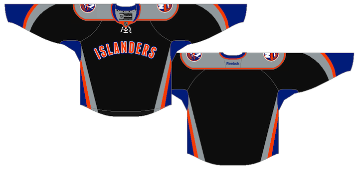
 Leaked photo of Isles jerseyFinally, the announcement we've all been waiting months to hear. When will the New York Islanders unveil their new third jersey? The answer: in 8 days.
The answer came this morning in an online press release from the team, announcing the Islanders Winter-Wear Wonderland event being held Wed., Nov. 16 at the Nassau Coliseum's new team store.
As you know, this jersey has been one of the worst-kept secrets in all of hockey this year, especially since it's currently appearing in printed editions of the River City Sports catalogue. They're reponsible for the leaked image seen here (right).
But that wasn't the first time we saw it. Here's a quick rundown of how the Isles' third jersey story unfolded:
- Aug. 2010 — Isles director of retail operations reveals a new third jersey is in the pipeline.
- March 2011 — Isles blogger Chris Botta confirms a third jersey is still in the works.
- May — A fan with a friend at a sporting apparel store spills the beans, reporting the jersey will be black. I am highly skeptical.
- Aug. 4 — An ex-Isles designer posts a uniform mock-up to his Flickr account. It appears to be the new black alternate uniform. The image soon disappears from the account but lives on forever in cyberspace.
- Aug. 21 — Icethetics independently confirms details of the new look, including features changed from the ex-designer's mock-up (i.e.: white shoulders swapped for gray).
- Oct. 12 — The River City Sports product catalogue is distributed and features official photography of the unreleased Islanders' third jersey.
That brings us to today's announcement. And by the way, if these leaks weren't enough to convince you this jersey will, in fact, be black, why not let the Islanders hint at it for you?

Why else would Michael Grabner be decked out in black? If that's not a hint, I don't know what is. Perhaps it's just the Isles' new Winter-Wear collection? Perhaps not.
 Islanders' 40th anniversary logoFurthermore, there's another point I don't think has been discussed here yet. This is the logo the New York Islanders are using to mark their 40th annivesary season (right).
The text in the circle that reads "celebrating 40 years of Islanders hockey" is set in a familiar font. It's the same font used in "Islanders" on the front of the leaked jersey. It's called Franchise.
The next question you probably have is this: since the leaks have been out for so long and the response as been less than favorable — and the team knows this — might they have changed the design between the leak and next week's release?
I think based on its appearance in the River City catalogue, that would be a clear no. Not to mention the fact that the Tampa Bay Lightning got an earful from fans over their new look, and despite wanting to make some alterations, said it was too late in the process to do so. That was February.
In other words, if the Bolts didn't have enough time between February and October to make changes, how could the Isles possibly have enough time between August and November? That's my take, anyway.

So has your opinion of this jersey changed since the first time you saw it? Because in eight days, it turns from Internet speculation into the real deal.


Reader Comments (55)
Really? When did gray and black enter the Isles' stable of colors? Fail.
seems like wang had a deal on left over jersey's from china . I say it over and over NEW YORK is the fashion capital of the world with Ralph and Tommy living on Long Island cant someone knock on their door. This is like RHL days meets minor hockey . It is a step up to the fish sticks. I got 5 designs way better then this for free mr.wang if you want.
i can tell you that this jersey will indeed have a front, centered number underneath the script. font should be different that the primary home/aways too.
Just watched a video posted by the team about the history of their jerseys through the years... they mention the orange third and how it was the best selling Isles jersey they ever released and how it was bold and that the fans really liked it, you'd think they'd take that into consideration but no... the organization can't even get that right and now we have this POS
Looks a little better in person then in the mock ups, but still... should have been Orange