


Islanders Launching New 3rd on 11/16
 55 Comments
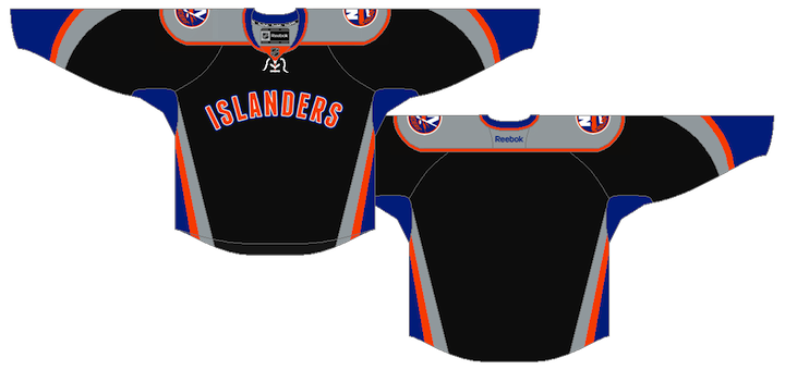
 Leaked photo of Isles jerseyFinally, the announcement we've all been waiting months to hear. When will the New York Islanders unveil their new third jersey? The answer: in 8 days.
The answer came this morning in an online press release from the team, announcing the Islanders Winter-Wear Wonderland event being held Wed., Nov. 16 at the Nassau Coliseum's new team store.
As you know, this jersey has been one of the worst-kept secrets in all of hockey this year, especially since it's currently appearing in printed editions of the River City Sports catalogue. They're reponsible for the leaked image seen here (right).
But that wasn't the first time we saw it. Here's a quick rundown of how the Isles' third jersey story unfolded:
- Aug. 2010 — Isles director of retail operations reveals a new third jersey is in the pipeline.
- March 2011 — Isles blogger Chris Botta confirms a third jersey is still in the works.
- May — A fan with a friend at a sporting apparel store spills the beans, reporting the jersey will be black. I am highly skeptical.
- Aug. 4 — An ex-Isles designer posts a uniform mock-up to his Flickr account. It appears to be the new black alternate uniform. The image soon disappears from the account but lives on forever in cyberspace.
- Aug. 21 — Icethetics independently confirms details of the new look, including features changed from the ex-designer's mock-up (i.e.: white shoulders swapped for gray).
- Oct. 12 — The River City Sports product catalogue is distributed and features official photography of the unreleased Islanders' third jersey.
That brings us to today's announcement. And by the way, if these leaks weren't enough to convince you this jersey will, in fact, be black, why not let the Islanders hint at it for you?

Why else would Michael Grabner be decked out in black? If that's not a hint, I don't know what is. Perhaps it's just the Isles' new Winter-Wear collection? Perhaps not.
 Islanders' 40th anniversary logoFurthermore, there's another point I don't think has been discussed here yet. This is the logo the New York Islanders are using to mark their 40th annivesary season (right).
The text in the circle that reads "celebrating 40 years of Islanders hockey" is set in a familiar font. It's the same font used in "Islanders" on the front of the leaked jersey. It's called Franchise.
The next question you probably have is this: since the leaks have been out for so long and the response as been less than favorable — and the team knows this — might they have changed the design between the leak and next week's release?
I think based on its appearance in the River City catalogue, that would be a clear no. Not to mention the fact that the Tampa Bay Lightning got an earful from fans over their new look, and despite wanting to make some alterations, said it was too late in the process to do so. That was February.
In other words, if the Bolts didn't have enough time between February and October to make changes, how could the Isles possibly have enough time between August and November? That's my take, anyway.
So has your opinion of this jersey changed since the first time you saw it? Because in eight days, it turns from Internet speculation into the real deal.

Reader Comments (55)
That jersey is an abomination. They would've been better off reintroducing the Fishsticks jerseys than that crap.
Note the 4 stripes on the ball cap to indicate the 4 cups.
Chris, if I had a dime for every time you used the phrase, "worst kept secret..."
I'm still not a big fan of it, but I would like to see the final product as far as the lettering and numbers go on the back before making a decision.
After getting so much good will going back to the classic look and colors, this seems like a mistake to me, but am interesting to see this on the ice and will reserve final judgment until then.
Any idea if this is going to have numbers on the front of the jersey like the Stars? Not that I want that, but the space under 'ISLANDERS' looks kinda empty.
If you're going to copy a NY baseball team and not care about how ugly the jerseys are, shouldn't you just make the whole thing pinstripes?
These are awful. The Islanders need an entire new logo, look, everything and I remember a concept that included a lighthouse posted on this site several months ago that would be perfect. I can't think of a single person that would buy this train wreck jersey.
My opinion has not changed. Still awful.
Do not like at all. Black is not an Islanders color. It screams 'Black for Black's sake' to steal the phrase from uniwatch. Hopefully it goes away quietly after being worn once.
the islanders should ban the term alternate jersey from their vocabulary,only on icethetics have i ever seen a decent idea for an islanders alternate and it sure was not a dallas/anaheim knock off like the one they plan to use with the thrown away lightning colors..i have no idea who dreamed this up but they should stop it and start paying more attention to putting a winning team on the ice.
I have a feeling that the numbering on this jersey will be just like the thrashers..
booooooooooooooooooooooooooooooooooooooooooooooooooooooooooooooo! why islanders? you should have gone with a fishsticks orange jersey. withOUT BLACK< TEAL OR GREY! do i make MYSELF CLEAR?
I still think it's awful. I find it hard to believe that this is the best they could come up with, but apparently it was.
You'd have $0.60, Minh. Can't believe how much I overuse certain phrases. Shameful. lol But perhaps I should be saying "one of the worst kept secrets." Let's be honest. That's what they are.
Once again, this is pathetic, it is beyond terrible... Orange would have been the way to go. They won't sell many of these, especially to the "traditional" tastes of the Islanders fans. I think this could be out by next season
I think it's going to look better on the ice than anyone expects.
Still terrible
nope, thats not getting any better seeing it again!!! the wordmark across the chest idea, is just such a lazy bit of design-work, hope the isles didnt pay too much to the designer......
lets hope they see sense and this is just a one season only (bad) idea.
The Islanders would like to introduce the league's newest "Worst Jersey" champion!
Looks like complete crap!! 2 perfect jerseys and they really have to introduce this?? hope they ditch it after this year. Fisherman > black
This is the Anaheim Ducks Jersey with blue and grey instead of gold and silver, and a grey yoke on the shoulders. Then add the thrashers style typeface and you've got a pretty boring and poorly designed jersey.
I am an isles fan and I am saying without this is arguably the worst jersey in NHL history!
Hahaha so this isn't even available yet? I saw this in the River City Sports Catalouge and thought "Wow that is so ugly" but its not even used yet? My advice to the Islanders is to NOT ever use it. This is Bad like the 1990's bad Ducks and Kings jerseys and the ALMOST monstrosity Blues one of the 95-96 year.
I still don't mind the jersey... Although my worry is the amount of space under the wordmark and down to the bottom of the jersey. If you ask me thats a space for numbers on the front of jerseys, and that will ruin it for me personally. If they leave numbers off the front it should be a tolerable jersey.
Also one reason I don't think the design would have changed is because in NHL 12 there is the locked alternate jersey for the Islanders, indicating that they have seen the jersey design prior to the release of the game. Since the jersey design is on the disc it would be the same as we have been seeing the last few months. If the team has submitted the proposed design to EA Sports they obviously have sent it to the NHL for approval. Which means they wouldn't change it since then in my mind.
I'm all for this jersey. It's simple and I like it.
Terry Goldstein are you listening? Apparently not...
It would have be a little better if they had went diagonal with the letters and placed the 40th patch on the upper left. Not saying it would be much better, but better none the less....
Remember when I said that the Connecticut Whale was "Horrawful"? This piece of garbage makes the Whale's identity look like the Red Wings.
SLAM, The 4 stripes aren't to symbolize Cup wins. The Penguins and Blackhawks hats of the same style have 4 stripes as well (fansedge.com). That is just the design of that "Old Style Hockey" brand cap. So don't read too much into the hat design. As for the jersey, matching color schemes with the Knicks and Mets isn't the worst idea in the world; however, I'd have prefered to see an orange based jersey rather than black.
Yep, just awful.
What's wrong with this team's sense of design?
They de-railed with captain highliner and it took them until now to get it back to normal.
Now they're going backwards again with this thing.
I think the Islanders have done what they set out to do... This jersey is sooooo friggin' awful, it's made us forget that the team is moving off the Island in 3 years!
What a piece of garbage...whoever put this wet fart on paper and called it a "jersey design" needs to be fired, post-haste.
(I'm a different Mike than the above poster)
I maintain that with the full circular Islanders logo on there instead of the writing "Islanders", it would have been a better jersey. Still not great, but at least the black wouldn't be quite so overpowering.
I really don't understand why this jersey is getting such bad press. Now, I'll admit up front that I'm a little biased because I think the color combination of black, blue, gray, and orange would look awesome in any design, but hear me out here. I think this jersey actually stacks up pretty well against some other jerseys that we've seen recently, for a few reasons:
1. The striping forms a coherent & symmetrical pattern. It's not a mishmash that looks like two different designers worked on different parts of the jersey independently and then threw their designs together (like, for example, the Sens' previous 3rd, the Flyers' and Oilers' original Edge jerseys, and everything the Thrashers wore in their last few years).
2. They didn't put a silly nickname on the front, like the Sens' previous 3rd and the Lightning's current 3rd.
3. (While we're on the topic of Tampa's 3rd jersey, it also doesn't randomly have an old logo that no longer fits the team's current design suite.)
4. It doesn't have important design elements that can only be seen from the back, like the Penguins' and Senators' jerseys (and the Lightning's original Edge designs).
5. It's not mind-numbingly dull and monochromatic, like the Lightning's current jerseys, the Red Wings' home jersey, and pretty much everything the Maple Leafs have ever worn.
6. It shows some design creativity, unlike the teams who are just dredging up old jerseys from the past (Edmonton, Calgary, the Isles' regular home & away jerseys, Philadelphia, Washington, & Toronto).
7. The striping design is very similar to that of the Ducks' 3rd, which seems to be pretty universally liked.
8. The third jersey provides a nice contrast with their regular home & away jerseys, unlike, say, the Canucks, who managed last year to have four different jerseys that all looked basically the same.
9. Finally, I apologize for piling on the few loyal fans that the Isles still have, but let's be honest... this team is the Titanic right now. Smallest fan base in the league, in the largest market in the league. They need to do whatever they can to attract new fans. Anything that keeps the team in the news is a good thing.
I hate the Fishsticks and I hate this sweater even more! BOOOOOOOO! Don't but this garbage and hopefully they'll get rid of it. What a joke!
I can't believe it, but the jersey is actually uglier than Michael Grabner.
If I was a player in Islanders I'd refuse to play in a game where that jersey is on. I would be happy to take the penalty for that.. It's a fashion statement! As well as a fact that I'd never want to be photographed or filmed wearing horrible garment unless it was for laughs. And I bet they're not trying to go that way in NHL just yet.
I wonder how much Reebok had to do with the design and the BFBS. Bring back the teal!
Awesome! Great jerseys!!!
Go Rangers!
As a Rangers fan, I laugh. No way our winter classics jersey can be worse, even if it's "vintage white".
And isn't blue the new black on NHL jerseys? This jersey should've been done years ago (with a completely different design though) when black was still trendy....
i say this new jersey deserves the gortons fisherman logo holy shiat this jersey is UGLY BUTT UGLY what were they thinking they ruined it !!!!!!!!!!!!!!!!!!!!!!!!!!!!!!!
This jersey...smells like cheese.
This jersey is OFFENSIVE TO ALL FIVE SENSES. It's 2011-12, I find it hard to believe that this is the best that a professional graphic designer could do. That being said, if it is the 'official' third jersey .... I'd have no choice but to believe that this is their way of sticking it to the NHL. It's been reported that the NYI didn't want to introduce a third jersey, while the league forces a few teams to do so every year or so. Makes sense if that's the case.
it atcually looks better on the teaser because you can't see the grey
Still as horrid as the first time I saw it. Once again Charles Wang craps on the fanbase.
The only jersey worse than this one is the Fishsticks nightmare from the '90's. Bring back the orange alternate third jersey from the early 2000's.
I like the wordmark. Wordmarks are an incredibly underused style in hockey. You see them a lot more in the college game, and they look great.
Quite literally everything else about that jersey utterly sucks.
POS!!! POS!!! POS!!! POS!!! I said it before and I will continue to say it over and over and over, WTF was WHO thinking when they came up with this POS!!! You could have put a room full of pre-schoolers in a room with a the Crayola 128 box and their random scribblins would not have been as offensive. If the point of a third jersey is to generate additional revenue, make it a jersey that people want to buy. Everyone loves the Winter Classic designs that come out every year and fans suck them up. When these POS are on the clearance racks for 90% off the $5.00 clearance price, I still wouldn't buy this POS jersey and this coming from a die hard fan who has a Wendel Clark fishstick jersey and a Mike Peca Halloween jersey. The best thing the Isles could do is burn this f'ing POS and put its memory way behind. Or the other way to look at it is, here is the black jersey for the funeral of the Isles. And that is what absolutely scares me the most!!!
Still think it's just an easy money grab for a struggling team. Come out with something terrible, knowing that there are still certain fans who will buy anything, than ditch it in a couple yrs, only to turn around and come out with yet ANOTHER jersey. You'll see... It will all just be a matter of time now before you hear mutterings of ditching this to come out with something else, down the road.
Why is it that everyone sees this as awful, except for the guys making the actual decision to make the jerseys??
Hasn't anyone on the Islanders staff heard of a "focus group"? Seriously, they are worth the investment. If I see more than three people buying this jersey, I'll be surprised.
Jimbo:
I get that it s a money grab, but I'm the primary fan, the target buyer and I think it is a POS. This is not a Yankee jersey, a Packers, jersey, a Lakers Jersey. JT is unfortunately not Derek Jeter, Michael Jordan, Sidney Crosby. This is a crappy looking, third jersey from a second rate team with little star power to back it up. Undoubtedly, Modell's will somehow get stuck stocking an assortment of Tavares, Grabner, Streit and DiPietro jersey's that will languish on the shelves until they finally tear down the Coliseum in 2018 after the Isles are long since forgotten. Personally, I never thought they could top the monstrosity that was Fishsticks, but apparently they have. How hard would it have been to take a nice weather worn blue and slap a lighthouse, or even more appropriately, AN ANCHOR, on the jersey and give it that old school Minnesota WIld third jersey feel. Guess they are going for a re-emergence of old School STRONG ISLAND Freeport/Roosevelt chic!!! Sadly, it almost seems if management doesn't even want the fans to be fans anymore.....