


Leafs Officially Unveil Third Jersey
 23 Comments
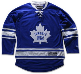 Leafs unveil new 3rd jerseyMonths of rumors were validated last week when the Toronto Maple Leafs new third jersey was mistakenly leaked. Then two days ago, the team made it official.
Last we heard, the Leafs were planning to "officially" introduce the new sweater on October 6, opening night. Instead, they decided to do it a couple weeks early — probably since it's already out there.
Real Sports Apparel in Toronto was the site of Friday's unveiling event. Current Leafs Luke Schenn and Colby Armstrong were in the house to model the new look alongside ex-Leafs Darryl Sittler and Wendel Clark.
The design is based on the jersey that was worn the last time the Maple Leafs lifted the Stanley Cup in 1967. In fact, here's the story as the team tells it:
First introduced at the start of the 1967 NHL playoffs, the Maple Leafs captured the Stanley Cup that spring and went on to wear it for the following three campaigns.
Some of the attributes of the sweater include; a solid, snow white, wool-felt, 11-point Maple Leaf crest similar to the Maple Leaf on the Canadian Flag as the country celebrated its centennial year in 1967, felt fabric numbers and lettering, one set of thin-wide-thin stripes adorning the waist and both elbows, no shoulder patches, and a six-eyelet lace at the front of the neck.
Pants adorned with a new white vertical stripe along the sides will also be worn by the hockey club for games in which the third sweater will be used.
I should use this opportunity to clear up a mistake I made when talking about the jersey earlier this summer. I originally reported that the crest had a silver inner-outline, which it clearly doesn't. The photo I had at the time was causing my eyes to play tricks on me. Turns out its just white embroidery on the wool-felt logo — which in itself is pretty awesome! Now that's what I call retro.
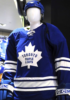 A faceless mannequinThe Maple Leafs also announced their third jersey schedule for the 2011-12 season. It'll be worn on 14 occassions during the regular season:
- Thurs., Oct. 6 – vs. Montreal Canadiens
- Sat., Oct. 29 – vs. Pittsburgh Penguins
- Sat., Nov. 5 – vs. Boston Bruins
- Sat., Nov. 12 – vs. Ottawa Senators
- Sat., Nov. 19 – vs. Washington Capitals
- Sat., Dec. 3 – at Boston Bruins
- Mon., Dec. 5 – at New York Rangers
- Sat., Dec. 17 – vs. Vancouver Canucks
- Sat., Jan. 7 – vs. Detroit Red Wings
- Fri., Jan. 13 – at Buffalo Sabres
- Sat., Feb. 4 – at Ottawa Senators
- Wed., Feb. 29 – at Chicago Blackhawks
- Sat., Mar. 24 – vs. New York Rangers
- Sat., Mar. 31 – vs. Buffalo Sabres
So that's five of the 14 third jersey nigths on the road against Original Six foes or geographical rivals. And if you want to see this jersey in action, seems your best bet is to show up to a Saturday home game.
Oddly enough, the Nov. 12 game against the Senators was one I had initially marked as a Heritage Jersey game for Ottawa based on information not directly from the team. Obviously this is incorrect as you cannot have dark blue versus black in Gary Bettman's NHL. I'm adjusting the Senators' schedule accordingly.
If you check out the rest of that press release, it talks about how the team polled more than a thousand fans while trying to determine which retro design to go with for this season. I'd bet the green St. Pats jerseys were on the list but that no Icethetics readers were polled. Shame.
For more pictures from the unveiling, click here.
Now if you thought that was it for third jersey news today, you were quite mistaken...
Panthers Dying to Ditch Those Blue Thirds
 I always thought the Florida Panthers looked best in red and, despite all the other teams that have added dark blue third jerseys in recent years, I never disliked theirs as much as other people did. Now I find out that "other people" group includes the Panthers' own management!
 Stephen WeissThis is also from last week, but Miami Herald beat writer George Richards quoted Panthers assistant GM Mike Santos saying some terrible things about what have become known as the "JetBlue jerseys" among fans.
The Panthers have brought back their original look by wearing predominately red jerseys at most home games this season. Florida has a contractual obligation to the league to wear its alternate light/dark blue jersey for 13 games this season.
It's apparent this will be the final year the Panthers wear that jersey. Santos is obviously not a fan of the look. He hopes to burn off some of the mandatory dates by wearing the third jersey in select road games. "As soon as we can rid ourselves of those things," Santos said, "we'll be a happier bunch."
The Panthers are going all out when it comes to bringing back the red color scheme. Seats in the lower bowl of the BankAtlantic Center are being reupholstered in red.
"We're connecting to a time when this organization was successful," Santos said. "A big part of that success is the color red. Red is our color, is a Panthers color. It's not light blue, baby blue or all these other silly colors. They have nothing to do with us. We were successful in red and will be again."
Based on this, it doesn't sound like the Stinkin' Panthers will be releasing a third jersey schedule, so we'll see them when we see them. But for the record, they've been wearing them for all of their home games during the preseason. According to Lightning radio play-by-play announcer Dave Mishkin, the team is waiting until the regular season to debut the new red sweaters.
For what it's worth, the Jets are also holding off on wearing their new home jerseys until the regular season. They've been wearing their white jerseys only throughout the preseason. The Predators and Lightning have each been wearing both of their new jerseys in exhibition play.
But back to the Panthers a moment. Since this will be the last season with the current third jersey, we have to wonder how long before they get back into the alternate uniform fray and what direction they'll go. Seems like blue is their best option, but maybe not the two-tone thing.
While we're on the subject of all these new jerseys, I'm already starting to put together new galleries. They'll start getting posted once the season gets started and there are more photos out there. (By the way, if anyone would like to help out with finding decent photos of pre-Edge jerseys, I'd love to expand even more.)
Housekeeping: Jets Contest & IceHL Project
I'll make this part quick. Since no one correctly predicted the unveiling dates of the Winnipeg Jets' logos and uniforms, I regret to say no one won the prize. I'm currently trying to think up another contest so I can give that board game away (preferably to a Canadian).
Also, if you haven't been keeping up with the IceHL Project, now is the time. I just published the IceHL 2011 Yearbook, a free digital book now availble to download here at Icethetics. It's the perfect way for new readers to catch up on everything you may have missed since the project began in 2008.
We have two fantasy leagues going this year, one with our Eastern Conference teams, the other with the Western Conference. But more importantly, you'll be able to get involved when Jersey Design Competition launches later this fall. And as if that weren't enough, we'll be expanding the league by two teams later in the winter or spring. So we'll need all you talented logo designers to help out!
Don't Forget: Winter Classic Announcement
 Last thing, I swear. The NHL officially announces the 2012 Winter Classic from Philadelphia tomorrow at 1:30 PM ET (10:30 AM PT). It's no secret the Philadelphia Flyers will host the New York Rangers at Citizens Bank Park on January 2, but that's not stopping the league from pretending like it is anyway.
The real secret, actually, is the uniforms. In the past, the Winter Classic uniforms have sometimes been unveiled at the press conference that announces the event. That wasn't the case last year, but I don't recall there ever being a big press event at Heinz Field last year. I could be wrong about that. (Bad memory, you know.) But either way, both the Penguins and Capitals waited until October to unveil their throwback jerseys last year.
This time around, there's a bigger question about the uniforms. We all know the Winter Classic is used as an excuse to make money and new jerseys mean more of it. However, neither the Rangers nor Flyers have made a lot of uniform changes over the years, so we may not see anything dramatic this time around.
Having said that, let's not forget that the Penguins' 2011 Winter Classic jersey, while based on historical elements, was a brand new design. Similarly in 2010, the Bruins designed a new look that incorporated certain features from past uniforms.
It's entirely possible that either one of the 2012 opponents (or both) could simply rewrite history and sport retro-style jerseys that are unlike anything they've ever worn before. Hopefully we find out tomorrow.

Reader Comments (23)
Do we know for sure the Jets are saving the home jersey for the regular season? They've only played 1 home game so far, and it was split squad with a road game in Columbus at the same time, so it may have just been easier for them to make up one batch of jerseys with names and numbers and split them up later than to wait until the rosters were set before personalizing the jerseys. Having said that, the road whites look a lot better over shoulder pads than they did in the unveiling.
Chris, you're eyes weren't playing tricks on you. I've been to Real Sports and the ACC since the unveiling and saw the jerseys in person. There is in fact a silver outline, although it's very feint. Hard to tell in a picture.
As a Panthers' fan, I'm pumped that they are going to rid the team from those horrific jerseys. It's not even like there's a South Florida franchise that wears that color combo (black and red for the Heat, teal and orange for the Dolphins, black and teal for the Panthers), because there's a TAMPA-based team that wears it (Rays). At least now the management is realizing just how much they failed with that jersey (not as much that it was navy, but that there was no red AND that it meant that, in 2 dark jerseys, there was no red jersey).
Just a sidenote, there was a big event at Heinz Field last year. I seem to recall Crosby and Ovechkin shooting wrist shots through the goal posts at the announcement (could be wrong on the players).
aoystreck: I want to say I read something about team management wanting to hold at least one jersey for the regular season. Makes sense it would be the home one. Wednesday and Friday are listed as home games. Should find out for certain then.
Justink: Are you sure it was silver? Looks like white embroidery to me. On the felt logo, it does make for an optical illusion.
How about just changing the colors of the Panthers 3rd jersey. Its still a nice jersey
I find it so strange that only the 'n' in TOROnTO MAPE LEAFS is lower case. Does anyone know why this is?
My memory agrees with Drew. I remember Knuble shooting off a ramp to try to spit the uprights.
Matt H: No idea. That's how it was on the original '67 jerseys, though.
I can't wait to get my hands on one of my own, though. I've been begging for that jersey to be re-released for a while now.
@justink, I was also at the unveiling. There's no silver outline. Sorry dude :-)
The embossing on the outside is white. It's a bit shinnier than the rest of the Leaf.
@Matt H: The "m" is in lowercase as well, I would suspect that it has to do with the font they use. The font is pretty condensed and using upper case M & N's would make it harder to read if it used the same width. Just a guess though.
That lowercase n bothers me too!
I have a soft spot in my heart for that retro Leafs jersey; it's always bugged me that that logo was hardly anywhere to be seen on any Leafs merchandise for decades, and poorly and inaccurately recreated the few times it did appear (like on the 1967 team Tribute Night jerseys). The lower case letters in the logo are a nicely offbeat touch; note that the 'm' in Maple is lower case as well. Why? Who knows...it was the sixties, man.
I was hoping the Panthers 3rd jersey was going to be the current home, its got a nice classic hockey feel to it that I love. I like it much better than the red (though the red is better than the old dark blue).
thought they were unveiling the WC jerseys today?? guess not. just looked at the winter classic press conference on tsn, looks like the philly players were wearing the usual home orange jerseys & rangers were wearing their usual road white jerseys......
At Heinz Field, they had a huge presser. Mario, Texas Ted, Sid, Oven chicken, Knuble... They were all there. I remember the outline of the rink in the middle of the grass, and there were 60 foot banners with the Fat Penguin in a Scarf and the caps throwback colors.
And the trend continues, the Sabres keep getting to see every 3rd jersey.
Are there numbers on the sleeves of the Leafs' new alternates?
Also, their pants have a thick white stripe down the side which hasn't been shown in any photographs yet
Can we stop with calling those letters lowercase? Are they smaller than the other letters? No, they're not! Therefore, they're NOT LOWER CASE! It's just the dang font, which was popular in the late 1950s and throughout the 1960s. There are plenty of other fonts that do similar crap! Get over it, people!!
Sorry, that's just been a huge peeve of mine lately. You'd think people have never seen capitalized diminutive forms ever before in their lifetime...
That said... I'm glad the Panthers want to ditch that third as soon as possible. It's so far removed from their own identity that it should never have been greenlighted in the first place. The only worse idea for a third (regarding team identity) was the Stars' "mooterus".
@Rob
It IS lower case. A lower case L (seen here: l) is just as tall as a capital letter O (demonstration: lO), but is still lower case. An upper case L looks like this: L. For comparison, here's a look at an upper case (N) and lower case (n) letter N.
Okay, sorry, the sarcasm probably wasn't called for. I just felt like having some fun. :)
The Blue Jackets use a similar font where their N's are lower case in the jerseys but are just as tall as the rest of the name (see: Rick Nash jerseys). I like it for Columbus, who is a modern team, but I'm not particularly fond of it for the Leafs. HOWEVER...it actually is historically accurate, which is really all that matters.
I'm kinda warming up to the Leafs new third. It does look fantastic, but I think it would stand out even more if the regular uniforms didnt feature lace-ups. It's way too much........FTR I miss their old third already. Can't they have four jerseys? Speaking of which it's gonna be a darn shame to see the Canucks throwback go away this season. Loved that one.
Reebok really needs to come out with a good looking collar that isn't a laceup. Those long Reebok V-necks collars are so ugly. If they just dropped the strings and eyelets from the regular lace-up jerseys they would look so much better.
That Panthers 3rd is only off because of the colors. They joined the Blue Jackets, Blues, and Predators with the same color combo.
In needs more red in it. I love the circle Chest logo though, with the face of the Panther. Nice logo overall.
What about the Toronto Dec. 3 date in Boston. Wouldn't that be Dark blue vs. Black also?
Mike, they plan these nights in advance. So obviously for the schedule road games, the home teams have agreed to wear their white uniforms. It's not uncommon to see the home team in white from time to time so fans get a chance to see their team wearing it.