Winnipeg Jets Uniforms Unveiled
 Tuesday · Sep 6 · 2011 | 9:40 AM PDT
  159 Comments
  Winnipeg Jets officially unveil uniforms / Jets
They're here. The Winnipeg Jets officially unveiled their uniforms today. I don't really have a lot to say on the matter at this point. Give me a day or two and I'll get back to you with my thoughts on it.
 Back of new Jets jerseys / CBCThe unveiling ceremony was held this morning at 11 AM central at 17 Wing in Winnipeg and was well-attended by local media. You can read more details about the design in the club's official release.
A few pictures have started turning up on Twitter, so that's all I have to share at the moment. I'm sure it won't be long before we have something more official from the team.
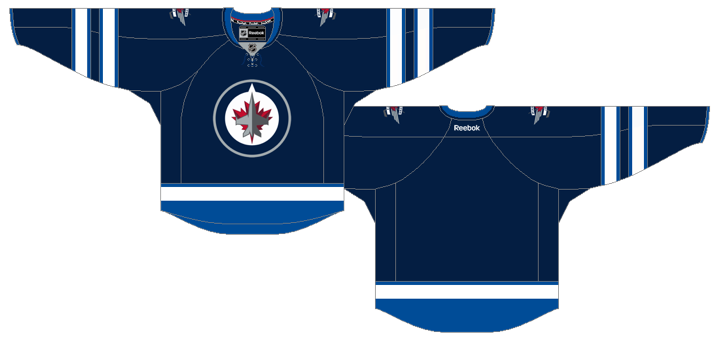
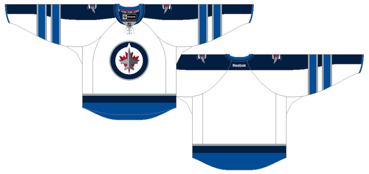
Both jerseys feature a unique double-striping pattern on the sleeves that hasn't been seen before on Reebok Edge jerseys in the NHL. The number and letter styles are also new are very modern.
Like I said, I'll get into my analysis later in the week when I have a little more time to dedicate. For now, feel free to share your thoughts on the new jersey designs. I'm sure we're all curious to see how they're being received.

 Chris
Chris
Now a closer look at those new Jets threads.
Home jersey

Road jersey
 Now what do you think?


Reader Comments (159)
I must say, I'm ok with these. I was honestly afraid of worse, especially with all the hype they'd been building. I do prefer the home jersey to the away jersey though. The road sweater just seems to have a bit too much going on. The home darks look cleaner. I'd give these an 8/10 overall. It's something the fans will go crazy over and wear proudly. Now begins our speculation for the third jersey they said they're bringing in next year.
Sourly disappointed!!
The double sleeve stripe is a little strange to me, but my biggest quarrel with this is that the blue sleeve stripes on the road jersey look way too out of place. there just isnt enough use of that colour to justify such a thick stripe, let alone two.
And the jerseys them selves as a whole, boring...
Maybe they will look better in action, heres hoping
Nice. Gonna get me one of those. Maybe even two. I love the two sets of full stripes on the sleeves of the road jersey.
I will buy a white one, but I can't say as I'm a huge fan of either jersey as whole. Especially considering I was expecting something totally different after the RCMP seized the fakes. The away jersey's should've cut the blue outline off at the shoulders, and the home jersey's should have a white shoulder yolk to match the away sweaters. Overall, not impressed, but again, I will buy a white one. Its the better looking of the two.
I think the numbers look cool. I think It would have been better if they had kept the light blue as the primary so they have some contrast with the pants we have seen earlier. There are some good ideas with these sweaters, but the colour choice is a bit bland and cold. Is it not bad enough that Winnipeg already has a reputation as a cold and desolate place. Flash some colour to brighten our days. With a full season to test these maybe the Jets and True North will make some adjustments to sharpen things up a bit. Still not the worst uniforms ever.
meh.. alot of hype for nothing it seems...i think the bigger story is why big buff isnt here for the photoshoot
Not too bad. I like the variation on the blue throughout the jersey. Would have prefered the Jets wordmak on the front with the logo on chest as shoulder patch.
I like a lot about them, but those are just about the most boring colors they could have chosen. I was really hoping the lighter blue would be the main home color; at least that's a LITTLE more different from the half-dozen other blue teams in the NHL.
Also, the fact that the aways are white with a navy yoke and sleeve stripe, just like Columbus', doesn't help them not look like Columbus.
So much for them 'looking nothing like' the concepts and counterfeits that were out there. They're not bad, but they're pretty boring, which is disappointing. These could have looked much nicer - see some of the awesome icethetics concepts.
At first I was a little disappointed with the jerseys. Then, when I got a close up view of them, I started to like them. Not too happy with the number font though, I was expecting them to use the one they've had on their website header since the beginning. Nevertheless, they're beautiful. Who knows what the third jersey will look like if/when they make one.
It's got 1992—1997 Whalers look to them, for the darks anyhow. The logo being what it is it's hard not to see is as minor league feeling... not even sure what to say about the white jersey's thrasher ish blue trim on the arms, kinda sticks out a little too much for my taste. With the time and money True North have putting in to bring the NHL back to the peg they could have done alot more in my mind to build there brand, which starts from the logo up, everthing to with the design just looks AHL to me rather then NHL.
Meh! OMG, Are circle logos and ties the NEW black
Hey Chris, looks more like the waist stripes follow the hem (like Tampa and Florida) rather than straight across.
Of course, it would look better straight...
I'd say Christopher, Trent, and Ryan all had better designs than this.
I got to say, I absolutely LOVE THEM! Nothing like I expected, and I am very happy about that because it came as a pleasant surprise! GO JETS GO!
Honestly this whole rebrand has been a big disappointment. As a graphic designer and religious hockey fan, I couldn't wait to see the new logos and jerseys when Atlanta announced it was relocating. I saw it as a huge opportunity for the franchise to rebrand itself with something timeless and simple (much unlike that typographic trainwreck of a logo they had before). Yet they came out with what looks like a completely unfinished mark and stuck it on the front of something that resembles a prototype of the Columbus Blue Jackets' third jerseys.
Not great, but good.
Amazing they're the only team with the style on the whites that realize the stripes CAN go the whole way around
I think they're awesome. The double stripes are cool and unique. These more than made up for the bad logo.
Good stuff brah!
Not bad...the "fakes" weren't too far off...but I still give it a thumbs up!!
I can't get past the logo. I don't like it.
Those knockoffs weren't that far off were they? I like the white away jersey but the solid blue is a bit dull. Still not a fan of the primary logo as it looks like something you would use in EA's NHL Video Game list of stock logo's for creating a new team.
They're okay -- pretty middle of the road relative to other designs that have come out recently. Look basically the same as the Florida, Nashville, Columbus, and Pittsburgh alternates from the past few years. Would have been great to see their home jersey with a gray base instead of "polar night" blue.
Do not like the double striping on the white jersey. Too much going on there.
Crappy. Seriously, Garbage Jersey's.
i like the home jersey but i don't like the road jersey. the solid blue sleeve looks awkward to me with the two forearm stripes.
Boring. They won't sell big outside of Winnipeg.
ahh...why a cf-18? maybe something more canadian like the avro arrow?
all in all i'm glad they're still the jets and are playing in winterpeg!
I can't emphasize enough how much I hate that accent blue. I ruins what could otherwise be passable jerseys. Now they're both boring AND ugly. Even those Chinese knock-offs from a few weeks ago were better than these. I do like the name and number font though.
meh... they're okay. Not great, but not bad either. Looks a bit on the bland side, to be quite honest, and I don't really think that the light blue adds anything to the jersey. Maybe if they went with a bit more red or gray it'd stand out a bit, but mostly just a forgettable jersey that you probably wouldn't remember for good or bad reasons.
They look pretty good! Number and name font is sharp. Certainly an improvement over the sweaters as the Thrashers.
Also, I really dislike using italicized fonts for names and numbers. Who came up with that?
i these are great, especially the shoulder/arm stripe on the white jersey. I've always loved that kind of design.
I have come to the conclusion that no matter what they did, many of you still would not have been happy. I don't exactly know what you people expected? If they had of went and did something totally wild I would be reading something about "How Reebok is ruining the NHL" or "How they completely missed the mark", etc. If so many of you don't like it, I suggest you write up a resume and get jobs designing jerseys for the NHL. The only thing that might bother me about these jerseys is that the home should have more silver worked into it somewhere... But now I'm just nit-picking.
Truth of the matter is they that came up with a clean design that doesn't feel like a complete eyesore. At least it can actually be passed off as a hockey jersey, and we didn't get stuck looking at horrible designs among the likes of: The Thrashers, no waste stripes, a bunch of vertical lines like Calgary, Colorado, Nashville (up until this season), arched wordmarks, a buffaslug, and so on.
All I can say is at least the new look seems to be getting embraced quite well by many Jets fans (the people who are actually associated with the team). And I've got to say, as a Canucks fan, Winnipeg is pretty damn lucky!
Not going to please all of the people all of the time... but I like 'em. If I were to get one, I'd yank the lace out of the collar, though.
The double-stripe pattern is curious, since to me it resembles the late-70s North Stars' sweaters. Having them go over the stripe down the sleeve on the white jersey is a little odd, but not unforgivable.
I quite like the blue ones. Clean, simple and classy. I don't like the white ones at all though. I don't like the striping, pretty much everything from the shoulders down is gross.
Excelent unis - only thing is the odd elbow striping on the white jerseys. It's ok though, and this will be less noticable when the players have their gloves on. Overall I give them an A-
pretty sweet. definetely on my list of jerseys to get!
Seems like Winnipeg as a whole, went for a very comfortable re-entry into the NHL. Reading through these reactions, and those to the logos, there seems to be a general, "good not great" vibe. Lets really think about it here though, did we think they were going to reinvent what a jersey was? Did we really expect them to come out with the best jerseys in the league? I say for them to introduce something that fits in, gives them an easy transition back into the league.
AWFUL!....uber-modern and just plain stupid. Where is the red? This new "Jets" team should be fined for killing the identity of a once proud red, white & royal blue fan base.
I think they should have added more silver to the home jerseys.. overall i like them !!
I like them, but the home jersey reminds me too much of Columbus.
I get that they were going for the classic old school jersey, but so many teams look like this. I was hoping they would put more work into it.
I like the fact that the hem of the jersey is light blue to contrast with the navy pants. Overall, they are ok. I'll reserve final judgement until I see them live on the ice.
The jerseys look great and with the detail they added they look much better than those 90's Vancouver Canucks sweaters that the knock-offs resembled. I have never been a huge fan of white jerseys, but imo these white jerseys add a touch of something new and look great. I can't wait to get my order in for one of each color (mainly the blue during the regular season and the white for the white-outs we'll be enjoying late into May/ June!) Top 10 in the league!
Go Jets Go!
Hmm. The home is passable, but I hate this never-ending obsession with lace up collars. The road? Nope. They've ruined it with the schizophrenic sleeves.
I think it's a damning verdict on the design staff involved with this that the counterfeit jerseys were genuinely much nicer, sleeker and well... jet like. The knock offs would have been a good match with the real font, which is the high point of this reveal for me.
A bit disappointed in them and as a European with little care for the logo "controversy", I have to say they laid the military stuff on far too thickly today.
Love the new jerseys. Sure its another blue jerseys in the NHL but what can you do when a lot of the teams are using blue but the Jets found a way to make these colors their own with the jerseys. Like the old and new mix. The white road jersey has the stripe down the sleeves like the old jets jerseys do.
I've noticed something in the photos that is not up on the templates of the closer look at the jerseys and that is the lighter blue stripe around the very edge of the sleeves.
I like the Home, but I don't understand the blue on the sleeves and then the horizontal stripes over the blue on the roads. Why do jersey designers continue to try this style? It never looks right. Either go with the horizontal stripes across the sleeves or striping down the sleeves - but not both.
the blue is awesome. 10/10. but the white i feel is take on the maple leafs of the 70's and 80's with extra sleeve stripes and extra colors. i give it a 5/10. but overall not bad
Meh.
Ok, looked at them, went away, came back & looked at them again.......and yeh i think both designs are ok, nothing amazingly original about them & it certainly looks like blue is the new black in the nhl.
i prefer the road / white to the home / navy jersey, again having different designs for home / away is something that really grinds my gears, would have preferred to see a grey (or lighter blue or white) yoke / sleeve design on the navy jersey so that they match OR just not have the blue yoke on the white jersey.
overall i'd give the white jersey a 7 / 10 & the navy jersey a 6.5 / 10. oh & the numbers should have had a red outline.