Winnipeg Jets Uniforms Unveiled
 Tuesday · Sep 6 · 2011 | 9:40 AM PDT
  159 Comments
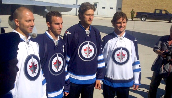
  Winnipeg Jets officially unveil uniforms / Jets
They're here. The Winnipeg Jets officially unveiled their uniforms today. I don't really have a lot to say on the matter at this point. Give me a day or two and I'll get back to you with my thoughts on it.
 Back of new Jets jerseys / CBCThe unveiling ceremony was held this morning at 11 AM central at 17 Wing in Winnipeg and was well-attended by local media. You can read more details about the design in the club's official release.
A few pictures have started turning up on Twitter, so that's all I have to share at the moment. I'm sure it won't be long before we have something more official from the team.
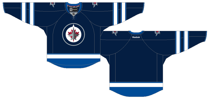
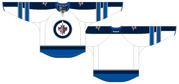
Both jerseys feature a unique double-striping pattern on the sleeves that hasn't been seen before on Reebok Edge jerseys in the NHL. The number and letter styles are also new are very modern.
Like I said, I'll get into my analysis later in the week when I have a little more time to dedicate. For now, feel free to share your thoughts on the new jersey designs. I'm sure we're all curious to see how they're being received.

 Chris
Chris
Now a closer look at those new Jets threads.
Home jersey

Road jersey
 Now what do you think?


Reader Comments (159)
I wasn't impressed by the logo, but I'm really digging these jerseys.
From a distance the Red Maple leaf makes it look like the Jet has been shot by a missile. Kaboom!
The saddest part in all of this is all trace of the Manitoba Moose jerseys are gone. I almost wish they would have gone with the Moose moniker - those were some sweet jerseys.
I love these jerseys and will most likely be getting myself a road one!
i have spent a long considering and reconsidering these jerseys. at the end of the day, when all elements are considered....it appears....that......they are disgusting.
the uber-modern name and numbers with the old-school tie up neck?...ech
the full sleeve yoke with double intersecting stripes??? aegh
the color scheme that's identical to that of jerseys recently released by the columbus blue jackets, florida panthers, pittsburgh penguins, and put team name here, all which were met with dismay upon arrival.
plus i agree with whomever said it above that there is no need for so much pandering to the air force. their is no historical link between tis hockey team and the air force detachment in winnipeg. yet there in the middle of the crest and are kind of filling the void that exists because this team has no history, no "personality/culture/aura" or whatever you want to call it.
Honestly those jersey are so PLAIN and BLAH ..... nothing is coming out if it !!!!
They are not even grwing on me .... like TB did ;)
Not enough red .... and EVERYBODY are using the same color scheme ...... its very poor from reebok !!!
Matt: I don't see what's wrong with using the city's air force heritage to fill the 'void' you speak of. Every new franchise (and this is effectively a new one) starts off without any historical links and has to brand itself in some way. They need to create their own starting point....unless you would prefer them to retain the Thrashers brand and identity, which would be just too odd.
TNSE has had a relationship with 17 Wing for awhile, with their military appreciation nights. You have CFB Winnipeg there along with several flight training schools and 3000 personnel. The team happens to be named..the Jets. We have Minto armory, streets named 'Valour Road', and statues of soldiers at Portage and Main. It seems logical to connect the dots and go with this branding.
To me the jerseys look fine. They look like a traditional hockey jersey - horizontal stripes, solid colours. Modern font. They aren't much of a deviation from 75% of the jerseys out there. My only criticism is that they're a tad generic. But 'disgusting' is a bit of an overreaction imho.
OK, I finally feel the need to set the record straight on something, and it's based on a perception, that in actuality, is false.
1) Number of teams that use dark blue as their primary jersey color (before Winnipeg) - 2 (Buffalo & Columbus)
2) Number of teams that use two shades of blue in their primary color scheme (before Winnipeg) - 0
3) Number of teams that use two shades of blue in their uniform scheme (including third jerseys) - 3 (Pittsburgh, Florida, and Columbus)
If you want to talk about a color being overdone in the League, how about this offender, red with 10 teams using it as their primary jersey color - Calgary, Carolina, Chicago, Detroit, Florida, Minnesota, Montréal, New Jersey, Ottawa, Washington - two of which (Minnesota and Ottawa) have their uses being considered (imo) inexcusable.
There is absolutely nothing wrong with the Jets new logo, or uniform scheme, which uses a palette that no team in the League is currently using on a full-time basis.
jrzman: I agree. Red would probably have been met with an equal or greater amount of criticism. I think people are just hoping for something different nowadays other than red and blue, which are pretty much the most common colours in sports aside from white. Oranges, greens, yellows can look sharp if used right. There is nothing wrong with the Jets colours - it's just that a lot of people are jaded.