New Sweaters with Ties to Tampa
 Saturday · Oct 13 · 2012 | 11:38 AM PDT
  16 Comments
 With no Tampa Bay Lightning hockey to follow at this point in the fall, I'm a little lost and turning to the minors for comfort. And it just so happens the Bolts' AHL and ECHL affiliates are sporting new uniforms this season. So let's have a look.
 Photos from Rochester Americans and Syracuse Crunch official websites
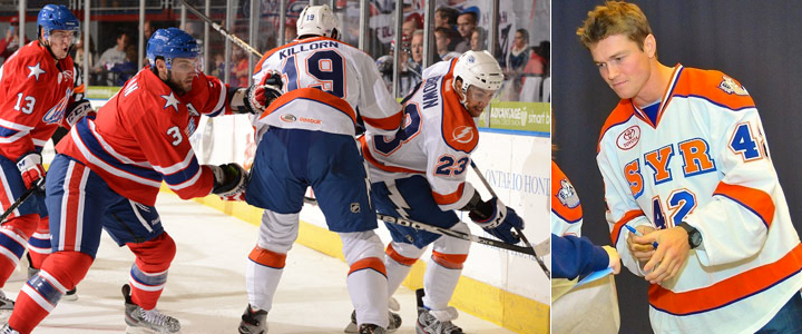
It happened with the Norfolk Admirals a few years ago and now it's happening to the Syracuse Crunch, who opened their season last night wearing not quite what you'd expect. For a team that just unveiled a very blue logo this summer, I'm surprised to still see so much orange in their uniforms.
But who knows what goes on behind the scenes with these teams? It could very well be that the rebrand happened too late in the game to get the uniforms completely overhauled. (Plus, they probably still have a lot of orange gear leftover that they need to sell, right?)
What's cool: The lightning bolt down the pants. Crunch players are actually wearing the same pants as their NHL affiliate. (You can even see the NHL shield on them in the photo above.) This is useful for two reasons. For one thing, it ties the branding of the two teams together. But more practically, players who are getting called up already have a key piece of their gear in tow.
What's not cool: The white Lightning logo over orange on the right shoulder. Someone at SME has to be shaking their head over that. I would've at least used the blue bolt if the shoulders had to be orange. Which brings me to my other point: Why not make the shoulders blue? These are obviously not recycled jerseys. They're new, with the blue piping added all over the place. Fix it.
That's all I have to say on Syracuse for now. Their home opener is tonight so I assume we'll get to see the other jerseys. I'll add photos as an update to this post later on.
 Photo from Florida Everblades (Facebook)
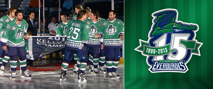
Also this season, the ECHL's Florida Everblades are celebrating their 15th anniversary along with their 2012 Kelly Cup championship. You can see both represented in the photo above as the team hit the ice in their new green anniversary sweaters and raised a special banner last night.
By the way, that Blades game was also the first time that expansion team Orlando Solar Bears hit the ice. You can see what their uniforms looked like in action for the first time on their Facebook page. The Orlando Sentinel also has a neat side-by-side shot of both teams' uniforms.
Interestingly, both of these games required extra time to decide. The Everblades won on a goal 26 seconds into overtime while the Crunch fell to the Rochester Americans in a shootout.
 Chris
Chris
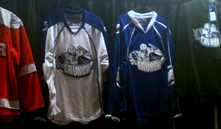
Turns out, the Crunch were just wearing an alternate jersey on Friday night. We know that because on Saturday night, they unveiled their actual home and road jerseys. They look like this.
 Photo by Jeremy Houghtaling (@JGHoughtaling on Twitter)
You'll note that the alternate jersey in this photo is the opposite of the white jersey the Crunch actually wore on Friday. That means they actually have four different uniforms in their arsenal this season. Seems a bit excessive. Is the attachment to orange all to do with the university?
I'll leave you with a look at the new white jersey in action.
 Photo by Scott Thomas Photography
Two sidebars. 1) Check out the 75th anniversary jersey the Hershey Bears are wearing! (That means four jerseys for them too, because they unveiled home, road and alternate sweaters with their rebrand over the summer.) And 2) Does anyone know what the standard is for AHL uniforms? Do they usually wear white at home or on the road? And does it switch midseason like it does in the ECHL?


Reader Comments (16)
The Syracuse Jersey is actually not the official jerseys they will be wearing. They are unveiling the new duds tonight at home. I know someone who saw them and their base color is blue.
Jared: Interesting. So was this just a one-off design so that they could do the unveiling at home? Or is it maybe an alternate jersey? Haven't been able to nail down a lot of details on the Crunch.
Good question, I heard its just the preseason jerseys but it was the design they used as an alt last year minus the blue.
Yea they had a variation of that jersey last season with the Ducks. It's inspired by the Phoenix Suns jersey and has orange on it because of the Syracuse University Orange... They probably figured they could sell some orange Crunch jerseys to basketball fans in the area. I know they were unveiled at some point during the basketball team's 20 games winning streak to start the season last year. I hope Chris is right and they have some Blue Lightning style jerseys for tonight. I've seen the orange ones before.
Also, the Syracuse University sports teams are known as the "Orange", so that may be part of the motivation to maintain a certain amount of orange in their jersey.
The jersey they wore last night in Rochester is the jersey they unveiled last season. It was black and orange and was a "tribute" to the past history of Syracuse hockey. But also last night in Rochester, the Amerks unveiled a red jersey. They had been with out a red jersey for a few good years only using white and blue.
I wondered why EA put that orange shouldered white jersey in the game. It is sad they couldn't have the real Crunch jerseys in the game. Go SU Orange!!!
The AHL typically wears white at home and dark on the road. Some teams wear dark 3rd/specialty jerseys.
Also, the Bears 75th anniversary jerseys are 1 time use (once home-once road) jerseys that will then be auctioned off
In the AHL, the home team wears white and the road team wears dark. If the home team wants to wear a dark alternate, they have to get permission from the visiting team so they can ship their whites with them.
AHL is white at home, dark on the road. Like the NHL a few years back, that also changes when the home team wears a dark third jersey. As for the switching, I dont believe they switch midseason. Pretty sure teams were wearing white at home in the Calder playoffs last year.
Yes, AHL wears white at home and colors on the road, this of coarse changes if the home team has a colored third. But they usually wear white at home, and color on the road, all season.
The green anniversary Everblades jerseys were only worn for opening weekend. They were auctioned off after last night's game. The will be sticking with the same jerseys as last year.
Another thing to remember is that there's a lot of single or limited use jerseys in the AHL, unlike the NHL. The Wilkes-Barre/Scranton Penguins typically go through about 6 or 7 designs a year (home and road, a new main alternate every year, a holiday jersey, a St. Patrick's Day jersey, a military/public service jersey, and a special occasion jersey or two (such as a breast cancer jersey last year)). The home fans in WBS may see the home white jerseys only 15 times a year.
I do have to wonder if the AHL will eventually switch to the home dark color scheme soon, as the amount of alternate/special occasion jerseys has gone through the roof the past couple years.
It's interesting someone brought up the Ohoenix Suns' jerseys with respect to the Crunch. I've always felt as though there were quite a few NBA logos that would be ripe for hockey jerseys. The Bulls, Trailblazers, Hawks, Hornets logos (i.e., not their lettermarks) all seem perfect for the front of a sweater.
The Ducks sold off old Crunch used practice jerseys with the "ice monkey" logo all last week at their team store for $20, as well as Ducks used practice jerseys. Got me a white Matt Beleskey Ducks Jersey. What a deal!
I have to know, do people in non-traditional hockey markets actually LIKE the "no logo, city abbreviation, big numbers on the front style"!? Every time any team from any league does something like that SYR orange jersey I get a little mad. Coming from a very traditional hockey market myself, every single one of those seems to border on hockey blasphemy... Am I out to lunch on this?