


Thursday
Jun212012
Branding the 2012 Draft Parties
The 2012 NHL Entry Draft opens in Pittsburgh tomorrow. With that, a number of teams will be celebrating with their fans. I've never understood why teams feel the need to brand their draft day parties with special logos, but every year we always get a few.
Here are the ones I've tracked down for this weekend.
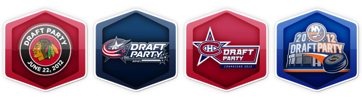
The Chicago Blackhawks, Columbus Blue Jackets, Montreal Canadiens and New York Islanders are all promoting their draft day events with specially-designed logos. I don't really have anything more to say about them, but the blog was getting a bit stale.
Update on Friday · Jun 22 · 2012 | 11:45 AM PDT by
 Chris
Chris
Chris
Looks like I nearly missed the Winnipeg Jets' draft party logo. Thanks @aoystreck.


Reader Comments (9)
The Isles are getting pretty good at this whole draft party thing!
And we all know that there was someone within each of those teams who were paid a very pretty penny to create those.
Because other than Chicago, what the hell else do any of those franchises have to celebrate this year? ;)
Hey, they have to keep the graphic designers working I guess, right? ;)
As a Ranger fan, it pains me to say this....but the Islanders logo is the best of the bunch, so far.
I know a couple of years ago a few AHL teams had draft parties as well. I think that it might be more amusing of an event at that level as there is a good chance of seeing some of the picks in the 2nd-4th rounds at that level the following season. I know when we hosted one, there were lots of excited fans as our parent club (Blackhawks) had just won the cup. Does anyone on here ever go to these events? Is it worth the effort to put together a logo for them? I'm curious if anyone has anything on the draft and related events to share.
The Canadiens one looks unfinished, why does the bottom left point on the star not have any red like the other 4
I love the Islanders' logo the best even though the Blackhawks' is classic
dylan is right. the missing bit on the canadiens star is weird.
and the islanders definitely just picked up their first postseason win since 2007.