


Providence Bruins Update Logos
 14 Comments
The parade of new minor league logos this summer continues with the AHL's Providence Bruins, who made their updated look official on Monday.
The new primary and secondary marks have been in use on the team's alternate jersey since 2010 and the upgrade is a welcome change. And it's all about simplifying the club's look, which is derived from its NHL affiliate, the Boston Bruins. Presumably, that third jersey will become the primary dark sweater now alongside a new white one.
The new secondary logo is based on the mark used in Boston since the Bs' 2007 facelift.

Founded in 1992, the Providence Bruins are celebrating their 20th anniversary. Perfect time for a sharp new identity. Even if it isn't completely original. Here's a blurb from the press release:
This new logo also represents a fundamental shift in focus for the Providence Bruins brand towards a more traditional, “old-time hockey” look and feel. This move coincides with the 2013 Dunkin’ Donuts AHL All-Star Classic, hosted by the Providence Bruins the weekend of January 25-28, which also reflects the new direction of the team’s visual identity.
Ah, yes the 2013 AHL All-Star Classic. We have the logo for that, too.
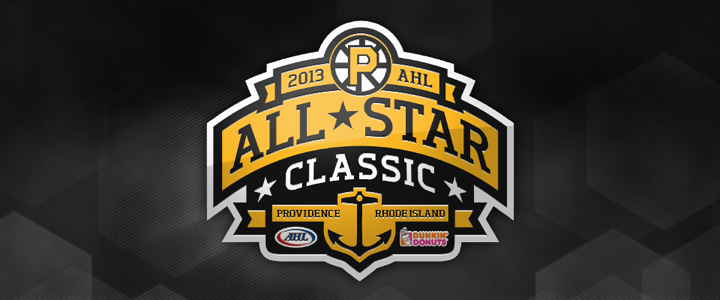
No surprise it features the Bruins' new refined spoked P logo. It's a really nice All-Star mark, actually. Too bad it had to be marred by a corporate sponsor who's colors are neon orange and hot pink. So how do you feel about the new look of pro hockey in Rhode Island?

Reader Comments (14)
Well the P-Bruins are actually sponsored by Dunkin, and play in the Dunkin Donuts Center. So, the DD logo is also on their jerseys.
I like the update. It's simple and basic, but really isn't that much different than what they have been using.
In my opinion, This logo would better fit the Boston Bruins than the one they currently have. (Of course completing the "B"). The current one has too many lines and serifs and all. Probably won't happen but I would like to see Boston change to this eventually. Nice job here.
The All Star Patch looks great except for the sponsor logo. I get that they pay money to be seen and to help with the costs of holding an event such as the All Star Game, but they could at least give one concession to not having the dunkin donuts logo spoil the look of the Patch.
Odd. The center, vertical spoke is not even aligned. The bottom section is more left than the top portion. And I never liked the gap in the lower right portion of the logo. I understand the need to mimic Boston, but it just looks weird to me. I don't think a P works very well in the spoked wheel. They should use the secondary logo instead.
All-star logo is ok. Other than the crappy DD logo, I would lose the anchor. Yes it's Providence, and there's always some type of community symbol in these logos, but I also feel it's overkill.
Anybody else bothered that the vertical spokes are misaligned?
No originality at all. That's what I hate about the minor leagues. Some teams feel they need to copy their major league affiliate's logos.
I like it but the vertical spokes don't line up correctly and looks weird.
Both look great. The P logo is nice and sharp. Very simple. And there's everything about the classic Bruins logo on the bottom. They take after their parent club, and do a very nice job of it.
I like it. And the All-Star Mark is great too, though I would prefer for the DD logo to be primarily yellow. Doesn't bother me that much though.
Three simple logos that should go above PLATINUM to TITANIUM, exactly what a hockey logo should be. No confusing ones (Buffalo's black, red, white slug), but something like what the Yankees wear, simple, unique, classic with the interlocking "N-Y".
I like the makeover. The simplified logo looks sharp (while I like the current, more detailed Bruins logo, too) and the switched colors work great.
The vertical spokes look weird to me, too, but they were already arranged that way in the previous logo. Does this have any hidden meaning in Providence?
@Greg: I'm always confused if I should like the farm teams "connecting" their identity with the parent club, or if its just uninspired artwork.
In fact the lack of originality was way worse in the 90s. Today, besides Providence, we've only got the Texas Stars, Worcester Sharks, WBS Penguins, Binghamton Senators and Albany Devils. (with Binghamton and WBS having rather individual logos). That's 6 out of 30.
In 1994 for example, the AHL had the Adirondack Redwings, the Binghamton Rangers, the Cape Breton Oilers, the Fredericton Canadiens, the Hamilton Canucks, the Saint John Flames, the St. John's Maple Leafs AND the Providence Bruins. And that were 8 teams out of 15, with only Cape Breton making a pathetic attempt of creating an artwork that goes beyond "adding the city's name to an existing NHL logo".
Not to forget honorable mentions like the PEI Senators, Utica Devils, Capital District Islanders or the Binghamton Whalers.
@Greg The bottom line is that connecting Providence to Boston as the Bruins puts 8,000 to 10,000 in the seats every night, as well as makes them the team that helps every other AHL club in New England put butts in the seats when they come to visit. Same with the Pawtucket Red Sox. Just smart business. Obviously if they were affiliated with anyone else they'd likely be called the Providence Reds.
@Mr Morrison. You are right. It was way worse in the 90s than it is now. I will say Albany didn't even try in coming up with an original logo or team name. And I find it funny how Worcester recycled San Jose's old logo.
Well the first time the Devils were in Albany, the team was called the River Rats. When the Hurricanes decided to move thier affiliate to Charlotte, the Devils moved back to Albany. I was hoping they would keep them the River Rats, but called them the Devils for some reason.
nicely done!!! i like it very much