New Sweaters Around the Minors
 Monday · Jul 30 · 2012 | 11:26 AM PDT
  11 Comments
 One after another this summer, teams across the minor leagues have been overhauling their looks. We've mostly been focusing on logos lately, so today we're switching gears. Check out some of the new jerseys that have been recently unveiled.

On Friday, the ECHL's Wheeling Nailers not only unveiled new sweater designs, but a revamped logo and color palette. Most notably, red is no longer one of the team's primary colors.
The Nailers' have been red, gold and black for as long as I can remember. But beginning in 2012, they switch to black and gold, just like their NHL affiliate, the Pittsburgh Penguins. In fact, their new home and road uniforms look awfully familiar.
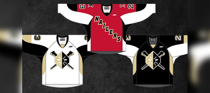
The new dark jersey (right) was actually introduced as a third last season. It gets the full-time treatment this fall along with a white version to match. Of course the red isn't completely disappearing. The Nailers will wear a red alternate uniform (center) which features the old logo on the shoulders.
A bit of a downgrade here, if you ask me. Shrinking the color palette often provides a cleaner look, but in this case, it just sort of flattens the Nailers' logo. As we've seen with the Penguins, Vegas gold is just too bland to be a team's only color.
For those not familiar with the ECHL, teams wear white at home for the first half of the season and switch for the second half. The Nailers say the red jersey will be worn on Sunday afternoons at WesBanco Arena.
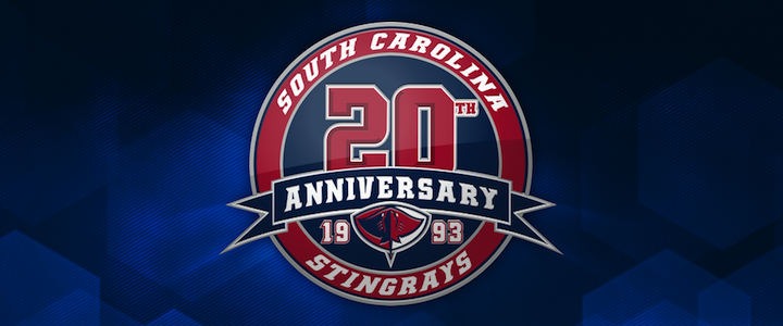
Elsewhere in the ECHL, the South Carolina Stingrays unveiled their 20th anniversary logo along with a pair of new jerseys for 2012. The North Charleston-based club made the announcement on May 31.
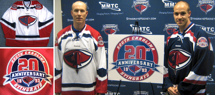
The Stingrays have done it right. These are some great-looking uniforms — even if the anniversary logo is a little too busy. Fans should be thrilled to see them hit the ice this fall. By the way, if you find yourself needing to add one of these to your collection, they're available.
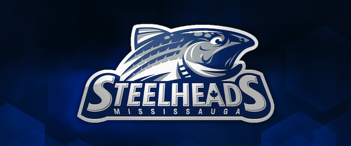
And finally, the OHL's recently rebranded Mississauga Steelheads officially unveiled their uniforms last Friday. Here's a closer look at their new secondary logo.

And they'll look a lot like the nearby Toronto Maple Leafs when they hit the ice.
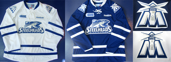
If you need a recap on where this team came from, see this blog post from May 31. Before the name change, the Steelheads were known as the Mississauga St. Michael's Majors.
Now what do you think of all the new threads hitting the lower leagues this fall?


Reader Comments (11)
Nailers: Looks like someone is giving that silly SF Bulls' designer more work. Very amateur.
SC & Steelheads: Sharp looking stuff though.
I wish Steelheads had tried something new. Toronto area hockey is swimming in those jerseys (pun fully intended.)
The Steelhead's secondary logo is great, except for the window in the middle of the lighthouse tower. If only the Islanders could come up with something similar.
You are missing the Saginaw Spirit's Thirds.
here is a link to it
http://news.sportslogos.net/2012/07/25/ohls-saginaw-spirit-unveil-new-thirds/
Note on Vegas Gold: back in the CCM days ('02-'07), the Pens' jerseys actually had a metallic gold; when RBK took over it basically turned to a taupe or sand color. The dulling of the color combined with the shift from slick chevrons to lumpy pit-stain patches of "gold" was a pretty big downgrade for the Pens. That said, even the old Vegas gold had nothing on the gold from the Lemieux era...
The Steelheads jerseys aren't bad or anything but I've never been a fan of junior or minor league teams copying NHL jerseys. IMO the Majors third jerseys last season ranked up there among the best uniforms in sports so it's very disappointing to see them go from that to a very unoriginal knockoff of the Maple Leafs jerseys.
Are those Stingrays jerseys really only $45 from the team online shop? Extremely tempted to order a blue one at that price.
James O.: Before you get your hopes up, you might want to read the fine print. It's $45 to reserve a jersey. Another $50 when you pick it up. Note the full price for the jersey is actually $95.
Steelheads jereys are SHARP.
Stingrays are nice ecxept the logo sits way too low and the reebok symbol on the chest is idiotic...
so the nailers just rip off the penguins design and the steelheads just rip off the maple leafs. where is the creativity?
The steelheads will only be wearing the look alike Leaf sweater for the one year according to the OHL website.