


Penguins Unveil Stadium Sweater
 28 Comments
Jersey utilizes same template as others from Stadium Series
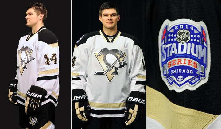
Just as they promised, the Pittsburgh Penguins unveiled their 2014 Stadium Series jersey this afternoon. Compared with the other Stadium sweaters we've seen so far, this one is the most similar to its team's existing uniform set.
No alternate colors. No alternate logos. Just more of the same. Only slightly different.
 Photos from Pittsburgh Penguins
I will say I like the black and Vegas gold better as distinct stripes than as amorphous splotches across the sweater. So I'll give them points for that. And I won't take away points for the similarities to the other Stadium Series jerseys. Reebok wants a template. Reebok gets a template. Hard to fight that battle.
But at least we got another new collar design. No laces for the Pens.
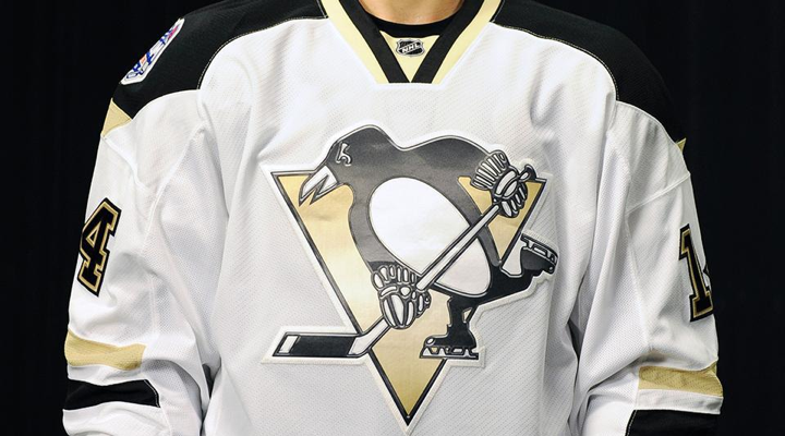 Photo from Pittsburgh Penguins
Where I will take away points is that crest. Combine the silly chrome Photoshop effect with the screen printing process and all you can do is shake your head. At no point should professional hockey players be wearing anything screen printed on their sweaters. And I think that's just a universal law.
Here's a look at the back from a few different angles.
 Video stills from Pittsburgh Penguins (composite)
I haven't seen a really great shot of the pants and socks yet, but what we have seen suggests it won't be a big deparature from what the Islanders, Kings and Ducks are doing.
The Penguins visit the Chicago to play their third outdoor game on March 1 at Soldier Field. By the way, we're still waiting to hear when the Blackhawks will show us their Stadium look. (No way they'd share the spotlight with Pittsburgh.)
So what do you think of the newest Penguins jersey? And what do you expect from the Hawks?

Reader Comments (28)
I really like the straight hem at the bottom of the jersey. I hope that is a sign of things to come for RBK Edge jerseys.
Its an upgrade over the current sweaters other than the crest. The Trib in pittsburgh has a blog that says the 91-92 sweaters may be the new alternate next season. The link is below.
http://triblive.com/mobile/5243728-96/orpik-penguins-boston
Yes, just yes. Great to finally see a new modern take on the Pens identity for the first time since freakin' 2007. Those jerseys that are basically colorswaps of the current Sens' and 2007-2011 Bolts have got to go. They're one of the most obvious surviving reminders of how the Edge almost completely ruined hockey jerseys. Templates, piping, the weird hanging hems, and the death of many unique and outstanding jerseys, such as the Avs, Stars, Senators, and Lightning. But thankfully, they've been improving as of the past few years, so I will complain no more.
I'm firstly saddened to see that there's not a sign of the Robo-Pen, or any homage to the era at all. It would've been nice to have this as a shoulder patch, at least. Oh well, when it does return one day, I will rejoice.
I originally thought this photo was going to turn out to be triangle yoke stripes. But, it turns out to be, lo and behold, what's this? Not only is the hem itself straight on the front and back, but pointed inwards at the sides? What is this? This is like...the replica jerseys (A bit hard to see, but look at the bottom left of the jersey, you can see the side hem is cut in a slightly similar way, albeit for the Pens jersey, the original is intended to like that, so who knows. Also, those who own replica Edges like me know what I'm talking about)! This is the most interesting unexpected take I've seen from these series of jerseys so far...and heck, who knows, we still have a few more to go. In any case, I like it. But I'd rather it not stick around, I hope it's only a one time thing.
I really like the Pens color scheme. It's not their better, classic black-n-gold, but it is unique, and looks pretty slick to say the least, and just screams modern. And I like how it works on this jersey. Classic striping, and a shoulder yoke that reminds me of both the new Flames alt, and the Bruins.
And, that collar is nothing new. The Oilers currenty use that collar, and I really hope it catches on. The generic one that the Pens and nearly every other team uses is kind of growing on me, and so are the laces. With new types of collars being introduced, it can be implemented amongst different teams to change up their look and add variety to the jerseys, especially to those whose home/aways haven't changed since the beginning of the Edge era, like the Blues, Sens, Devils, Blue Jackets, Canadiens, Blackhawks, Red Wings, etc. The collar the Oilers and this Pens jersey use actually seems a lot pre-Edge-esque than the generic one. It reminds me of the old V-neck collars, my favorite jersey collar style, personally, and are one of the best ways I can imagine de-Edging the Edge jersey, possibly.
That's all this guy's got to say on this sweater. I'm excited to see them in action at Soldier Field (on TV, of course, those tickets sold out in a day!) against the Hawks.
And speaking of which...Chicago and the Rangers are the two that I think are going to be the most interesting jerseys out of the whole bunch. And I say that because there hasn't ever been a modern take on jerseys with these classic logos on them. Sure, the Rangers have had a truly-shouting modern take on their identity, which turned out amazingly, but the actual Rangers logo is nowhere to be in sight (the one you see on the shoulders is slightly altered), but that's a different story. As we've seen so far, the theme for the Stadium Series is generally modern. And there's no doubt that the Rangers and Hawks are going to use their primary logos on the front of the jersey (New York for the first time since 2003-04 for the Vintage program, before that 1978), so who knows where they'll be going with this. I expect a red or black jersey from Chicago, since it obviously won't be white. But will it have similarities to the red or black jerseys they've been wearing currently/recently? I don't know...it feels weird, the idea of seeing these classic logos on modern-esque jerseys. I'm excited.
I actually like this jersey a lot! The only improvement that comes to mind would be switching the yoke colors, make the bigger area the vegas gold. The black reminds me too much of the Bruins and also the 90's white homes had the pointy yoke in the traditional gold back then. Overall, I'd say a pretty solid jersey asides the Reebok Stadium series design gimmicks!
thats actually much better than the current road jersey, just needs the normal logo on the front instead of the shiny / plastic RBK thing. only problem is, using the same template as the other teams, sorry, but thats just very very LAZY designing!!
So Cookie-Cutter! Dissapointing.
Swap out the gimmick screen printed crest for a real pro tackle twill one, slap on a either a robo-penguin shoulder patch (or something new) and I can live with this jersey. Make a black version and ditch the current cookie cutters.
Huge pens fan, however this was a big disappointment. They could have done a modern twist on the much sought after 92' yellow jersey. To me it looks like if the boston bruins just released thier poor attempt at a third jersey. Change the crest and it would work for them. Hoping that Trib article is true.
These look incredibly similar to what Wilkes-Barre has changed their uniforms to, this season.
I personally like when NHL/AHL teams share uni-designs.
One can only hope the Pittsburgh makes a dark version of this and uses them as home/away kits going forward from this season.
I hate that the Penguins are using the same template as someone else.. again. But on the other had if this was a unique jersey, I would take it everyday over the current set, I like how the colors work on this.
That's not exactly a new collar design. The Oilers have used it on their current home jersey since 2008, although I believe their stripes are a bit thinner.
I only have a couple issues with this jersey. First, I hate the numbers... that's more of a complaint about the Penguins in general and not the use of the elongated numbers. I'm not a huge fan of their number font to begin with, and the fact that they're elongated on this jersey makes it look terrible. And I didn't notice it until just now, and this is more nitpicking than anything else, but the fact that they don't use the elongated numbers on the sleeves irks me. I can't think of any other uniform in the league that uses different styles for the numbers on the back and the sleeves. (Several teams use a different style on their helmets, most notably the Canadiens, but that isn't noticeable to any fans actually watching the game)
But as for the actual jersey, I hate the waist stripes. I don't really know how to explain it other than I hate how the stripes are aligned to the shape of the jersey. As far as I'm concerned, the stripes should always be one continuous stripe all the way around the jersey, not this diagonal stuff. I'm sure it will look much better during real in-game action, but it looks horrible in the still photos.
And also, this "arm stripes that don't wrap all the way around" thing really needs to stop. It looked horrible when the Oilers did it, why does Reebok think it will look any better now? And I don't want to hear anybody blaming the template. Reebok could make a template that allows stripes all the way around the arm. (See: almost every other jersey in the league)
As a whole, these Stadium Series looks haven't been very good. So I'm already preparing myself for all the outrage for the Blackhawks' uniform for this game...
Not a Pens fan, but I really like the jerseys except for the elongated numbers.
I really don't understand how anyone could want to rehash those old 90's jerseys. Yes, they won 2 cups in them, yes I personally had 2 of them. However, things need to move forward and progress. Yea I definitely like this design as compared to their currents, and I would definitely pick one of these up.
I also find it funny on other sites, that people are calling the Pens lazy for this design. If you read the top section, as well as from the previous Stadium unveils, it says that Reebok wanted a template. Don't know how much say each team could really have if that is the case.
@ Cramer, I agree with you on the fact that Yes this jersey is better than what they have now but I disagree on the move forward and progress idea! That kinda idea produced the Pigeon logo during the '92/'93 season, LOATHE that logo! IMO Det and Chi have the best uniforms ever! Why? Because they are simple and they have barely changed over time! IF Baldwin woulda kept his grubby hands off of the Pens uniforms ('91/'92), they may have become a classic, not saying they would rival that of Det or Chi but......
I don't dislike it, but I don't especially like it either. It's a lot less obviously different than the other three SS sweaters we've seen, and I think the Pens' Vegas Gold color scheme is one of the least striking in the league. Can't win 'em all.
Zzzzzzzzzz
I am NOT a Pens fan, though I live in Pittsburgh, but the design lover in me really thinks these are much much better than the current set of uniforms they have. My only complaint, besides the chrome logo that nobody seems to like on any team so far, is that the stripes don't wrap around the arm. I, too, would've like to have seen a snazzy twist on the Flying Pigeon style uniforms, but these could be a lot, lot worse (the Islanders' SS uniforms are atrocious). And to be fair and not come off as a Pens hater, I am a diehard Red Wings fan and I hate their Winter Classic uniforms with a passion, especially since their first Winter Classic uniforms were so, so amazing.
Boy, the Penguins sure fooled me. I thought this was going to be a Vegas Gold jersey. That would have been a nice change for a one-off game but I'm glad they went with a white jersey instead. I must say, I'm impressed. I've never been a fan of the Vegas gold, even though the pre-Edge look wasn't too bad but I don't mind it on this jersey at all. In fact, I think the chrome logo actually helps the look because it brings a bit of the metallic look from before 2007 back and in this case I think that's a good thing. The chrome logo actually looks quite nice on this. As for the uniform, unlike their current jerseys, this has some life to it even though I think they need to go back to the early 90's or late 70's. I like this better than their current jerseys. If they switched to something like this, it would be an improvement even though I think the early 90's Stanley Cup jerseys are my favorite Penguins jerseys. I must say, I'm surprised with how many people on here that like the Robo-Penguin logo. I thought that the vast majority of people hated it compared to their current logo. I use to absolutely love that logo when I was younger. I think it was a decent logo when it was used but when I look back, I'm glad they went back to the skating Penguin because even though I think the Robo-Penguin is a nice logo, it looks like a corporate logo to me. I don't know what it is but when I see it reminds me of something a corporation would use.
I'm a lifelong Penguins fan. I've come to loath the current set of uniforms because they are just bland and cookie cutter. I am a fan of Vegas gold. It's a cleaner look. Though I'll always have a soft spot for the 91-92 uniforms. I even can stand the robopenguin, today. Though this is very similar to the other Stadium Series jerseys I do like it. I like what they did with the collar (I already love the Oilers look). They don't have the cosmetic laces. The jersey is far more balanced than what we have as a home or away jersey. The only other negative is the logo and that we don't have a new secondary logo or robocpenguin on the shoulders. I get it, but I'd love to see what this looks like with a real penguins crest and a new secondary logo/ robopenguin. And is it me or does the penguin logo look a bit small? Maybe the Bruins can sue us for the jersey design like they did our colors?
This new template is atrocious. From the hem to the stripes to the shoulders. I really hope this is a one and done deal, because if this is the direction hockey jerseys are going I don't think I'll ever buy an NHL jersey ever again.
I like it, but every time I see it my first thought is "Boston Bruins." Still a great design, though.
This jersey isn't very bad, but it isn't very good either. I'm glad it's only going to be worn for that game.
This is a fairly harmless jersey. Very much the product of the Penguins being offered a template and not being creative with it. Brings nothing new to the teams identity, takes nothing away. I expect a similar lack of experimentation from Devils, Rangers and Hawks.
Wasted opportunities unlike the Kings, Ducks, and Islanders who did something new while being given a template.
I really love this jersey. I feel like the Penguins are one of the teams that needs to fix what Reebok did to them when the Edge template was first released. I would love to see a black version of this jersey and have it become the new uniform from here on out. It's a modern look that at the same time feels traditional that isn't something easily pulled off.
Agh, forgot to mention in my post, this jersey, mostly the hem stripes, reminds me of their 2002-2007 white jersey.
The horizontal striping alone makes this colour scheme work and this is far better than their current jerseys. Do I love everything about it? No, but it is an improvement at least so let's not expect miracles. Bottom hem is very weird, as is the gold striping on the shoulder yoke. It looks unfinished. Other than that it's the same nuances I don't care for as all these stadium jerseys - angled sleeve numbers, elongated back numbers, cheesy and tacky screened crest and those atrocious half stripes on the sleeve. Not perfect but not bad either. 6.5/10
These look like those cheap jerseys you can get at Canadian Tire.
After seeing the NYR jersey,the white underarms on the Pens one look like crap as compared to maybe black,other than that, meh...