Frozen Frontier Sweaters Shine
 Sunday · Dec 15 · 2013 | 5:44 PM PST
  29 Comments
  All photos by Micheline Veluvolu
AHL's Americans and Monsters meet at Frontier Field
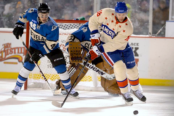
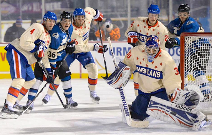
The first outdoor game of the hockey season happened Friday night in Rochester, New York. The Rochester Americans hosted the Lake Erie Monsters in a game with a very distinct look. In typical outdoor fashion, the opponents sported throwback jerseys.
The Amerks were dressed to look like they did back in the late 1950s. The Monsters, meanwhile, took on the look of an even older team that preceded them in their hometown of Cleveland — the Cleveland Barons.
A photo gallery posted on the Amerks' Facebook page allows us to enjoy the aesthetics of the game in all their splendor. I recommend spending some time there.
What do you think? Are you over the throwback trend? Or is it a welcome relief from the onslaught of modern Olympic and NHL Stadium Series jerseys?


Reader Comments (29)
One word...amazing!
I was at the game the other night--they look fantastic!
Loved both of the jerseys. It was also a hell of a game, minus the fact that I feared for my toes making it through haha.
The Amerks jerseys have red numbers on the back with that blue bar extended around under the numbers. Because the game was played on a minor league baseball field, the TV cameras were extremely far from the ice and, combined with the artificial lighting, it looked like big brother had struck through all their jersey numbers with a gigantic marker, making it impossible to tell the players apart.
As a person who braved the 18 degree weather through the OT and shootout I can personally say that everything looked gorgeous on the ice and around the stadium, we even lucked out with fresh snow in the outfield ... as far as the sweaters and all future throwbacks, ENOUGH with the "vintage white" it has completely lost its luster and I am definitely over it
Rochester's goalie looks to have the darker blue pants and helmet to match the chest stripe, but everyone else looks just a shade 'bright'. Otherwise, a fantastic look for both. Much prefer these to the chromified Stadium Series sweaters that are coming out!
Amerks always have such great sweaters.
Awesome! Simply awesome.
Even the monsters' goalie is sporting the rustic tan gear. What better way to honour the teams of the past, by wearing those amazing uni's every once in awhile.
I will never be "over" the throwback look. It's how hockey is SUPPOSED to look.
Im over the throwback thing.
In general, entertainment needs more new ideas, and needs to stop the endless recycling of old ideas.
Gorgeous looking throwbacks give them a 10 out of 10...love throwbacks done right.
Doesn't 'classic' imply timelessness? The throwback look can be overused, but never tired. I agree with Drew, it IS how hockey is supposed to look.
both are awesome. i think i like the cleveland ones a little better. the circle A for the asst captains and the large uni numbers on the front are really cool. somehow, the uni numbers on the front for those look 1000 times better than more modern ones like on the san jose jerseys.
Love the look for Lake Erie. very nice of them to embrace the Barons history.
Best part? Rochester got away with zero sponsor patches and LE only had one small patch... suppose they were trying to make up for the dumb name "2013 Rochester Area Honda Dealers Frozen Frontier Presented by Labbatt"
I hate retro jersey's for the most part, but those Cleveland uniforms are awesome.
Wow, AHL jerseys are usually so bad. These are gorgeous!
Here's a quick look at the back of the Americans jersey and sort of Lake Eerie's too: http://i.embed.ly/1/display/resize?key=1e6a1a1efdb011df84894040444cdc60&url=http%3A%2F%2Ffarm8.static.flickr.com%2F7377%2F11360630074_a345541680_z.jpg&width=490
I definitely still love the throwback look, I will say that I am tired of vintage white and would like to see some throwbacks down with plain white. I think they would still look great and it would get away from the over-use of vintage white which is beginning to feel a tad too gimmicky for my likings.
The throwback look itself is great.
But vintage white on the Cleveland jersey with regular white socks bugs the crap out of me.
I thought both teams looked great. I like the use of throwbacks, the outdoor games are a special event and what better time to embrace and honor a team's history or even a previous team's history. I would love to see the Sabres in another outdoor game sporting the old Buffalo Bisons uniforms.
Look at the Matt Hackett picture... Is he wearing is uncle's mask? (Jeff, who played for the Canadiens?)
Did nobody else notice that the Monsters' socks were plain white and therefore did not match with the "vintage white" stripe of the jersey? Kind of a half-hearted effort, that...
I was all set to buy tickets, but had to back out due to family reasons. However, I did watch it on the Time Warner Sports Channel. Definitely looked great. Of course, the Amerks haven't had many bad jerseys throughout their history. I have a couple of "Star-and-Bars" jerseys that I love.
Love it, except for the whole vintage white thing. Cleveland is gorgeous.
I didnt like the numbers on the front shoulder (I feel that way on EVERY jersey) but the were awesome with that old tyme hockey feel
While vintage white is wearing out it's welcome, it should be noted that the Amerks' jerseys they were throwing back to were actually that color.
http://www.amerksboosterclub.com/images/56-57home.jpg
I think both of these jerseys are quite nice. The only thing I hate about the Monsters' jersey is the ridiculously huge Captain Patches and the front numbers as well as the white sock stripes while the jersey stripes are off-white. As for the Americans, that Vintage White jersey is a 10/10. It would be an 11/10 in my opinion if it was white instead. That jersey would have looked far better if it was white instead. As I said, both jerseys are very nice, especially for an Outdoor Game. Also, I heard that the Rangers are supposedly unveiling their Stadium Series jersey sometime this week.
Wow, those have to be the best set of throwbacks I've seen in a LONG time! Would buy both jerseys if they were available for retail. Only real knock I have are the large (and odd) numbers on the front of the Monsters' jerseys, but I totally dig the assistant A (and presumably captain's C). Fact that their socks are white and not 'vintage' white seems strange too. I could see how the Amerks' rear numbers might look difficult in less-than-HD quality video, but I still think they're absolutely fantastic!!
The Amerks sweaters were done right. The only difference between them and the 1957-59 wool-blend originals is the sleeve numbers. On the originals the numbers were in Royal Blue and appeared on the left sleeve only. And the sock stripes worn with the originals were Red-Blue-Red, just the reverse of what was worn. Still a perfect look. There are too many minor league hockey jerseys today that look like they were designed by a 10-year-old. But when your team changes looks every few years what do you expect. In their history the only Amerks "bad" sweater was in 1971-72 when they were forced to wear variation of then-parent Vancouver's "stick-in-a-rink" logo. Brutal.
When local Rochester ownership bought the team back in 1972-73 the iconic shield logo was back. Nuf ced!