


Rivermen, Raiders Unveil New Logos
 22 Comments
Peoria's new SPHL team reveals logo, uniforms
On Saturday, the latest incarnation of the Peoria Rivermen franchise — now a member of the Southern Professional Hockey League — officially unveiled its logo and uniforms.
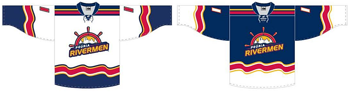 Peoria Rivermen new uniform designs (via Facebook)
I briefly went over the history of the Rivermen in Friday's post. The new look came just a day later via the club's new Facebook page, where they also posted the progression of Rivermen logos over the years.
 Rivermen logo progression, 1984—present (via Facebook)
The branding efforts are an attempt to capture history and tradition of the Rivermen franchise which has existed in some form for nearly 30 years. That's quite a run. For a deeper look, I recommend this article from Dave Eminian of the Peoria Journal Star. The write-up mentions that the logo and uniforms were designed by Carie Hanawalt.
The old Rivermen franchise of the AHL was recently purchased by the Vancouver Canucks and will no longer play in Peoria. So there will be a new name and a new location for the team at some point but nothing has been announced yet.

WHL's Prince Albert Raiders start "green movement"
The other big logo unveiling last week happened in the Western Hockey League. The Prince Albert Raiders decided to highlight their green and introduce all new logos and uniforms.
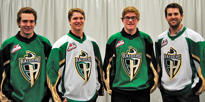 New jerseys modeled at Raiders unveiling (via Facebook)
Take a good look at those jerseys. They're Reebok Edge, but a brand new template we've ever seen. Factor in the colors, and what are the odds we're looking at the next Dallas Stars uniform with a different logo on the front? It was an IceHL GM, Mike Kelly, who first mentioned this via Twitter. And I have to agree.
Then again, it would be surprising for a couple of reasons. First, if Reebok is going to go out of its way to generate an entirely new sweater template, why would they do it for a junior league team. It's more likely that it'd be for an NHL club — like Dallas. But then if all that is true, why allow the junior team to hold its unveiling first — three weeks before the NHL club?
It could be a simple solution, like maybe Reebok works up new templates every year — some of which may or may not end up in use in the NHL. It could just be a way of expanding their own product line. In any case, it's something worth talking about.
What's your take? Both on the Raiders' new look as well as the possibility that they're a preview of the Stars' redesign. And how about the new Rivermen?

Reader Comments (22)
Odds of it being the next Stars uniform? Zero. Nada. No chance in hell. Tom Gaglardi has repeatedly asserted his desire to build a uniform with a classic look. No way he's approving any sort of travesty that is remotely similar to those uniforms. Just racist they're green and gold doesn't mean they're even likely to be the Stars' next uniform.
Is that also a new collar design on the Prince Albert jersey? I don't think I have seen one like that before on an Edge Jersey.
On whether or not it could be the new Stars jersey, I wouldn't doubt it for a second. Or complain about it. They are very Stars-esque jerseys, and there is lots of green. Can't wait to see what the actual Stars are.
I think the Rivermen logo transition is similar to that Golden Seals concept we saw a while ago, A classic logo, trying to be stylish, trying to make it look more like a hockey logo then switching to the modern version of the classic look, sort of reminds me of Buffalo or Vancouver but more that Seals concept.
Looks like the new collar on the Raiders kit was taken from the updated NHL practice jersey templates we saw in 2012. Currently there's a blank spot in the center where the NHL shield would go for the Dallas jersey.
The Rivermen jerseys are real nice. I'm glad that that creative hockey jersey designs aren't dead, there's still hope. Other than the small resemblance to...*shudder*...the Fisherman...I think it is an overall good jersey. Here's to more jerseys like this in the NHL.
Holy crap I love the Raiders' new sweater. The template is great, the colors are amazing (green/black/gold are my favorite colors). Overall, I would like it a bit better if the sleeves extended as shoulder yokes. Other than that, it's a pretty awesome jersey, I'd love it if these were the new Stars jerseys.
I think with the Rivermen moving to one of the lowest minor pro circuits, they could pretty much do anything and get away with it. Nothing more than an expanded shoulder patch in my view. As far as the potential new Stars uni, I have to give this one a thumbs down. Hockey is about tradition, and all the vertical sleeve lines with heavy gold presence are busy and not something that's going to hold over time. Look to this being 'downgraded' at some point when nobody is running stripes up their sleeves. Although they may have copied the Leaf's colors, you have to hand it to the Lightening; they went with simple, clean and timeless. This new uniform is busy, choppy and will look Mickey Mouse in 5 years. Fail.
That new jersey probably won't last long, to me it emulates the new fisherman Isles jerseys.
Finally two teams that got it right. The Rivermen went with a change but didn't go drastic, kept it classy, and aesthetically pleasing. Love the white jersey of the Raiders. Very cool logo too.
I actually think the New Rivermen's logo looks great! I am impressed for once. The Jersey looks good too. I am glad they have the straight horizontal lines on the shoulders. For some reason I am not minding the squigley lines, I think because they are consistent across the hem, unlike I think the Fisherman's jersey and other's, replicating water.(If I remember right)
As for the PA jerseys, definitely not a good look. I really hope these are not similar to a new Stars jersey. That would be horrible!! and would put the Stars down to the bottom of the league in terms of jersey's!
I noticed that the new Prince Albert Raiders jerseys feature the Reebok practice jersey collar, which makes me believe the jerseys are largely of the newer Reebok practice jersey template, which is rather odd if you ask me. just compare these new PA Raiders jerseys to the modern NHL Reebok practice jersey.
@Drew Tom Glagardi? I'm assuming he's a part of the Stars' marketing staff or something? And, by classic look, did he mean, if you know his intentions, Stars-classic (as in resembling their older sweaters), or classic as in classic in general (Canadiens, Rangers, anything 20's-70's-esque)?
I am really quite impressed with what the Rivermen have come up with. The squiggly lines to me are one of those very rare exceptions where strange striping actually look quite nice. As for the Raiders, I am not impressed. I tip my hat to them for going green, no pun intended :p but, they could have done much better. The Raiders' last set was far better and they had two black jerseys and of course a white road. If they wanted to go green, they should have brought back those early 90s Northstar-based uniforms instead.
The template on the new Raiders' sweater almost resembles the template the Sabres used for the Slug jerseys. I don't think this is the route the Stars go. From what has been said (the timeless, original six, classic look) I think that it will have more horizontal stripes and be a lot less busy.
Absolutely LOVE the Prince Albert jerseys and logos.
Looks liket the Raiders logo was influenced by pokemon....
http://www.google.com/imgres?q=pokemon+black+and+white+shield&um=1&sa=N&hl=en&biw=1920&bih=877&tbm=isch&tbnid=j3kkxSvjXjzfYM:&imgrefurl=http://www.gamesmediapro.co.uk/pokemon-tcg-black-white-plasma-freeze-in-stores-from-may-8/&docid=3imP36zvWRKlCM&imgurl=http://www.gamesmediapro.co.uk/wp-content/uploads/2013/03/Pokemon-Black-and-White-GmP-Gaming-image-plasma-shield.jpg&w=2894&h=4093&ei=cICbUYaND6fL0QHn24DgBA&zoom=1&iact=rc&dur=1&page=1&tbnh=133&tbnw=94&start=0&ndsp=48&ved=1t:429,r:3,s:0,i:92&tx=50&ty=80
I agree with drew the owner of the stars seemed to stress designing something that was classic NHL like Canadians, leafs, wings, devils etc. I would be stunned if he ended up with something crazy modern like that for the next stars jersey. In any case I would not be upset if the green and gold and perhaps white instead of the black were used as the colors.
Sure hope that isn't the new stars jersey as like a previous poster said it would be at the bottom of the league along with the kings in my opinion.
Rivermen logo is beast. Much better than the captain. Encouraging kids to chew bad things as well. {Look at the logos]
that practice jersey collar looks really bad without the NHL shield logo. Id like to see the WHL design a new logo to fit the rbk collars like the NHL.
that practice jersey collar looks really bad without the NHL shield logo. Id like to see the WHL design a new logo to fit the rbk collars like the NHL.
The Raiders template looks like the NHL Practice Jerseys template
That collar reminds me of those All-Star jerseys from the last two times it's happened. I actually like the Raiders' new look, but hope the lettering and numbering won't be worse than what they had with the previous set.
One of my favorite and best logos of NHL, Absolutely impressive.