


Sharks Signal "Next Wave" of Jerseys
 Images from San Jose Sharks (via Instagram)
San Jose previews new sweater with Instagram video
Out of the blue tonight, the San Jose Sharks used an Instagram video to give us our first glimpse of one of their new sweaters — slated to debut this fall.
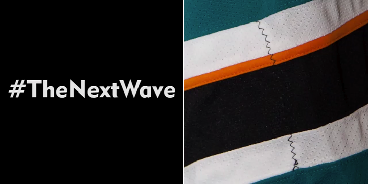
The teaser clip is four seconds long and features a creepy Jaws-like musical stinger with the hashtag #TheNextWave and an incredibly brief one-frame flash of the jersey (seen above). At the end, another title comes up reading "Coming Soon..."
Based on the sharktooth stitching (clever!), we're likely looking at the elbow of the teal home sweater. The key difference — if you can call it that — is we now have one orange stripe instead of two. I'm sure there are at least a few more changes to make this relaunch worthwhile, but we'll probably have to wait to see those.
I think it's funny they're calling the new jerseys "The Next Wave." You may recall the Sharks when the Sharks launched their third jersey in 2008, they nicknamed it "Black Armor".
I'll keep an eye out for any more teasers from the Sharks. I'm sure there will be more.
 Chris
Chris
 Images from San Jose Sharks (via Instagram)
Sharks tease more of jersey with second video
Woke up this morning to another Instagram video from the Sharks. Same idea as before with #TheNextWave hashtag and single frame of part of the jersey. Looks like this time it's the numbers from the sleeve. (I'm really hoping they're doing away with the chest numbers.)
Like the previous teaser, there's a lot less orange in the picture — none on the numbers at all, apparently. Did they really get that many complaints about using a bright color trim in their uniforms?
Since it was just 12 hours between the posting of these two videos, we have to wonder if an unveiling is right around the corner — and how many more sneak peeks we'll get. I will say this. They're doing a better job than the Sabres by at least offering different views of the jersey.
So are you happy to see the orange mostly going away? Or were you a fan of it?
Chris
 Images from San Jose Sharks (via Instagram)
Sharks' third teaser indicates unveiling is only 24 hours away
Well, the Sharks aren't messing around, are they? Today at 5pm PT, the club released a third teaser video on Instagram. As you can see in the screen grabs above, there are two big developments.
First, it seems the black shoulder yoke is gone from the teal home sweater. But the nameplate appears to be the same — white letters outlined in black. The teal shoulders harken back to the Sharks' original jerseys from the '90s — the ones with the fins on the shoulders.
Could the 2007-updated fin logo make an appearance on the new sweaters?

The other major news of course is that the end of the video says "Tomorrow...", perhaps meaning that the full unveiling is less than 24 hours away. Same with this tweet. I'll be keeping an eye on that.
When the first video last night said "coming soon," I didn't realize how soon!

Reader Comments (37)
Still don't dig the orange-esque colour. Never will.
only one orange stripe, but still an orange stripe, which i really like. some people think that the sharks should drop the orange, but i think that's just boring. the Teal and Orange is a unique color scheme for the Sharks but it isn't TOO ridiculous. i say embrace it. the last thing the NHL needs is more teams going back to "Simple, Classic" looks where there's only Red, Blue, White and Black in the entire league.
they should have gotten rid of the orange altogether. I should be happy that they're halfway there, but it just looks terrible with one stripes. I don't get it, but I guess we'll have to wait for the full reveal before I can give my final grade. not looking good so far.
The orange is back. And all is sad with the world. ;(
I agree with LMNOP. The teal is a unique color in itself, but it's more interesting to mix it with orange than with grey. It plays such a minor role in the team's uniforms that it isn't very important anyway.
I don't have any problems with the Sharks' current uniforms and I'm almost certain this will be a downgrade. We'll just have to wait and see...
Oh well, I hoped they'd ditch the orange. It only belongs on their logo, IMO. Was also hoping it'd be somewhat of a tribute to their inaugural jerseys, I'd take that over anything that looks like what they wear today.
But whatever, this is only the beginning, only so much can be said. So far it's not looking to different, though...
Also, hoping to see some Sharks concepts soon, too.
The original sharks jerseys were perfect. No orange and not too much black. I'm not excited by this revelation.
They better not be trotting out the protracted, piece-by-piece reveal the Sabres are going for with their alternates. I'll be just as quick to criticize my own team if they pull that crap.
What's with all the orange hate here? Do you guys realize how muted and drab the Sharks would look in a modern uniform without it? What, do you guys want them to go back to grey (which would look terrible) or simply tri-tone (which would probably be even worse)? As it stands now, the orange complements the teal nicely, the two contrasting tones help make one another pop.
P.S.: wonder what wil be the hanger effect for these jerseys? Something to motivate the team? "Get to the finals" on the inside of the road, and "or you're all fired" on the inside of the home would be my suggestion.
Unless you're the Miami Dolphins...never mix teal and orange on a sports jersey! The Sharks just don't get it. Do they really expect their fanbase to get excited for this modern art garbage?
JAs long as they lose the numbers on the front. That should be outlawed in the NHL. Ridiculous.
"Instead of two orange stripes, we've got one!"
Pretty lame Millhouse.
I don't mind the orange, but they could simplify the jersey a bit just by taking off the number from the front. Especially with numbers on the fronts of the helmets, it just makes it look like there is a lot on the front of the uni. Get rid of it, and it cleans up some of the space.
i'm so sick of these teasers! just show the damn jerseys
Hopefully they remove the # from the front of the Jersey
I liked the orange as a trim, but I never thought it really looked right on the numbers. Was perfectly fine with its appearance on the striping and am a little sad to see it not only removed but also downsized. I understand teal+orange is a really OUT THERE color combo for most people, but when the other alternatives are grey or just more white/black, I fail to see why not have more non-monochromatic elements on the jersey.
Either way I'm really excited to see whether or not they go with the full Shark logo and/or adopt the orange crests as shoulder patches, and will probably buy the jersey regardless.
I like the idea of reducing the orange. I think their jersey's were too busy. I hope they eliminate the chest number and the Sharks on the shoulders. One shark on the jersey is plenty. Maybe use their underused shark Fin patch instead.
Thank you Torontosharksfan -- I totally agree. I don't get why people have so much heartburn with the orange. It's just trim. There's not a substantial amount on the current jerseys. Just enough to make the teal pop. Plus on the original jerseys, the teal was a lighter shade. The black outline on the darker "pacific blue" teal may be a bit harder to distinguish. They actually need the orange trim on the numbers for the black jersey -- the teal outline disappears against the black -- not enough contrast. People who aren't familiar with design don't realize that teal is a subtle, muted color -- without a contrasting color it gets lost -- especially with a darker background.
It will be interesting to see the final product -- I'm hoping they go with the fin shoulder patch.
People that like the orange - part of the reason those of us who are not fans of the orange, are one fans that liked the Teal, Black and Gray. Second, while it's always been in the logo, it had never been that 'bright' before on the uniform - which could just be the lens and cameras, etc. being used but still...
There are many many ways imo to make the Sharks uniform pop with Teal, Black and Silver or Teal Black and White (I'd be fine with white too instead of silver/shimmering gray) without using the orange.
Just look at the 49ers - they have always had black in their logo, but never on their uniform, but then they got the genius idea of putting that on the uniform...oops. Now where are they? The only black is on the logo witch is on the helmet. On their pants and and jerseys there really isn't any black, except for maybe some player shoes or shoe tape, etc. A lot 49ers fans and football fans like this uniform.
Granted I haven't seen the who uniform yet, so I won't be able to grade it until more is revealed, but I do like the fact they've seemed to remove some of the orange. My biggest complain isn't just that there was too much orange on the uniform the last few seasons, but they decided to make orange a secondary color. That is where I draw the line. If the 49ers ever wanted black to return to the uniform, I wouldn't really like it, but I might be able to deal with it. But if the 49ers changed their primary colors to Red, Black, Gold - I think quite a few fans would s*** bricks.
If they want to keep a little orange, I've come to grips with it I guess, just wish they'd get rid of the black shoulder yoke on their sweaters. Though that might be asking too much. :)
The bit by bit reveal is pretty cool since they're doing it daily. Much better than the Sabres strategy of just randomly putting out hints.
And according to Kevin Kurz, who covers the Sharks for CSN, the jerseys will be revealed later this week.
I like the orange, but one orange stripe at the top looks lop-sided. If it were in the very middle of the black line, it would be perfect. And they better not be getting rid of the waist stripes. Their alternate looks awful for that very reason. The numbers without orange don't look that bad. I'm just hoping for a simplification of what they already had. And if that is the case, this whole "slow reveal" thing is pointless
I have a feeling, and hope, that these teasers are no more than a piece of a bigger reveal similar to the Sabres video where parts are magically appearing/disappearing. The one orange stripe looks ridiculous and I really cannot see that being real. I think it was a clip of an animation where the orange was disappearing, and they used that just to mess with everyone.
Same goes for the number shot. It looks like their current home number, just with the orange removed. The extra line of stitching suggests that. It wouldn't look that way if it was just a white number with black outline.
There's already been another tease, the yoke is gone, well technically the same color as the rest of jersey, all teal.
DC32 is right. No more black shoulders. I think I'm the only one that actually liked the black. Oh well.
The teaser also said that the unveiling will be tomorrow (Tuesday)!
Based on the latest teaser, I'm more excited. This is starting to look like their inaugural jerseys, I like. I can't wait.
The reveal is up. Essentially it's the 3rd jersey template. Still has the jumping shark shoulder patch and numbers on the front. http://sharks.nhl.com/club/page.htm?id=91306&navid=DL|SJS|JERSEY
ugh, looks like they got rid of the black shoulder yoke, did not switch to the fin for the shoulder logo, and now have uneven striping. terrible.
Here is the official reveal.http://sharks.nhl.com/club/microhome.htm?location=/jersey
No more bottom stripes, no more shoulder yoke, no more orange trim on numbers, no extra trim around collar, laces added.
This looks so much better. Too bad they didn't go back to the fin on the shoulder. But i guess we can't have everything.
The shoulders and the 2 (not 3) colour numbers shown certainly clean things up on the shirts. That is a good sign.
The jersey's just went live and they are terrible. So generic, reminds me of the bland crap we say when the Reebok New Edge templates were first released. They should have used the second logo, with the tail. As a sharks fan i'm really displeased with this current look the sharks are taking.
1/5 stars!!!
Sharks posted the home & away sweater online. I absolutely love it!
They released them, pretty much the same jerseys minus the shoulder yokes. No "fin" patch and yes the numbers are still on the front
I saw they have it posted that they revealed the jerseys. Chest number still there, and no bottom striping at all, they look like practice jerseys really.
Wow, they're crap. They killed the waist stripes and the yoke, and kept the front numbers. I thought NHL designers had started to realize that nobody liked the practice jersey idiocy?
Mattman 2900 -- Apparently you're not from the Bay Area, or you're suffering from Alzheimers. Before Jim H took over as head coach, the 49ers switched to a slightly deeper shade of red and added black to the helmet, sleeve and pants striping. They wore that for a number of years. When Jim H took over as head coach the niners returned to the scarlet red and eliminated the black from everything but the logo (to revert back to the unis of the "glory years" so to speak). It's best to do a little homework before you post.
IMO WORST color scheme in NHL. If any team could use an overall of the logo/colors it's the Sharks.
As of 11:00 AM Pacific time, the new jerseys have been posted on the Sharks website. Epic fail. Not a surprise. Not only do they choke come playoff time, but now the marketing, retail and design department chokes as well. Too bad. Rather glad I unloaded my season tix after 20 years.
The new jerseys are up on the Sharks site. http://sharks.nhl.com/?navid=nav-teamnav-sjs