Thursday
Oct172013

Loose Threads: Outdoors & More

Flames to unveil third jersey at Flames Fest

Got a handful of items today, so I'm condensing them into this post.

First, the Calgary Flames sent an email to season ticket holders last night, inviting them to the first ever Flames Fest on Oct. 27. And getting a starring role at the event will be the unveiling of the team's new third jersey. (In fact, it's mentioned four times in the email!)

Specifically, the jersey will be officially unveiled at 1:30 PM MT (or 12:30 PT, 3:30 ET). Of course, if you can't wait, there's always that leak from a couple weeks ago.

Thanks to Ryan C. for sharing the email.

Ducks to wear fifth jersey to Stadium Series game

In a previous post, I wondered aloud whether the Anaheim Ducks would simply wear the eggplant throwback again in January for their Stadium Series game against the Kings. We now have definitive word that they will not.

According to tweets to fans from Adam Brady, the Ducks' Director of Publications and New Media, the team will have a completely different uniform for the Jan. 25 game — making it the fifth jersey the Ducks will wear this season on top of their home, road, third and last weekend's throwback.

Thanks to Matt Baldock for pointing me to this tweet.

There are also rumors — which may have started with an employee of the team store — saying that the Stadium Series jersey will be primarily orange and feature a version of the throwback Mighty Ducks logo. Probably not unlike what's currently used on the shoulder patch of the third jersey.

I can't imagine we'll have to wait too much longer to start seeing Stadium Series jerseys. Perhaps closer to late November? All seven teams are expected to have them, including the Ducks, Kings, Rangers, Islanders, Devils, Penguins and Blackhawks. (We're also waiting on the Canucks' and Senators' Heritage Classic sweaters.)

Do Lundqvist's Stadium Series pads preview jersey?

Henrik Lundqvist BlogSpeaking of the NHL Stadium Series, the New York Rangers will actually play two outdoor games this winter — but I'm only expecting one jersey from them. And Rangers fans may have gotten a sneak

Icethetics reader John F. sent in this photo (right) via Facebook. The photo appears to have been first posted almost a week ago by The Henrik Lundqvist Blog.

Unfortunately, while the writer said the photo was found on Twitter, no source link was provided.

There was also no information about the context of what we're seeing. Where/when was the photo taken? We don't know. Maybe someone reading can help out there and offer a little background.

On the table there's a card that reads:

Henrik Lundqvist
New York Rangers

Stadium Series
Yankee Stadium - January 26, 2014

So it's definitely a recent shot.

All that said, what's interesting about these pads is the striping pattern. While it definitely screams Rangers, it's not like anything they've worn recently.

I can't tell if it's the lighting, but the pads appear to be an off-white color. Vintage white. My favorite. But the heavy use of the Rangers' shield logo suggests we might see used it on a jersey for the first time ever. (The shield was different in 1978 and the 2012 Winter Classic.)

If nothing else, this might be good for another concept artist challenge. Who wants to create a jersey based on Lundqvist's pads?

Bruins throw back to 1940s with Milt Schmidt

Finally, here's one that slipped under the radar a bit. The Boston Bruins paid tribute to Milt Schmidt and the 1940s team on Monday afternoon as part of their 90th anniversary celebrations.

Photos from Boston Bruins

The 95-year-old ex-Bruin stepped onto the ice for the ceremonial puck drop sporting a replica of the sweater he wore way back in the mid-1940s — with the 90th anniversary patch stitched on. (Two minutes for tucking it in, though.)

The scoreboard was also decked out in the 1940s "B" logo, as seen in this photo tweeted by @KyleClauss

Seeing Schmidt in that sweater led some to wonder whether the Bruins would make a good opponent for the Capitals at the 2015 Winter Classic. (Yes, I know they've taken part before.) If so, this would be a great jersey to go up against the Caps' classic red look. What do you think?

Tuesday
Oct152013

Flames Preview New Sweater

Arena teaser video reveals Oct. 27 launch date

We got our first look at the new Calgary Flames third jersey more than a week ago by way of that accidental NHL 14 leak. The team officially acknowledged the upcoming uniform for the first time last Friday with a teaser video played for fans at the Scotiabank Saddledome.

You may note that the team first promoted its new jersey while playing New Jersey. I'm sure there's a pun to be made if it hasn't already.

But the point of this blog post is to show you that video. While I haven't seen it on the Flames' website, Icethetics reader and occasional concept artist Caleb Fuller managed to capture the video from the scoreboard on his phone.

Take a look and then we'll break it down frame by frame.

It's short as most of these teaser videos are, but it gives us enough to prove the NHL 14 leak accurate. 

From video by Caleb Fuller

The first shot we see is the black flaming C on a red background. We know from the leak they're cleverly framing out the new script that adorns the crest. Next is a close-up of the collar. It's a new style from Reebok which actually features a different color behind the laces.

From video by Caleb Fuller

Then it's a sneak peek at the new number and letter styles. Looks like sleeve numbers on the left — probably Curtis Glencross' No. 20 — and a name bar on the right. That appears to be a G with an I next to it. Probably looking at the jersey of new captain Mark Giordano there.

From video by Caleb Fuller

Up next is the new striping pattern along the waist. It's not like anything we've seen from Calgary before, but it definitely falls in line with the leak. But then something that doesn't. On first glance, it looks like a close-up of the new shoulder patch. But look again.

On the shoulder shoulder patch in the leak, one of the mountains in the middle is formed by a stylized F. There's no F here. But the way the material curves suggests to me this could be Reebok's infamous "hanger effect." This design may be on the inside of the collar, borrowed from the new shoulder patch. But that's just a guess.

From video by Caleb Fuller

Apparently, we'll find out for sure on Sun., Oct. 27. The final frame of the teaser video shows us the date, which is presumably when the new sweater will launch. But the Flames don't have a game that night. In fact, their next game after that date is Wed., Oct. 30. Will we see it on the ice the first time then?

We'll likely get more information over the next few weeks, so stay tuned!

Monday
Oct142013

The Mighty Ducks Still Shine

Photo from Anaheim Ducks

Anaheim looked fantastic on Throwback Night

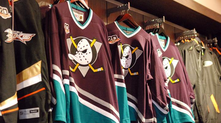
I still puzzle over this one. Why did the NHL have to lose one of its coolest brands? And make no mistake, the Mighty Ducks of Anaheim were definitely among the best. And don't give me a lame business or marketing excuse. This uniform should still be making regular appearances every night.

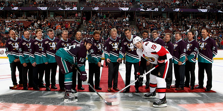
Sunday night was a special one in Ducks history. Not only did they pay homage to their inaugural team with the most crowded ceremonial puck drop ever, but they did it in style by breaking out the old eggplant and jade jerseys no one can forget.

Photos from Anaheim Ducks

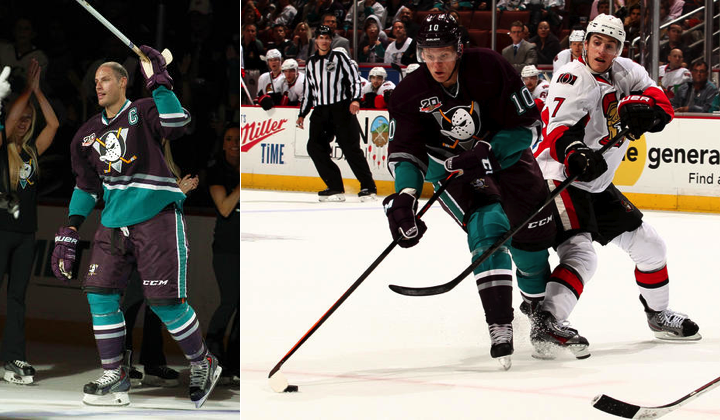
Twenty years on, those uniforms still look great. Is the crest a little cartoony? Maybe, but it's a classic. Are the colors a little unusual? Of course, but that's what gave this team its identity! Anyone who doesn't love these jerseys doesn't love hockey uniforms for the right reasons.

Photos from Anaheim Ducks

One of my favorite rules of good sweater design is whether the team is still recognizable without the crest. This one absolutely is! The current Ducks jerseys are as well, for the most part, but for the wrong reasons. All three California teams wear black and, for one of the sunnier states in the union, that's sad.

Look at this. Is there any question this is a California team? Can't say that about the black and gold.

Photo provided by Paul Gheduzzi

Icethetics reader Paul Gheduzzi was at the game Sunday night and snapped a few pictures during warm-ups. I particularly like seeing the original Mighty Ducks third jersey from 1996 in the crowd above. Still have one of those hanging in my closet.

Photo provided by Paul Gheduzzi

One of my favorite aspects of Ducks' Throwback Night was how even the TV side got involved! Throughout the game, Prime Ticket used classic-colored graphics and the Mighty Ducks logo and even mixed in a few old-style Chyron overlays.

Stills from Prime Ticket (via NHL GameCenter Live)

I enjoyed the use of the original Ottawa Senators logo too. Some Icethetics readers wondered if the Sens had planned to surprise us with an early '90s throwback of their own. But this was Anaheim's night, so it wouldn't have made much sense.

It was a pretty spectacular night all around for jersey geeks and Mighty Ducks fans. So the next question we have to ask... will they do it again?

The Ducks haven't announced plans for any other throwback nights this season, but given how popular this one was (on Twitter at least; I wasn't at the Honda Center), I could see them scheduling one more later in the year.

Could Ducks go Mighty again for outdoor game?

Let's not forget that the Ducks will play an outdoor game on Jan. 25, 2014. They will meet the Los Angeles Kings at Dodger Stadium as part of the NHL's new Stadium Series. (All five teams involved are expected to have special sweaters for the games.)

But before you point out that teams wear white on the road (and the Ducks would be considered the road team for this game), understand that none of the standard rules really apply when we talk about these outdoor "event" games.

The Sabres wore white when they hosted the first ever Winter Classic in 2008. In this season's Winter Classic, neither team will wear white. Plus, if the Ducks and Kings wear throwbacks, they'd be "throwing back" to a time before 2003 when teams did wear white at home.

I point this out not because I don't want to see a white version of the Mighty Ducks jersey again, but because it would make more economic sense for Reebok to produce just one throwback jersey for the Ducks in a single season rather than two. This is an outdoor game, but it's one of four so it won't be as big a deal as the actual Winter Classic. (In other words, I'm tempering expectations.)

So that's my take. What's yours? And what did you think of seeing the Mighty Ducks on the ice again after seven years? Would you want to see more or less of them in the future?

Friday
Oct112013

Anaheim Preps Throwback Night

Photo from Anaheim Ducks

Mighty Ducks jerseys will see action again this Sunday

It's been seven years since we last saw them take the ice. But in just two days, the Anaheim Ducks will revive the Mighty Ducks for one game this weekend. On Sunday, the Ducks will host Throwback Night against the Ottawa Senators.

Photo from Brad Kirchhofer

Last month, Ducks season ticket holder Brad Kirchhofer sent in this photo of the game ticket, which features the classic Mighty Ducks logo. He also pointed out a couple of other ways the throwback logo was being used as part of the team's 20th anniversary promotions.

Photos from Anaheim Ducks

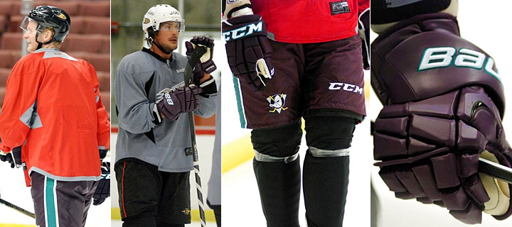
This week, the old eggplant and jade starting showing up at Ducks practices so players could break in their new gear before Sunday. We got a glimpse and gloves and pants on Tuesday and Wednesday. (There are plenty more photos at those two links if you're interested.)

It's my understanding, however, that the team will be wear Reebok Edge versions of the old Mighty Ducks jerseys, meaning we should see an updated collar and cut. But otherwise, it should be the spitting image of the old eggplant jersey.

Photos from Anaheim Ducks

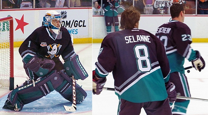
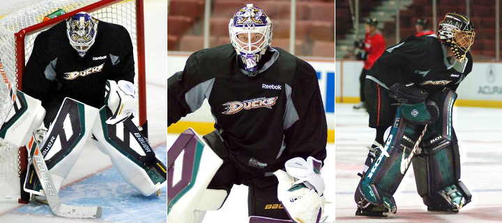
The goalies got to test out their new equipment as well. The shots on the left and center are Viktor Fasth, who modeled his mask after Guy Hebert's. On the right, you can see Jonas Hiller in his throwback pads. The Ducks tweeted a photo of Hiller in his mask earlier today.

If all this has you feeling nostalgic, I dug up some photos of current Ducks players in the classic threads.

That's Francois Beauchemin, Corey Perry — as No. 61! — and Teemu Selanne as No. 13. Think of this as a sneak peek of what's to come on Sunday — only pre-Edge. Hopefully it won't look too much different.

Lastly, for non-Ducks fans, how about a look at a few familiar faces who you perhaps didn't know — or forgot — once donned the eggplant and jade?

That's Joffrey Lupul, Chris Kunitz and Sergei Fedorov. Truth be told, before I found that photo, I didn't know Lupul had played for Anaheim. But he did for a couple seasons a decade ago.

So who's excited for Sunday?!

Tuesday
Oct082013

Canada's Olympic Jerseys Unveiled

All photos from Nike

Official photos reveal differences from leaks

Canada's 2014 Olympic jerseys leaked not once but twice this summer. First, Jonathan Toews was caught modeling it in a photo shoot, then another photo popped up showing all three sweaters in a retail setting. So the official unveiling today from Nike was just a formality, right? Not exactly.

What we couldn't tell from those early photos is that the large chest and sleeve stripes don't extend all the way around the jersey. They stop at the player's side. There's a practical reason for this. A completely different (and more breathable) material makes up the side panels of the jerseys.

Another difference seems to be between the retail and game-worn versions of the jersey. In the retail store shot posted two weeks ago, 12 gold maple leaves are visible on the front, toward the bottom. (They represent the combined gold medals won by the Olympic and Paralympic teams, according to Nike.)

On the game version, the gold leaves are on the inside of the collar. Look closely and you'll notice that telltale faux lace-up collar protruding through. Not quite Reebok's "hanger effect" fad, but it does have something in common with the American jerseys now.

Another new detail is the shoulder applique. It's a maple leaf within a maple leaf pointing out of the collar. So far, only the Czech Republic has escaped this feature — what many here would likely call a scourge. Under those bright TV lights, it'll probably be more noticeable than you'd expect. We'll find out in February.

At this point, I'm counting 19 individual maple leaves on this jersey. Maybe going a bit overboard, Nike? In any case, these are the sleeve features. On the left is the Canadian flag — which we've seen before, and on the right are the Olympic rings — which we haven't.

Finally, there's the black jersey. This won't be the first time Canada has worn black, but all the gold makes it a bit odd. According to Nike's press release, it's there to "remind the world of Canada’s goal to win gold medals in Sochi." Everyone needs a reason for existing.

Many of you have probably said your peace on the previous leak posts, but if you have anything else to add, now's the time to do it. Do these slick photos from Nike make you like the new jerseys any better? To those who hadn't made up their mind today, what do you like/dislike most about the new designs?

Page 1 ... 7 8 9 10 11 ... 156 Next 5 Entries »