Tuesday
Sep212010

Chicago Express Joins ECHL

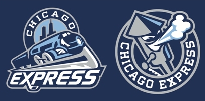
Chicago Express logos unveiledToday, the ECHL's newest franchise unveiled its name, colors and logos. The Chicago Express will begin play in Hoffman Estates, Ill. in the 2011-12 season.

The name was selected from the "Name Your Hockey Team" contest held by the organization this summer. The reason was explained in an article on the team's website:

Chicago is the most important railroad center in North America. More lines of track radiate in more directions from Chicago than from any other city. Chicago has long been the most important interchange point for freight traffic between the nation’s major railroads and it is the hub of Amtrak. Chicago ranks second (next to New York City) in terms of volume of commuter rail passengers each day.

I like the colors. The logos are about what we've come to expect from minor league hockey teams. They get the job done. But here's what I noticed: The designer used the Icethetics font for the word EXPRESS in the primary logo! It's called Continuum. I think that's kind of funny.

Anyway, there's an article about the name contest winner on their website as well. His name is Marc Johnson and he is stoked, as you would imagine. No jerseys have been unveiled yet and the team won't actually begin play until next season.

And by the way, based on the reaction to yesterday's renaming of the AHL's Hartford Wolf Pack to Connecticut Whale — this is going to be fun. Comment away.

Sunday
Sep192010

The Whale is Coming

The AHL's Hartford Wolf Pack will be renamed the Connecticut Whale on Monday at 5 PM, according to the Hartford Courant.

A long-in-the-works deal for Howard Baldwin to take control of the American Hockey League franchise is apparently done. It was rumored he would rename the team the Connecticut Whalers. Perhaps he's saving that name for his ultimate goal of reviving the Hartford Whalers.

Connecticut Whalers T-shirtThe Courant says the deal and the rebranding efforts will be officially announced late Monday afternoon at the XL Center and that the new logo will not be unveiled. However, it could look something like what's on a t-shirt being sold through Baldwin's website. Wrote up a whole blog post last month.

Despite the announcement coming right away, it'll take some time before the change over happens. According to the newspaper:

The team will open the 2010-11 season as the Wolf Pack; the name change is expected to take place at some point before midseason. The name, a new logo and uniforms are expected to be in place by Feb. 19, when the Whale face the Providence Bruins.

That previously scheduled game is expected to be moved outside to Rentschler Field and played before an exhibition between a team of Hollywood celebrities — centered around the movie "Mystery, Alaska" — and former NHL All-Stars in celebration of the 25th anniversary of the NHL All-Star Game played in Hartford.

The article says to expect the changes to the logos and uniforms to happen between Thanksgiving and Christmas. Definitely keeping an eye on that.

Thanks to Jason for the tip!

Saturday
Sep182010

Sabres Debut New Uniforms!

The Buffalo Sabres introduce new home, road and alternate jerseys today

It's official. Years of work have paid off for the guys at Sabres Not Slugs — a hardcore group of fans on a mission to rid their team of the infamous "Buffaslug" logo, instituted in 2006.

Today, the Buffalo Sabres unveiled new home, road and alternate jerseys for the 2010-11 season — and the old logo is nowhere to be found. In fact, the new sweaters show a shift by the team back to its original identity.

Thomas Vanek #26Where to start... First, the previous third jersey, introduced in 2008, is the new standard home sweater. No surprise, and it's a welcome change as this is a spectacular hockey uniform. Even better, the Sabres will double up on this solid design by wearing a white version for road games.

Some fans have bemoaned the heavy use of navy blue, but let's be honest: this is 2010, not 1980. Bright colors are better in small doses. And that makes the new alternate sweater perfect. The bright colors are a great change of pace and superb tribute to the past.

And BUFFALO across the front, an homage to the town's original pro hockey club, couldn't be better suited. After years of new logos that have failed to catch on with fans, this was exactly the right play for the Sabres. Celebrate the city, its hockey history, and stop trying to reinvent the wheel.

In a single day, one of the NHL's worst-dressed clubs has become one of the best. It's an outstanding set of sweaters. Most teams would be lucky to look this good.

Unique features on the back of the thirdA release on the Sabres website details some interesting facts about new third jersey:

  •  The royal blue color of the third jersey reflects the original Sabres jersey that debuted in 1970.
  • The “Buffalo” script wordmark was inspired by the old Buffalo Bisons “bottlecap” logo. 
  • The choice of an off-white color for the Buffalo script was to give the jersey a vintage feel.
  • There are four stripes on the sleeves, socks and around the waist that represent 40 years of Sabres hockey. 
  • A commemorative 40th anniversary “1970” logo sits below the Buffalo script. 
  • The faux felt numbers have a unique cross stitched pattern in reference to early pro hockey jerseys.

The new third jersey will be worn for 12 home games this season, including its debut on Oct. 9 for the Sabres' season opener when they host the New York Rangers at HSBC Arena. Seems 10/9/10 is going to be the night for retro sweaters in the NHL.

According to the Sabres' website, "the design for both jerseys was a collaborative effort between the Sabres and Reebok International." By the way, they also have a complete photo gallery of today's unveiling for your enjoyment.

Friday
Sep172010

Flyers "Unveil" Road Jersey

Richards sports new road jerseyNo one was surprised when the Philadelphia Flyers unveiled their "new" road sweater this afternoon.

Flyers captain Mike Richards was on hand at Virtua Flyers Skate Zone to model the jersey for the cameras and the crowd.

As anticipated, it's the Winter Classic throwback sweater recycled. And it's the third time in as many years that at least one specialty uniform from the big outdoor game went on to be used on a regular basis the following season. Pittsburgh and Chicago each turned theirs into third jerseys.

If you're craving more photos from today's unveiling event in Philadelphia, the Flyers website has you covered.

By the way, today's announcement means the Flyers are the third team to replace both their home and road sweaters since the league-wide Reebok Edge redesign in 2007. The Maple Leafs and Islanders already did so earlier this summer and the Sabres will join that small group tomorrow with their unveiling event.

In case anyone's keeping track.

Sabres tease third, coming tomorrow

Sabres tease new third jerseyThe Buffalo Sabres will officially unveil their new third jersey tomorrow at PuckDrop 2010.

It's also expected the club will take the opportunity to officially introduce last season's third jersey as the new home sweater — along with a brand new white version to be worn on the road.

Both the new alternate and away sweaters were leaked online earlier this month.

Still, the Sabres currently have a small teaser photo on the splash page of their website tonight. Doesn't really do much for us since we've seen the whole thing now, but if nothing else it further confirms the speculation.

If you are interested, the Sabres will be streaming tomorrow's sweater unveiling on their website starting at 11:30 AM eastern. I, for one, will be watching.

Blue Jackets third launches Nov. 26

Just in time for Black Friday, the Columbus Blue Jackets will hit the ice for the first time donning their new alternate jerseys on Friday, Nov. 26 as they go up against the Detroit Red Wings.

These details were confirmed in a posting on the team's website outlining special events and promotions for their 10th anniversary season.

The article does not detail any plans to unveil the sweater or its design prior to the game, so we may just have to wait until November to see the thing. I'll keep you posted.

Until Saturday morning, that's all the third jersey news I have for you. But I have a lot of other Icethetics-related news to catch up on all weekend, so keep checking back.

Thursday
Sep162010

Avery Leaks Rangers Third

Rangers third revealedNew York Rangers forward Sean Avery has taken it upon himself to give us a sneak peek at his team's new third jersey.

This image was posted today on Avery's website. Looks like a pre-release photo shoot with the new alternate sweater — obviously.

Having gotten an early look at it myself, I can say that this is in fact the extra uniform the Rangers will have on hand for the 2010-11 season. You can see a patch there on the right shoulder. It's most likely the 85th anniversary logo.

I'm not sure when the team plans to hold an official unveiling for the third. They may just wait until November, like Anaheim. Or they may do it sooner. Either way, you've already gotten a chance to see it for yourself.

I'm a big fan of the color scheme, but it's no secret that personally, I would've rather seen them go with with the Lady Liberty logo from the mid-90s. What do you guys think? Hit or miss?