


QMJHL Adds Armada
 32 Comments
 The QMJHL team that didn't really have a name has been rebranded — and now it doesn't really have colors. The Montreal Junior Hockey Club moved about 20 miles northwest and are now the Blainville-Boisbriand Armada.
The new name, logo and uniforms were officially unveiled today at a press conference at team's arena in Boisbriand. The bland palette is black and white with what appears to be an inkling of silver as a trim color — a lot like the Los Angeles Kings' depressing new look.
Despite its unfortunate lack of color, I like the design of the primary logo. It's very clean and bold. And it looks like every element of the mark was carefully positioned. You'd think that'd be a given in logo design these days — but then you saw the WHL's Victoria Royals logo, right?
The sweaters are simple, but they almost feel like an afterthought. Here's a look from the QMJHL's website:
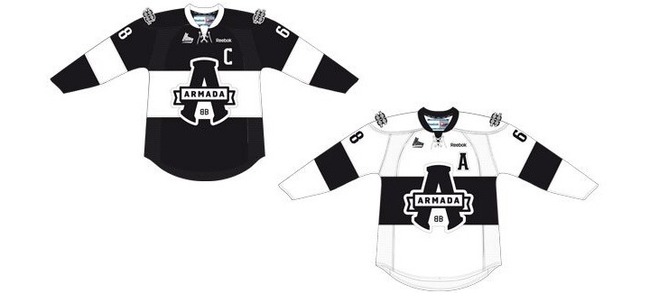 Blainville-Boisbriand Armada jersey design unveiled / QMJHL
One thing I will say about this branding is it's definitely not targeting children with bright colors and cartoon creatures. This is an all-out effort to create a professional look for a junior hockey club. I give it a tenuous thumbs-up overall. A solid effort in design but sorely lacking in personality.
