Entries in jerseys (170)

Tuesday
Jan052010

Wolves Test Powder Blue Waters

The minor league jersey news just keeps coming, this time out of the AHL.

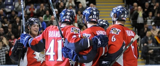
The Chicago Wolves honored their everyday heroes on Saturday night with special Police & Fire Forces jerseys, which feature special shields on the shoulders.

Peter Mannino #33And yes, they're the same powder blue color that's been sweeping the NHL. It started with the Pittsburgh Penguins recapturing their youth, wearing their original colors at the Winter Classic in 2008, then later as an alternate sweater. Then the Panthers hopped on the bandwagon this season adding the hue to their new third jersey.

A couple of pictures of the jerseys in action were available on the Wolves' web site so I grabbed them to share with you.

I don't think they look awful, but I do think the red is too bright. You've got a really bright blue jersey so your accent color should be muted a bit — or at least that's my two cents. But that's what you get designing a jersey in-house.

Brett Sterling #29I might've gone with something closer to the Wolves' own brand of maroon instead of that bright red. But then again it is fire engine red, so maybe I'm out of line.

This shot of Brett Sterling offers an even better look at the sweater. You can even click to enlarge it slightly.

The jerseys must have brought Chicago good luck because they beat the Peoria Rivermen 3-2 in a shootout before a record crowd on January 2.

Chris Chelios #7They're probably hoping for more luck as this won't be the last the Wolves will wear these sweaters. They'll be used on three more occasions this month before being auctioned off for charity.

Fans will see them next on January 9, 10 and 17 — all home games. You can read the full release on the Wolves' web site.

By the way, how weird is it that Chris Chelios is playing in the minors? I guess I just thought he retired, but it turns out he declined an NHL offer just last month to keep playing for the Wolves. The guy's pushing 50 and he's just doing what he loves. No pressure, just having fun.

Before I go, I will leave you with this photo of the new powder blue jerseys hanging on the rack — straight from the aforementioned release.

Thanks to Reilly for passing along the info!

Monday
Jan042010

Kings' Throwback Reigns

Following in the footsteps of the previous post, there's another minor league jersey worth mentioning from a couple of weeks ago.

The Ontario Reign, ECHL affiliate to the Los Angeles Kings, wore a special, one-time throwback jersey as a tribute to the big club. It was a replica of the black Kings jersey which debuted to Californians along with the arrival of Wayne Gretzky in 1988.

Reign throwback nightThe primary Kings logo from that era has been modified into a Reign logo. But at a glance, it looks exactly like what the Great One wore after the big trade.

The Reign's current secondary logo was converted to silver and black and placed on the shoulders. It really is quite a jersey. And I couldn't wait to see what it looked like on the ice.

Lucky for us, this sweater was worn on December 18 when the Reign faced the Las Vegas Wranglers. (They even won in a shootout.) So there are a few pictures available — albeit low quality from the team's web site.

Shawn Germain #5 in action in the L.A. throwback Goalie Curtis Darling #29 wearing the specialty sweater

Saturday
Jan022010

Salmon Kings New 3rd Launched

This news may be a few weeks old, but the ECHL's Victoria Salmon Kings recently launched brand new third jerseys for the 2009-10 season. I just came across a couple of pictures in the ol' Icethetics archive and thought I should share them.

First, some background. On December 10, the Salmon Kings announced the unveiling of a new alternate sweater as a tribute to the 2010 Olympics, which will take place in their backyard. It then hit the ice for the first time the following night against the Las Vegas Wranglers.

Salmon Kings old thirdGone is Victoria's old third jersey, seen to the right. I believe it was introduced for the club's fifth anniversary in the ECHL and was only worn for one season.

It's got a clever double meaning, for those who missed it the first time around. V being the Roman numeral for 5 and also the initial of Victoria. Anyone feel dumber for my having explained that?

So anyway, that's what they were wearing. White and boring.

This season they're going in a new direction by implementing red Reebok Edge jerseys as their new alternate. Here's their official statement:

The Salmon Kings’ new third jersey will be the second alternate sweater design for the organization in the past two seasons. This year’s design will replace the “V” logo jersey that was used last year.

“The inspiration for this jersey comes from the upcoming Olympic Games in Vancouver,” President Dave Dakers said. “This is a great sweater that combines our pride for the Salmon Kings as well as our nation.”

Salmon Kings new thirdThe classic fish logo is pulling an Alien by ripping through the skater's chest. But beyond that, the red really stands out and is very Canadian.

Red is new territory for the Salmon Kings and while the color does appear in the logo, they're definitely aiming higher. Go Canada!

Anyway, I apologize for not getting to this sooner but part of my new commitment to Icethetics is getting news posted even if it's just for archival purposes. I want Icethetics to be the reference for all things jerseys.

I can dream.

One last look at Victoria's new thirds before I leave you to share your own thoughts on it.

By the way, happy new year!

Thursday
Dec312009

Where Are They Now?

As the year comes to an end, I thought I'd update you guys on a couple of non-NHL related topics that dominated Icethetics in the later part of this year.

The USF Ice Bulls hockey club team came to Icethetics in August, looking for a new logo to get out from under the thumb of a fee-hiking university. Dozens of artists sent in amazing concepts. But only one could be chosen — designed by Gary Cekus.

Ice Bulls goalie maskGary's design has since been implemented on the club's home jersey as well as the mask of the starting goalie.

I had to get this picture posted — not just because the goalie happens to be my brother — but because this is an awesome mask design that came as a direct result of an Icethetics contest!

The mask was designed by Todd Miska of Miska Designs, who is responsible for the artwork that adorns the helmets of such NHL goaltenders as Ed Belfour, Miikka Kiprusoff and Evgeni Nabokov.

Now he's put his touch on the University of South Florida's team and that could not be more amazing. I highly recommend checking out some of Todd's other work on his web site.

Ice Bulls home jerseyThe Ice Bulls' white home jersey also features the Icethetics contest-winning logo but unfortunately the team didn't have a lot of time to put together the best overall design.

As you can see here, they've used the Dallas Stars' road sweater, which is rather lacking in color. And while the crest logo may be a little small, they are planning to fix that for the 2010-11 season.

The road black jersey is custom-designed with the word BULLS spelled out diagonally across the front and does not feature the new logo.

For more game and team photos, check out the Ice Bulls' photostream on Flickr.

Another big non-NHL story in 2009 was the controversy surrounding the logo selection of the SPHL's expansion franchise Pensacola Ice Flyers.

It yielded quite a bit of outrage — perhaps mostly from me — as the club announced a logo design contest then ignored the voting results right after.

Ice Flyers road jerseySo after choosing to brand themselves with the worst logo in minor league hockey, how are the Ice Flyers looking these days? Glad you asked. 

To the left you can see the jersey they had designed. Just as horrible as we all expected. It's dark blue with a lot of white and gold accents — including planes shooting across the bottom. We get it, your town is home to the Blue Angels.

The jersey is finished off with what is surely an iron-on logo on the chest. Have fun trying to embroider gradients.

Ice Flyers in home whitesHere's a look at the home whites. Not quite sure what's going on at the bottom there. But it's definitely not the same as what's on the dark jerseys.

I hate to sound so mean-spirited toward the Ice Flyers. I'm actually not even bothered that much, but I was a little disappointed to see the mess they made here. Especially when they started out with such great options in that online poll. 

Ice Flyers in their camosFor what it's worth, the atrocities don't end with the home and road sweaters. They're all about the specialty jerseys as well. And being in a big military market, it's not hard to understand why camouflage jerseys made an appearance at one point this season.

If you want to see some more low-resolution game action photos, you might want to check out their web site. But all I can say is it's probably not worth your time.

I'm sure I've missed an update here or there, but this is all I have time to type at the moment. Have a great night and see you in 2010!

Thursday
Dec312009

Coyotes Need Money

I'm just trying to help the Phoenix Coyotes say what they're beating around the bush about this New Year's Eve.

Here's the situation, and it's a doozy. We know the Coyotes are in dire financial straits and the question of whether the franchise will still be in Glendale next season remains up in the air (though Bettman might have you believe otherwise).

I suppose in some sort of misguided effort to make a quick cash grab, the Coyotes are following in the footsteps of many a minor league team. Tonight, bidding begins on a handful of autographed specialty jerseys made just for New Year's Eve.

Normally, a minor league club will have a special edition jersey made to be worn on a promotional night. After which the game-worn jerseys are then put up for auction, usually with a handful of the cash going to charity. The rest back into the team's often dwindling budget.

To the left you see what happens when an NHL team tries it. They're actually nothing more than black practice jerseys with special logos sewn on. Special "champagne-colored" logos. Could they be any more desperate?

Every player on the team has signed a jersey with his name on it but the worst part is they won't even be worn by the players. Ever. Not even during warm-ups before the game or anything. Obviously the NHL has pretty strict rules when it comes to one-off specialty jerseys. And rightfully so. (These are atrocious!)

Still, in a rough economy you have to do what you have to do. And to be perfectly fair, the money is actually going to charity for the most part. But the Coyotes are fun to tease these days. Here's what their official press release has to say about the auction.

Each Coyotes player will autograph a one-of-a-kind New Year’s jersey with his name and number on the back. The jerseys will then be available for bidding on NHL.com beginning at noon on Dec. 31. The auction will close at 6 p.m. on Wednesday, Jan. 13.

Proceeds from the auction will benefit Coyotes Charities, which is dedicated to enhancing the quality of life throughout Arizona communities by supporting non-profit organizations that promote healthcare, education, cultural arts and sports-related programs for children.

So if you're a Coyotes fan, head on over and show your support. The rest of us can just have a giggle at the expense of those ridiculous jerseys.

Thanks to Dan for pointing out this story!