Entries in sphl (9)

Monday
Oct122009

New Minor League Jerseys

We're taking another stab at the Icethetics Season Preview with a look at a variety of mostly horrendous minor league jerseys for 2009-10. We'll begin with the bigger leagues.

In the AHL, the Rochester Americans will be pulling out an old classic to be worn as a third jersey.

Rochester Americans' 3rd jersey

I don't know if it's better or worse than what Montreal did to us last season. As mentioned previously on Twitter, the Bridgeport Sound Tigers will take to the ice looking like the old Islanders all year.

Bridgeport Sound Tigers' new uniforms

Their new home and road jerseys are modeled after the Isles' new throwback third. Hopefully the big league club will join them soon.

In the ECHL, the Stockton Thunder recently unveiled their new third jersey.


Yeah, if that's not bad enough, the lightning bolt motif is even making its way into the SPHL. The Mississippi Surge will wear these this year.

Mississippi Surge uniforms

The Dayton Gems have also released designs for four different jerseys that will be used for 2009-10. There are home, road, alternate and retros. For a league that probably plays four games a year, it's probably a little much. But wait until you see them.

I'd be embarrassed to wear that in front of the home crowd. At least black road jersey has some interesting striping. That yellow jersey is just horrible. 

Here's the third to the left. Very reminiscent of our favorite Reebok Edge designs, what with the interrupted striping, curvy tails and the team name printed across the ass.

The retro's not that much better.


They've hidden most of the logo in the picture anyway.

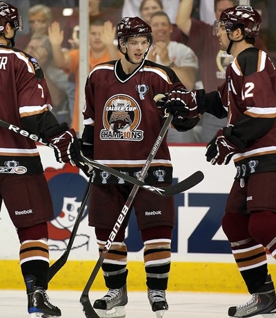
I have to finish up by going back to the AHL. I saved this one intentionally. I've seen teams wear patches to commemorate a championship victory. But I have never seen an entire sweater dedicated to blatantly bragging about it.

Way to go, Hershey Bears, for being the first.

That is all I have to say on that. Feel free to share your opinions below.

Thursday
Jul232009

Ice Flyers Unveil Logo... Ugh!

At my hands journalism takes a beating tonight, but I have to editorialize. Rarely do I feel the need to opinionize (new word), yet evil happens when good men sit idly by. And even when they don't, evidently.

The Pensacola Ice Flyers shocked probably no one but me when they unveiled their new logo earlier tonight. They did so before a small gathering of North Florida hockey fans and supporters celebrating the return of the sport to their town.

The Southern Professional Hockey League is expanding this season by adding the Ice Flyers along with the Mississippi Surge. They shouldn't have bothered. The following symbol will represent this team.

Ice Flyers' new logo

All right, by now you get my outrage, so I'll get back to my journalistic roots now.

Coach Todd Gordon and owner Tim Kerr (photo: Ben Twingley)

The Pensacola News Journal was there with Ben Twingley providing photographic evidence. Team owner and former Philadelphia Flyer Tim Kerr chatted to fans at the event alongside head coach Todd Gordon. Gordon wore the snazzy new shirt but Kerr did not. SPHL commissioner Jim Combs was also in attendance.

Two questions. 1) What did they do? 2) Why are they so happy about it? Damn, I switched back into editorial mode. All right, I know the answers. They sold enough ticket packages to bring hockey back this season and they're hockey fans so they're very excited about that. But honestly, I can't get over the logo.

Two weeks ago, the News Journal posted a poll which I wrote about here on Icethetics. It asked readers which of four logos they preferred. You can see the results here to the left. For reference, "Logo 1" is what's been plastered on the above shirts.

It finished with about 440 out of 3,011 votes. I know the poll was meant "for entertainment purposes only" but Kerr can't take a hint. Two of the logos each grabbed more than a third of the vote and they've been discarded. To see all four logos, click on the graphic.

Once again my strong feelings have emerged. So why do I feel this way? I think it's important that what represents hockey represents it well. This logo does not accomplish that. It was a missed opportunity. I feel bad for Six Zero and the other designers whose superior work was overlooked.

If the gradients, pedestrian typeface, and all-around clip-art feel of the design weren't bad enough, it seems they can't even decide how to properly symbolize the name Ice Flyers. Is it the Blue Angels or an eagle? They clash. Pick one.

I eagerly await the uniform unveiling to see what they're going to do. I literally couldn't begin to guess. It sounds crass, but it wouldn't surprise me to see them print up 20 of these logos on their ink-jets and glue them to jerseys.

Again, a missed opportunity here if you ask me. Anyone agree? Anyone disagree? The floor is yours.

Friday
Jul172009

Around the Minors

I've actually got a lot to talk about on this Friday, including a few minor league-relating items.

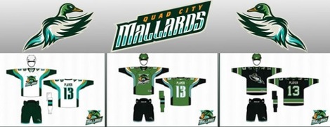
We'll begin with a shoutout to PuckDrawn, with a first look today at the new uniforms of the IHL's Quad City Mallards. Icethetics first took you "quack to the future" with the unveiling of the team's new logos back on July 1. Now see them on the jerseys.

Mallards unveil uniforms (via PuckDrawn)

You can see the home, road an alternate sweaters being modeled here. A little shockingly, those neon greens are not the third jerseys. So they're going to see a lot of ice time this year. The Mallards also made available the lowest quality images ever of the designs.

Typically, we like these images to be larger for the purpose of seeing the detail of the design. But we'll live. One thing worth noting is that the green in this image and the actual green of the jersey look nothing alike. I like the one shown here better.

It also appears that the alternate sweater in the photo is dark blue while seeming to be black in the following image. Not sure which one is playing tricks on my eyes.

Next, we move on to another obscure minor league — the SPHL. On Wednesday, the Pensacola Ice Flyers announced they have sold enough ticket packages to be able to field a team this season. Now it's time for a real web site. But that also means they need a logo.

This morning I checked back in on the poll being conducted by the Pensacola News Journal. Much to my disappointment, SixZero's design (Logo 3) has fallen behind option 4. After 2,776, Logo 4 is ahead with 35% of the vote, just three percentage points ahead of SixZero. Normally, I'd tell all of you to get over there and get voting, but this isn't for us, it's for hockey fans in North Florida. If that's what they want, that's what they get.

However, the poll, which began on July 17, indicates no end date. Therefore, there's no way to know when the Ice Flyers club will make its decision with regard to the team's logo. So I will keep an eye out for that and keep you all updated.

Thursday
Jul092009

Vote for SPHL Team Logo!

This is a story that Johnny over at PuckDrawn has been following for quite some time. Last month the SPHL's newest member, the Pensacola Ice Flyers (not to be confused with the defunct ECHL club Pensacola Ice Pilots) announced they were looking for a logo and accepting fan submissions.

The team said that a vote would be held for two weeks beginning July 1 on the Pensacola News Journal's web site. After being delayed by more than a week, that poll is finally live. There are four finalists to choose from. Here's a preview.

Here's a quick breakdown of the Icethetics assessment:

Logo 1: Gradients? Really? This isn't a logo. Far too intricate and detailed to be a good, recognizable mark for embroidery on jerseys and hats.

Logo 2: Solid effort. The team will take care of making the gold more eye-friendly if they choose it, but overall it's a strong classic design. The only issue it has is that minor league expansion franchises must have an integrated wordmark in order to properly build the brand. That's the only thing this logo is lacking.

Logo 3: Easily my favorite of the batch, but then I may be slightly biased. This design comes from SixZero, who entered a lot of concepts into the IceHL competition (which will return soon). In fact, he has over a dozen more concepts for the Ice Flyers here worth checking out (link from PuckDrawn).

Logo 4: This one has all the necessary elements for a minor league logo, including a sharp wordmark and a very identifiable secondary logo. The problem is in the minute detail of the primary mark. I think this might be solved by making each of the five planes much bigger.

Overall, Icethetics recommends Logo 3 if you're voting. It's even in the lead with 43% of the nearly 700 votes at the present time. 

By the way, stuff like this always comes with a disclaimer. Despite offering the illusion that fans will be choosing their team's new logo, this is by no means the case. Obviously, team ownership and management will have the final say. The News Journal is quick to point out that this poll is for entertainment purposes only.

Happy voting!

Page 1 2