I'm not sure why it took this long.
The other night I mentioned via Twitter my intentions to buy a blue 2011 All-Star jersey. And that I hoped Steven Stamkos would get picked for that team so I could customize it. Then someone asked about the extent of my personal jersey collection.
All right, I admit it. I know full well why it took this long.
Some might say I write a somewhat popular blog on the topic of hockey jerseys with a rather nerd-like knowledge. And as such, it would make sense that I have an extensive collection of sweaters of my own. This might surprise you, but actually... I don't.
At present, I own just five hockey jerseys — all replicas. Perhaps due to that revelation, there was enough of a response on Twitter that I figured I'd share them and the reasons they're in my closet. However humiliating.
As my headline warns, prepare to be disappointed by my feeble collection — half of which you'll expect, half of which you won't. And to delay the embarrassment I have coming, I will be presenting them in reverse chronological order, starting with the newest.
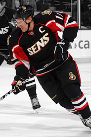
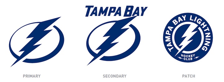
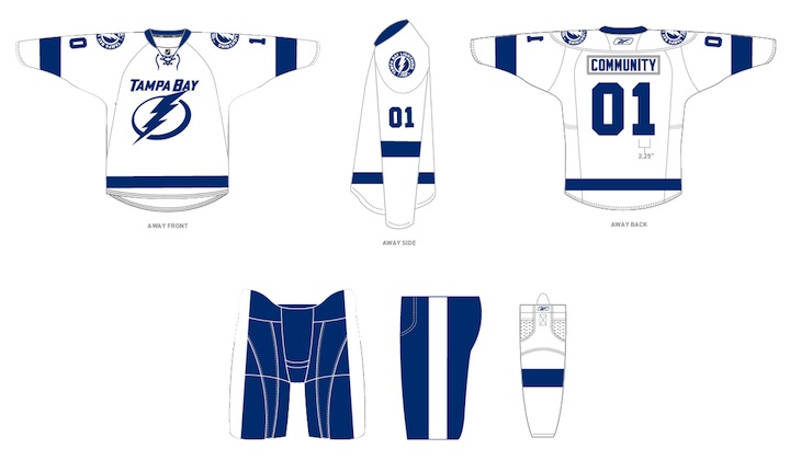
Tampa Bay Lightning

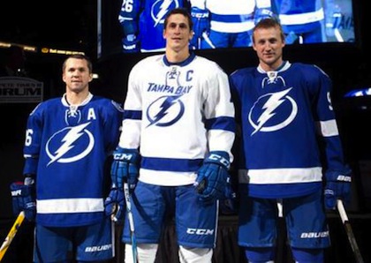
Third jersey (2008—2011)
It shouldn't surprise you to learn that half of my meager collection is made up of Lightning jerseys. As I've said many times, I'm a true Bolts fan and have been since the day Phil Esposito and some Japanese guys brought them to Tampa in the early '90s.
When this third jersey was revealed in November 2008, it was widely criticized on this very website for its pedestrian crest. BOLTS? On the front of the sweater? I wasn't even sold at first. But it quickly grew on me. I call them the Bolts all the time. Why can't the jersey say that?
But the most important factor? I've wanted a blue Lightning jersey for years. There's nothing wrong with black, but blue is just as important in Tampa Bay's color scheme. Why had we gone so many years without one? So when it finally happened, I had to have it.
Now that it sounds like my Bolts are going with blue at home, I'm just beside myself.
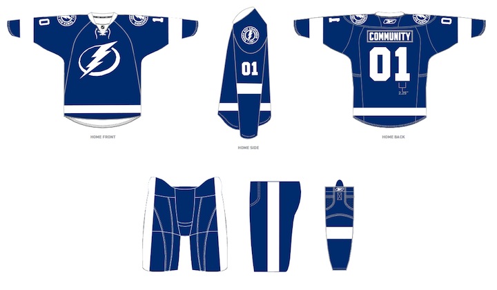
Tampa Bay Lightning

Home jersey (2007—2011)
If you've been a reader since the beginning, you'll remember I posted pictures on the blog when this jersey arrived. That was Sep. 20, 2007, not long after the Lightning first unveiled the sweater. That was the Summer of Reebok. And nothing has been the same since.
Believe it or not, I'd never owned my own Lightning jersey prior to that. I haven't needed to. In the handful of seasons leading up to the Lightning's Stanley Cup championship, my dad used to buy game worn jerseys, some of which were even autographed.
He picked up Nikolai Khabibulin's No. 35, Tim Taylor's No. 27, and Brad Richards' No. 19 to name a few. During that incredible Cup run, I wore the Richards jersey to every game. I was devastated when they traded him in 2008. (Glad to see him back on Marty St. Louis' team for the All-Star Game — although annoyingly sharing Stamkos' No. 91.)
Anyway, when the new jerseys were unveiled I had to have one to properly represent my team. No other reason needed.
Florida Everblades (ECHL)

Road jersey, 10th anniversary (2007-08)
I had lived in Tampa my whole life, until 2007 when I got a job in Fort Myers — about two hours to the south. My closest team, geographically, became the ECHL's Florida Everblades, who were not affiliated with the Lightning at the time, but rather the Carolina Hurricanes.
It was easier and cheaper to drive 20 minutes and take in a Blades game than to drive two hours for a Bolts game. And even though I never found watching minor league hockey as fun as NHL hockey, it was still hockey.
While I could never not wear my Lightning jersey to a hockey game of any kind, my wife liked the Everblades' colors and uniforms. The Blades happened to be celebrating their 10th anniversary season and were wearing special sweaters to mark the occasion. So that's what I bought for her.
Now we live in Seattle so it just collects dust in the closet along with the next two on the list.
Nashville Predators

Home jersey (1998—2001)
This one may seem random, but there's a story. During a week-long family trip to Tennessee in the winter of 1999, we went to a Nashville Predators game — I believe on New Year's Day. For whatever reason, I really wanted to wear a Preds jersey. I was 15 so who knows what I was thinking.
We stopped into a sports store in downtown Nashville just a few blocks from the hockey arena so I could blow one of my first paychecks from the job I had just started. I wore the jersey to the game and that was pretty much it. They were playing the San Jose Sharks but I can't remember if they won.
A non-hockey fan friend of mine in Fort Myers used to wear it to Everblades games just to have a hockey jersey on. He joked that I should give him some facts about the Preds in case someone from Nashville ever came up to him. I told him that would never happen. Then it did. It was awkward.
I've never had a reason to wear that jersey since 2000. I'm not in any way a Predators fan — or a fan of any NHL team other than the Lightning. So that's the story.
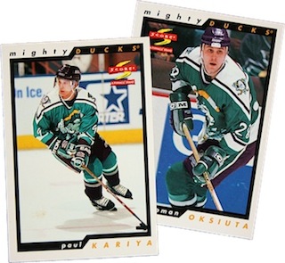
Mighty Ducks of Anaheim

Third jersey (1996)
Here's where we end. And I am mortified.
It's true. I own what might possibly be the ugliest third jersey in NHL history. Why? Because I thought it was cool. Bet you didn't see that one coming.
I was 11 years old when this one debuted. I think I bought it in the bargain bin a year later at a Sports Authority. If I remember right, I got it for $28. And even at that rate it was way overpriced. But that season saw the launch of the NHL's Third Jersey Program which, somewhat ironically, spurred my interest in hockey uniform designs.
By that time, I'd only been watching hockey a few years, but it seemed NHL jersey designs were all set in stone, and frankly when you're a kid, that's kind of boring. Now I can look back nostalgically but in 1996, I saw for the first time that teams could try new things and be creative. As a creative person myself and not really that athletically-inclined, I fell in love with that aspect of the sport.
 But the thing is, it was never that easy for me to see the variety that did exist in the league. The Internet as we know it today was barely in its infancy. There was no looking up photos on Google Images. No photo galleries on team websites. No Icethetics, to be sure.
Instead, I started learning about all of the NHL's jerseys by collecting hockey cards. Most kids would've been eager to see which new players they got as they unwrapped a new pack. For me, it was which new jerseys I got.
To this day, I still have that collection, thousands of cards going back to the early '90s. And when I saw Paul Kariya wearing this jersey, I figured it had to be awesome. Because he was. I've since learned that is faulty logic.
As my pathetic jersey collection clearly shows, I'm not a traditionalist in any sense. I love the vintage-style uniforms for teams that have a long history. Outside of that, I think a bit of creativity and outside-the-box thinking is warranted. But that doesn't mean I won't like the whatever the Lightning come up with, even if it lives up to the rumors. They're my team.
I love hockey sweaters as much as anyone else. Some choose to manifest that love with big jersey collections. Personally, I'm just not a fan of spending that much money on something that will collect dust in the closet. The only jersey I'll ever wear to a hockey game is a Lightning one. So I don't need any others.
But that won't stop me from collecting pictures of all the jerseys I can find.
So now that you've seen my collection, show me yours. Who among you has the best collection? Most eclectic? Biggest? Ugliest? Let's do a little competition. Maybe we'll even have a prize for the winner. Leave a note in the comments if you have a collection you're interested in putting on display. If enough people want to get involved, I'll set up a page and let everyone vote.
Update on Saturday · Feb 5 · 2011 | 11:39 AM PST by
 Chris
Chris
My jersey collection expanded by one this morning — thanks to the Icethetics readership!
Tampa Bay Lightning

Third jersey (1997—1999)
After I wrote this post and mentioned my desire to add the Lightning's original third jersey to my diminutive collection, a reader linked me to an ebay listing that was winding down. Lucky timing, I guess.
As wacky of a design as it is, this was one of the first hockey jerseys that piqued my interest in the subject in the first place. The NHL's Third Jersey Program introduced us to the idea that teams could get creative with their looks. And even though this was a pretty atrocious attempt, as a kid, I loved it. I'm glad to have it.
Couple of disappointing details: It's a little too small for me to wear and because it's a replica, it doesn't feature the underarm "victory stripes" that have been a mainstay on every Lightning sweater from 1992 to 2011. That aside, it's in great condition and it totally brings me back to my middle school days!
Still planning to expand the collection this year — but only with Lightning or Lightning-related jerseys. I'd like to pick up a customized Stamkos 2011 All-Star sweater along with the Bolts' new home and road sweaters, just unveiled this week. They won't be available until sometime this summer.


;)