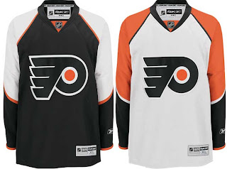
Flyers, Here's How You Fix It
 Monday · Oct 1 · 2007 | 1:50 PM PDT
  7 Comments
 I think many Philadelphia Flyers fans would argue specifically that if it needed changing, the only thing that would be necessary is an orange jersey instead of a black one. Having said that, the Flyers have already announced plans to introduce an orange third jersey next season.
Still, one fan emailed me this suggestion that extends the sleeve panel down past the elbow and shrinks the stripe around it. Have a look for yourself.
It's a minor tweak that, in my eyes doesn't really look that much different.
On a totally separate note, another fan emailed in an interesting concept that looks at altering the captains' letters.
Any thoughts? I'd love to hear them. Comment below.
By the way, apologies for the limited posts today. I've been a bit under the weather and I'm going to be needing to get to bed soon. Coming shortly will be the uniform review for the Columbus Blue Jackets.
Next up: Dallas Stars.


Reader Comments (7)
The only way to really fix these jerseys is if they switch the black to orange.
I really like the captain and alternate ideas.
Alternate, not assistant.
the alternate and captain concept is a really neat idea
Those sleeves look much better.
The "C" and the "A" are a neat idea, but they would look awful actually on the jersey. They would look more like an ECHL team.
Those jerseys look much better. At first, I thought the biggest problem was keeping black instead of orange for the home jersey. But there's an even bigger problem.
The problem is that the Flyers abandoned the "wing" concept they've carried on their sleeves since day one. The sleeves are now colored in block segments, like a LEGO character or something.
The way to improve the jerseys would be to change the upper arms to restore the "wing" down the sleeves.
That "C" and "A" would have looked real nice in the 70's but don't know if it would fly today - I think the idea is great!