Predators, Here's How You Fix It
 Friday · Oct 5 · 2007 | 12:36 PM PDT
  2 Comments
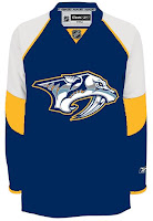
 I used to believe the Nashville Predators were among the clubs with the best jerseys. With the introduction of their Rbk EDGE sweaters, I'm now less than convinced of that. Anyway, it's not horrible, but some folks thinks it needs fixing. Hence this.
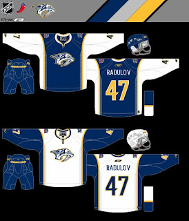
 Here is one solution. Flyers fans should be able to pick out the design in a heartbeat.
This jersey is in fact based on Philadelphia's. Only the colors and logo have been changed. I do like that blue.
I don't know, though. I'm not sure it's that much of an improvement on what they're wearing now. But it certainly isn't a bad alternative.
Nor is this.
I think it looks an awful lot like the Buffalo Sabres — perhaps a little too much — but there you have it. Count me as a fan though. We'd have to lose the anniversary logo off the shoulders, however, before I'd fully approve. Otherwise, I really like the idea of contrasting the sleeves and torso like that.
What do you guys think? Do either of this fix it? Did it need fixing to begin with? You be the judge.
Coming next: Buffalo Sabres.


Reader Comments (2)
"I used to believe the Nashville Predators were among the clubs with the best jerseys."
Seriously? I respect that everyone has their own opinion, it's just that I don't think I've ever heard anyone say anything even remotely flattering about their old look, let alone that it was one of the best, so that was surprising.
Yay... your doing Sabres next! PLEASE be against lol