This One's All Atlanta
 Thursday · Nov 15 · 2007 | 1:46 PM PST
  10 Comments
 As the title implies, this post will stick to an Atlanta-based theme. We'll start with the team currently in that town — the Thrashers.
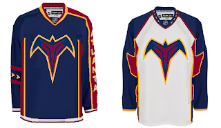
A reader emailed in this concept which calls for a return to the days of going heavy on the dark blue and maroon. Don't get me wrong, I don't think it's a bad look. I just prefer the light blue jerseys. One of the best in the league, if you want my opinion — which I'm sure many of you don't.
I bet the asymmetry of that blue jersey is causing aneurysms for a good number of you. I think it's a winner. Not really feeling the sleeves on the white jersey, however. I know what's being attempted, but it just isn't working. Thoughts?
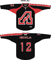
Now let's take a blast from the past with the Atlanta Flames.
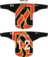
You might notice Jarome Iginla's name on the back of these sweaters. Try to ignore the Calgary connection. I really am trying to write an Atlanta post. The one on the left is a little plain but I like the city name down the sleeve. The crest is awkwardly large however. What I like is the one on the right which is oversized just right — if that makes any sense.
I think this is a really cool idea. The giant logo basically becomes the jersey design. I think it provides a really cool effect. Not sure how great it would look on the ice, however. But by itself there, I'm a fan.
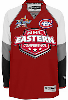
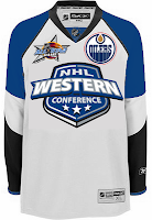
And finally, we'll top things off with the 2008 NHL All-Star Game which is being hosted by the great city of Atlanta. The jerseys for that game were recently unveiled to the general disappointment of a lot of the readers here. One fan emailed in a couple of concepts for the big game. They're not bad, but they do borrow heavily from the Philadelphia Flyers.
Oh, and before a handful of you start needlessly jumping up and down on the designer, let me point out that we know a design like this prohibits the use of a "C" or "A" on the chest. And I do think the all-star and team logos should be left on the shoulders. Other than that, I think they work. Perhaps we'll see something similar in the future.
Until then, we have what we have.




Reader Comments (10)
I have to agree with you Chris.. the light blue is very nice. I would however like to see that blue jersey used at a third uni... It looks great.
Thrashers light blue jersey is awesome! but that first dark blue jersey is cool too! hopefully that is what Atlanta's third jersey will look like
How about taking the All-star jerseys and add a stripe down the sleeve for the name of the team per player like Atlanta does. Give it that Thrashers feel. So put the team logo on the opposite shoulder. I think the giant logo on the jersey screams roller hockey.
See, those all-star jerseys are simple,but also very good. Why doesn't RBK get it that a jersey doesn't need all sorts of crazy piping and colours to be good?
it seems like there is alot of Atlanta concepts all the time
I agree chris that the blue used by atlanta is cream-my-pants beautiful, plus it is unique in a league saturated by reds, blacks, navys etc. The proposed cept mimicky the current atlanta blue jersey is pretty nice though. I've actually been a fan of the assymetrical arm stripe since the beginning most likely due to it being original, simple and sexy. I was thinking something similar to another poster than the one arm stripe should be used for the all-star game being held in atlanta. perhaps the player's original team name could be written down the arm with the team crest on the shoulder above the name ... sorry if someone already mentioned this, but i am not meaning to steal your idea. I've been thinking this for a while.
And yeah, why the heck are there so many atlanta concepts posted on this page? seems strange
must be a hardcore atlanta fan.
blueland is the best concept said that they are the only light blues in the league
Okay... Frankly, I think that you have to be insane to like the asymmetry of Atlanta's jerseys. The color is great. But the asymmetry... it's God-awful.
You seriously think ATL's light blue jersey is a winner?? It's atrocious! Ugh, I just hate the color altogether.
Their road jersey is much better.