Just To Freak You Out XV
 Friday · Nov 16 · 2007 | 1:46 PM PST
  9 Comments
 We were a little thin in terms of new Freak Out art this week, so forgive me if today's post is a little light. Still, nothing pleases me more than trying to freak you guys out with some crazy concept art.
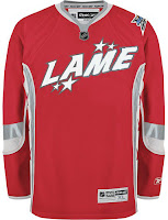
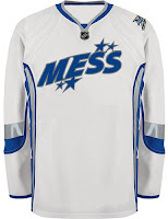
As many of you know, the NHL unveiled the 2008 All-Star Game sweaters this week. Reader reaction here was not great. In fact, I got some very Freak Out-worthy concepts based off of those jerseys.
John sent those in along with a few others. You'll be able to find them in the Concepts Gallery this weekend.
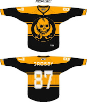
We'll keep things moving with the Pittsburgh Penguins next. Each concept here imagines a drastic change. For instance, the first example suggests renaming the team the Pirates — a club that once existed in Pittsburgh during the early years of the NHL.
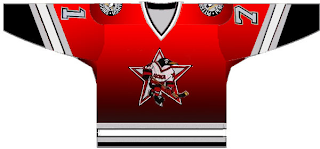
And the second suggests that the team keep the name but move to Russia.
That silly penguin even looks Russian.
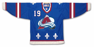
And then, this goes out to all the folks from Quebec. It just doesn't look right. At all.
We'll keep things in the Western Conference now. With all the vanity in the world these days, you had to see this coming.
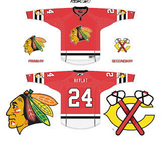
It seems even the Chicago Blackhawks' Indian head wanted a facelift. Either that or he got the Botox. And don't think I'm ignoring the Bears reference in there.
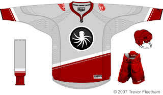
Next we'll head to Detroit where I'm quite concerned.
I think the grey jersey is an interesting choice, but I don't think an octopus will ever be anything but scary on a Red Wings concept. That tradition should stay off the sweater. Having said that, as a logo itself, it's not bad. But I'm still very, very concerned.
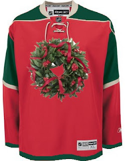
And finally, with Christmas just 39 days away, I thought I'd start my decorating now.
Ho ho ho!
If you've made or run across any concepts you think might be worth posting for Freak Out Friday, don't be shy. Send them along! You can email me at nhllogos@gmail.com.



Reader Comments (9)
I think the New Jersey devils should bring back those red and green jerseys for the Christmas season. They could play the Wild with the wreath crest. But where are we going to put the Christmas tree lights??
actually, that penguin is from the old Russian Penguins team. the penguins bought Dynamo Moscow back in the early 90s as a farm team, and renamed them the Russian Penguins. That jersey is more an obscure relic concept rather than a freak out
That MIN Christmas jersey is priceless. You don't really even need the wreath on it for it to be Christmas though. That is, IMO, the worst jersey in the NHL.
I have to be honest. I dig the Pirates concept.
Regarding my Wings uni, don't be too concerned Chris. I went with the obvious with the Octopus. Even though I made it, I could never imagine Stevie Y wearing those threads. I do like that gray though....
I have thought of something to try that will demonstrate the City of Detroit well. You should get it soon.
That Pirates/Penguins concept is very sharp. Anything that looks like it could be a sweater is a-ok with me.
Why move the Hawks' shoulder logos onto the arm stripes?
Hawks had the tomahawks over the stripes in the 50's. Always thought it was an interesting look.
I laughed my butt of when I saw your Xmas decorating jersey, I am a MN Wild fan and I can't stand the red Home jerseys!
even as a wings fan, i wouldn't go so far as to say we have the best logo in the nhl, but it's close. there's very little you can do to improve it. it's a logo that will never die, just like the blues, the habs, or the flyers. if you wanted to rebrand it, take the tire out of the 30's and make the wings a little edgier.
however, the biggest improvements i feel would come with redesigning the piping- still find a way to keep the sleeves predominantly red, like they're red wings, but play around with the rest of the jersey's coloring.