Recolor This
 Friday · Nov 2 · 2007 | 1:08 PM PDT
  8 Comments
 Today's concept post will deal strictly with recoloring things. Yes, that's right. For instance, let's suppose the Florida Panthers had opted for the more traditional red home sweater over the blue one they actually went with.
Not bad, but despite the fact that I loath the Stinkin' Panthers, I prefer the blue. The old red sweaters were nice, but I don't care much for this one pictured here. But that's just me.
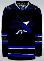
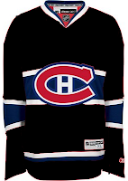
Speaking of me being a Lightning fan, someone remade the Sharks' and Habs' sweaters with Bolts colors.
I don't know. No. They'll always be a teal team. That's just who they are. Don't question it. As for the Habs, you can't have that jersey in anything but red. Even blue would be weird.
Here's something else that might make you question whether this is the Freak Out Friday post. Not quite yet. Just a misguided attempt at giving the Canucks new colors.
I'm all for the return of a green team to the NHL, but this is not how that is achieved. No, no, no. I know I'm sounding very negative right now, but just no.
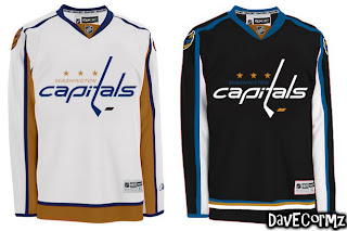
Anyway, here's something I like. The Blue & Bronze Age of the Washington Capitals was my favorite. Even though it fits them perfectly, thematically speaking, the red/white/blue combo is so overused in this sport. Check out the current EDGE unis in the old colors.
It may not be the most brilliant thing you've ever seen, but come on. That's not too shabby. I like the white "capitals." Very sharp, right there, if you ask me. I'd just like to see the black jersey in blue instead. I was more a fan of the blue '90s jerseys for the Caps. I like the black one as a third jersey — not so much a primary home sweater.
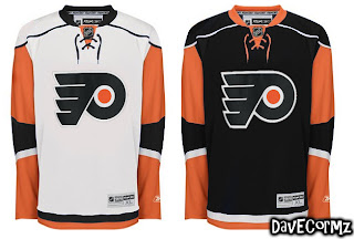
And finally, we'll finish off with something a bit different. This is the Islanders uniforms recolored — but for a different team.
Wow, no. I'm sorry, but those sleeves don't look good on any team if you ask me. The more I see it, the less I like it. Granted it looks better in black and orange than blue and orange, but still, I'll pass on this one.
What do you guys think? Any winners here? Or should we go back to the paint bucket?








Reader Comments (8)
There's only 4 teams in the NHL that have red-white-blue color scheme (Rangers, Caps, Canadiens, & Jackets). If you consider 4 overused, that's fine, but it's not like half or even a third of the teams have that color combo
"There's only 4 teams in the NHL that have red-white-blue color scheme (Rangers, Caps, Canadiens, & Jackets). If you consider 4 overused, that's fine, but it's not like half or even a third of the teams have that color combo"
I don't see why the Panthers, Avalanche, and Thrashers wouldn't count in here.
IMO, those teams do not have white as one of their primary colors. It comes from their road jerseys.
Panthers are red, blue, and yellow. The Avs are burgundy and sky blue (which I guess you could technically consider shades of red and blue), and the Thrashers are red, blue, lght blue, orange, yellow, etc.
I think it's a stretch to consider those teams a traditional red, white, & blue.
ok, great...now what's your point? I made the panthers jersey and I don't really care how many teams have red white and blue, I care what people think of my work.
IMHO the recolord caps unis look way better than the original ones. I didn't like the lay-out of their old jerseys but I do like the new ones. So the new lay-out recolord seems to fit perfect, at least for me ;).
Habs in black? NOOOO WAY! As Chris said, the Habs are a "must be" blue-white-red team!
why do my jerseys always appere fuzzy??? (Sharks Jersey)
The Canucks green concept is a very poor photoshop job, but I think green would look good as a 3rd jersey in the future. Perhaps something like what is shown but put Johnny Canuck on the front. Also leave the helmet, and pants blue but add green socks. I think that could look pretty sharp....and unique.
wow, the flyers and caps ones looked really good. but i really like the caps now and i LOVE the new flyers jerseys. so hopefully they don't change.