Painted On
 Sunday · Dec 16 · 2007 | 3:35 PM PST
  17 Comments
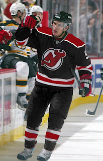
 I think you guys know by now one thing I'm a fan of is concept designers putting the extra effort in and painting their designs onto player photos. It's the closest thing we'll get to seeing what these jerseys might look like on the ice without them actually being stitched together.
Tonight's post is all about that. I'm starting with my favorite of the bunch. Why don't the Canucks wear green? Why isn't there any green in their logo?
Here's a new idea for the Islanders. I like it better than their real jerseys, but that's just my opinion.
Imagine the Flames in a black jersey. (Not sure what's going on on the shoulder there.)
Frankly, anything with a flaming C on it disgusts me right now after the
Sticking to Alberta, many Oilers fans have been praying for the day that their club returns to their original colors.
While I'm on the subject, apparently word has been floating around that the Oilers have designed a third jersey that's awaiting NHL approval and will be worn next fall. I'm sure everybody's looking forward to that. I'll be sure to post something when I have more information.
And finally, we have black for the Devils.
If you have comments, you know what to do.


Reader Comments (17)
that looks like the saint john flames logo on the shoulder
Green works for the 'nucks.... except the conspiracy theorist in me says there is a reason there is no green in the logo: green will be phased out in favor of grey or silver.
D
Ok, I'm convinced.
Vancouver HAS to switch to that jersey...with two minor tweaks...ditch the wordmark, and add some colour to the logo.
If the flames ever do have a black home jersey, the logo should definitely be the flaming horse. That was bad-ass.
Edmonton looks good in the old Orange n Blue. I wouldn't be against seeing it return. That jersey isn't my favourite though.
all look sick expecially the devils black and the falmes very sharp
The problem with the Oilers' jerseys isn't the colors, it's the design. I wouldn't mind returning to orange, but not like this.
The Islanders' jersey is a big improvement. Clean and unique.
Forget a third jersey, the Oilers need a first jersey!
Agreed on the Canucks in green. Not feeling any of the others.
Re: Calgary's 9-6 win.
See you next year, Chris. See you next year.
Everyone that wants a third jersey is getting one next year.
Love 'Couver in the green!
When are we going to hammer down the worst logo in the NHL...I have a vested interest in this tournment as well!
I agree with Best Test Group Ever. Green would look absolutely great on the Canucks. However, I would make the helmets blue to match the pants due to the fact that blue represents the water element of Vancouver. As for the conspiracy theory, the green will not be phased out. As I suspected, the Orca logo, thankfully, will be phased out in a year or two. From what a retailer told me, the reason the Canucks kept the Orca(with no green) was because of the team ownership trial, which is coming to a conclusion. The classic Johnny Canuck logo would make a green sweater look razor-sharp!
No, I for one haven't forgotten the 2004 Stanley Cup, but shouldn't that have been "the team that actually defeated the Lightning for the Stanley Cup, but got ripped off by the officials"?
Gelinas scored the series winning goal in Game 6. Even though you couldn't see the puck in the replay, the logic here is really simple to follow. 1) The goalie's pad was inside the net. 2) The puck turned out to be under the goalie's pad. The inescapeable conclusion? 3) The puck was in the net!
Ditching the birthing whale? Don't get my hopes up like that, andre.
You big tease.
Okay, Who Wants to Start a Petition to Make the Green Canucks Jersey the Third Jersey and place the modifyed Stick in Rink in it's rightful place on the Blue and White Unis.
Hey canucklehead,
No, I don't mean to get your hopes up nor mine, but think about it: the MAJORITY of Canuck fan dislike the Orca because of its connection to Orca Bay. Next season, the Orca Bay name will officially be removed from the club's company name. Also, with the risk of losing the franchise, depending on the outcome of the ownership trial, and the cost of removing or changing a logo, the Orca had to be kept. I am very sure that before this decade is over, the birthing or constipated Orca will be harpoooned. Hopefully, the crooked updated Stick logo will be gone too. Once that happens, put Johnny Canuck on the green and white sweaters and the classic Stick logo on a third blue sweater.
The Devils black jersey looks much better in that picture than it does is some other concept photos I've seen.
The Islanders need to get rid of the pinstriping, IMHO.
Oilers need to go back to the original colors.
The Canucks....not sure what I think they should do...the whole "Vancouver" on the jersey thing is definitely working better there than it is in Dallas though.
i would love the 3rd oilers jersey to be gold colored, itd be sweet
the devils should just switch to black jerseys for their home ones