Just To Freak You Out XVII
 Sunday · Dec 2 · 2007 | 2:22 PM PST
  14 Comments
 Welcome to the belated 17th installment of the Freak Out series. Time's been getting away from me the last few days so I apologize for the delay. Anyway, this week's art has a very specific theme. I asked for you guys to send me stuff of the "If They Mated" variety and some of you actually responded.
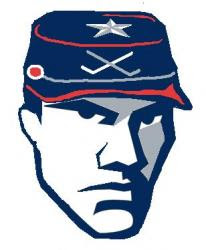
We'll start with a couple of logos I thought were "special."
If you're staring at that and just can't place it, look no further than the Ottawa Senators. You'll recognize his cap from the Columbus Blue Jackets' shoulder patch. That one just cracks me up every time I look at it. It's like the guy took the day off to go to a baseball game but he still can't seem to wipe that constipated look off his face.
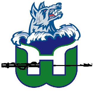
The next one goes out to all my Connecticut readers.
It's a combination of the Hartford Whalers and Hartford Wolf Pack. And the more astute among you might notice the nod to the New England Whalers. That's three leagues covered in one logo. Impressive.
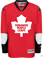
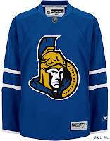
So going back to Ontario now, try to imagine what would happen if the Leafs and Sens (perish the very thought) were to swap uniforms and colors?
Don't send me hate mail. I'm illiterate anyway.
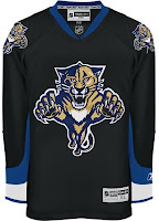
And now for a rivalry absolutely no one could care less about.
Personally, I'm disgusted by this but it does make me laugh a little. What's with the black tongue on the panther? Someone should tell him to stop chewing on his pen.
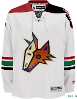
This here is more of a fusion of past Coyotes jerseys. We've got the old colors on the new uniform. How many of you like me would prefer to gouge out your own eyes before watching a team wear a jersey with two different color shoulder yokes? That's got to be breaking some sort of law.
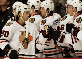
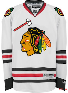
Speaking of law-breaking, remember the scary Blackhawks logo I used to kick off last week's Freak Out post?
Somebody glued it on a jersey. D'oh!
And then I thought this was mildly amusing if nothing else.
But this is what happens when you guys stop sending in the really good stuff. Hope you enjoyed another week's worth of Freak Out art. Hopefully I'll be back with more on Friday. Enjoy what's left of your weekend!




Reader Comments (14)
I'm sure Sens and Leafs fans will agree with me that swapping colours would be blasphemy. The Panthers looks pretty cool on black though...
what a joke hehehe
i like the panthers one lol
That poor Sens logo really needs some anti-depressants.
the florida/ontairo colour swaps look pretty good. would love to see an alberta, california, new york color swaps.
does anyone remember the home/away jerseys from the 90's that were split down the middle with white on one side and away on the other?
I like the Florida swap. The Blackhawks made laugh. I remember those split jerseys. I have a friend back in Dallas that got a white and black Stars jersey. How about a jersey swap of relocated teams. For example. Phoenix with Winnepeg or Colorado and Quebec. Sens in blue, Leafs in Red is just wrong. How about switching Edmonton and Calgary?
The florida one is great! I think it looks better than there current jersey!
The Florida swap is awesome... it looks like it was meant for each other. Also, I'm OK with a red Maple Leafs jersey, just like Canada...! And also, the Hartford one is simply amazing... even though the NE Whalers doesn't really fit, the Wolf Pack along with the Whalers one could be awesome, if the bottom green part was more stylized, and "un-plain", "un-smooth"! Great job to those who made it!
Chris, you should make a series for "Random Recolorings"... I'd be glad to submit a few to start it off! In fact, I'm in the middle of a Penguins' recoloring right now!
Thanks derek, I made the Hartford Hockey logo. The reason the NE Whalers is in there is because all three of those teams have played at the Hartford Civic Center.
Oh... I realize now
That Sens/Lafs thing is awesome. Can you do that for Oilers and Flames please!?!
I'm a hardcore Blackhawks fan and I just about fell out of my chair laughing at the logo. Great stuff!!
The Wolf Pack/Whalers logo is gaaaaaaaaaaaaaaaaay!