Nothing Official From Canucks Today?
 Wednesday · Aug 1 · 2007 | 11:57 AM PDT
  14 Comments
 Damn. As it turns out, the Vancouver Canucks are supposedly having a private shoot today with the new Rbk EDGE jerseys. Yeah, not so much with the public unveiling thing. However, there's another alleged leak.
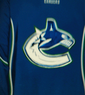
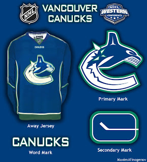
Saw it on the Canucks official message board. They're calling it a cell phone photo of the new jersey but you know how these things go. With it, one fan apparently finished off what could be the look which you can see in the graphic below.
I don't know now. I'm reading dates like mid to late August for the team's official announcement. I don't know if they team has said anything specific about a date, but I have seen August 29. I'm not holding my breath, though. So it probably won't be in the sidebar countdown — until we do get some sort of confirmation.
Shame about that. Though I can't say I'm surprised. The Canucks seem to be yanking their fans around quite a bit on this topic. I think they should just unveil the thing and be done with it.


Reader Comments (14)
you know. i kiinda like it. my only beef with the jersey is the side numbers. is that line going to go in between the 1 9 you know? hmm. i wonder what the away will look like?
that is the away, the nhl going back to home white arent they ?
I think the person who made that graphic erred on the side of wishful thinking. Nothing I've heard this summer or prior has indicated any plans to return to whites at home.
In fact, if you visit the http://shop.nhl.com/home/index.jsp" REL="nofollow">NHL's online shop, check out the new Rbk EDGE jerseys and you'll see the darks are labeled home and the whites are labeled away. That should clear up any confusion.
Well, that's a hell of a lot better than the ones with Vancouver across the chest.
I thought that pic was confirmed to be a photoshop of the Capitals' red jersey...
You're thinking of a http://nhllogos.blogspot.com/2007/07/possible-new-canucks-jersey.html" REL="nofollow">different picture, but yes, it is considered to be a manipulation of the Caps uni. Thanks for the comments, all.
i think tyhis is dumb they should have released the new jerseys on the day they said they would
They never said that they were going to release the jersey on August 1st. They said they'd be having a rpivate photoshoot. Alot of people mistook it for a jersey release.
Holy ZOMG www.canucks.com. Check it out new jerseys on the 29th yay happy blah
Shmoogly Klibbensharger Blarghshmagoogle
YAAAAAAAAAAYYYYYYYYY
The wait is finally over
jsdhfiousagdhfokjdshfgawirouofiugeifouaerohvcberouvhboueyhrofhaoiwfhlkuhfiurehoifuahroiuaerhouhaoeiuhfiherbfvilhjeaoihrvou
I think these are them.
don't know what you guys think but it says new unis and logo and that logo looks the same as the last one.
A return to the original blue and green colors makes me VERY happy!!!
These look sharp! Very classy looking jerseys. The logo looks way WAY better in these colours!! Blue and green is definitely the way to go for Vancouver. Hard to outdo the original six, but these would be the best of the new ones so far if this image is real.
Hi, take a look at this suggestion by John Slabyk. It's a different concept, but man it's cool. Simple lines yet lots of details and of course elements from past Canucks logos.
www.humanot.com - choose "sports" than "Canucks"
Just love it. Any comments??